


在之前一篇文章中我们讲解了三种ProgressBar的做法,详见—>《Android 自定义View——自定义ProgressBar 》。这一节中我们模仿360加速球制作一个动态ProgressBar。
当然制作之前,我们先来看看360加速球是什么样子的:
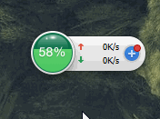
通过上面的动图,我们了解到360加速球是什么样子的,现在我们开始来制作自己的ProgressBar。这里用到了之前两篇博客的知识。大家可以参考学习:
《Android 自定义View——Path的使用 》
《Android 自定义View——自定义ProgressBar 》
《Android PorterDuff.Mode图形混合处理 》
不废话了,接下来进入正题……
原理解析
首先我们定义有一个Bitmap,给这个Bitmap对象定义一个Canvas画布,我们将内容绘制在这个Bitmap上,然后再将Bitmap添加到View的Canvas上。
Bitmap的Canvas上,我们要绘制一个圆形,这个圆形代表最大进度,然后绘制圆形内的“波动的水”。这个波动的水我们要通过处理图形混合的PorterDuff.Mode来实现。“波动的水”的实现,是通过Path中定义贝塞尔曲线完成的。我们绘制一条贝塞尔曲线,通过moveTo()和lineTo()方法,将贝塞尔曲线闭合,然后通过Handler操纵贝塞尔曲线波动。通过PorterDuff.Mode的PorterDuff.Mode.SRC_IN模式上层只显示圆圆形重合的部分,从而实现在贝塞尔曲线在圆形内波动。
代码实现
我们看代码,再通过代码解析:
public class MyProgressAnimation extends View {
    private int width;//设置高
    private int height;//设置高

    private Bitmap bitmap;//定义Bitmap
    private Canvas bitmapCanvas;//定义Bitmap的画布

    private Path mPath;    //定义路径
    private Paint mPathPaint;//定义路径的画笔

    private Paint mPaintCircle;//定义圆形的画笔

    private Paint mPaintText; //定义绘制文字的画笔

    //设置进度
    private int maxProgress = 100;
    private int currentProgress = 0;

    public int getMaxProgress() {
        return maxProgress;
    }

    public void setMaxProgress(int maxProgress) {
        this.maxProgress = maxProgress;
    }

    public int getCurrentProgress() {
        return currentProgress;
    }

    public void setCurrentProgress(int currentProgress) {
        this.currentProgress = currentProgress;
        invalidate();//实时更新进度
    }


    private int count = 0;
    private static final int NEED_INVALIDATE = 0X6666;
    //操作UI主线程
    private Handler handler = new Handler() {
        @Override
        public void handleMessage(Message msg) {
            super.handleMessage(msg);
            switch (msg.what) {
                case NEED_INVALIDATE:
                    //更新时间
                    count += 5;
                    if (count > 80) {
                        count = 0;
                    }
                    invalidate();
                    sendEmptyMessageDelayed(NEED_INVALIDATE, 50);
                    break;
            }

        }
    };

    public MyProgressAnimation(Context context, AttributeSet attrs) {
        super(context, attrs);
        //初始化一个路径
        mPath = new Path();
        //初始化绘制路径的画笔
        mPathPaint = new Paint();
        mPathPaint.setAntiAlias(true);
        mPathPaint.setColor(Color.argb(0xff, 0xff, 0x69, 0x5a));
        mPathPaint.setStyle(Paint.Style.FILL);//设置为填充,默认为填充,这里我们还是定义下
        mPathPaint.setXfermode(new PorterDuffXfermode(PorterDuff.Mode.SRC_IN));

        mPaintCircle = new Paint();
        mPaintCircle.setAntiAlias(true);
        mPaintCircle.setColor(Color.argb(0xff, 0xf8, 0x8e, 0x8b));

        mPaintText = new Paint();
        mPaintText.setAntiAlias(true);
        mPaintText.setColor(Color.argb(0xff, 0xFF, 0xF3, 0xF7));
        mPaintText.setTextAlign(Paint.Align.CENTER);
        mPaintText.setTextSize(50);

        handler.sendEmptyMessageDelayed(NEED_INVALIDATE, 50);
    }

    public MyProgressAnimation(Context context) {
        super(context);
    }

    @Override
    protected void onMeasure(int widthMeasureSpec, int heightMeasureSpec) {
        super.onMeasure(widthMeasureSpec, heightMeasureSpec);
        super.onMeasure(widthMeasureSpec, heightMeasureSpec);
        width = getDefaultSize(getSuggestedMinimumWidth(), widthMeasureSpec);
        height = getDefaultSize(getSuggestedMinimumHeight(), heightMeasureSpec);
        setMeasuredDimension(width, height);//设置宽和高

        bitmap = Bitmap.createBitmap(width, height, Bitmap.Config.ARGB_8888);
        bitmapCanvas = new Canvas(bitmap);
    }


    @Override
    protected void onDraw(Canvas canvas) {
        super.onDraw(canvas);
        //绘制Bitmap上的圆形
        bitmapCanvas.drawCircle(width / 2, height / 2, 150, mPaintCircle);
        //通过Path绘制贝塞尔曲线
        mPath.reset();
        mPath.moveTo(width, (height / 2 + 150) - (currentProgress * 300f / maxProgress));
        mPath.lineTo(width, height / 2 + 200);
        mPath.lineTo(count, height / 2 + 200);
        mPath.lineTo(count, (height / 2 + 150) - (currentProgress * 300f / maxProgress));
        for (int i = 0; i < 10; i++) {
            mPath.rQuadTo(20, 5, 40, 0);
            mPath.rQuadTo(20, -5, 40, 0);
        }
        mPath.close();
        //将贝塞尔曲线绘制到Bitmap的Canvas上
        bitmapCanvas.drawPath(mPath, mPathPaint);
        //将Bitmap绘制到View的Canvas上
        bitmapCanvas.drawText(currentProgress * 100f / maxProgress + "%", width / 2, height / 2, mPaintText);
        canvas.drawBitmap(bitmap, 0, 0, null);
    }
}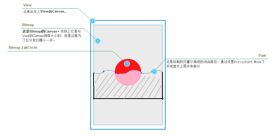
通过这张图片我们可以更好的理解绘制原理。
绘制红色区域的圆形:
        //绘制Bitmap上的圆形
        bitmapCanvas.drawCircle(width / 2, height / 2, 150, mPaintCircle);
绘制Path轨迹区域:
注意:这里我们绘制路径是最后使用贝塞尔曲线封闭的。然后Path封闭路径的高度是变化的。
        //通过Path绘制贝塞尔曲线
        mPath.reset();
        mPath.moveTo(width, (height / 2 + 150) - (currentProgress * 300f / maxProgress));//通过此处根据进度设置高度
        mPath.lineTo(width, height / 2 + 200);
        mPath.lineTo(count, height / 2 + 200);
        mPath.lineTo(count, (height / 2 + 150) - (currentProgress * 300f / maxProgress));//通过此处根据进度设置高度
        for (int i = 0; i < 10; i++) {
            mPath.rQuadTo(20, 5, 40, 0);
            mPath.rQuadTo(20, -5, 40, 0);
        }
        mPath.close();
通过效果,只保留上层的重叠部分:
        //在初始化绘制路径的画笔上加入这个效果
        mPathPaint.setXfermode(new PorterDuffXfermode(PorterDuff.Mode.SRC_IN));
控件使用
1. 在布局中定义控件和按钮,点击按钮,进度开始自动增加。
<LinearLayout xmlns:android="http://schemas.android.com/apk/res/android"
    xmlns:tools="http://schemas.android.com/tools"
    android:layout_width="match_parent"
    android:layout_height="match_parent"
    android:orientation="vertical"
    tools:context="com.example.administrator.mywidgetdemo.activity.MyProgressAnimationActivity">

    <Button
        android:id="@+id/button_start_myprogressanomation"
        android:layout_width="match_parent"
        android:layout_height="wrap_content" />
    <com.example.administrator.mywidgetdemo.widget.MyProgressAnimation
        android:id="@+id/myprogressanomation"
        android:layout_width="match_parent"
        android:layout_height="match_parent" />

</LinearLayout>
2. Activity中点击按钮后增加进度。
public class MyProgressAnimationActivity extends Activity {
private Button mButton;
private MyProgressAnimation myprogressanomation;
private static final int PROGRESS= 0X0003;
//定义一个进度
private int progress;
private Handler handler = new Handler() {
@Override
public void handleMessage(Message msg) {
super.handleMessage(msg);
switch (msg.what) {
case PROGRESS:
progress++;
if (progress <= 100) {
myprogressanomation.setCurrentProgress(progress);
sendEmptyMessageDelayed(PROGRESS, 100);
}
break;
}
}
};
@Override
protected void onCreate(Bundle savedInstanceState) {
super.onCreate(savedInstanceState);
setContentView(R.layout.activity_my_progress_anomation);
mButton = (Button) findViewById(R.id.button_start_myprogressanomation);
myprogressanomation= (MyProgressAnimation) findViewById(R.id.myprogressanomation);
mButton.setOnClickListener(new View.OnClickListener() {
@Override
public void onClick(View v) {
handler.sendEmptyMessageDelayed(PROGRESS, 1000);
}
});
}
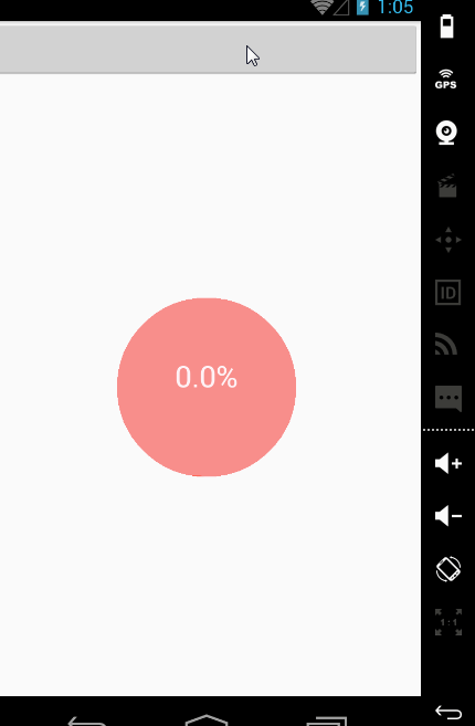
}3. 实现效果如下:


 2013
2013

 被折叠的 条评论
为什么被折叠?
被折叠的 条评论
为什么被折叠?
 到【灌水乐园】发言


