


最近在做数据分析相关的工作,需要将数据分析的结果直观的展示出来,以便进行微调。这里就需要用到柱形图,饼图,折线图等,Java里有JFreeChart 库来实现数据统计图,JFreeChart 官网:http://www.jfree.org/jfreechart/。
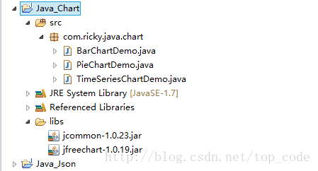
一 jar配置
当前使用的是官方最新的版本 1.0.19,使用时需导入 jcommon-1.0.23.jar和jfreechart-1.0.19.jar
二 示例
1.柱形图
示例代码:
package com.ricky.java.chart;
import java.awt.Font;
import javax.swing.JFrame;
import org.jfree.chart.ChartFactory;
import org.jfree.chart.ChartPanel;
import org.jfree.chart.JFreeChart;
import org.jfree.chart.axis.CategoryAxis;
import org.jfree.chart.axis.ValueAxis;
import org.jfree.chart.plot.CategoryPlot;
import org.jfree.data.category.CategoryDataset;
import org.jfree.data.category.DefaultCategoryDataset;
public class BarChartDemo {
/**
* @param args
*/
public static void main(String[] args) {
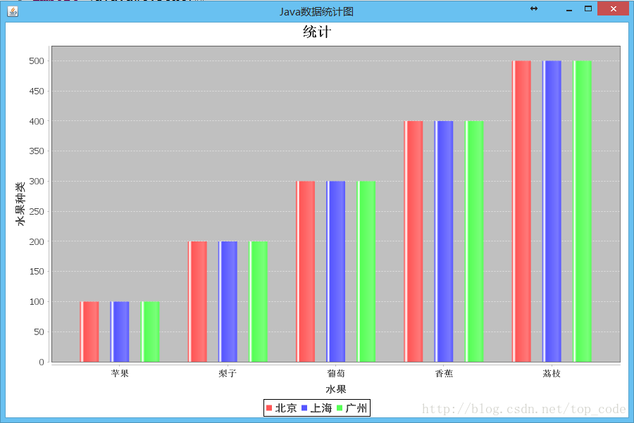
JFreeChart chart = ChartFactory.createBarChart("统计", "水果", "水果种类",
getDataSet());
// 从这里开始
CategoryPlot plot = chart.getCategoryPlot();// 获取图表区域对象
CategoryAxis domainAxis = plot.getDomainAxis(); // 水平底部列表
domainAxis.setLabelFont(new Font("黑体", Font.BOLD, 14)); // 水平底部标题
domainAxis.setTickLabelFont(new Font("宋体", Font.BOLD, 12)); // 垂直标题
ValueAxis rangeAxis = plot.getRangeAxis();// 获取柱状
rangeAxis.setLabelFont(new Font("黑体", Font.BOLD, 15));
chart.getLegend().setItemFont(new Font("黑体", Font.BOLD, 15));
chart.getTitle().setFont(new Font("宋体", Font.BOLD, 20));// 设置标题字体
ChartPanel chartPanel = new ChartPanel(chart, true); // 这里也可以用chartFrame,可以直接生成一个独立的Frame
JFrame frame=new JFrame("Java数据统计图");
frame.add(chartPanel); //添加柱形图
frame.setBounds(50, 50, 900, 600);
frame.setVisible(true);
}
private static CategoryDataset getDataSet() {
DefaultCategoryDataset dataset = new DefaultCategoryDataset();
dataset.addValue(100, "北京", "苹果");
dataset.addValue(100, "上海", "苹果");
dataset.addValue(100, "广州", "苹果");
dataset.addValue(200, "北京", "梨子");
dataset.addValue(200, "上海", "梨子");
dataset.addValue(200, "广州", "梨子");
dataset.addValue(300, "北京", "葡萄");
dataset.addValue(300, "上海", "葡萄");
dataset.addValue(300, "广州", "葡萄");
dataset.addValue(400, "北京", "香蕉");
dataset.addValue(400, "上海", "香蕉");
dataset.addValue(400, "广州", "香蕉");
dataset.addValue(500, "北京", "荔枝");
dataset.addValue(500, "上海", "荔枝");
dataset.addValue(500, "广州", "荔枝");
return dataset;
}
}
运行效果
2. 饼状图
示例代码:
package com.ricky.java.chart;
import java.awt.Font;
import java.text.DecimalFormat;
import java.text.NumberFormat;
import javax.swing.JFrame;
import org.jfree.chart.ChartFactory;
import org.jfree.chart.ChartPanel;
import org.jfree.chart.JFreeChart;
import org.jfree.chart.labels.StandardPieSectionLabelGenerator;
import org.jfree.chart.plot.PiePlot;
import org.jfree.data.general.DefaultPieDataset;
public class PieChartDemo {
/**
* @param args
*/
public static void main(String[] args) {
DefaultPieDataset data = getDataSet();
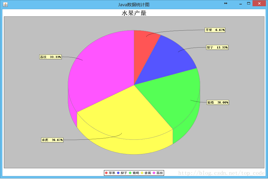
JFreeChart chart = ChartFactory.createPieChart3D("水果产量", data, true,
false, false);
// 设置百分比
PiePlot pieplot = (PiePlot) chart.getPlot();
DecimalFormat df = new DecimalFormat("0.00%");// 获得一个DecimalFormat对象,主要是设置小数问题
NumberFormat nf = NumberFormat.getNumberInstance();// 获得一个NumberFormat对象
StandardPieSectionLabelGenerator sp1 = new StandardPieSectionLabelGenerator(
"{0} {2}", nf, df);// 获得StandardPieSectionLabelGenerator对象
pieplot.setLabelGenerator(sp1);// 设置饼图显示百分比
// 没有数据的时候显示的内容
pieplot.setNoDataMessage("无数据显示");
pieplot.setCircular(false);
pieplot.setLabelGap(0.02D);
pieplot.setIgnoreNullValues(true);// 设置不显示空值
pieplot.setIgnoreZeroValues(true);// 设置不显示负值
chart.getTitle().setFont(new Font("宋体", Font.BOLD, 20));// 设置标题字体
PiePlot piePlot = (PiePlot) chart.getPlot();// 获取图表区域对象
piePlot.setLabelFont(new Font("宋体", Font.BOLD, 10));// 解决乱码
chart.getLegend().setItemFont(new Font("黑体", Font.BOLD, 10));
ChartPanel chartPanel = new ChartPanel(chart, true);
JFrame frame = new JFrame("Java数据统计图");
frame.add(chartPanel); // 添加柱形图
frame.setBounds(0, 0, 900, 600);
frame.setVisible(true);
}
private static DefaultPieDataset getDataSet() {
DefaultPieDataset dataset = new DefaultPieDataset();
dataset.setValue("苹果", 100);
dataset.setValue("梨子", 200);
dataset.setValue("葡萄", 300);
dataset.setValue("香蕉", 400);
dataset.setValue("荔枝", 500);
return dataset;
}
}
运行结果
3. 折线图
示例代码:
package com.ricky.java.chart;
import java.awt.Font;
import java.text.SimpleDateFormat;
import javax.swing.JFrame;
import org.jfree.chart.ChartFactory;
import org.jfree.chart.ChartPanel;
import org.jfree.chart.JFreeChart;
import org.jfree.chart.axis.DateAxis;
import org.jfree.chart.axis.ValueAxis;
import org.jfree.chart.plot.XYPlot;
import org.jfree.data.time.Month;
import org.jfree.data.time.TimeSeries;
import org.jfree.data.time.TimeSeriesCollection;
import org.jfree.data.xy.XYDataset;
public class TimeSeriesChartDemo {
/**
* @param args
*/
public static void main(String[] args) {
XYDataset xydataset = createDataset();
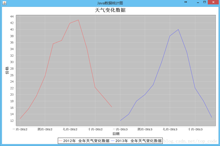
JFreeChart jfreechart = ChartFactory.createTimeSeriesChart("天气变化数据", "日期", "价格",xydataset, true, true, true);
XYPlot xyplot = (XYPlot) jfreechart.getPlot();
DateAxis dateaxis = (DateAxis) xyplot.getDomainAxis();
dateaxis.setDateFormatOverride(new SimpleDateFormat("MMM-yyyy"));
dateaxis.setLabelFont(new Font("黑体",Font.BOLD,14)); //水平底部标题
dateaxis.setTickLabelFont(new Font("宋体",Font.BOLD,12)); //垂直标题
ValueAxis rangeAxis=xyplot.getRangeAxis();//获取柱状
rangeAxis.setLabelFont(new Font("黑体",Font.BOLD,15));
jfreechart.getLegend().setItemFont(new Font("黑体", Font.BOLD, 15));
jfreechart.getTitle().setFont(new Font("宋体",Font.BOLD,20));//设置标题字体
ChartPanel chartPanel = new ChartPanel(jfreechart,true);
JFrame frame = new JFrame("Java数据统计图");
frame.add(chartPanel); //添加柱形图
frame.setBounds(50, 50, 900, 600);
frame.setVisible(true);
}
private static XYDataset createDataset() { //这个数据集有点多,但都不难理解
TimeSeries timeseries = new TimeSeries("2012年 全年天气变化数据");
timeseries.add(new Month(1, 2012), 12.6d);
timeseries.add(new Month(2, 2012), 15.6d);
timeseries.add(new Month(3, 2012), 19.6d);
timeseries.add(new Month(4, 2012), 25.6d);
timeseries.add(new Month(5, 2012), 35.6d);
timeseries.add(new Month(6, 2012), 36.6d);
timeseries.add(new Month(7, 2012), 41.9d);
timeseries.add(new Month(8, 2012), 42.9d);
timeseries.add(new Month(9, 2012), 34.2d);
timeseries.add(new Month(10, 2012), 22.2d);
timeseries.add(new Month(11, 2012), 19.2d);
timeseries.add(new Month(12, 2012), 16.2d);
TimeSeries timeseries1 = new TimeSeries("2013年 全年天气变化数据");
timeseries1.add(new Month(1, 2013), 11.99d);
timeseries1.add(new Month(2, 2013), 13.99d);
timeseries1.add(new Month(3, 2013), 17.99d);
timeseries1.add(new Month(4, 2013), 19.99d);
timeseries1.add(new Month(5, 2013), 22.99d);
timeseries1.add(new Month(6, 2013), 29.99d);
timeseries1.add(new Month(7, 2013), 37.99d);
timeseries1.add(new Month(8, 2013), 39.99d);
timeseries1.add(new Month(9, 2013), 32.99d);
timeseries1.add(new Month(10, 2013), 21.99d);
timeseries1.add(new Month(11, 2013), 17.99d);
timeseries1.add(new Month(12, 2013), 12.99d);
TimeSeriesCollection timeseriescollection = new TimeSeriesCollection();
timeseriescollection.addSeries(timeseries);
timeseriescollection.addSeries(timeseries1);
return timeseriescollection;
}
}
运行结果
源码下载地址:


 1056
1056


 被折叠的 条评论
为什么被折叠?
被折叠的 条评论
为什么被折叠?
 到【灌水乐园】发言


