


学习目标:
掌握使用 <shape> 标签和 <selector> 标签 在 Button 视图上的使用。
掌握使用代码代替xml文件的功能,实现同上效果。
掌握自定义属性的使用。
写一个自定义Button配合自定义属性,完成反色效果。
1.> <shape> 标签 与 <selector> 标签
在 drawable 文件夹下新建一个button_shape.xml文件,来对 shape 进行描述
<?xml version="1.0" encoding="utf-8"?>
<shape xmlns:android="http://schemas.android.com/apk/res/android" >
<!-- 圆角半径,越大,则角越圆,越小则角越方 -->
<corners android:radius="5dp"/>
<!-- 描边线 -->
<stroke android:width="5dp" android:color="#6699FF"/>
<!-- 填充 -->
<solid android:color="#6699FF"/>
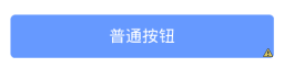
</shape>写完之后,便可以在布局文件中,使用 backgroud 来引用这个 shape了
<Button
        android:text="普通按钮"
        android:layout_width="match_parent"
        android:layout_height="wrap_content"
        android:textColor="#ffffff"
        <strong>android:background="@drawable/button_shape"</strong>/>
效果如图所示,非常简单
因为Button是可点击的,每一次对 Button进行触碰的时候,都会改变它的状态。
我们可以通过为 Button 的 backgroud 指定一个 处理方案<selector>,来告诉 Button,对于哪一样的状态,用什么用的背景图
drawable >> while_button.xml
<?xml version="1.0" encoding="utf-8" ?>
<selector xmlns:android="http://schemas.android.com/apk/res/android">
    <item android:state_pressed="true" android:drawable="@drawable/white_radius_clicking_button"/>
    <item android:state_pressed="false" android:drawable="@drawable/white_radius_button"/>
    <!-- 默认时的背景图片-->
    <item android:drawable="@drawable/white_radius_button" />
</selector>
针对于反色,我们设定在默认状体下,Button的形状为:蓝色描边线,白底填充,蓝色字体.
drawable >> white_radius_button.xml
<?xml version="1.0" encoding="utf-8"?>
<shape xmlns:android="http://schemas.android.com/apk/res/android" >
    <stroke android:width="1dp" android:color="#6699FF"/>
    <corners android:radius="5dp"/>
    <solid android:color="@android:color/white"/>
</shape>
当我们点击的时候,修改对应的状态为: 蓝色描
 最低0.47元/天 解锁文章


 3171
3171


 被折叠的 条评论
为什么被折叠?
被折叠的 条评论
为什么被折叠?
 到【灌水乐园】发言


