


自定义组合控件,顾名思义就是把现有的系统控件自行拼合,然后拿来直接用,这样的好处就是如果多次调用某几种控件的组合的话就不会写那么多重复的代码了。这里我要讲的是ImageView和TextView的组合。啥?就是这样:
这样:

这样:
还有这样,哎呦谁zhemeshuai~:
几乎所有的常用软件都会有下面那条AppBar,而里面的图文按钮就是今天要说的。
一、文件列表
我们一共需要这么几个文件:
1.用于自定义控件属性的.xml文件;
2.用于进行控件自定义组合的.xml文件;
3.用于编写后台代码的.java文件;
4.最后用来调用自定义控件并展示在前台的Activity(.xml)。
二、自定义控件属性
1.新建项目后在res-values文件夹下新建.xml文件,我起名曰attr-imagetext.xml;
2.写入<declare-styleable>标签,name是你定义的控件的名字,<attr> 标签中name为属性名称,format是属性的类型。
<?xml version="1.0" encoding="utf-8"?>
<resources>
    <declare-styleable name="ImageText">
        <attr name="text_content" format="string"/> <!--图文按钮的“文本” -->
        <attr name="text_color" format="color"/> <!--“文本”颜色 -->
        <attr name="text_size" format="dimension"/> <!--“文本”字体大小 -->
        <attr name="image_path" format="reference"/> <!--图文按钮的图片资源ID(路径) -->
        <attr name="image_path_after" format="reference"/> <!--点击后的图片资源ID -->
    </declare-styleable>
</resources>
三、控件组合
1.在res-layout文件夹下新建.xml文件,起名曰control-imagetext.xml;
2.根容器设置为RelativeLayout(当然,其他容器例如LinearLayout等也可),设置宽充满父类,高50dp(高度根据自己想法自由设定)
3.在RelativeLayout中分别添加一个ImageView和一个TextView控件,使TextView置于ImageView之下。再设置两个控件的android:layout_centerInParent="true",使之横向居中,并设置背景透明。
4.最基本的设置完成了,对布局有详细要求的可以再进行其他属性的调整。
<?xml version="1.0" encoding="utf-8"?>
<RelativeLayout xmlns:android="http://schemas.android.com/apk/res/android"
    android:layout_width="fill_parent"
    android:layout_height="50dp"
    android:background="#00000000">

    <ImageView
        android:id="@+id/mImageView"
        android:layout_width="30dp"
        android:layout_height="30dp"
        android:layout_alignParentTop="true"
        android:src="@drawable/etaccount"
        android:layout_centerInParent="true"
        android:layout_marginTop="2dp"/>

    <TextView
        android:id="@+id/mTextView"
        android:layout_width="wrap_content"
        android:layout_height="wrap_content"
        android:layout_alignBottom="@+id/mImageView"
        android:layout_alignParentBottom="true"
        android:text="示例文字"
        android:textColor="#000000"
        android:textSize="12sp"
        android:layout_centerInParent="true"
        android:layout_marginBottom="2dp"/>

</RelativeLayout>
四、自定义控件后台代码初始化
1.在src文件夹中建一个包专门用来存放自定义控件,在包中建.java文件,起名曰ImageText.java;
2.先使ImageText类继承自RelativeLayout,而后定义几个私有属性:
	private ImageView mImageView; //ImageView控件

	private TextView mTextView; //TextView控件

	private Drawable mImagePath; //图片文件路径

	private String mTextContent; //文本内容

	private int mTextColor; //文本颜色

	private float mTextSize; //文本字体大小
<span style="white-space:pre">	</span>//java代码创建视图的时候被调用,如果是从xml填充的试图,就不会被调用@from baidu.com
	public ImageText(Context context){
		 this(context,null);
	}
	//在xml创建但是没有指定style的时候被调用@from baidu.com

	public ImageText(Context context,AttributeSet control_imagetext){
		this(context,control_imagetext,0);
	}

	public ImageText(Context context,AttributeSet control_imagetext,int defStyle){
		super(context,control_imagetext,defStyle);

		TypedArray a = context.obtainStyledAttributes(control_imagetext,R.styleable.ImageText,defStyle,0);

		Drawable d = a.getDrawable(R.styleable.ImageText_image_path);
		if(d!=null){
			mImagePath = d;
		}
		mTextContent = a.getString(R.styleable.ImageText_text_content);
		mTextColor = a.getColor(R.styleable.ImageText_text_color, Color.BLACK);
		mTextSize = a.getFloat(R.styleable.ImageText_text_size,12);
		a.recycle();

		LayoutInflater.from(context).inflate(R.layout.control_imagetext, this);
		mImageView = (ImageView)findViewById(R.id.mImageView);
		mTextView = (TextView)findViewById(R.id.mTextView);

		//设置自定义控件的自定义属性
		if(!TextUtils.isEmpty(mTextContent)){
			mTextView.setText(mTextContent);
		}
		mTextView.setTextColor(mTextColor);
		mTextView.setTextSize(mTextSize);

		mImageView.setImageDrawable(mImagePath);


}1).三个构造函数格式是固定的,为啥这样请参阅开发文档或自行某度,抱歉我也不太明白;
2).先定义一个TypedArray类型的a并初始化,格式同样固定,以后方便调用各种属性;
3).LayoutInflater的inflate相当于findViewById,只不过寻找的是layout的资源;
4).对属性进行a.get方法赋值是对属性进行初始化,也就是说在使用控件的时候如果不对某个属性值进行修改则使用 该默认属性值;
5).“属性.setXXX”是用户使用时对控件的属性值进行改变,跟上一条相对。
五、使用控件
进行到这一步实际上对控件的基础外观设计已经基本结束,除此之外还要添加控件的事件方法,这一段先不讲,因为我还没学会。。。。那就先看看调用吧。
调用其实跟普通控件没什么区别,主要还是标签头的不同,其余一样:
<RelativeLayout xmlns:android="http://schemas.android.com/apk/res/android"
xmlns:tools="http://schemas.android.com/tools"
android:layout_width="fill_parent"
android:layout_height="fill_parent"
tools:context=".MainActivity"
android:background="#ffffff" xmlns:app="http://schemas.android.com/apk/res/com.example.classprogram">
<include layout="@layout/activity_topbar"/>
<RelativeLayout
android:layout_width="fill_parent"
android:layout_height="50dp"
android:layout_alignParentBottom="true"
android:background="#00ff0000">
<LinearLayout
android:layout_width="fill_parent"
android:layout_height="50dp"
android:layout_alignParentLeft="true"
android:background="#f0f0f0">
<com.example.mycontrol.ImageText
android:layout_width="0dp"
android:layout_height="50dp"
app:text_content="首页"
app:text_color="#000000"
android:layout_weight="1"
app:image_path="@drawable/etname"
/>
<com.example.mycontrol.ImageText
android:layout_width="0dp"
android:layout_height="50dp"
app:text_content="寻找"
app:text_color="#000000"
android:layout_weight="1"
app:image_path="@drawable/etfoot"
/>
<Button
android:id="@+id/button1"
android:layout_width="0dp"
android:layout_height="fill_parent"
android:layout_weight="1"
android:text="发表" />
<com.example.mycontrol.ImageText
android:layout_width="0dp"
android:layout_height="50dp"
app:text_content="社区"
app:text_color="#000000"
android:layout_weight="1"
app:image_path="@drawable/etcity"
/>
<com.example.mycontrol.ImageText
android:layout_width="0dp"
android:layout_height="50dp"
app:text_content="我的"
app:text_color="#000000"
android:layout_weight="1"
app:image_path="@drawable/etaccount"
/>
</LinearLayout>
</RelativeLayout>
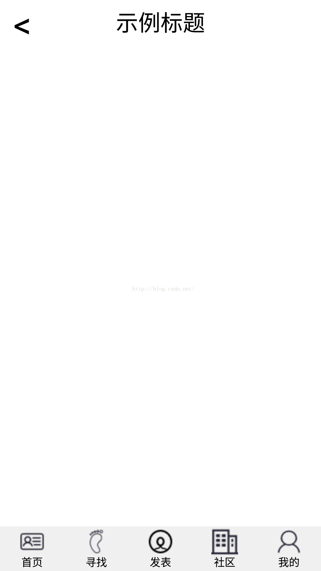
</RelativeLayout>最终效果图(忽略上面的标题栏):


 4241
4241


 被折叠的 条评论
为什么被折叠?
被折叠的 条评论
为什么被折叠?
 到【灌水乐园】发言


