


导航条的使用很广,每个网站都会做出具有自己特色的导航条。最近特地去了解了各种类型的导航条,比如具有高亮显示的导航条,中英文互相切换的导航条,具有弹性动画的导航条,甚至是具有摩擦运动动画的导航条(文字下面有横线)等。每种导航条都有自己的特色,比如高亮显示的导航条看起来比较简单,但是视觉效果还不错,具有动画效果的导航条在视觉上也是有很好的效果。
接下来将会一一介绍4种应用比较广的导航条,即:高亮显示的导航条,中英文互相切换的导航条,具有弹性动画的导航条,具有摩擦运动动画的导航条。
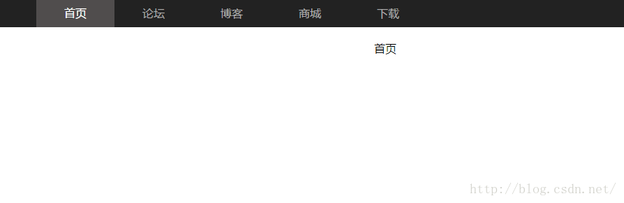
1、高亮显示的导航条
这种导航条:当你点击某一个导航时,就让他高亮显示,其他的默认原来的样式,也就是说在不改变菜单CSS代码的情况下,用Js控制菜单的背景,假如该菜单项被点击后,将赋予它一个与众不同的背景颜色或背景图像,这样可以清淅的指引用户下在浏览的网站栏目,简单方便而且效果好。
效果图如下:
html:(这里省略了其他html文件的代码,只贴出一个index.html的代码)
<!DOCTYPE html>
<html lang="en">
<head>
    <meta charset="UTF-8">
    <title>首页</title>
    <link href="../css/demo1.css" rel="stylesheet" type="text/css">
    <script src="../js/jquery-3.1.0.min.js" language="javascript" charset="utf-8"></script>
    <script src="../js/demo1.js" language="javascript" charset="utf-8"></script>
</head>
<body>
    <div class="nav">
        <ul class="nav-list">
            <li><a href="index.html">首页</a></li>
            <li><a href="bbs.html">论坛</a></li>
            <li><a href="blog.html">博客</a></li>
            <li><a href="mall.html">商城</a></li>
            <li><a href="download.html">下载</a></li>
        </ul>
    </div>
    <div class="content">首页</div>
</body>
</html>*{
margin:0px;
padding:0px;
font-family: "Microsoft Yahei", Helvetica, sans-serif, Lato;
}
.nav{
background-color: #222;
height: 40px;
width:100%;
margin-top:50px;
}
.nav-list{
width: 1000px;
margin: 0 auto;
}
.nav-list li{
list-style: none;
float: left;
}
.nav-list li a{
color: #aaa;
padding:0 40px;
text-decoration: none;
line-height: 40px;
display: block;
border: none;
}
.content{
margin:20px auto;
text-align: center;
}
.nav-list li a:hover{
color: #fff;
background: #504d4d;
}
<span style="color:#ff0000;">.nav-list li a.on{
color: #fff;
background: #504d4d;
}</span>
$(function(){
    var index = (window.location.href.split("/").length)-1;
    var href = window.location.href.split("/")[index].substr(0,4);
    if (href!=null){
        $(".nav-list li a[href^='"+href+"']").addClass("on");
    }else{
        $(".nav-list li a[href='index.html']").addClass("on");
    }
});2、中英文切换的导航条
先来看一下效果图:
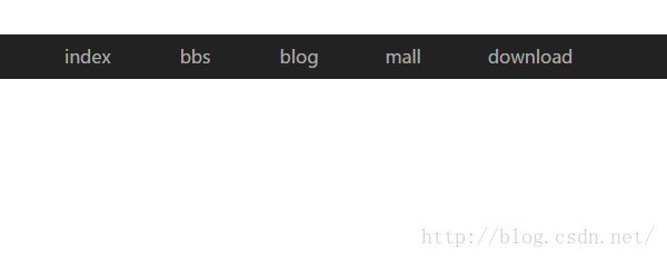
我采用了两种方式实现,一种用css3,另一种是用jquery实现。
首先说一下用css3如何实现:
html:
<!DOCTYPE html>
<html lang="en">
<head>
    <meta charset="UTF-8">
    <title>首页</title>
    <link rel="stylesheet" href="../css/demo2.css">
</head>
<body>
    <div class="nav">
        <ul class="nav-list">
            <li>
                <a href="index.html">
                    <b>index</b>
                    <i>首页</i>
                </a>
            </li>
            <li>
                <a href="index.html">
                    <b>bbs</b>
                    <i>论坛</i>
                </a>
            </li>
            <li>
                <a href="index.html">
                    <b>blog</b>
                    <i>博客</i>
                </a>
            </li>
            <li>
                <a href="index.html">
                    <b>mall</b>
                    <i>商城</i>
                </a>
            </li>
            <li>
                <a href="index.html">
                    <b>download</b>
                    <i>下载</i>
                </a>
            </li>
        </ul>
    </div>
</body>
</html>
*{
    margin:0px;
    padding:0px;
    font-family: "Microsoft Yahei", Helvetica, sans-serif, Lato;
}
li{
    list-style: none;
}
a{
    text-decoration: none;
}
.nav{
    width:100%;
    height: 40px;
    background-color: #222;
    margin-top:100px;
    overflow: hidden;
}
.nav-list{
    width:1000px;
    margin:0 auto;
    height: 40px;
}
.nav-list li {
    float: left;
}
.nav-list li a{
    display: block;
    transition: 0.2s;
}
.nav-list li b,.nav-list li i{
    color:#aaa;
    line-height: 40px;
    display: block;
    padding:0 30px;
    text-align: center;
}
.nav-list li b{
    font-weight:normal;
}
.nav-list li i{
    font-style: normal;
    color:#fff;
    background-color: #333;
}
.nav-list li a:hover{
    margin-top:-40px;
}接着是用jquery实现:
css:
*{
    margin:0px;
    padding:0px;
    font-family: "Microsoft Yahei", Helvetica, sans-serif, Lato;
}
li{
    list-style: none;
}
a{
    text-decoration: none;
}
.nav{
    width:100%;
    height: 40px;
    background-color: #222;
    margin-top:100px;
    overflow: hidden;
}
.nav-list{
    width:1000px;
    margin:0 auto;
    height: 40px;
}
.nav-list li {
    float: left;
}
.nav-list li a{
    display: block;
}
.nav-list li b,.nav-list li i{
    color:#aaa;
    line-height: 40px;
    display: block;
    padding:0 30px;
    text-align: center;
}
.nav-list li b{
    font-weight:normal;
}
.nav-list li i{
    font-style: normal;
    color:#fff;
    background-color: #333;
}
$(function(){
    $(".nav-list li a").hover(function(){
        $(this).stop().animate({"margin-top":-40},200)
    },function(){
        $(this).stop().animate({"margin-top":0},200)
    });
});
3、带有弹性动画的导航条
我采用了三种方式实现,第一种是css3,第二种是jquery,第三种是jquery easing实现。效果图如下:
因为三种的布局是一样的,所以就直接附上html的结构代码。
html:
    <div class="nav">
        <ul class="nav-list">
            <li>
                <a href="#">首页</a>
            </li>
            <li>
                <a href="#">论坛</a>
                <div class="nav-down">
                    <a href="#">java论坛</a>
                    <a href="#">js论坛</a>
                    <a href="#">jquery论坛</a>
                    <a href="#">css3论坛</a>
                </div>
            </li>
            <li>
                <a href="#">博客</a>
                <div class="nav-down">
                    <a href="#">精彩博文</a>
                    <a href="#">博客专栏</a>
                    <a href="#">博客专家</a>
                    <a href="#">我的博客</a>
                </div>
            </li>
            <li>
                <a href="#">商城</a>
                <div class="nav-down">
                    <a href="#">软件商城</a>
                    <a href="#">C币商城</a>
                    <a href="#">C币充值</a>
                </div>
            </li>
            <li>
                <a href="#">下载</a>
                <div class="nav-down">
                    <a href="#">资源分类</a>
                    <a href="#">我的资源</a>
                </div>
            </li>
        </ul>
</div>*{
margin:0px;
padding:0px;
font-family: "Microsoft Yahei", Helvetica, sans-serif, Lato;
}
li{
list-style: none;
}
a{
text-decoration: none;
}
.nav{
width:100%;
height: 40px;
margin-top:50px;
background-color: #222;
}
.nav .nav-list{
width: 1000px;
height: 40px;
margin:0 auto;
}
.nav .nav-list li{
float: left;
position: relative;
}
.nav .nav-list li > a{
display: block;
height: 40px;
line-height: 40px;
padding:0 30px;
color:#aaa;
width:60px;
}
.nav .nav-list li:hover>a{
color:#fff;
background-color: #333;
}
<span style="color:#ff0000;">.nav .nav-list li:hover .nav-down{
display: block;
}</span>
.nav-down{
width:150px;
background-color: #333;
position: absolute;
top:40px;
left:0px;
display: none;
}
.nav .nav-list .nav-down a{
display: block;
line-height: 30px;
color:#aaa;
padding-left:30px;
}
<span style="color:#ff0000;">.nav .nav-list .nav-down a:hover{
color:#fff;
background-color: #333;
}</span>
第二种:用jquery实现。
css:
*{
    margin:0px;
    padding:0px;
    font-family: "Microsoft Yahei", Helvetica, sans-serif, Lato;
}
li{
    list-style: none;
}
a{
    text-decoration: none;
}
.nav{
    width:100%;
    height: 40px;
    margin-top:50px;
    background-color: #222;
}
.nav .nav-list{
    width: 1000px;
    height: 40px;
    margin:0 auto;
}
.nav .nav-list li{
    float: left;
    position: relative;
}
.nav .nav-list li > a{
    display: block;
    height: 40px;
    line-height: 40px;
    padding:0 30px;
    color:#aaa;
    width:60px;
}
.nav .nav-list li:hover>a{
    color:#fff;
    background-color: #333;
}
.nav-down{
    width:150px;
    background-color: #333;
    position: absolute;
    top:40px;
    left:0px;
    display: none;
}
.nav .nav-list .nav-down a{
    display: block;
    line-height: 30px;
    color:#aaa;
    padding-left:30px;
}
.nav .nav-list .nav-down a:hover{
    color:#fff;
    background-color: #333;
}$(function(){
$(".nav .nav-list li").hover(function(){
$(this).find(".nav-down").stop().slideDown()
},function(){
$(this).find(".nav-down").stop().slideUp()
});
});
第三种:用jquery.easing实现。
css的样式跟用jquery实现的样式一样,这里就不增加空间再复制一遍了。
jquery:
<pre name="code" class="javascript">$(function(){
    $(".nav .nav-list li").hover(function(){
        $(this).find(".nav-down").stop().slideDown({duration:500,easing:"easeOutBounce"})
    },function(){
        $(this).find(".nav-down").stop().slideUp({duration:500,easing:"easeOutBounce"})
    });
});
4、摩擦运动动画跟随的导航条
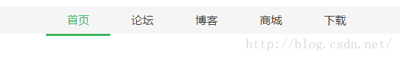
实现思路就是:将鼠标移动的时候,把横条的位置移动到当前文字的下方。所以需要获取当前鼠标移动到的位置,即top和left,然后将横条的top和left相应地改变就可以实现,具体实现如下。
html:(这里只贴上一个页面的代码)
<!DOCTYPE html>
<html lang="en">
<head>
    <meta charset="UTF-8">
    <title>摩擦运动动画跟随的导航条</title>
    <link href="../css/demo7.css" rel="stylesheet">
    <script src="../js/jquery-3.1.0.min.js" language="javascript" charset="utf-8"></script>
    <script src="../js/jquery.easing.1.3.min.js" language="javascript" charset="utf-8"></script>
    <script src="../js/demo7.js" language="javascript" charset="utf-8"></script>
</head>
<body>
   <div class="nav">
       <div class="nav-content">
           <ul class="nav-list">
               <li><a href="index.html">首页</a></li>
               <li><a href="bbs.html">论坛</a></li>
               <li><a href="blog.html">博客</a></li>
               <li><a href="mall.html">商城</a></li>
               <li><a href="download.html">下载</a></li>
            </ul>

           <div class="nav-line"></div>
       </div>
   </div>
</body>
</html>*{
margin:0px;
padding: 0px;
font-family: "Microsoft Yahei", Helvetica, sans-serif, Lato;
}
li{
list-style: none;
}
a{
text-decoration: none;
}
.nav{
width:100%;
height:40px;
margin-top:50px;
background-color: #f6f6f6;
}
.nav .nav-content{
width:1000px;
margin:0 auto;
height: 40px;
position: relative;
}
.nav .nav-list li{
float: left;
}
.nav .nav-list li a{
color:#333;
height: 40px;
line-height: 40px;
display: block;
padding:0 30px;
}
.nav .nav-line{
height:3px;
background: #35b558;
width:100px;
position: absolute;
top:40px;
left:0px;
}
.nav .nav-list li a:hover{
color:#35b558;
}
.nav .nav-list li a.on{
color:#35b558;
}$(function () {
var index = window.location.href.split("/").length-1;
var href = window.location.href.split("/")[index];
$(".nav .nav-list li a[href='"+href+"']").addClass("on");
var li_width = $(".nav .nav-list li a.on").outerWidth();
var li_left = $(".nav .nav-list li a.on").position().left;
$(".nav-content .nav-line").css({width:li_width,left:li_left});
$(".nav .nav-list li").hover(function(){
var li_width = $(this).outerWidth();
var li_left = $(this).position().left;
$(".nav-content .nav-line").stop().animate({"width":li_width,"left":li_left},{duration:1500,easing:"easeOutElastic"});
},function(){
$(".nav-content .nav-line").stop().animate({"width":li_width,"left":li_left},{duration:1500,easing:"easeOutElastic"});
});
});
1)outerwidth()获取元素的宽度(因为文字的个数不同,宽度就不一样,为了好看,横条需要适应文字的宽度);
2)position().left获取元素的位置中left的值;
2)position().left获取元素的位置中left的值;
3)animate()实现动画效果;
4)duration和easing都是jquery easing插件的内容,即设置动画的效果。
在这里,所有的分享就结束了。


 2901
2901


 被折叠的 条评论
为什么被折叠?
被折叠的 条评论
为什么被折叠?
 到【灌水乐园】发言


