


更新:可直接访问 [CSS/CSS3 如何实现元素水平居中] 查看效果,右键查看源代码
-------------------------------------------------分割线---------------------------------------------
先上效果图
图中链接:Horizontally Centered Menus with no CSS hacks
实现代码:
<span style="font-family:Microsoft YaHei;font-size:14px;"><span style="font-family:Microsoft YaHei;font-size:14px;"><!DOCTYPE html>
<html>
<head>
<meta charset="utf-8"/>
<title>Horizontal</title>
</head>
<body>
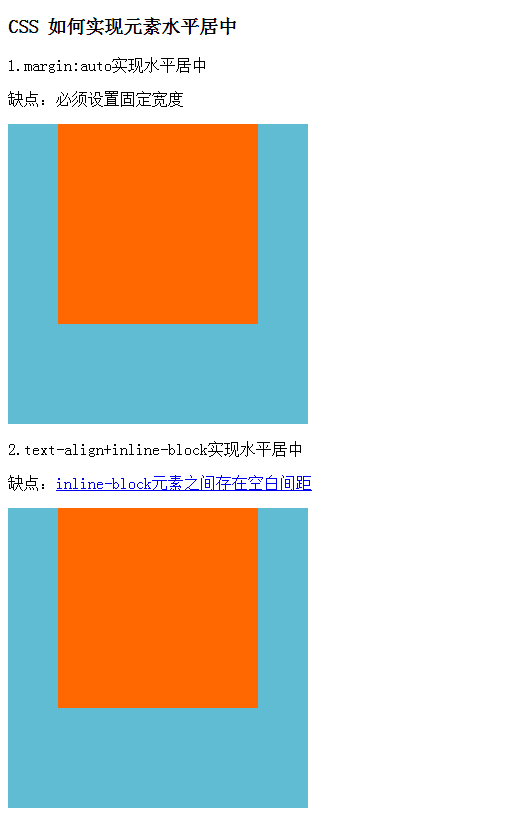
<h3>CSS 如何实现元素水平居中</h3>
<!-- margin:auto实现水平居中 -->
<p>1.margin:auto实现水平居中</p>
<p>缺点:必须设置固定宽度</p>
<style type="text/css">
.margin-auto-parent{width: 300px; height: 300px; background: #60bcd3; }
.margin-auto-content{width: 200px; height: 200px; margin:0 auto; background: #ff6700;}
</style>
<div class="margin-auto-parent">
<div class="margin-auto-content"></div>
</div>
<!-- text-align+inline-block实现水平居中 -->
<p>2.text-align+inline-block实现水平居中</p>
<p>缺点:<a href="http://www.w3cplus.com/css/fighting-the-space-between-inline-block-elements" target="_blank">inline-block元素之间存在空白间距</a></p>
<style type="text/css">
.inline-block-parent{width: 300px; height: 300px; background: #60bcd3; text-align: center;}
.inline-block-content{width: 200px; height: 200px; display: inline-block; background: #ff6700;}
.inline-block-content span{display: inline-block;text-align: left;}
</style>
<div class="inline-block-parent">
<div class="inline-block-content">
<!-- <span>换行后右边会产生空白间距</span> -->
</div>
</div>
<!-- 通过设置float + text-align + display:inline;实现水平居中 -->
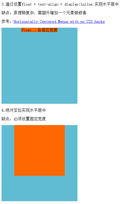
<p>3.通过设置float + text-align + display:inline;实现水平居中</p>
<p>缺点:原理稍复杂,需额外增加一个元素做嵌套</p>
<p>参考:<a href="http://matthewjamestaylor.com/blog/beautiful-css-centered-menus-no-hacks-full-cross-browser-support" target="_blank">Horizontally Centered Menus with no CSS hacks</a></p>
<style type="text/css">
.float-center-parent{width: 300px; height: 300px; background: #60bcd3; position: relative;}
.float-center-content-wrap{position: relative;left: 50%; text-align: center;}
.float-center-content{display: inline; position: relative; right: 50%; background: #ff6700;}
</style>
<div class="float-center-parent">
<div class="float-center-content-wrap">
<div class="float-center-content">float...自适应宽度</div>
</div>
</div>
<!-- 绝对定位实现水平居中 -->
<p>4.绝对定位实现水平居中</p>
<p>缺点:必须设置固定宽度</p>
<style type="text/css">
.position-absolute-parent{width: 300px; height: 300px; background: #60bcd3; position: relative;}
.position-absolute-content{width: 200px; height: 200px; position: absolute; left: 50%; margin-left: -100px; background: #ff6700;}
</style>
<div class="position-absolute-parent">
<div class="position-absolute-content"></div>
</div>
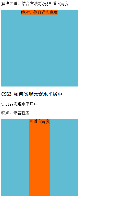
<p>解决之道:结合方法3实现自适应宽度</p>
<style type="text/css">
.position-float-parent{width: 300px; height: 300px; background: #60bcd3; position: relative;}
.position-float-content-wrap{position: absolute; left: 50%;}
.position-float-content{position: relative; right: 50%; float: left; display: inline; background: #ff6700;}
</style>
<div class="position-float-parent">
<div class="position-float-content-wrap">
<div class="position-float-content">绝对定位自适应宽度</div>
</div>
</div>
<h3>CSS3 如何实现元素水平居中</h3>
<!-- flex实现水平居中 -->
<p>5.flex实现水平居中</p>
<p>缺点:兼容性差</p>
<style type="text/css">
.flex-parent{width: 300px; height: 300px; background: #60bcd3; display: flex; justify-content:center;}
.flex-content{ background: #ff6700;}
</style>
<div class="flex-parent">
<div class="flex-content">自适应宽度</div>
</div>
<!-- width:fit-content; + margin:0 auto;实现水平居中 -->
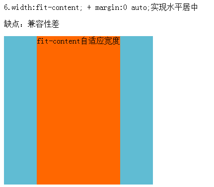
<p>6.width:fit-content; + margin:0 auto;实现水平居中</p>
<p>缺点:兼容性差</p>
<style type="text/css">
.flex-parent{width: 300px; height: 300px; background: #60bcd3; }
.flex-content{ background: #ff6700; width: fit-content; margin: 0 auto;}
</style>
<div class="flex-parent">
<div class="flex-content">fit-content自适应宽度</div>
</div>
</body>
</html></span></span>---------------------------------------------------------参考资料------------------------------------------------------------------


 901
901


 被折叠的 条评论
为什么被折叠?
被折叠的 条评论
为什么被折叠?
 到【灌水乐园】发言


