


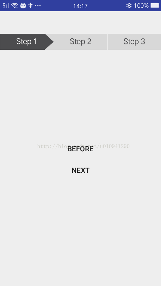
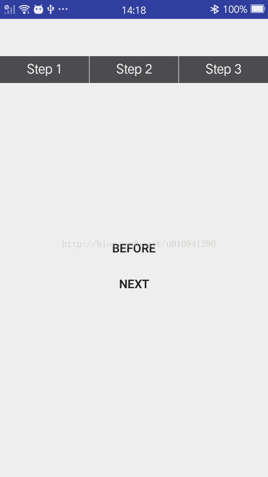
出于项目需求与对自己的锻炼,自定义了步骤进度指示器,与大家分享,效果如图。

使用方式就跟原生控件一样,可以xml直接引用,也可以在代码中直接动态添加。
如果需要加入自己项目中,
只需要三步:
1.新建StepWidget控件类
public class StepWidget extends View {

    int totalCount; //总步骤数量
    int arrowWidth; //箭头的宽度
    int defaultBackColor; //默认的背景颜色值
    int selectedBackColor; //进度达到时的背景颜色值
    int defaultTextColor; //进度达到时的背景颜色值
    int selectedTextColor; //进度到达时的字体颜色值
    int gapColor; //步骤间的空隙颜色
    float textSize; //字体大小
    float gapWidth; //步骤空隙大小
    boolean hasGap = true; //是否有空隙

    Paint paint;
    Paint.FontMetrics fm;
    Rect rect;
    Path path;
    int currentIndex = 1;
    int width; //空间测量宽度
    int height; //空间测量高度

    public StepWidget(Context context) {
        this(context, null);
    }

    public StepWidget(Context context, @Nullable AttributeSet attrs) {
        this(context, attrs, 0);
    }

    public StepWidget(Context context, @Nullable AttributeSet attrs, int defStyleAttr) {
        super(context, attrs, defStyleAttr);
        TypedArray ta = context.obtainStyledAttributes(attrs, R.styleable.StepWidget, defStyleAttr, 0);
        totalCount = ta.getInteger(R.styleable.StepWidget_totalCount, 3);
        arrowWidth = ta.getDimensionPixelOffset(R.styleable.StepWidget_arrowWidth, (int) TypedValue.applyDimension(TypedValue.COMPLEX_UNIT_DIP, 20, context.getResources().getDisplayMetrics()));
        defaultBackColor = context.getResources().getColor(ta.getResourceId(R.styleable.StepWidget_defaultBackColor, R.color.color_d8d8d8));
        selectedBackColor = context.getResources().getColor(ta.getResourceId(R.styleable.StepWidget_selectedBackColor, R.color.color_4c4c4e));
        defaultTextColor = context.getResources().getColor(ta.getResourceId(R.styleable.StepWidget_defaultTextColor, R.color.color_4c4c4e));
        selectedTextColor = context.getResources().getColor(ta.getResourceId(R.styleable.StepWidget_selectedTextColor, R.color.white));
        textSize = ta.getDimensionPixelSize(R.styleable.StepWidget_android_textSize, (int) TypedValue.applyDimension(TypedValue.COMPLEX_UNIT_SP, 16, context.getResources().getDisplayMetrics()));
        gapWidth = ta.getDimensionPixelSize(R.styleable.StepWidget_gapWidth, (int) TypedValue.applyDimension(TypedValue.COMPLEX_UNIT_PX, 1, context.getResources().getDisplayMetrics()));
        gapColor = context.getResources().getColor(ta.getResourceId(R.styleable.StepWidget_gapColor, R.color.white));
        hasGap = ta.getBoolean(R.styleable.StepWidget_hasGap, true);
        ta.recycle();

        paint = new Paint();
        paint.setStyle(Paint.Style.FILL);
        paint.setColor(selectedBackColor);
        String text = "Step 2";
        rect = new Rect();
        paint.setTextSize(textSize);
        paint.setAntiAlias(true);
        paint.getTextBounds(text, 0, text.length(), rect);
        path = new Path();
        fm = paint.getFontMetrics();
        if (hasGap)
            paint.setStrokeWidth(gapWidth);
    }

    @Override
    protected void onMeasure(int widthMeasureSpec, int heightMeasureSpec) {
        super.onMeasure(widthMeasureSpec, heightMeasureSpec);
        width = getMeasuredWidth();
        height = getMeasuredHeight();
    }

    @Override
    protected void onDraw(Canvas canvas) {
        int avgWidth = width / totalCount; //根据总步骤数获取平均宽度(ps:别太大,不好看的)
        int selectedWidth = avgWidth * currentIndex; //根据当前步骤currentIndex确定箭头的宽度
        if (currentIndex == totalCount) {
            canvas.drawColor(selectedBackColor);
        } else {
            canvas.drawColor(defaultBackColor);
            path.reset();   //Clear the previous setting, make path empty
            path.moveTo(0, 0);
            path.lineTo(selectedWidth - arrowWidth, 0);
            path.lineTo(selectedWidth, height / 2);
            path.lineTo(selectedWidth - arrowWidth, height);
            path.lineTo(0, height);
            paint.setColor(selectedBackColor);
            canvas.drawPath(path, paint);
        }
        for (int i = 1; i <= totalCount; i++) {
            if (i <= currentIndex) {
                paint.setColor(selectedTextColor);
                canvas.drawText("Step " + i, (avgWidth - rect.width()) / 2 + avgWidth * (i - 1), height - (height - rect.height()) / 2 - fm.descent, paint);
            } else {
                paint.setColor(defaultTextColor);
                canvas.drawText("Step " + i, (avgWidth - rect.width()) / 2 + avgWidth * (i - 1), height - (height - rect.height()) / 2 - fm.descent, paint);
            }
            if (hasGap) {
                if (i < currentIndex || (i > currentIndex && i != totalCount)) {
                    paint.setColor(gapColor);
                    canvas.drawLine(avgWidth * i, 0, avgWidth * i, height, paint);
                }
            }
        }
    }

    public void previous() {
        if (currentIndex > 1) {
            currentIndex--;
            invalidate();
            if (onStepChangedListener != null) onStepChangedListener.onStepChanged(currentIndex);
        }
    }

    public void next() {
        if (currentIndex < totalCount) {
            currentIndex++;
            invalidate();
            if (onStepChangedListener != null) onStepChangedListener.onStepChanged(currentIndex);
        }
    }

    public int getCurrentIndex() {
        return currentIndex;
    }

    private OnStepChangedListener onStepChangedListener; //步骤变化监听回调,根据需要添加,如果不为null,会在改变之后自动调用

    public interface OnStepChangedListener {
        void onStepChanged(int currentStep);
    }

    public void setOnStepChangedListener(OnStepChangedListener onStepChangedListener) {
        this.onStepChangedListener = onStepChangedListener;
    }

}
2.在style文件中声明控件所需属性
<declare-styleable name="StepWidget">
        <attr name="totalCount" format="integer"/>
        <attr name="arrowWidth" format="dimension"/>
        <attr name="gapWidth" format="dimension"/>
        <attr name="gapColor" format="reference"/>
        <attr name="hasGap" format="boolean"/>
        <attr name="defaultBackColor" format="reference"/>
        <attr name="selectedBackColor" format="reference"/>
        <attr name="defaultTextColor" format="reference"/>
        <attr name="selectedTextColor" format="reference"/>
        <attr name="android:textSize"/>
    </declare-styleable>
3.在布局文件中引用,比如
<com.lly.material.materialtest.widget.StepWidget
        android:layout_width="match_parent"
        android:layout_height="36dp"/>
说完了使用方法,下面说说控件的实现吧~
首先是获取声明的控件属性,比如
totalCount,
arrowWidth等属性,如果未在布局文件中添加属性,将使用默认值,上面的图片示例就是默认效果。关于控件属性的获取我就不班门弄斧了,相信大家都有所了解的。
onMeasure中获取到控件测量过后的宽高,onDraw中进行绘制:
1.首先判断是否当前步骤已经达到totalCount,进行对应的状况下的背景与箭头的绘制,很明显,当达到totalCount的时候,不用绘制箭头的
        if (currentIndex == totalCount) {
            canvas.drawColor(selectedBackColor);
        } else {
            canvas.drawColor(defaultBackColor);
            path.reset();   //Clear the previous setting, make path empty
            path.moveTo(0, 0);
            path.lineTo(selectedWidth - arrowWidth, 0);
            path.lineTo(selectedWidth, height / 2);
            path.lineTo(selectedWidth - arrowWidth, height);
            path.lineTo(0, height);
            paint.setColor(selectedBackColor);
            canvas.drawPath(path, paint);
        }
2.根据当前步骤去绘制对应的文字及其颜色,之后判断如果hasGap,那么就绘制每个均分区域的空隙
for (int i = 1; i <= totalCount; i++) {
            if (i <= currentIndex) {
                paint.setColor(selectedTextColor);
                canvas.drawText("Step " + i, (avgWidth - rect.width()) / 2 + avgWidth * (i - 1), height - (height - rect.height()) / 2 - fm.descent, paint);
            } else {
                paint.setColor(defaultTextColor);
                canvas.drawText("Step " + i, (avgWidth - rect.width()) / 2 + avgWidth * (i - 1), height - (height - rect.height()) / 2 - fm.descent, paint);
            }
            if (hasGap) {
                if (i < currentIndex || (i > currentIndex && i != totalCount)) {
                    paint.setColor(gapColor);
                    canvas.drawLine(avgWidth * i, 0, avgWidth * i, height, paint);
                }
            }
        }
3.添加 previous 和 next 方法,提供向上一步骤和下一步骤的判断与切换
慢慢分析开来还是很简单的,希望能帮到正有这方面需求的看官,谢谢!


 2274
2274


 被折叠的 条评论
为什么被折叠?
被折叠的 条评论
为什么被折叠?
 到【灌水乐园】发言


