


1.XML文件中的OnClick 属性可以指定在Activity中处理点击事件的方法,Activity中必须定义该属性指定的值作为方法的名字且有一个View类型的参数,表示此物件被点击。
2.使用selector配置可以实现不同模式下按钮的样式。
selector文件属性说明:
android:drawable 默认状态
android:state_pressed 是否按下,如一个按钮触摸或者点击。
android:state_focused 是否取得焦点,比如用户选择了一个文本框。
android:state_hovered 光标是否悬停,通常与focused state相同,它是4.0的新特性
android:state_selected 被选中,它与focus state并不完全一样,如一个list view 被选中的时候,它里面的各个子组件可能通过方向键,被选中了。
android:state_checkable 组件是否能被check。如:RadioButton是可以被check的。
android:state_checked 被checked了,如:一个RadioButton可以被check了。
android:state_enabled 能够接受触摸或者点击事件
android:state_activated 被激活(这个麻烦举个例子,不是特明白)
android:state_window_focused 应用程序是否在前台,当有通知栏被拉下来或者一个对话框弹出的时候应用程序就不在前台了
注意:如果有多个item,那么程序将自动从上到下进行匹配,最先匹配的将得到应用。(不是通过最佳匹配)
如果一个item没有任何的状态说明,那么它将可以被任何一个状态匹配。
3.使用shape配置可以定制各种不同的按钮样式。
shape属性说明:
solid:实心,就是填充的意思
android:color指定填充的颜色
gradient:渐变
android:startColor和android:endColor分别为起始和结束颜色,ndroid:angle是渐变角度,必须为45的整数倍。
另外渐变默认的模式为android:type="linear",即线性渐变,可以指定渐变为径向渐变,android:type="radial",径向渐变需要指定半径android:gradientRadius="50"。
stroke:描边
android:width="2dp" 描边的宽度,android:color 描边的颜色。
我们还可以把描边弄成虚线的形式,设置方式为:
android:dashWidth="5dp"
android:dashGap="3dp"
其中android:dashWidth表示'-'这样一个横线的宽度,android:dashGap表示之间隔开的距离。
corners:圆角
android:radius为角的弧度,值越大角越圆。
我们还可以把四个角设定成不同的角度,方法为:
<corners
android:topRightRadius="20dp" 右上角
android:bottomLeftRadius="20dp" 右下角
android:topLeftRadius="1dp" 左上角
android:bottomRightRadius="0dp" 左下角
/>
这里有个地方需要注意,bottomLeftRadius是右下角,而不是左下角
padding:间隔
这个就不用多说了,XML布局文件中经常用到。
<?xml version="1.0" encoding="utf-8"?>
<LinearLayout xmlns:android="http://schemas.android.com/apk/res/android"
    xmlns:tools="http://schemas.android.com/tools"
    android:layout_width="fill_parent"
    android:layout_height="fill_parent"
    android:orientation="vertical" >

    <EditText android:layout_width="match_parent"
              android:layout_height="wrap_content"
              android:inputType="text"/>
    <Button
        android:layout_width="wrap_content"
        android:layout_height="wrap_content"
        android:background="@drawable/button_selector"
        android:onClick="onBtnClick"
        android:text="This is a Button."
        tools:ignore="HardcodedText" />

</LinearLayout>
package com.light.study.android;
import android.app.Activity;
import android.os.Bundle;
import android.view.View;
import android.widget.Toast;
public class MainActivity extends Activity {
@Override
public void onCreate(Bundle savedInstanceState)
{
super.onCreate(savedInstanceState);
setContentView(R.layout.activity_main);
}
public void onBtnClick(View view){
Toast.makeText(this, "you are so clever!", Toast.LENGTH_LONG).show();
}
}
selector文件:
<?xml version="1.0" encoding="utf-8"?>
<selector xmlns:android="http://schemas.android.com/apk/res/android" >
    <!-- 没有焦点时的背景图片-->
    <item android:state_window_focused="false" android:drawable="@drawable/button_normal_style" />
    <!-- 触摸模式下单击时的背景图片-->
    <item android:state_focused="true" android:state_pressed="true"
          android:drawable="@drawable/button_press_style"/>
    <!-- 非触摸模式下获得焦点并单击时的背景图片-->
    <item android:state_focused="false" android:state_pressed="true"
          android:drawable="@drawable/button_press_style"></item>
</selector>
2个shape文件
按钮按下:
<?xml version="1.0" encoding="utf-8"?>
<shape  xmlns:android="http://schemas.android.com/apk/res/android" >
            <!-- 实心 -->
            <solid android:color="#ff9d77"/>
            <!-- 渐变 -->
            <gradient
                android:startColor="#ff8c00"
                android:endColor="#FFFFFF"
                android:angle="270" />
            <!-- 描边 -->
            <stroke
                android:width="2dp"
                android:color="#dcdcdc" />
            <!-- 圆角 -->
            <corners
                android:radius="2dp" />
            <padding
                android:left="10dp"
                android:top="10dp"
                android:right="10dp"
                android:bottom="10dp" />

</shape>
<?xml version="1.0" encoding="utf-8"?>
<shape xmlns:android="http://schemas.android.com/apk/res/android" >
    <solid  android:color="#f4100f"/>
    <stroke android:width="2dp"
            android:color="#ccc" />
    <corners android:radius="8dp" />
</shape>
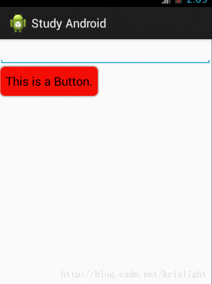
结果:
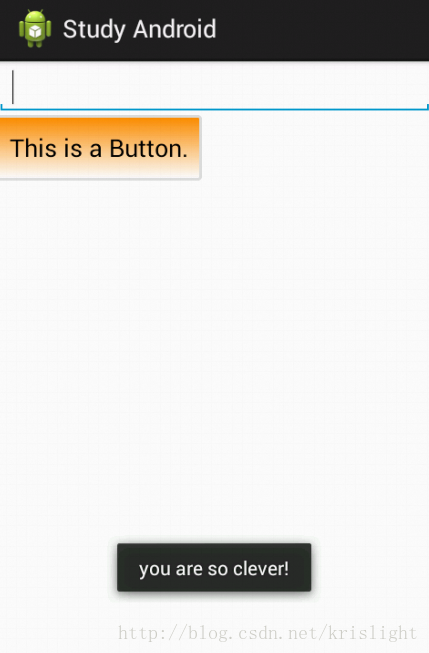
点击后:


 459
459


 被折叠的 条评论
为什么被折叠?
被折叠的 条评论
为什么被折叠?
 到【灌水乐园】发言


