


今天学习了轮播图的使用,上网查阅了一下,发现有react-native-swiper和React-Native-Viewpager 两种封装的比较好的第三方组件,对比了下文档,觉得react-native-swiper功能更加完善,而且文档说明比较全面,所以只用了react-native-swiper,下面介绍下react-native-swiper的使用。该组件同时支持android和iOS。
使用说明:
1. 先安装React-native-swiper
使用说明:
1. 先安装React-native-swiper
npm i react-native-swiper –save
2. 导入Swiper
import Swiper from ‘react-native-swiper’;
- 使用 Swiper
<Swiper
style={styles.swiper}
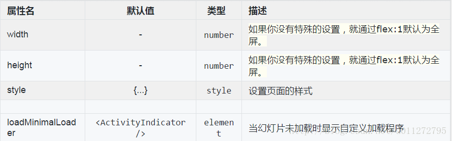
height={200}
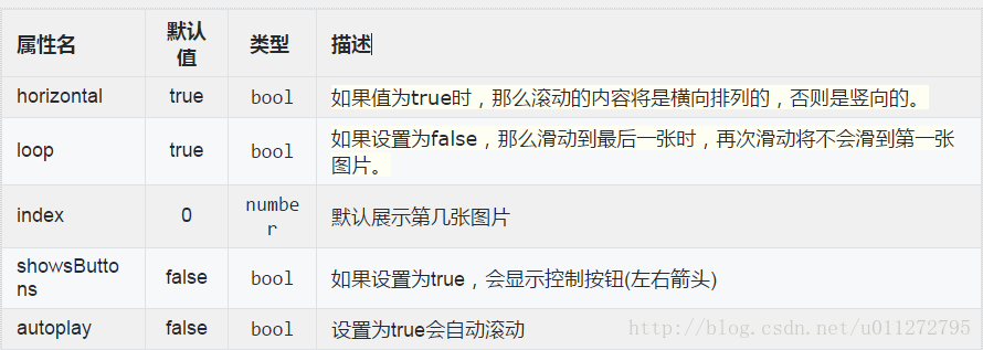
horizontal={true}
paginationStyle={{bottom: 10}}
showsButtons={false}>
<Image source={require('./js/img/a.jpg')} style={styles.img}/>
<Image source={require('./js/img/b.jpg')} style={styles.img}/>
<Image source={require('./js/img/c.jpg')} style={styles.img}/>
</Swiper>
const styles = StyleSheet.create({
swiper: {},
img: {
width: dimensions.width,
height: 200,
}
});4.相关属性和方法介绍
先看个事例:
<Swiper
style={styles.swiper} //样式
height={200} //组件高度
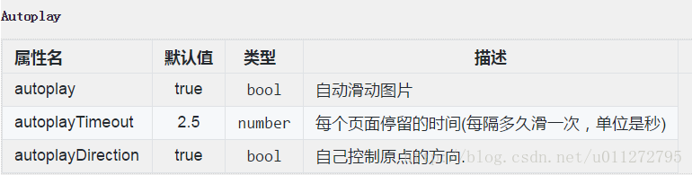
loop={true} //如果设置为false,那么滑动到最后一张时,再次滑动将不会滑到第一张图片。
autoplay={true} //自动轮播autoplayTimeout={4} //每隔4秒切换
horizontal={true} //水平方向,为false可设置为竖直方向
paginationStyle={{bottom: 10}} //小圆点的位置:距离底部10px
showsButtons={false} //为false时不显示控制按钮
showsPagination={false} //为false不显示下方圆点
dot={<View style={{ //未选中的圆点样式
backgroundColor: 'rgba(0,0,0,.2)',
width: 18,
height: 18,
borderRadius: 4,
marginLeft: 10,
marginRight: 9,
marginTop: 9,
marginBottom: 9,
}}/>}
activeDot={<View style={{ //选中的圆点样式
backgroundColor: '#007aff',
width: 18,
height: 18,
borderRadius: 4,
marginLeft: 10,
marginRight: 9,
marginTop: 9,
marginBottom: 9,
}}/>}
>
<Image source={require('./js/img/a.jpg')} style={styles.img}/>
<Image source={require('./js/img/b.jpg')} style={styles.img}/>
<Image source={require('./js/img/c.jpg')} style={styles.img}/>
</Swiper>
| showsButtons | TRUE | bool | 为true时显示控制按钮 |
| buttonWrapperStyle | {backgroundColor: 'transparent', flexDirection: 'row', position: 'absolute', top: 0, left: 0, flex: 1, paddingHorizontal: 10, paddingVertical: 10, justifyContent: 'space-between', alignItems: 'center'} | style | 自定义样式 |
| nextButton | <Text style={styles.buttonText}>›</Text> | element | 允许自定义下一个按钮 |
| prevButton | <Text style={styles.buttonText}>‹</Text> | element | 允许自定义上一个按钮 |
| 属性 | 默认值 | 类型 | 描述 |
| showsPagination | TRUE | bool | 为true时显示小圆点 |
| paginationStyle | {...} | style | 允许自定义小圆点的样式 |
| renderPagination | - | function | Complete control how to render pagination with three params (index, total, context) ref to this.state.index / this.state.total / this, For example: show numbers instead of dots. |
| dot | <View style={{backgroundColor:'rgba(0,0,0,.2)', width: 8, height: 8,borderRadius: 4, marginLeft: 3, marginRight: 3, marginTop: 3, marginBottom: 3,}} /> | element | 自定义没有选中时的组件 |
| activeDot | <View style={{backgroundColor: '#007aff', width: 8, height: 8, borderRadius: 4, marginLeft: 3, marginRight: 3, marginTop: 3, marginBottom: 3,}} /> | element | 自定义选中时的组件 |
| dotStyle | - | object | 自定义选中的元素 |
| dotColor | - | string | 自定义选中的元素 |
| activeDotColor | - | string | 自定义选中的元素 |
| activeDotStyle | - | object | 自定义选中的元素 |


 585
585


 被折叠的 条评论
为什么被折叠?
被折叠的 条评论
为什么被折叠?
 到【灌水乐园】发言


