


最近有些忙,今天又用到了Toolbar就想起来继续写Material Design的文章了,大家久等了,今天我们主要来讨论下Toolbar的使用方法以及使用过程中可能遇到的问题。
简单介绍下,Toolbar是Android 5.0提供的控件,如果想在低版本上使用导入V7包即可。通常一个APP的多个页面中都会有一个标题,而且效果差不多,这时我们可以考虑在Activity的基类中集成Toolbar,并提供一些设置back按钮图标,title,title字体颜色等方法。下面呢,我们就分为两部分来介绍,首先讲解Toolbar的基础用法,然后给大家讲解BaseActivity中如何集成Toolbar。
Toolbar的简单用法
1、首先我们需要定义一个app的base style和Toolbar的style
<!-- Base application theme. -->
<style name="AppTheme" parent="Theme.AppCompat.Light.NoActionBar">
<!-- Customize your theme here. -->
<item name="colorPrimary">@color/colorPrimary</item>
<item name="colorPrimaryDark">@color/colorPrimaryDark</item>
<item name="android:windowBackground">@color/windowBackground</item>
<item name="colorAccent">@color/colorAccent</item>
<item name="android:textColorPrimary">@android:color/white</item>
<!--返回或更多(app:showAsAction="never")的按钮颜色-->
<item name="colorControlNormal">@android:color/white</item>
<!--菜单字体颜色-->
<item name="actionMenuTextColor">@android:color/white</item>
</style>
<!-- Toolbar的style,这里设置了menu上面字体的颜色 -->
<style name="Theme.ToolBar.Base" parent="Theme.AppCompat.Light.NoActionBar">
<item name="actionMenuTextColor">@color/black</item>
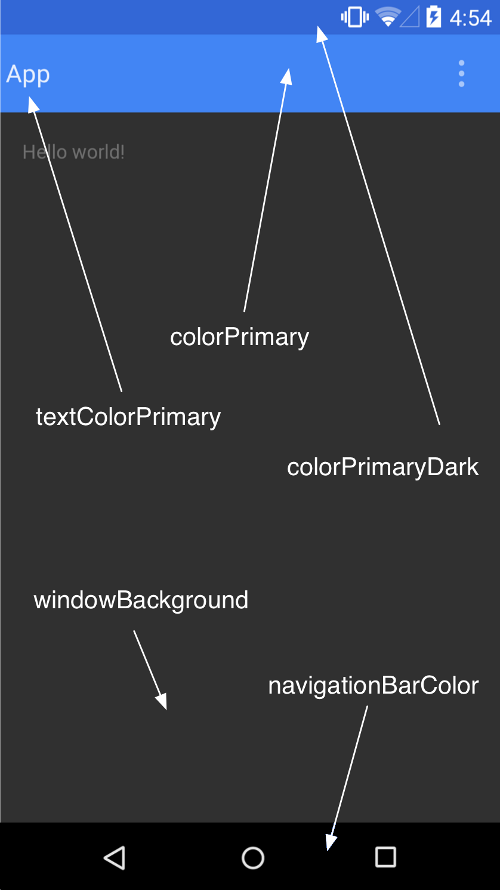
</style>没明白base style意思的同学参考这张图哈
2、接下来编写布局文件,直接上代码
<?xml version="1.0" encoding="utf-8"?>
<LinearLayout xmlns:android="http://schemas.android.com/apk/res/android"
    xmlns:toolbar="http://schemas.android.com/apk/res-auto"
    android:layout_width="match_parent"
    android:layout_height="wrap_content"
    android:orientation="vertical">

    <android.support.v7.widget.Toolbar
        android:id="@+id/toolbar"
        android:layout_width="match_parent"
        android:layout_height="wrap_content"
        android:minHeight="?attr/actionBarSize"
        toolbar:navigationIcon="@drawable/img_back_white"
        android:background="?attr/colorPrimary"
        toolbar:popupTheme="@style/Theme.ToolBar.Base">

        <!--<ImageView
            android:layout_width="wrap_content"
            android:layout_height="wrap_content"
            android:scaleType="center"
            android:src="@drawable/img_back_white" />-->

        <TextView
            android:layout_width="wrap_content"
            android:layout_height="wrap_content"
            android:layout_gravity="center"
            android:text="@string/index"
            android:textColor="@color/white" />
    </android.support.v7.widget.Toolbar>

    <TextView
        android:layout_width="wrap_content"
        android:layout_height="wrap_content"
        android:text="@string/title" />
</LinearLayout>
这里有个小小的注意:我们在编写固定宽高的布局时最好,不要直接将android:layout_width/android:layout_height而是将他们设为wrap_content,然后设置android:minHeight/android:minWidth。这里设置了Toolbar的最小高度为ActionBar的高度。
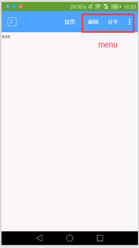
3、新建一个menu文件,主要是用来显示Toolbar上面的按钮的,现在可能有的同学还不理解是什么意思,没关系,等下妹子给你上图。
<?xml version="1.0" encoding="utf-8"?>
<menu xmlns:android="http://schemas.android.com/apk/res/android"
xmlns:app="http://schemas.android.com/apk/res-auto">
<item
android:id="@+id/action_edit"
android:orderInCategory="80"
android:title="@string/edit"
app:showAsAction="ifRoom" />
<item
android:id="@+id/action_share"
android:orderInCategory="90"
android:title="@string/share"
app:showAsAction="ifRoom" />
<item
android:id="@+id/action_settings"
android:orderInCategory="100"
android:title="@string/setting"
app:showAsAction="never" />
<item
android:id="@+id/action_about"
android:orderInCategory="101"
android:title="@string/about"
app:showAsAction="never" />
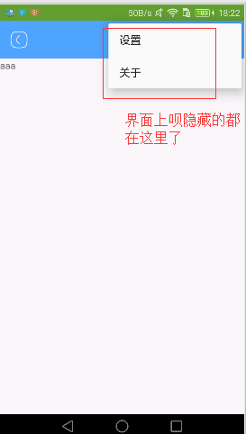
</menu>这里也要注意下:android:orderInCategory的值越大,这个menu在Toolbar上面的位置排的就越靠后。app:showAsAction=never表示这个menu从不在Toolbar上面展示,app:showAsAction=ifRoom表示如果Toolbar上面还有空间就展示出来,否则就折叠起来。
4、设置Toolbar中的popupmenu的字体颜色:
在style文件中新建一个style,上面已经提前说过了哦 <item name="actionMenuTextColor">@color/black</item>
在布局文件中添加:
toolbar:popupTheme="@style/Theme.ToolBar.Base"
5、Activity代码实现:
 toolbar = (Toolbar) findViewById(R.id.toolbar);
//        toolbar.setLogo(R.mipmap.ic_launcher);
//        toolbar.setTitle("title");
//        toolbar.setSubtitle("subtitle");

        setSupportActionBar(toolbar);
        android.support.v7.app.ActionBar actionBar = getSupportActionBar();
        if (actionBar != null) {
            actionBar.setDisplayHomeAsUpEnabled(true);
            actionBar.setDisplayShowTitleEnabled(false);
        }
//        toolbar.setNavigationIcon(R.mipmap.ic_launcher);
        toolbar.inflateMenu(R.menu.menu);
        toolbar.setOnMenuItemClickListener(new Toolbar.OnMenuItemClickListener() {
            @Override
            public boolean onMenuItemClick(MenuItem item) {
                String msg = "";
                switch (item.getItemId()) {
                    case R.id.action_edit:
                        msg += "edit";
                        break;
                    case R.id.action_share:
                        msg += "share";
                        break;
                    case R.id.action_settings:
                        msg += "settings";
                        break;
                    case R.id.action_about:
                        msg += "about";
                        break;
                    default:
                        break;
                }

                if (!msg.equals("")) {
                    Toast.makeText(ToolbarActivity.this, msg, Toast.LENGTH_SHORT).show();
                }
                return false;
            }
        });
运行效果如图所示:
6、更改系统返回键的图标
toolbar:navigationIcon="@drawable/img_back_white"
7、不显示系统标题
if (actionBar != null) {
    actionBar.setDisplayHomeAsUpEnabled(true);
    actionBar.setDisplayShowTitleEnabled(false);
}
8、设置Toolbar的title和logo有两种方法:Java代码和xml文件,在xml文件中添加时首先要在xml的头部添加自定义属性toolbar的声明,再使用toolbar的属性 xmlns:toolbar="http://schemas.android.com/apk/res-auto"
9、去掉Toolbar默认左边距
Toolbar默认包含了一个左边距,这会导致我们的标题或Toolbar里面的布局不居中,修改方法:
app:contentInsetLeft="0dp"
app:contentInsetStart="0dp"


 扫一扫
扫一扫
 794
794

 被折叠的 条评论
为什么被折叠?
被折叠的 条评论
为什么被折叠?
 到【灌水乐园】发言


