


LZ-Says: 似乎最近渐行渐远了。。。

前言
Material Design,一个神奇的家伙,而今天,我们一起来看看关于FloatingactionButton相关内容。
FloatingActionButton 初识
FloatingActionButton,基于谷歌design包,老样子,依旧鉴名其意,浮动按钮。
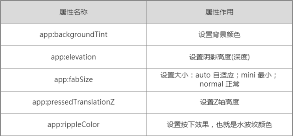
简单附上简图如下:

简单说明关键属性:
撸码见识
第一步:导入依赖
implementation 'com.android.support:design:25.0.1'第二步:开撸
<?xml version="1.0" encoding="utf-8"?>
<RelativeLayout xmlns:android="http://schemas.android.com/apk/res/android"
    xmlns:app="http://schemas.android.com/apk/res-auto"
    xmlns:tools="http://schemas.android.com/tools"
    android:layout_width="match_parent"
    android:layout_height="match_parent"
    android:orientation="vertical"
    tools:context="com.materialdesignstudy.floatingactionbutton.FloatingActionButtonActivity">

    <android.support.design.widget.FloatingActionButton
        android:layout_width="wrap_content"
        android:layout_height="wrap_content"
        android:layout_alignParentBottom="true"
        android:layout_alignParentRight="true"
        android:layout_margin="15dp"
        android:clickable="true"
        android:src="@drawable/ic_float_action_btn"
        app:backgroundTint="?attr/colorPrimary"
        app:elevation="1dp"
        app:fabSize="auto"
        app:pressedTranslationZ="1dp"
        app:rippleColor="#ff00" />

</RelativeLayout>
第三步:设置点击动画
    private boolean isReverse = false;

    public void getRotate(View view) {
        float toDegree = isReverse ? -180 : 180f;
        ObjectAnimator animator = ObjectAnimator.ofFloat(view, "rotation", 101f, toDegree).setDuration(100);
        animator.start();
        isReverse = !isReverse;
    }
嗯哼,如此而已,效果实现完毕。
源码简要分析
看源码,是个好玩的事儿,虽然目前仅仅停留很浅的阶段,但是只要坚持,总会有所收获~
首先来看它是什么来头。
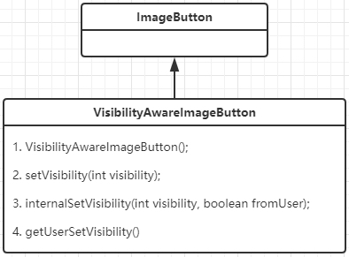
实际FloatingActionButton就是一个ImageButton~!!!
那就先来看初始化的时候,究竟干了什么事儿。
    public FloatingActionButton(Context context) {
        this(context, null);
    }

    public FloatingActionButton(Context context, AttributeSet attrs) {
        this(context, attrs, 0);
    }

    public FloatingActionButton(Context context, AttributeSet attrs, int defStyleAttr) {
        super(context, attrs, defStyleAttr);

        ThemeUtils.checkAppCompatTheme(context);

        TypedArray a = context.obtainStyledAttributes(attrs,
                R.styleable.FloatingActionButton, defStyleAttr,
                R.style.Widget_Design_FloatingActionButton);
        mBackgroundTint = a.getColorStateList(R.styleable.FloatingActionButton_backgroundTint);
        mBackgroundTintMode = ViewUtils.parseTintMode(a.getInt(
                R.styleable.FloatingActionButton_backgroundTintMode, -1), null);
        mRippleColor = a.getColor(R.styleable.FloatingActionButton_rippleColor, 0);
        mSize = a.getInt(R.styleable.FloatingActionButton_fabSize, SIZE_AUTO);
        mBorderWidth = a.getDimensionPixelSize(R.styleable.FloatingActionButton_borderWidth, 0);
        final float elevation = a.getDimension(R.styleable.FloatingActionButton_elevation, 0f);
        final float pressedTranslationZ = a.getDimension(
                R.styleable.FloatingActionButton_pressedTranslationZ, 0f);
        mCompatPadding = a.getBoolean(R.styleable.FloatingActionButton_useCompatPadding, false);
        a.recycle();

        mImageHelper = new AppCompatImageHelper(this);
        mImageHelper.loadFromAttributes(attrs, defStyleAttr);

        mMaxImageSize = (int) getResources().getDimension(R.dimen.design_fab_image_size);

        getImpl().setBackgroundDrawable(mBackgroundTint, mBackgroundTintMode,
                mRippleColor, mBorderWidth);
        getImpl().setElevation(elevation);
        getImpl().setPressedTranslationZ(pressedTranslationZ);
    }
上面无非就是通过自定义属性以及设置其他相关颜色。
最关键几行代码如下:
getImpl().setBackgroundDrawable(mBackgroundTint, mBackgroundTintMode, mRippleColor, mBorderWidth);

getImpl().setElevation(elevation);

getImpl().setPressedTranslationZ(pressedTranslationZ);
分别为设置背景颜色,设置阴影以及设置Z轴。
而接下来我们看一下关于设置大小,代码进行如下校验:
    private int getSizeDimension(@Size final int size) {
        final Resources res = getResources();
        switch (size) {
            case SIZE_AUTO:
                // If we're set to auto, grab the size from resources and refresh
                final int width = ConfigurationHelper.getScreenWidthDp(res);
                final int height = ConfigurationHelper.getScreenHeightDp(res);
                return Math.max(width, height) < AUTO_MINI_LARGEST_SCREEN_WIDTH
                        ? getSizeDimension(SIZE_MINI)
                        : getSizeDimension(SIZE_NORMAL);
            case SIZE_MINI:
                return res.getDimensionPixelSize(R.dimen.design_fab_size_mini);
            case SIZE_NORMAL:
            default:
                return res.getDimensionPixelSize(R.dimen.design_fab_size_normal);
        }
    }
并定义了一个静态常量:
    /**
     * The switch point for the largest screen edge where SIZE_AUTO switches from mini to normal.
     */
    private static final int AUTO_MINI_LARGEST_SCREEN_WIDTH = 470;
而我们在上面看到的关于设置大小时,关键的地方便是读取系统定义的dimens根据不同取值进行不同设置。
    private FloatingActionButtonImpl createImpl() {
        final int sdk = Build.VERSION.SDK_INT;
        if (sdk >= 21) {
            return new FloatingActionButtonLollipop(this, new ShadowDelegateImpl(),
                    ViewUtils.DEFAULT_ANIMATOR_CREATOR);
        } else if (sdk >= 14) {
            return new FloatingActionButtonIcs(this, new ShadowDelegateImpl(),
                    ViewUtils.DEFAULT_ANIMATOR_CREATOR);
        } else {
            return new FloatingActionButtonGingerbread(this, new ShadowDelegateImpl(),
                    ViewUtils.DEFAULT_ANIMATOR_CREATOR);
        }
    }
上面代码,可以看到谷歌为了兼容性可谓付出不少努力,值得我们学习。
而其内部,LZ个人感觉相关兼容性的适配原则和LZ上篇查看CardView差不多。
就简单分析到这了。
困呐,开会整整开了一天~


 扫一扫
扫一扫
 1601
1601

 被折叠的 条评论
为什么被折叠?
被折叠的 条评论
为什么被折叠?
 到【灌水乐园】发言


