


转自:http://blog.csdn.net/whqet/article/details/24793049
之前曾经研究过几个纯css实现的文字效果,《CSS文字条纹阴影动画》和《响应式奶油立体字效果》等,今天我们来研究几款文字效果,主要利用text-shadow、webkit内核的几个独有特性实现效果。
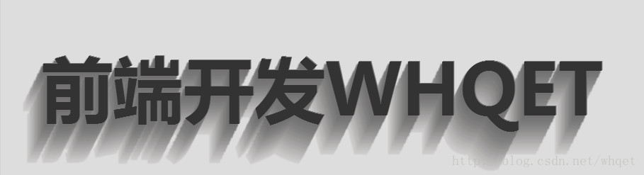
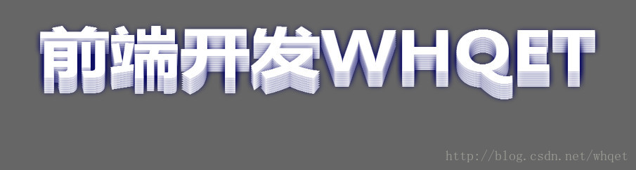
效果一-立体字效果

我们的html文件貌似这样,为了更好的展示效果,我们加上了可编辑属性。
- <div contenteditable="true" class="text effect01">前端开发whqet</div>
- body{
- background-color: #666;
- }
- @import url(http://fonts.googleapis.com/css?family=Dosis:500,800);
- .text {
- font-family:"微软雅黑", "Dosis", sans-serif;
- font-size: 80px;
- text-align: center;
- font-weight: bold;
- line-height:200px;
- text-transform:uppercase;
- position: relative;
- }
- .effect01{
- background-color: #333;
- color:#fefefe;
- text-shadow:
- 0px 1px 0px #c0c0c0,
- 0px 2px 0px #b0b0b0,
- 0px 3px 0px #a0a0a0,
- 0px 4px 0px #909090,
- 0px 5px 10px rgba(0, 0, 0, 0.6);
- }
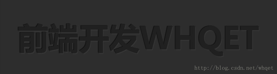
效果二-长尾效果
html文件还是那样
- <div contenteditable="true" class="text effect02">前端开发whqet</div>
- .effect02{
- color:#333;
- background-color: #ddd;
- text-shadow:
- 1px -1px 0 #767676,
- -1px 2px 1px #737272,
- -2px 4px 1px #767474,
- -3px 6px 1px #787777,
- -4px 8px 1px #7b7a7a,
- -5px 10px 1px #7f7d7d,
- -6px 12px 1px #828181,
- -7px 14px 1px #868585,
- -8px 16px 1px #8b8a89,
- -9px 18px 1px #8f8e8d,
- -10px 20px 1px #949392,
- -11px 22px 1px #999897,
- -12px 24px 1px #9e9c9c,
- -13px 26px 1px #a3a1a1,
- -14px 28px 1px #a8a6a6,
- -15px 30px 1px #adabab,
- -16px 32px 1px #b2b1b0,
- -17px 34px 1px #b7b6b5,
- -18px 36px 1px #bcbbba,
- -19px 38px 1px #c1bfbf,
- -20px 40px 1px #c6c4c4,
- -21px 42px 1px #cbc9c8,
- -22px 44px 1px #cfcdcd;
- }
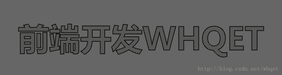
效果三-内阴影
html文件
- <div contenteditable="true" class="text effect03">前端开发whqet</div>
- .effect03{
- color: #202020;
- background-color: #2d2d2d;
- text-shadow:
- -1px -1px 1px #111111,
- 2px 2px 1px #363636;
- }
效果四-斜纹字描边效果
- <div contenteditable="true" class="text effect04">前端开发whqet</div>
- .effect04{
- background-color: #333;
- background-image:
- linear-gradient(
- 45deg,
- transparent 45%,
- hsla(48,20%,90%,1) 45%,
- hsla(48,20%,90%,1) 55%,
- transparent 0
- );
- background-size: .05em .05em;
- -webkit-background-clip: text;
- -webkit-text-fill-color: transparent;
- -webkit-text-stroke: 2px #111;
- }
效果五-文字条纹动画
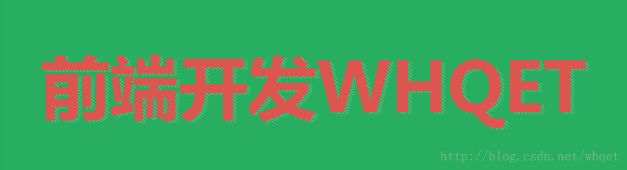
html文件
- <div data-text="前端开发whqet" class="text effect05">前端开发whqet</div>
- .effect05{
- color:#DC554F;
- background-color:#27ae60;
- z-index: 3;
- }
- .effect05:before{
- content:attr(data-text);
- width:100%;
- line-height:200px;
- opacity: .5;
- position: absolute;
- top:2px;
- left:5px;
- background-image:
- linear-gradient(
- 45deg,
- transparent 45%,
- hsla(48,20%,90%,1) 45%,
- hsla(48,20%,90%,1) 55%,
- transparent 0
- );
- z-index:-1;
- background-size: .05em .05em;
- -webkit-background-clip: text;
- -webkit-text-fill-color: transparent;
- animation: shadowGo 20s linear infinite;
- }
- @keyframes shadowGo{
- 0% {background-position: 0 0}
- 0% {background-position: -100% 100%}};
效果六-描边文字

html文件
- <div contenteditable="true" class="text effect06">前端开发whqet</div>
- .effect06 {
- -webkit-text-fill-color: transparent;
- -webkit-text-stroke: 2px #d6d6d6;
- background: url(http://www.pencilscoop.com/demos/CSS_Text_Effects/images/galaxy.jpg);
- background-size: cover;
- }
效果七-遮罩文字

html文件
- <div contenteditable="true" class="text effect07">前端开发whqet</div>
- .effect07 {
- background: url(http://www.pencilscoop.com/demos/CSS_Text_Effects/images/galaxy.jpg) #333;
- -webkit-background-clip: text;
- -webkit-text-fill-color: transparent;
- background-size: cover;
- animation: 10s infinite linear animate;
- }
- .effect07:before {
- content:"";
- width:100%;
- height:100%;
- position: absolute;
- left:0;
- top:0;
- background-color: #999;
- z-index: -1;
- }
- @keyframes animate {
- 0% {
- background-position:0;
- }
- 100% {
- background-position:-1000px 0;
- }
- }
效果八-3D炫光效果
html文件
- <div class="text effect08">
- <h1>前端开发whqet</h1>
- <h1>前端开发whqet</h1>
- <h1>前端开发whqet</h1>
- <h1>前端开发whqet</h1>
- <h1>前端开发whqet</h1>
- <h1>前端开发whqet</h1>
- <h1>前端开发whqet</h1>
- <h1>前端开发whqet</h1>
- </div>
- .effect08 {
- color:#fff;
- transform-origin:center bottom;
- transform-style:preserve-3d;
- transition:all 1s;
- cursor: pointer;
- }
- .effect08:hover {
- transform:rotate3d(1, 0, 0, 40deg);
- }
- .effect08 h1 {
- position: absolute;
- left:0;
- right:0;
- margin:auto;
- text-shadow:0 0 10px rgba(0, 0, 100, .5);
- }
- /*
- sass 循环给每一个h1设置不同的translateZ
- */
- @for $n from 1 to 8 {
- .effect08 h1:nth-child(#{$n}) {
- transform:translateZ(4px*$n);
- }
- }
That's it,篇幅限制,仅仅列出了效果思路,效果的灵活性、复用性,请移步《
CSS立体文字效果最佳实践》查看详情。
----------------------------------------------------------
前端开发whqet,关注web前端开发,分享相关资源,欢迎点赞,欢迎拍砖。
---------------------------------------------------------------------------------------------------------


 552
552


 被折叠的 条评论
为什么被折叠?
被折叠的 条评论
为什么被折叠?
 到【灌水乐园】发言


