iOS-设置控件不同方位的圆角(OC & Swift)

前言:

设置控件的圆角,包括有:

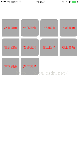
没有圆角,全部圆角,上部圆角,下部圆角,左部圆角,右部圆角,左上圆角,右上圆角,左下圆角,左下圆角

OC代码

NSArray *titleArr = @[@"没有圆角",@"全部圆角",@"上部圆角",@"下部圆角",@"左部圆角",@"右部圆角",@"左上圆角",@"右上圆角",@"左下圆角",@"左下圆角"];
    CGFloat space = 10;
    NSInteger lineCount = 4;
    CGFloat view_WID = (ScreenWidth - space * (lineCount + 1))/lineCount;
    for (int i = 0; i<10; i++) {
        UILabel *textLab = [[UILabel alloc]init];
        textLab.textAlignment = NSTextAlignmentCenter;
        textLab.textColor = [UIColor redColor];
        textLab.backgroundColor = [UIColor lightGrayColor];
        textLab.frame = CGRectMake(space + (view_WID + space)*(i%lineCount), 100 + (view_WID + space)*(i/lineCount), view_WID, view_WID);
        textLab.text = titleArr[i];
        [textLab setZFJGlobalViewWith:i cornerRadius:10.0];
        [self.view addSubview:textLab];
    }

Swift代码

let titleArr = ["没有圆角","全部圆角","上部圆角","下部圆角","左部圆角","右部圆角","左上圆角","右上圆角","左下圆角","左下圆角"]
        let space : Float = 10.0
        let lineCount = 4
        let view_WID : Float = (ScreenWidth - space * (Float(lineCount) + 1))/Float(lineCount)
        
        for i in stride(from: 0, to: 10, by: 1) {
            print("\(i)")
            let textLab = UILabel()
            textLab.textAlignment = NSTextAlignment.center
            textLab.textColor = UIColor.red
            textLab.backgroundColor = UIColor.lightGray
            let rect = CGRect(x: CGFloat(space + (view_WID + space)*Float(i%lineCount)), y: CGFloat(100 + (view_WID + space)*Float(i/lineCount)), width: CGFloat(view_WID), height: CGFloat(view_WID))
            textLab.frame = rect
            textLab.text = titleArr[i]
            textLab .setZFJGlobalView(viewType: GlobalViewType(rawValue: i)!, cornerRadius: 10.0)
            self.view.addSubview(textLab)
        }

效果图


Demo下载

http://download.csdn.net/detail/u014220518/9683593


  • 3
    点赞
  • 2
    收藏
    觉得还不错? 一键收藏
  • 0
    评论
使用SwiftUI自定义iOS分段控件可以通过以下步骤实现: 1. 创建一个新的SwiftUI View,命名为SegmentedControl。 2. 在SegmentedControl中定义一个枚举类型,用于表示分段控件中的选项。 3. 在SegmentedControl中定义一个@Binding属性用于绑定选中的选项。 4. 在SegmentedControl中使用ForEach循环遍历所有的选项,并将它们显示在分段控件中。 5. 在ForEach循环中,使用Button显示每一个选项,并在按钮的action中更新选中的选项。 6. 为分段控件添加样式,例如设置选中的选项的背景色和字体颜色等。 下面是一个简单的示例代码: ```swift enum SegmentedOption: String, CaseIterable { case option1 case option2 case option3 } struct SegmentedControl: View { @Binding var selectedOption: SegmentedOption var body: some View { HStack { ForEach(SegmentedOption.allCases, id: \.self) { option in Button(action: { self.selectedOption = option }) { Text(option.rawValue) .foregroundColor(self.selectedOption == option ? .white : .black) .padding(.horizontal, 20) .padding(.vertical, 10) .background(self.selectedOption == option ? Color.blue : Color.gray) .cornerRadius(10) } } } } } ``` 在使用时,只需要将SegmentedControl添加到需要显示的View中,并将选中的选项绑定到某个属性即可。例如: ```swift struct ContentView: View { @State private var selectedOption: SegmentedOption = .option1 var body: some View { VStack { SegmentedControl(selectedOption: $selectedOption) Text("Selected option: \(selectedOption.rawValue)") } } } ``` 这样就可以在界面上显示一个自定义的iOS分段控件了。

“相关推荐”对你有帮助么?

  • 非常没帮助
  • 没帮助
  • 一般
  • 有帮助
  • 非常有帮助
提交
评论
添加红包

请填写红包祝福语或标题

红包个数最小为10个

红包金额最低5元

当前余额3.43前往充值 >
需支付:10.00
成就一亿技术人!
领取后你会自动成为博主和红包主的粉丝 规则
hope_wisdom
发出的红包
实付
使用余额支付
点击重新获取
扫码支付
钱包余额 0

抵扣说明:

1.余额是钱包充值的虚拟货币,按照1:1的比例进行支付金额的抵扣。
2.余额无法直接购买下载,可以购买VIP、付费专栏及课程。

余额充值