官网对自定义组件新手来说可能会比较比较笼统,写出来也可能会页面很乱
所以在这里我细致化的写出来,读一遍就可以
微信小程序自定义组件
1:创建自定义组件目录(这里我创建的自定义组件目录为myCompontent)
2:自定义组件和页面相似同样拥有 .js,.json,.wxml,.wxss四个文件,当然为了方便使用
这里使用的四个文件名称使用的是以myCompontent命名
3:在myCompontent.json中组件声明
{
"component": true
}
这是将此文件设置为自定义组件
首先展示项目截图
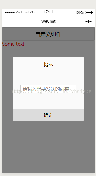

做过两年原生app开发总觉得自定义控件用起来很方便,只要随便一调用就可以使用了,根据自己想要的用,方便。但是当开发一段时间微信小程序时,突然发现自定义就让人苦恼了,有时候因为Android,ios系统不同让人很烦躁,兼容性问题又有些麻烦。捉摸了两天(当然是因为使用时实在太苦恼),最终决定写一个自定义dialog。
看到截图了吧,哈哈,不烦你们了,这里上传代码
1:自定义控件目录:myDialogComponent,在此目录下建立四个文件myDialogComponent.js,myDialogComponent.json,myDialogComponent.wxss,myDialogComponent.wxml.
2:首先需要在myDialogComponent.json文件中进行引用声明(将 component 字段设为 true 可这一组文件设为自定义组件)
3:wxss控件样式书写,这里我就不多赘述了,和css样式书写类似,这里只接写代码,拷贝下来就行了
myDialogComponent.wxss文件
/*mask*/
.drawer_screen {
width:
100%;
height:
100%;
position:
fixed;
top:
0;
left:
0;
z-index:
1000;
background:
#000;
opacity:
0.5;
overflow:
hidden;
}
/*content*/
.drawer_box {
width:
76%;
overflow:
hidden;
position:
fixed;
top:
50%;
left:
0;
z-index:
1001;
background:
#fafafa;
margin:
-150px
12%
0
12%;
border-radius:
3px;
}
.drawer_title {
padding:
15px;
text-align:
center;
background-color:
gazure;
}
.drawer_content {
height:
130px;
overflow-y:
scroll;
/*超出父盒子高度可滚动*/
}
.title {
height:
30px;
line-height:
30px;
width:
160
rpx;
text-align:
center;
display:
inline-block;
font:
300
28
rpx/
30px
"microsoft yahei";
}
.text {
color:
black;
}
.sureQuery {
width:
100%;
display:
flex;
flex-direction:
row;
align-items:
center;
justify-content:
space-between;
box-sizing:
border-box;
background-color:
white;
}
.btn {
width:
100%;
padding:
10px;
text-align:
center;
color:
red;
}
.btn:active{
width:
100%;
padding:
10px;
text-align:
center;
color:
red;
background-color:
gray;
}
.btnSure {
width:
100%;
padding:
10px;
background-color:
gainsboro;
text-align:
center;
}
.titleMsg {
font:
200
35
rpx/
30px;
text-align:
center;
margin-top:
45px;
display:
block;
}
.input_base {
padding-top:
3px;
padding-bottom:
3px;
max-block-size:
10;
display:
block;
background-color:
white;
margin-top:
45px;
border:
2
rpx
solid
#ccc;
padding-left:
20
rpx;
margin-right:
10%;
border-radius:
3px;
margin-left:
10%;
}
4:接下来就是myDialogComponent.wxml文件了
myDialogComponent.wxml文件:
<
view
hidden=
'{{dialogHidden}}'>
<
view
class=
'drawer_screen'
bindtap=
'cancleBtn'
/
>
<
view
class=
'drawer_box'>
<
view
class=
"drawer_title">提示
</
view
>
<
view
class=
'drawer_content'>
<
text
class=
'titleMsg'>{{titleMsg}}
</
text
>
<
input
class=
"input_base"
hidden=
'{{inputHidden}}'
bindinput=
"bindKeyInput"
value=
"{{inputValue}}"
maxlength=
'10'
auto-focus=
'autofocus'
placeholder=
'{{inputPlaceHalder}}'
/
>
</
view
>
<
view
class=
'sureQuery'>
<
view
bindtap=
'cancleBtn'
class=
'btn'
hidden=
'{{cancleBtn}}'>取消
</
view
>
<
view
bindtap=
'determineBtn'
class=
'btnSure'>确定
</
view
>
</
view
>
</
view
>
</
view
>
5:myDialogComponent.js文件
Component({
properties: {
inputPlaceHalder: {
type: String,
value:
' ',
},
inputHidden: {
type: Boolean,
value:
true
},
dialogHidden: {
type: Boolean,
value:
true
},
// 这里定义了innerText属性,属性值可以在组件使用时指定
titleText: {
type: String,
value:
'提示',
},
titleMsg: {
type: String,
value:
' ',
},
inputMsg: {
type: String,
value:
'请输入你他妈想干嘛',
},
//确定
determineBtn: {
type: String,
value:
'default value',
},
//取消
cancleBtn: {
type: Boolean,
value:
true,
},
},
data: {
// 这里是一些组件内部数据
inputValue:
"",
onCancleClick:
false,
},
methods: {
// 输入值
bindKeyInput:
function (e) {
this.setData({
inputValue: e.detail.value
})
},
// 这里是一个自定义方法,取消
cancleBtn:
function () {
// Properties pro = new Properties();
console.log(
"点击取消按钮")
this.setData({
dialogHidden:
true,
})
},
// 确定
determineBtn:
function () {
var determineDetail =
this.data.inputValue
// detail对象,提供给事件监听函数
this.triggerEvent(
'determineevent', determineDetail)
this.setData({
inputValue:
""
})
}
}
})
大功告成,终于将自定义控件写完了,接下来就要调用了
首先 1:在用到的page页面的json中进行引用声明,我用的page页目录为(myDialogTestPage)当然了,page页面同样拥有四个文件(js,json,wxss,wxml)
myDialogTestPage.json文件
{
"usingComponents": {
"my-component-dialog":
"../../myDialogComponent/myDialogComponent"(这是自定义控件的根目录结构,你们用的时候可能也不一定是这个结构,要注意,别踩坑)
}
}
2:使用:在wxml中引用
myDialogTestPage.wxml文件
<
button
bindtap=
'showCompomentDialog'>自定义组件
</
button
>
<
my-component-dialog
bind:determineevent=
"onMyEvent"
bind:cancleevent=
"cancleBtn"
dialog-hidden=
"{{isHidden}}"
title-msg=
"{{titleMsg}}"
input-hidden=
"{{inputHidden}}"
cancle-btn=
"{{cancleBtn}}"
input-place-halder=
"{{inputPlaceHolder}}"
/
>
3:myDialogTestPage.js文件
Page({
/**
* 页面的初始数据
*/
data: {
// isAdministrators:true
isHidden:
true,
titleMsg:
" ",
inputHidden:
false,
cancleBtn:
false,
inputPlaceHolder:
""
},
onMyEvent:
function (e) {
var that =
this;
console.log(
"e.detail :", e.detail)
that.setData({
isHidden:
true,
// inputHidden: false
})
},
showCompomentDialog:
function () {
var that =
this;
that.setData({
isHidden:
false,
titleMsg:
"这样真的好吗",
// inputPlaceHolder: "请输入想要发送的内容",
inputHidden:
true,
// cancleBtn: true,
})
}
})
在showCompomentDialog:function (){
}
onMyEvent方法就是点击确定按钮(这里我只是打印出来内容,比如输入框里面的内容)
中的值进行更改你们可以试一试,(//注释掉的不要随便删除哦,去掉注释可以显示不同样式,好用的话小伙伴们)


 扫一扫
扫一扫
 1886
1886

 被折叠的 条评论
为什么被折叠?
被折叠的 条评论
为什么被折叠?
 到【灌水乐园】发言


