


 本文介绍了一个自定义的圆形按钮组件CircleButton,该组件利用画布和属性动画实现了按钮的视觉反馈效果。文章详细解析了CircleButton的工作原理及其实现过程,并提供了一种矩形按钮的扩展思路。
版本:2.0
日期:2014.3.21 2014.3.28
版权:© 2014 kince 转载注明出处
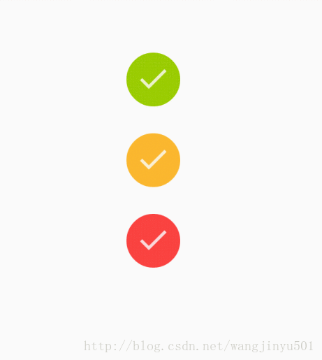
android-circlebutton
是github上的一个开源项目,正如它的简介一样:Circle button widget for Android,就是一个圆形的button。它与一般圆形的button不同之处在于它是画出来的,属于自定义UI的范畴,因此我拿来介绍一下,而们平常一般使用的button可能是来自于美工的图片。它的好处是节省了资源空间,当然缺点也很明显开发人员也要参与界面设计这块了。其实这样也不能说不好,反过来想减少了对美工的依赖,而且也比较适合开发人员自己去实现一些扁平化的东西,因为它很简洁。
首先看代码,
package com.example.circlebutton;

import android.animation.ObjectAnimator;
import android.content.Context;
import android.content.res.TypedArray;
import android.graphics.Canvas;
import android.graphics.Color;
import android.graphics.Paint;
import android.util.AttributeSet;
import android.util.TypedValue;
import android.widget.ImageView;

public class CircleButton extends ImageView {

     private static final int PRESSED_COLOR_LIGHTUP = 255 / 25;
     private static final int PRESSED_RING_ALPHA = 75;
     private static final int DEFAULT_PRESSED_RING_WIDTH_DIP = 4;
     private static final int ANIMATION_TIME_ID = android.R.integer.config_shortAnimTime;

     private int centerY;
     private int centerX;
     private int outerRadius;
     private int pressedRingRadius;

     private Paint circlePaint;
     private Paint focusPaint;

     private float animationProgress;

     private int pressedRingWidth;
     private int defaultColor = Color.BLACK;
     private int pressedColor;
     private ObjectAnimator pressedAnimator;

     public CircleButton(Context context) {
          super(context);
          init(context, null);
     }

     public CircleButton(Context context, AttributeSet attrs) {
          super(context, attrs);
          init(context, attrs);
     }

     public CircleButton(Context context, AttributeSet attrs, int defStyle) {
          super(context, attrs, defStyle);
          init(context, attrs);
     }

     @Override
     public void setPressed(boolean pressed) {
          super.setPressed(pressed);

          if (circlePaint != null) {
               circlePaint.setColor(pressed ? pressedColor : defaultColor);
          }

          if (pressed) {
               showPressedRing();
          } else {
               hidePressedRing();
          }
     }

     @Override
     protected void onDraw(Canvas canvas) {
          canvas.drawCircle(centerX, centerY, pressedRingRadius + animationProgress, focusPaint);
          canvas.drawCircle(centerX, centerY, outerRadius - pressedRingWidth, circlePaint);
          super.onDraw(canvas);
     }

     @Override
     protected void onSizeChanged(int w, int h, int oldw, int oldh) {
          super.onSizeChanged(w, h, oldw, oldh);
          centerX = w / 2;
          centerY = h / 2;
          outerRadius = Math.min(w, h) / 2;
          pressedRingRadius = outerRadius - pressedRingWidth - pressedRingWidth / 2;
     }

     public float getAnimationProgress() {
          return animationProgress;
     }

     public void setAnimationProgress(float animationProgress) {
          this.animationProgress = animationProgress;
          this.invalidate();
     }

     public void setColor(int color) {
          this.defaultColor = color;
          this.pressedColor = getHighlightColor(color, PRESSED_COLOR_LIGHTUP);

          circlePaint.setColor(defaultColor);
          focusPaint.setColor(defaultColor);
          focusPaint.setAlpha(PRESSED_RING_ALPHA);

          this.invalidate();
     }

     private void hidePressedRing() {
          pressedAnimator.setFloatValues(pressedRingWidth, 0f);
          pressedAnimator.start();
     }

     private void showPressedRing() {
          pressedAnimator.setFloatValues(animationProgress, pressedRingWidth);
          pressedAnimator.start();
     }

     private void init(Context context, AttributeSet attrs) {
          this.setFocusable(true);
          this.setScaleType(ScaleType.CENTER_INSIDE);
          setClickable(true);

          circlePaint = new Paint(Paint.ANTI_ALIAS_FLAG);
          circlePaint.setStyle(Paint.Style.FILL);

          focusPaint = new Paint(Paint.ANTI_ALIAS_FLAG);
          focusPaint.setStyle(Paint.Style.STROKE);

          pressedRingWidth = (int) TypedValue.applyDimension(TypedValue.COMPLEX_UNIT_DIP, DEFAULT_PRESSED_RING_WIDTH_DIP, getResources()
                    .getDisplayMetrics());

          int color = Color.BLACK;
          if (attrs != null) {
               final TypedArray a = context.obtainStyledAttributes(attrs, R.styleable.CircleButton);
               color = a.getColor(R.styleable.CircleButton_cb_color, color);
               pressedRingWidth = (int) a.getDimension(R.styleable.CircleButton_cb_pressed_ring_width, pressedRingWidth);
               a.recycle();
          }

          setColor(color);

          focusPaint.setStrokeWidth(pressedRingWidth);
          final int pressedAnimationTime = getResources().getInteger(ANIMATION_TIME_ID);
          pressedAnimator = ObjectAnimator.ofFloat(this, "animationProgress", 0f, 0f);
          pressedAnimator.setDuration(pressedAnimationTime);
     }

     private int getHighlightColor(int color, int amount) {
          return Color.argb(Math.min(255, Color.alpha(color)), Math.min(255, Color.red(color) + amount),
                    Math.min(255, Color.green(color) + amount), Math.min(255, Color.blue(color) + amount));
     }
}
继承了ImageView,这也注定了没有文字效果,所以如果你还想有文字效果,那么可以继承于button。看一下变量,除了Paint之外,再也就是3.0之后引入的属性动画ObjectAnimator这个类。既然是属性动画,当然是改变属性值了(不断更改对象的属性值),在这里就是改变button的颜色值。
构造方法里,还是常规的初始化paint、从attrs里获取属性值以及设置一些其他变量值,还要就是ObjectAnimator的初始化。然后CircleButton类会进入onSizeChanged方法,在这个方法里初始化了CircleButton的圆形坐标以及其他的变量。接着进入onDraw方法,在这里面绘制CircleButton,代码如下:
  canvas.drawCircle(centerX, centerY, pressedRingRadius + animationProgress, focusPaint);
  canvas.drawCircle(centerX, centerY, outerRadius - pressedRingWidth, circlePaint);
可以看到它绘制了两个圆形,其实是这样的,从两个Paint变量就可以看出:一个是cirlcePaint,它的Style是FILL类型的,说明它画的是实心圆也就是默认状态下的button。另一个focusPaint是获取焦点时候调用的,它的Style是STROKE类型的,所以画出一个圆环效果,这也就是点击button之后出现的。但是看一下这两个圆环的半径发现实心圆的半径比空心圆的半径要大4。那把画实心圆的代码注释掉,效果是这样的:
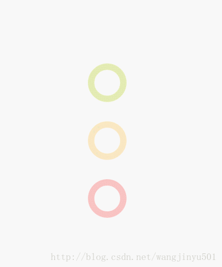
看完就明白了,原来是实心圆把空心圆给遮住了,所以默认情况下,看到的是实心圆。当点击button的时候,执行
setPressed()方法,这个方法在里面会调用
showPressedRing()方法,也就是开启动画效果。这样,关于CircleButton的机制就清楚了。
接下来根据这个lizi 做一个拓展,学以致用。比如我还想使用矩形的butoon,然后也有点击动画的效果,那如何完成呢?很简单,原理同上,上面的例子画的是圆形,那么类似地就画矩形。在onDraw()中加入如下代码:
		//可以放大的矩形
		RectF rect=new RectF();
		rect.left=8-animationProgress;
		rect.top=8-animationProgress;
		rect.right= 47+ animationProgress;
		rect.bottom=47 + animationProgress;
		canvas.drawRect(rect, focusPaint);// 长方形
		//实心矩形
		RectF rect1=new RectF();
		rect1.left=5;
		rect1.top=5;
		rect1.right=50;
		rect1.bottom=50;
canvas.drawRect(rect1, circlePaint);// 长方形 


 扫一扫
扫一扫


 2053
2053


 被折叠的 条评论
为什么被折叠?
被折叠的 条评论
为什么被折叠?
 到【灌水乐园】发言


