


站在前辈们的肩膀上来学习和总结!
1.文本的居中
height+line-height:配合使用,垂直方向居中
text-align:父级的text-align,水平居中
ps:text-align:center 只是将子元素里的内联元素居中。
还有一种文本居中的方式是定高父级元素激活表格属性和基线样式:
display:table-cell;vertical-align:middle; /IE8,Firefox,chrome/
那么不是内联元素是如何实现居中的?margin: 0 auto;
2.定宽块元素的水平居中
两个条件:宽度固定值+块级元素
.wrap{width:200px;border:1px solid red;margin:0 auto;} //宽度必须给值
<div class="wrap"></div>
3.不定宽块元素水平居中
- 外层包裹一个table标签。table标签的宽度自适应,即其内部内容的宽度决定了它的宽度,所以能看成固定宽度。
 table{border:1px solid red;margin:0 auto;}
 <table>
  <tbody>
    <tr>
        <td>
            <h2>我是一行文本</h2>
        </td>
    </tr>
  </tbody>
</table>- 改变为行内元素,然后使用text-align:center处理。多用于不定项导航的ul的居中
.nav{text-align:center;}
.nav ul{display:inline;}或者{display:inline-block;*display:inline;*zoom:1;}
<div class="nav">
    <ul>
        <li>首页</li>
        <li>内页</li>
    </ul>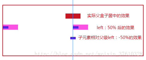
</div>- 父元素浮动,left:50%;同时设置position:relative(给子元素相对定位一个参考);子元素相对定位position:relative;left:-50%;(照着自己理解画了个图:上图)
.wrap{position:relative;left:50%;float:left;}
.box{position:relative;left:-50%;}
<div class="wrap">
    <div class="box">一个子级盒子</div>
<div>
3.块元素的垂直水平居中
- 固定宽的块元素
.wrap{width:400px;height:400px;border:1px solid #EEE;position:relative;}
.box{width:100px;height:100px;background:red;position:absolute;top:50%;left:50%;
margin-top:-50px;margin-left:-50px;}
<div class="wrap">
    <div class="box"></div>
</div>.wrap{width:400px;height:400px;border:1px solid #EEE;position:relative;}
.box{width:100px;height:100px;background:red;position:absolute;left:0;top:0;right:0;
bottom:0;margin:auto;}
<div class="wrap">
<div class="box"></div>
</div>css3的translate偏移:
.wrap{width:400px;height:400px;border:1px solid #EEE;position:relative;}
.box{width:100px;height:100px;background:red;position:absolute;top:50%;left:50%;
-webkit-transform: translate(-50%,-50%);
-ms-transform: translate(-50%,-50%);-o-transform: translate(-50%,-50%);
transform: translate(-50%,-50%);}
<div class="wrap">
    <div class="box"></div>
</div>
表格布局:
.wrap{width:400px;height:400px;border:1px solid #EEE;display:table;}
.box{background:red;display:table-cell;text-align:center;vertical-align:middle;}
<div class="wrap">
    <div class="box">转换为表格</div>
</div>
css3中的display:box;
.wrap{width:400px;height:400px;border:1px solid #EEE;display:
 -webkit-box;-webkit-box-pack:center;-webkit-box-align:center;}
.box{background:red;width:100px;height:100px;}
<div class="wrap">
    <div class="box">box</div>
</div>
弹性布局display:flex:
.wrap{width:400px;height:400px;border:1px solid #EEE;display:
flex;justify-content: center;align-items: center;}
.box{background:red;width:100px;height:100px;}
<div class="wrap">
    <div class="box">box</div>
</div>


 5913
5913


 被折叠的 条评论
为什么被折叠?
被折叠的 条评论
为什么被折叠?
 到【灌水乐园】发言


