


React主要有如下3个特点:
- 作为UI(Just the UI)
- 虚拟DOM(Virtual DOM):这是亮点 是React最重要的一个特性 放进内存 最小更新的视图,差异部分更新 diff算法
- 数据流(Date Flow)单向数据流
学习React需要掌握哪些知识?
- JSX语法 类似XML
- ES6相关知识
- 前端基础 CSS+DIV JS
例子一
(简单组件和数据传递) 使用this.props 指向自己的属性
<!DOCTYPE html>
<html>
<head lang="en">
    <meta charset="UTF-8">
    <title>React第一个例子</title>
    <script type="text/javascript" src="react.js"></script>
    <script type="text/javascript" src="react-dom.js"></script>
    <script type="text/javascript" src="browser.min.js"></script>
</head>
<body>
<div id="example"></div>
<script type="text/babel">
    var HelloMessage=React.createClass(
            {
                render:function(){
                    return <h1 style={{color:'#ff0000',fontSize:'24px'}} >Hello {this.props.name}!我是东方耀</h1>;
                    //这是注释  React.createElement
                }
            }
    );

    ReactDOM.render(<HelloMessage name="React 语法基础8" /> ,document.getElementById('example'));


</script>
</body>
</html>
例子二(通过this.state更新视图)
<!DOCTYPE html>
<html>
<head lang="en">
    <meta charset="UTF-8">
    <title>React第二个例子</title>
    <script type="text/javascript" src="react.js"></script>
    <script type="text/javascript" src="react-dom.js"></script>
    <script type="text/javascript" src="browser.min.js"></script>
</head>
<body>

<div id="example"></div>

<script type="text/babel">
    var Timer=React.createClass(
            {
      /*初始状态*/
            getInitialState:function(){
      return {secondsElapsed:0};
    },

    tick:function(){
      this.setState({secondsElapsed:this.state.secondsElapsed+1});
    },

    /*组件完成装载*/
    componentDidMount:function(){
      this.interval=setInterval(this.tick,1000);
    },
    /*组件将被卸载   清除定时器*/
    componentWillUnmount:function(){
        clearInterval(this.interval);
    },
    /*渲染视图*/
    render:function(){
        return(
                <div> Seconds Elapsed:{this.state.secondsElapsed} </div>
        );
    }

    }
    );


    React.render( <Timer /> ,document.getElementById('example'));


</script>

</body>
</html>
例子三(简单应用)
<!DOCTYPE html>
<html>
<head lang="en">
    <meta charset="UTF-8">
    <title>React第三个例子</title>
    <script type="text/javascript" src="react.js"></script>
    <script type="text/javascript" src="react-dom.js"></script>
    <script type="text/javascript" src="browser.min.js"></script>
</head>
<body>

<div id="example"></div>

<script type="text/babel">

    var ShowEditor=React.createClass(
            {
                getInitialState:function(){
                  return {value:'你可以在这里输入文字'};
                },

                handleChange:function(){
                  this.setState({value:React.findDOMNode(this.refs.textarea).value});
                },

                render:function(){
                    return (


                            <div>
                            <h3>输入</h3>
                                    <textarea style={{width:300,height:150,outline:'none'}}
                       onChange={this.handleChange}
                       ref="textarea"
                    defaultValue={this.state.value}

                />
    <h3>输出</h3>

            <div> {this.state.value} </div>

                            </div>

                    );

                }


            }

    );


    React.render(<ShowEditor />,document.getElementById('example'));


</script>

</body>
</html>
flexbox布局
伸缩项目的属性
1.order
定义项目的排列顺序,数值越小,排列越靠前,默认值为0,语法为:order:整数值
2.flex-grow
定义伸缩项目的放大比例,默认值为0,即表示如果存在剩余空间,也不放大,语法为:flex-grow:整
数值
3.flex-shrink
定义伸缩项目的收缩能力,默认值为1 ,其语法为:flex-shrink:整数值
4.flex-basis
用来设置伸缩项目的基准值,剩余的空间按比率进行伸缩,其语法为:flex-basis:length | auto,默认
值为auto
5.flex
是flex-grow flex-shrink flex-basis这三个属性的缩写,其语法为:flex:none | flex-grow flex-shrink flexbasis,
其中第二个和第三个参数为可选参数,默认值为:0 1 auto
6.align-self
用来设置单独的伸缩项目在交叉轴上的对齐方式,会覆盖默认的对齐方式,其语法为:align-self:auto
| flex-start | flex-end | center | baseline | stretch(伸缩项目在交叉轴方向占满伸缩容器,如果交叉轴为
垂直方向的话,只有在不设置高度的情况下才能看到效果)
在React Native中使用flexbox
RN目前主要支持flexbox的如下6个属性:
1.alignItems
用来定义伸缩项目在交叉轴上的对齐方式,语法为: alignItems:flex-start(默认值) | flex-end |
center | stretch
2.alignSelf
用来设置单独的伸缩项目在交叉轴上的对齐方式,会覆盖默认的对齐方式,其语法为:alignSelf:auto |
flex-start | flex-end | center | stretch(伸缩项目在交叉轴方向占满伸缩容器,如果交叉轴为垂直方向的
话,只有在不设置高度的情况下才能看到效果)
3.flex
是flex-grow flex-shrink flex-basis这三个属性的缩写,其语法为:flex:none | flex-grow flex-shrink flexbasis,
其中第二个和第三个参数为可选参数,默认值为:0 1 auto
4.flexDirection
指定主轴的方向 flex-direction:row| row-reverse | column(默认值) | column-reverse
5.flexWrap
6.justifyContent
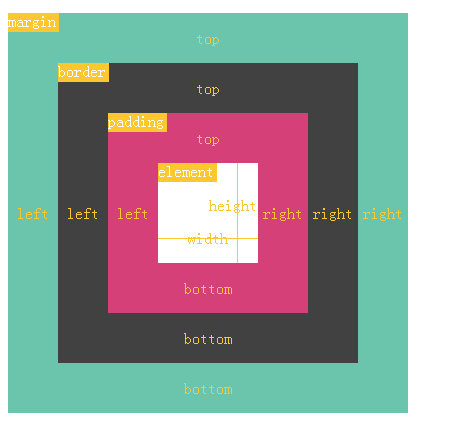
BOX实现
<!DOCTYPE html>
<html>
  <head>
    <meta charset="utf-8">
    <title></title>
    <style>
      .height50 {
        height: 50px;
      }
      .height400 {
        height: 400px;
      }
      .height300 {
        height: 300px;
      }
      .height200 {
        height: 200px;
      }
      .height100 {
        height: 100px;
      }
      .width400 {
        width: 400px;
      }
      .bgred {
        background-color: #6AC5AC;
      }
      .bggreen {
        background-color:  #414142;
      }
      .bgyellow {
        background-color: #D64078;
      }
      .box {
        display: flex;
        flex-direction: column;
        flex: 1;
        position: relative;
        color: #FDC72F;
        line-height: 1em;
      }
      .label {
        top: 0;
        left: 0;
        padding: 0 3px 3px 0;
        position: absolute;
        background-color: #FDC72F;
        color: white;
        line-height: 1em;
      }
      .top {
        width: 100%;
        justify-content: center;
        display: flex;
        align-items: center;
      }
      .bottom {
        width: 100%;
        display: flex;
        justify-content: center;
        align-items: center;
      }
      .right {
        width: 50px;
        display: flex;
        justify-content: space-around;
        align-items: center;
      }
      .left {
        width: 50px;
        display: flex;
        justify-content: space-around;
        align-items: center;
      }
      .heightdashed {
        position: absolute;
        right: 20px;
        height: 100%;
        border-left: 1px solid #FDC72F;
      }
      .widthdashed {
        position: absolute;
        left: 0px;
        width: 100%;
        bottom: 24px;
        border-top: 1px solid #FDC72F;
      }
      .margginBox {
        position:absolute;
        top: 100px;
        padding-left:7px;
        padding-right:7px;
      }
      .borderBox {
        flex: 1;
        display: flex;
        justify-content: space-between;
      }
      .paddingBox {
        flex: 1;
        display: flex;
        justify-content: space-between;
      }
      .elementBox{
        flex: 1;
        display: flex;
        justify-content: space-between;
      }
      .measureBox {
        flex: 1;
        display: flex;
        justify-content: flex-end;
        align-items: flex-end;
      }
    </style>
  </head>
  <body>
    <span class="margginBox">
      <span class="box height400  width400">
        <span class="label">
          margin
        </span>
        <span class="top height50 bgred">
          top
        </span>
        <span class="borderBox">
          <span class="left bgred">
            left
          </span>
          <span class="box height300  ">
            <span class="label">
              border
            </span>
            <span class="top height50 bggreen">
              top
            </span>
            <span class="paddingBox">
              <span class="left bggreen">
                left
              </span>
              <span class="box height200  ">
                <span class="label">
                  padding
                </span>
                <span class="top height50 bgyellow">
                  top
                </span>
                <span class="elementBox">
                  <span class="left bgyellow">
                    left
                  </span>
                  <span class="box height100  ">
                    <span class="label">
                      element
                    </span>
                    <span class="widthdashed">
                    </span>
                    <span class="heightdashed">
                    </span>
                    <span class="measureBox">
                      <span class="right">
                        height
                      </span>
                    </span>
                    <span class="bottom  height50">
                      width
                    </span>
                  </span>
                  <span class="right bgyellow">
                    right
                  </span>
                </span>
                <span class="bottom  height50 bgyellow">
                  bottom
                </span>
              </span>
              <span class="right bggreen">
                right
              </span>
            </span>
            <span class="bottom  height50 bggreen">
              bottom
            </span>
          </span>
          <span class="right bgred">
            right
          </span>
        </span>
        <span class="bottom  height50 bgred">
          bottom
        </span>
      </span>
    </span>
  </body>
</html>
效果如下
ReactNative版实现
/**
 * Sample React Native App
 * https://github.com/facebook/react-native
 */
'use strict';
import React, {
  AppRegistry,
  Component,
  StyleSheet,
  Text,
  View
} from 'react-native';

class DongFang extends Component {
  render() {
    return (
        <View style={[BoxStyles.margginBox]}  ref="lab1">
          <View style={[BoxStyles.box,BoxStyles.height400,BoxStyles.width400]}>
            <View style={[BoxStyles.top,BoxStyles.height50,BoxStyles.bgred]}>
              <Text style={BoxStyles.yellow}>top</Text></View>
            <View style={[BoxStyles.borderBox]}>
              <View style={[BoxStyles.left,BoxStyles.bgred]} >
                <Text style={BoxStyles.yellow}>left</Text></View>
              <View style={[BoxStyles.box,BoxStyles.height300]}>
                <View style={[BoxStyles.top,BoxStyles.height50,BoxStyles.bggreen]}>
                  <Text style={BoxStyles.yellow}>top</Text></View>
                <View style={[BoxStyles.paddingBox]}>
                  <View style={[BoxStyles.left,BoxStyles.bggreen]} >
                    <Text style={BoxStyles.yellow}>left</Text></View>
                  <View style={[BoxStyles.box,BoxStyles.height200]}>
                    <View style={[BoxStyles.top,BoxStyles.height50,BoxStyles.bgyellow]}>
                      <Text style={BoxStyles.yellow}>top</Text></View>
                    <View style={[BoxStyles.elementBox]}>
                      <View style={[BoxStyles.left,BoxStyles.bgyellow]} >
                        <Text style={BoxStyles.yellow}>left</Text></View>
                      <View style={[BoxStyles.box,BoxStyles.height100]}>
                        <View  style={[BoxStyles.label]}>
                          <Text style={BoxStyles.white}>element</Text></View>
                        <View style={[BoxStyles.widthdashed]} ></View>
                        <View style={[BoxStyles.heightdashed]} ></View>
                        <View style={[BoxStyles.measureBox]} >
                          <View style={[BoxStyles.right]}>
                            <Text style={[BoxStyles.yellow]}>height</Text></View>
                        </View>
                        <View style={[BoxStyles.bottom,BoxStyles.height50]}>
                          <Text style={BoxStyles.yellow}>width</Text></View>
                      </View>
                      <View style={[BoxStyles.right,BoxStyles.bgyellow]}><Text style={BoxStyles.yellow}>right</Text></View>
                    </View>
                    <View style={[BoxStyles.bottom,BoxStyles.height50,BoxStyles.bgyellow]}>
                      <Text style={BoxStyles.yellow}>bottom</Text></View>
                    <View style={[BoxStyles.label]}>
                      <Text style={BoxStyles.white}>padding</Text></View>
                  </View>
                  <View style={[BoxStyles.right,BoxStyles.bggreen]}><Text style={BoxStyles.yellow}>right</Text></View>
                </View>
                <View style={[BoxStyles.bottom,BoxStyles.height50,BoxStyles.bggreen]}>
                  <Text style={BoxStyles.yellow}>bottom</Text></View>
                <View style={[BoxStyles.label]}><Text style={BoxStyles.white}>border</Text></View>
              </View>
              <View style={[BoxStyles.right,BoxStyles.bgred]}>
                <Text style={BoxStyles.yellow}>right</Text></View>
            </View>
            <View style={[BoxStyles.bottom,BoxStyles.height50,BoxStyles.bgred]}>
              <Text style={BoxStyles.yellow}>bottom</Text></View>
            <View style={[BoxStyles.label]} ><Text style={BoxStyles.white}>margin</Text></View>
          </View>
        </View>
    );
  }
}

const BoxStyles = StyleSheet.create({
  height50:{
    height: 50,
  },
  height400:{
    height: 400,
  },
  height300:{
    height: 300,
  },
  height200:{
    height: 200,
  },
  height100:{
    height: 100,
  },
  width400:{
    width: 400,
  },
  width300:{
    width: 300,
  },
  width200:{
    width: 200,
  },
  width100:{
    width: 100,
  },
  bgred: {
    backgroundColor:'#6AC5AC',
  },
  bggreen: {
    backgroundColor: '#414142',
  },
  bgyellow: {
    backgroundColor: '#D64078',
  },
  box: {
    flexDirection: 'column',
    flex: 1,
    position: 'relative',
  },
  label: {
    top: 0,
    left: 0,
    paddingTop: 0,
    paddingRight: 3,
    paddingBottom: 3,
    paddingLeft: 0,
    position: 'absolute',
    backgroundColor: '#FDC72F',
  },
  top: {
    justifyContent: 'center',
    alignItems: 'center',
  },
  bottom: {
    justifyContent: 'center',
    alignItems: 'center',
  },
  right: {
    width: 50,
    justifyContent: 'space-around',
    alignItems: 'center',
  },
  left: {
    width: 50,
    justifyContent: 'space-around',
    alignItems: 'center',
  },
  heightdashed: {
    bottom: 0,
    top: 0,
    right: 20,
    borderLeftWidth: 1,
    position: 'absolute',
    borderLeftColor: '#FDC72F',
  },
  widthdashed: {
    bottom: 25,
    left: 0,
    right: 0,
    borderTopWidth: 1,
    position: 'absolute',
    borderTopColor: '#FDC72F',
  },
  yellow: {
    color: '#FDC72F',
    fontWeight:'900',
  },
  white: {
    color: 'white',
    fontWeight:'900',
  },
  margginBox:{
    position: 'absolute',
    top: 100,
    paddingLeft:7,
    paddingRight:7,
  },
  borderBox:{
    flex: 1,
    justifyContent: 'space-between',
    flexDirection: 'row',
  },
  paddingBox:{
    flex: 1,
    justifyContent: 'space-between',
    flexDirection: 'row',
  },
  elementBox:{
    flex: 1,
    justifyContent: 'space-between',
    flexDirection: 'row',
  },
  measureBox:{
    flex: 1,
    flexDirection: 'row',
    justifyContent: 'flex-end',
    alignItems:'flex-end',
  },
  container: {
    flex: 1,
    justifyContent: 'center',
    alignItems: 'center',
    backgroundColor: '#F5FCFF',
  },
  welcome: {
    fontSize: 20,
    textAlign: 'center',
    margin: 10,
  },
  instructions: {
    textAlign: 'center',
    color: '#333333',
    marginBottom: 5,
  },
});

AppRegistry.registerComponent('DongFang', () => DongFang);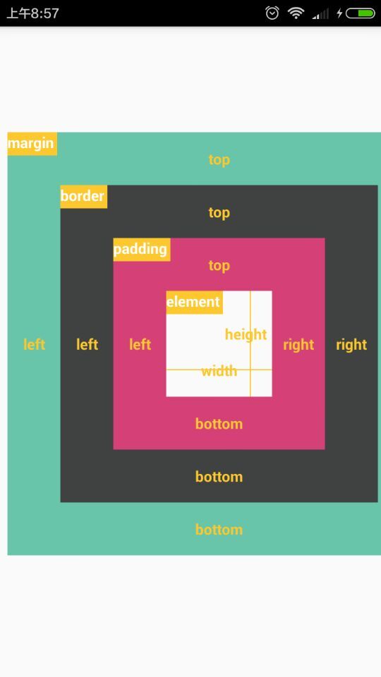


 2972
2972


 被折叠的 条评论
为什么被折叠?
被折叠的 条评论
为什么被折叠?
 到【灌水乐园】发言


