


所有type通用样式:
.input-wrap input{
display: block;
outline: none;
-webkit-border-radius: 4px;
-moz-border-radius: 4px;
border-radius: 4px;
margin-bottom: 30px;
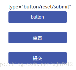
}1、type=”button/submit/reset”
.input-wrap input[type="button"],
.input-wrap input[type="submit"],
.input-wrap input[type="reset"]{
    width: 200px;
    height: 40px;
    font-size: 16px;
    color: #ffffff;
    background: #4359aa;
    border: none;
}
.input-wrap input[type="button"]:hover,
.input-wrap input[type="submit"]:hover,
.input-wrap input[type="reset"]:hover{
    opacity: 0.7;
    filter: alpha(opacity=70);
}
.input-wrap input[type="button"]:active,
.input-wrap input[type="submit"]:active,
.input-wrap input[type="reset"]:active{
    background: #041a6b;
}<div class="input-wrap">
<!--
disabled:设置返回是否禁用按钮;
form :返回包含按钮的表单对象的引用
name:设置或返回按钮的名称
type:设置表单元素的类型
value:设置或返回按钮上显示的文本
-->
<input type="button" value="button" />
<input type="reset" />
<input type="submit" />
</div>效果:
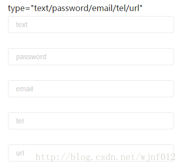
2、type=”text/password/email/tel/url”
.input-wrap02 input{
    width: 300px;
    height: 20px;
    background: #ffffff;
    font-size: 14px;
    color: #222222;
    line-height: normal;
    border: 1px solid #e8e8e8;
    padding: 6px 15px;
}

.input-wrap02 input::-moz-placeholder{
    font-size: 14px;
    color: #D0D0D0;
}
.input-wrap02 input::-ms-input-placeholder{
    font-size: 14px;
    color: #D0D0D0;
}
.input-wrap02 input::-webkit-input-placeholder{
    font-size: 14px;
    color: #D0D0D0;
}<div class="input-wrap input-wrap02">
<!--
在移动端点击输入框时:
当为text时,点击输入框弹出的默认键盘为中文
当为password时,点击输入框弹出的默认键盘为英文
当为email时,点击输入框弹出的默认键盘为中文
当为tel时,点击输入框弹出的默认键盘为数字键盘
当为URL时,点击输入框弹出的默认键盘为中文
-->
<!--
autocompelete:设置或返回的autocompelete属性值(text/email/url)
autofocus:在页面加载设置或返回文本域是否自动获取焦点(text/email/url)
defaultValue:设置或返回文本域的默认值
disabled:设置或返回文本域是否禁用
form:返回一个包含闻女恩宇的表单对象的引用(text/email/url)
list:返回一个包含文本域的选项列表对象的引用(text/email/url)
maxLength:设置或返回最大字符数
name:设置或返回名称
pattern:设置或返回文本域的pattern属性值(text/email/url)
palceholder:设置或返回文本域的palaceholder属性值
readOnly:设置或返回是否应该是只读的
required:设置或返回字段在表单中是否为必填字段(text/email/url)
size:设置或返回文本域或密码字段的长度(text/password/url)
type:返回表单元素类型
value:设置或返回value属性值
multiple:是指或返回email字段是否可以输入多个邮箱地址(email/url)
step:设置或返回email字段的step属性值(email/url)
-->
<input type="text" placeholder="text" />
<input type="password" placeholder="password" />
<input type="email" placeholder="email" />
<input type="tel" placeholder="tel" />
<input type="url" placeholder="url" />
</div>效果:
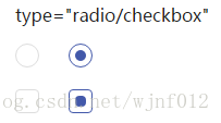
3、type=”radio/checkbox”
.way-1{
    padding: 10px 0;
}
.way-1 input{
    display: none;
}
.way-1 label{
    position: relative;
    display: block;
    width: 20px;
    height: 20px;
    border: 1px solid #dddddd;
}
.way-1 input[type=checkbox] + label,
.way-1 input[type=checkbox]:checked + label:before{
    -webkit-border-radius: 4px;
    -moz-border-radius: 4px;
    border-radius: 4px;
}
.way-1 input[type=checkbox]:checked + label,
.way-1 input[type=radio]:checked + label{
    border: 1px solid #4359aa;
}
.way-1 input[type=checkbox]:checked + label:before,
.way-1 input[type=radio]:checked + label:before{
    position: absolute;
    top: 50%;
    left: 50%;
    content: '';
    width: 10px;
    height: 10px;
    background: #4359aa;
    margin-top: -5px;
    margin-left: -5px;
}
.way-1 input[type=radio] + label,
.way-1 input[type=radio]:checked + label:before{
    -webkit-border-radius: 100%;
    -moz-border-radius: 100%;
    border-radius: 100%;
}<div class="input-wrap">
<!--
disabled:设置或返回checkbox是否被禁用
checked:是指或返回checkbox是否应被选中
defaultChecked:返回checked属性的默认值
form:返回对包含checkbox的表单的引用
name:设置或返回checkbox的名称
type:返回checkbox的表单元素的类型
value:设置或返回checkbox的value属性的值
-->
<div class="way-1">
<input id="radio" type="radio" />
<label for="radio"></label>
</div>
<div class="way-1">
<input id="checkbox" type="checkbox" />
<label for="checkbox"></label>
</div>
</div>效果:
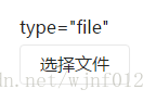
4、type=”file”
.file-wrap{
    position: relative;
    cursor: default;
}
.file-wrap,
.file-wrap input{
    width: 100px;
    height: 35px;
    font-size: 16px;
    color: #222222;
    line-height: 33px;
    text-align: center;
    border: 1px solid #e8e8e8;
    background: #ffffff;
    -webkit-border-radius: 4px;
    -moz-border-radius: 4px;
    border-radius: 4px;
}
.file-wrap input{
    position: absolute;
    top: 0;
    left: 0;
    opacity: 0;
    margin: 0;
}<div class="input-wrap">
<!--
disabled:设置或返回是否禁用FileUpload对象
accept:设置或返回只是文件传输的mime类型列表(逗号分隔)
form:返回对包含FileUpload对象的表单的引用
name:设置或返回FileUpload对象的名称
type:返回表单元素的类型。对于FileUpload,则是file
value:返回由用户输入设置的文本后,FileUpload对象的文件名
-->
<div class="file-wrap">
选择文件<input type="file" />
</div>
</div>效果:
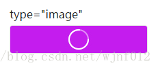
5、type=”image”
.input-wrap input[type="image"]{
    width: 200px;
    height: 40px;
    font-size: 16px;
    color: #222222;
    text-align: center;
    line-height: 40px;
    border: 1px solid #e8e8e8;
    background: #ffffff;
    -webkit-border-radius: 4px;
    -moz-border-radius: 4px;
    border-radius: 4px;
}<div class="input-wrap">
<!--
***定义图像形式的提交按钮
<input type="image" src="xxx.gif" onclick="return dosubmit();">
这样经常会造成两次提交的现象,数据库写入异常,不建议使用
因为<input type="image" />本身就是一个提交按钮,和submit一样,加上onclick就提交两次了
-->
<!--
align: 设置或返回与内联内容的对齐方式
alt:设置或返回无法显示图像时的替代文本
border:设置或返回图像周围的边框
complete:返回浏览器是否已完成图像的加载
height:设置或返回图像的高度
hspace:设置或返回图像左侧和右侧的空白
longDesc:设置或返回指向包含图像描述的文档的URL
lowsrc:设置或返回图像的低分辨率版本的URL
name:设置或返回图像的名称
src: 设置或返回图像的URL
useMap: 设置或返回客户端映射的usemap属性的值
yspace:设置或返回图像的顶部或者底部的空白
width:设置或返回图像的宽度
-->
<input type="image" src="loading.jpg" alt="加载中" />
</div>效果:
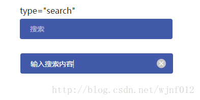
6、type=”search”
.input-wrap input[type="search"]{
    width: 300px;
    height: 40px;
    font-size: 14px;
    color: #ffffff;
    border: none;
    padding: 10px 0 10px 20px ;
    background: #4359aa;
}
.input-wrap input[type="search"]::-webkit-input-placeholder{
    font-size: 14px;
    color: rgba(255,255,255,0.6);
}
.input-wrap input[type="search"]::-webkit-search-cancel-button{
    -webkit-appearance: none;/*去掉默认样式*/
    width: 40px;
    height: 40px;
    background: url(icon-cancel.png) no-repeat center;
    background-size: 18px 18px;
}<div class="input-wrap">
<!--
在移动端点击输入框时弹出的默认键盘为中文
-->
<!--
属性有:
autocomplete / autofocus / defaultValue / disabled /
form / list / maxLength / name / pattern /
palceholder / readOnly / required / size /
-->
<form action="#">
<input type="search" placeholder="搜索" />
</form>
</div>效果:
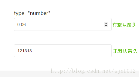
7、type=”number”
/*number*/
.input-wrap input[type="number"]{
    width: 300px;
    height: 20px;
    border: 1px solid #e8e8e8;
    font-size: 14px;
    color: #222222;
    padding: 10px;
    -moz-appearance: textfield;/*firefox上去掉箭头*/
}
/*去掉默认的箭头*/
.input-wrap input[type="number"]::-webkit-outer-spin-button,
.input-wrap input[type="number"]::-webkit-inner-spin-button{
    -webkit-appearance: none;
}<div class="input-wrap">
<!--
在移动端点击输入框时弹出的默认键盘为数字键盘
与type="tel"的区别是,tel没有箭头,number有箭头
-->
<!--
属性:
autocomplete / autofocus / defaultValue / disabled / form / list / name / placeholder / readOnly / required / step / type / value
labels:返回number字段的标签元素列表
max:设置或返回number字段的max属性值
min:设置或返回number字段的min属性值
step:可以设置number的精确度,默认为整数,例如:两位小数step="0.01"
-->
<input type="number" step="0.01" />
</div>效果:
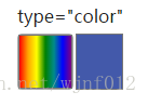
8、type=”color”
.input-wrap input[type="color"]{
    position: relative;
    width: 50px;
    height: 50px;
}
.input-wrap input[type="color"]::-webkit-color-swatch-wrapper{
    border: 1px solid #777777;
    background: -webkit-gradient(linear,0 0,100% 0,from(red),
                color-stop(15%,orange),
                color-stop(30%,yellow),
                color-stop(50%,green),
                color-stop(65%,darkcyan),
                color-stop(80%,blue),
                to(purple));/*old webkit*/
    background: -webkit-linear-gradient(left,red,orange,yellow,green,darkcyan,blue,purple);/*new webkit*/
    background: -moz-linear-gradient(left,red,orange,yellow,green,darkcyan,blue,purple);/*mozilla*/
    background: -o-linear-gradient(left,red,orange,yellow,green,darkcyan,blue,purple);/*opera11.0*/
}
.input-wrap input[type="color"]::-webkit-color-swatch{
    position:relative;
    left: 50px;
    top:-6px;
    height:50px;
}<div class="input-wrap">
<!--
***h5新增
autocomplete:设置或者返回拾色器的autocomplete属性
autofocus:设置或返回在页面加载时拾色器是否获取焦点
defaultValue:设置或返回拾色器默认的值
disabled:设置或返回拾色器是否可用
form:返回包含拾色器的form表单引用
list:返回包含拾色器的datalist引用
name:设置或者返回拾色器name属性值
type:返回拾色器的表单元素类型
value:设置或者返回拾色器的value属性值
-->
<input type="color" value="#4359aa" />
</div>效果:
9、type=”range”
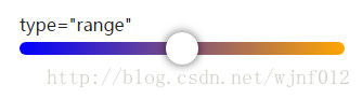
.input-wrap input[type="range"]{
    -webkit-appearance: none;
    width: 300px;
    height: 12px;
    border-radius: 15px;
    background: red;
    background: -webkit-linear-gradient(left,blue,orange);
}
.input-wrap input[type="range"]::-webkit-slider-runnable-track{
    height: 30px;
}
.input-wrap input[type="range"]::-webkit-slider-thumb{
    -webkit-appearance: none;
    height: 30px;
    width: 30px;
    background: #ffffff;
    border-radius: 100%;
    box-shadow: 0 0 10px 1px rgba(0,0,0,0.5);
}<div class="input-wrap">
<!--
属性:
form / disabled / list / autocomplete / name / type
max:设置或返回滑块控件的最大值
min:设置或返回滑块空间的最小值
step:设置或返回每次拖动滑块控件时的递增量
value:设置或返回滑块控件的value属性值
defaultValue:设置或返回滑块控件的默认值
autofocus:设置或返回滑块控件在页面加载后是否应自动获取焦点
-->
<input type="range" />
</div>默认效果:
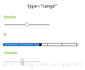
修改效果:
10、type=”hidden”
<input type="hidden" />隐藏域在页面中是不可见的,在表单插入隐藏域的目的是在于收集和发送信息,以利于被处理表单的程序所使用。
详细可查看:表单元素input type=”hidden”的作用
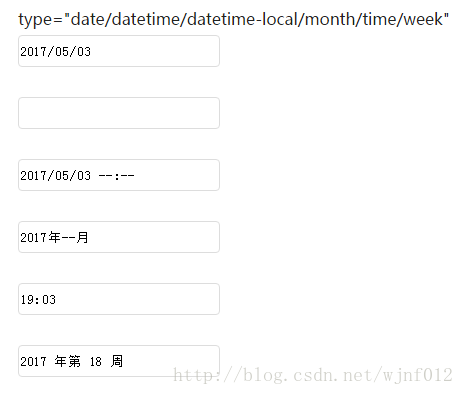
11、type=”date/datetime/datetime-local/month/time/week”
.input-time input{
    width: 200px;
    height: 30px;
    border: 1px solid #dddddd;
}
.input-wrap input[type="date"]::-webkit-outer-spin-button,
.input-wrap input[type="date"]::-webkit-inner-spin-button{
    -webkit-appearance: none;
}<div class="input-wrap input-time">
<p>type="date/datetime/datetime-local/month/time/week"</p>
<!--
在移动端使用:
date:年-月-日
datetime:年-月-日 时:分
datetime-local:年-月-日 时:分
month:年-月
time:时:分
week:年-W21
-->
<input type="date" />
<input type="datetime" />
<input type="datetime-local" />
<input type="month" />
<input type="time" />
<input type="week" />
</div>效果:


 2万+
2万+


 被折叠的 条评论
为什么被折叠?
被折叠的 条评论
为什么被折叠?
 到【灌水乐园】发言


