


android 拨号盘Contacts讲解(四)
1. 拨号盘最底部控制栏 讲解,如图所示:
2. 界面布局,通过dialpad_additional_buttons.xml文件,这是展讯代码,Mtk一样,
路径:packages/apps/Contacts/res/layout/
主要涉及到了三个ImageButton , 2个view 的横向布局排列,以下布局xml文件代码。
<LinearLayout xmlns:android="http://schemas.android.com/apk/res/android"
android:id="@+id/dialpadAdditionalButtons"
android:layout_width="match_parent"
android:layout_height="@dimen/dialpad_additional_buttons_height"
android:layout_alignParentBottom="true"
android:layout_gravity="center_horizontal"
android:layout_weight="@integer/dialpad_layout_weight_additional_buttons"
android:background="#000000"
android:orientation="horizontal" >
<LinearLayout
android:layout_width="match_parent"
android:layout_height="match_parent"
android:background="@drawable/dialpad_background"
android:orientation="horizontal" >
<ImageButton
android:id="@+id/videoButton" ------这个是视频通话
android:layout_width="0px"
android:layout_height="match_parent"
android:layout_gravity="center_vertical"
android:layout_weight="0.30"
android:background="?android:attr/selectableItemBackground"
android:contentDescription="@string/description_search_button"
android:src="@drawable/video_call"
android:state_enabled="false" />
<View android:id="@+id/after_dialButton_divider"
android:layout_width="1dip"
android:layout_height="24dip"
android:layout_gravity="center_vertical"
android:background="?android:attr/dividerVertical" />
<ImageButton
android:id="@+id/dialButton" --------拨号功能按钮
android:layout_width="0px"
android:layout_height="match_parent"
android:layout_gravity="center_vertical"
android:layout_weight="0.40"
android:background="@drawable/btn_call"
android:contentDescription="@string/description_dial_button"
android:src="@drawable/ic_dial_action_call"
android:state_enabled="false" />
<Button android:id="@+id/dialButtonEcc" ------- 紧急拨号按钮
android:layout_width="80dp"
android:layout_weight="0.4"
android:layout_height="match_parent"
android:layout_gravity="center_vertical"
android:text="@string/emergencycall_ext"
android:state_enabled="false"
android:background="@drawable/btn_dial_ecc"/>
<View
android:layout_width="1dip"
android:layout_height="24dip"
android:layout_gravity="center_vertical"
android:background="?android:attr/dividerVertical" />
<ImageButton
android:id="@+id/deleteButton" --------删除输入框删除按钮
android:layout_width="0px"
android:layout_height="match_parent"
android:layout_gravity="center_vertical"
android:layout_weight="0.30"
android:background="?android:attr/selectableItemBackground"
android:contentDescription="@string/description_delete_button"
android:src="@drawable/ic_dial_action_delete"
android:state_enabled="false" />
</LinearLayout>
</LinearLayout>
注意到:简单的两个图片,怎么这么多组件,这样分清了:
是否存在sim卡等情况了,在没有sim卡时,显示如图,有sim卡时,就不同了,同时,注意到组件中属性
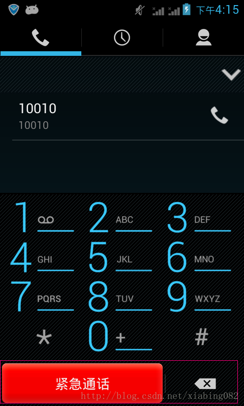
3. 当没有sim卡时,紧急拨号状态中,如图:
使用的是,<Button android:id="@+id/dialButtonEcc">这个组件,
*属性:android:layout_weight="0.4",作为图片显示比例。
layout_weight使用:
layout_weight 用于给一个线性布局中的诸多视图的重要度赋值。所有的视图都有一个layout_weight值,默认为零,意思是需要显示多大的视图就占据多大的屏幕空间。比如:
如果两个文本编辑元素每一个的layout_weight值都设置为1,则两者平分
在父视图布局剩余的宽度(因为我们声明这两者的重要度相等)。如果两个文本编辑元素其中第一个的layout_weight值设置为1,而第二个的设置为2,则剩余空间的三分之一分给第一个,三分之二分给第二个(数值越大,重要度越高)。
而在本界面中,看到Button设置为0.4 而最后一个ImageButto为0.3,显示比例大小可见。
*属性:android:state_enabled :设置是否响应事件,指所有事件
*属性:android:background="@drawable/btn_dial_ecc”
作为一个selector使用。在btn_dial_ecc.xml中:
<selector xmlns:android="http://schemas.android.com/apk/res/android">
<!-- Enabled views -->
<item android:state_pressed="true"
android:drawable="@drawable/incall_menu_background_c_select" />
<item android:state_focused="true"
android:drawable="@drawable/incall_menu_background_c_select" />
<item
android:drawable="@drawable/incall_menu_background_c" />
</selector>
待续.......


 165
165


 被折叠的 条评论
为什么被折叠?
被折叠的 条评论
为什么被折叠?
 到【灌水乐园】发言


