


转载请注明出处:http://blog.csdn.net/xuejinwei0530/article/details/46273573
翻译自:http://android-developers.blogspot.jp/2015/05/android-design-support-library.html
本人首次翻译,欢迎批评指正。
- 前言
- 开始
Android 5.0棒棒糖是有史以来最重要的Android版本之一,在很大程度上由于一个新的设计语言Material Design的引入,刷新整个安卓系统的体验。我们的详细介绍是一个学习适配material design的好地方。但是我们知道,对于开发人员来说他也是一个挑战,特别是向下兼容方面。从新的Android Design Support Library(android设计支持库)带来一点小的帮助:我们带来了一些重要的Material Design组件给所有开发者,兼容Android 2.1和以上的设备。你会发现一个Navigation View(导航抽屉组件),floating labels for editing text(浮动标签用于编辑文本), a floating action button(浮动操作按钮), snackbar, tabs,将这些控件结合起来的 一个手势和滚动框架。
- Navigation View
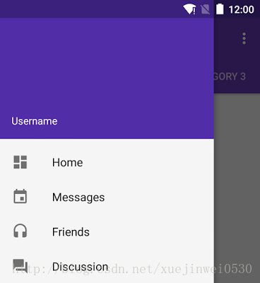
你使用NavigationView作为DrawerLayout抽屉里内容视图布局如下:
<span style="font-size:14px;"><android.support.v4.widget.DrawerLayout
        xmlns:android="http://schemas.android.com/apk/res/android"
        xmlns:app="http://schemas.android.com/apk/res-auto"
        android:layout_width="match_parent"
        android:layout_height="match_parent"
        android:fitsSystemWindows="true">

    <!-- your content layout -->

    <android.support.design.widget.NavigationView
            android:layout_width="wrap_content"
            android:layout_height="match_parent"
            android:layout_gravity="start"
            app:headerLayout="@layout/drawer_header"
            app:menu="@menu/drawer"/>
</android.support.v4.widget.DrawerLayout>
</span>
你会注意到两个NavigationView的属性:
app:headerLayout 控制用于标题的布局(可选)
app:menu 导航列的菜单资源文件(也可以在运行时更新)
NavigationView 处理好了和状态栏的关系,确保您的NavigationView 与状态栏在API21+设备上正确进行交互。
最简单的抽屉资源是几个可点击菜单项的集合如下:
<span style="font-size:14px;"><group android:checkableBehavior="single">
    <item
        android:id="@+id/navigation_item_1"
        android:checked="true"
        android:icon="@drawable/ic_android"
        android:title="@string/navigation_item_1"/>
    <item
        android:id="@+id/navigation_item_2"
        android:icon="@drawable/ic_android"
        android:title="@string/navigation_item_2"/>
</group></span>你也可以在menu中使用subheaders为菜单分组:
<span style="font-size:14px;"><item
    android:id="@+id/navigation_subheader"
    android:title="@string/navigation_subheader">
    <menu>
        <item
            android:id="@+id/navigation_sub_item_1"
            android:icon="@drawable/ic_android"
            android:title="@string/navigation_sub_item_1"/>
        <item
            android:id="@+id/navigation_sub_item_2"
            android:icon="@drawable/ic_android"
            android:title="@string/navigation_sub_item_2"/>
    </menu>
</item></span>
你可以通过设置OnNavigationItemSelectedListener 使用setNavigationItemSelectedListener(),来获得元素被点击的回调事件。 这提供了被点击的菜单元素,让您处理选择事件,改变复选框状态,加载新的内容,代码关闭抽屉,或你可能希望的任何其它操作。
- Floating labels for editing text
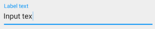
除了可以显示输入提示,你也可以通过setError()在EditText下面显示错误信息。
作者提示:效果类似wrapp/floatlabelededittext 如下图:
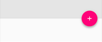
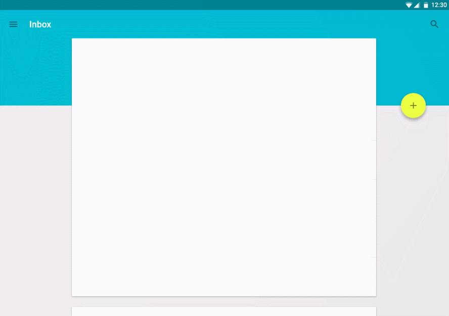
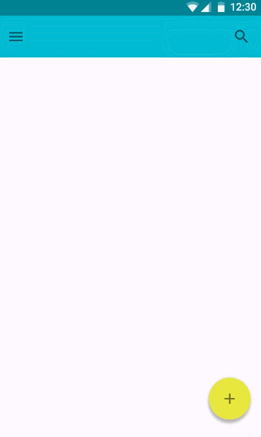
- Floating Action Button
- Snackbar
Snackbar因为包含了可以与之交互的滑动删除与操作按钮,snackbar被看作是比toast更强大的快速反馈机制。你会发现Snackbar的API是相当熟悉的:
<span style="font-size:14px;">Snackbar
  .make(parentLayout, R.string.snackbar_text, Snackbar.LENGTH_LONG)
  .setAction(R.string.snackbar_action, myOnClickListener)
.show(); // 不要忘记show出来!</span>- Tabs(TabLayout普通的可滑动的 Tab)

TabLayout既实现固定的标签,tab的宽度是平均分配的在所有tabs中。也实现了滚动tabs,tabs的宽度并不是统一的,可以水平滚动的,可以在代码中实现添加tabs的:
<span style="font-size:14px;">TabLayout tabLayout = ...;
tabLayout.addTab(tabLayout.newTab().setText("Tab 1"));</span>然而,如果您使用的是ViewPager水平之间横向切换,您可以创建直接从你的标签PagerAdapter的getPageTitle() 中创建tabs,后连使用setupWithViewPager()将二者联系起来。 它可以使tab的选中事件能更新ViewPager,同时ViewPager的页面改变能更新tab的选中状态。
- CoordinatorLayout,手势,and 滚动(CoordinatorLayout:全新,更加彪悍的 FrameLayout)
- CoordinatorLayout,和悬浮操作按钮
- CoordinatorLayout and the app bar
AppBarLayout(全新的用来实现各种Material Design概念效果的一个Layout,主要负责对滑动的响应)让你的Toolbar和其他视图(例如:TabLayout提供的tabs)能够相应标记了ScrollingViewBehavior的view的滚动事件。因此,你可以创建一个布局,如下:
<span style="font-size:14px;"><android.support.design.widget.CoordinatorLayout
        xmlns:android="http://schemas.android.com/apk/res/android"
        xmlns:app="http://schemas.android.com/apk/res-auto"
        android:layout_width="match_parent"
        android:layout_height="match_parent">

     <! -- Your Scrollable View -->
    <android.support.v7.widget.RecyclerView
            android:layout_width="match_parent"
            android:layout_height="match_parent"
            app:layout_behavior="@string/appbar_scrolling_view_behavior" />

    <android.support.design.widget.AppBarLayout
            android:layout_width="match_parent"
            android:layout_height="wrap_content">
   <android.support.v7.widget.Toolbar
                  ...
                  app:layout_scrollFlags="scroll|enterAlways">

        <android.support.design.widget.TabLayout
                  ...
                  app:layout_scrollFlags="scroll|enterAlways">
     </android.support.design.widget.AppBarLayout>
</android.support.design.widget.CoordinatorLayout></span>现在,当用户滚动RecyclerView时候,AppBarLayout可以这样响应滚动事件:根据子view的滚动标志(scroll flag)来控制它们如何进入(滚入屏幕)与退出(滚出屏幕)。
- Collapsing Toolbars 可伸缩折叠的Toolbar
CollapsingToolbarLayout:
<span style="font-size:14px;"><android.support.design.widget.AppBarLayout
        android:layout_height="192dp"
        android:layout_width="match_parent">
    <android.support.design.widget.CollapsingToolbarLayout
            android:layout_width="match_parent"
            android:layout_height="match_parent"
            app:layout_scrollFlags="scroll|exitUntilCollapsed">
        <android.support.v7.widget.Toolbar
                android:layout_height="?attr/actionBarSize"
                android:layout_width="match_parent"
                app:layout_collapseMode="pin"/>
        </android.support.design.widget.CollapsingToolbarLayout>
</android.support.design.widget.AppBarLayout></span>这个设置使用CollapsingToolbarLayout的app:layout_collapseMode="pin"确保Toolbar本身在折叠的时候仍然固定在屏幕的顶端。更好的是,当你一起使用CollapsingToolbarLayout和Toolbar的时候,toolbar的title在展开的时候会自动变大,而折叠的时候让文字自动过度到默认的大小。注意,在这种情况下你应该setTitle()在CollapsingToolbarLayout上而不是ToolBar自己。
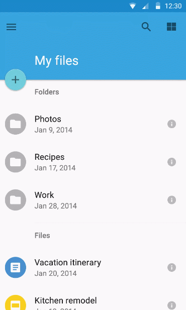
除了钉住View,你可以使用app:layout_collapseMode+"parallax"(可选app:layout_collapseParallaxMultiplier="0.7"设置视差参数)实现视差滚动效果(下图所示的ImageView在CollapsingToolbarLayout中)。)。这个漂亮的例子使用了app:contentScrim="?attr/colorPrimary"属性在CollapsingToolbarLayout视图中,添加一个完整的渐变效果。如下图:

- CoordinatorLayout 与自定义view
- 现在如何使用
<span style="font-size:14px;">compile 'com.android.support:design:22.2.0'</span>注意:新的设计类库依赖于support V4 和AppCompat Support Libraries,这些当您添加设计库的依赖关系时自动包含在内。我们也十分小心,这些新的部件是可用在Android Studio Layout Editor’s Design (布局编辑器)的设计视图(找到他们在CustomView下),给你一个更简单的方式来预览其中的一些新的部件。
The Design library, AppCompat,和所有的Android Support Library 重要的工具用来构建一个现代的、漂亮的Android应用程序,不用一切从头开始。


 9966
9966


 被折叠的 条评论
为什么被折叠?
被折叠的 条评论
为什么被折叠?
 到【灌水乐园】发言


