


先看看效果图:
下边的是底部四个tab效果,一般app都有这个效果,是用tablayout 实现的,没什么好说的,主要是看下布局,可以看到往上拉,顶部appbar有部分隐藏掉了,而此时底部不在滑动布局中,布局如下:
<?xml version="1.0" encoding="utf-8"?>
<RelativeLayout xmlns:android="http://schemas.android.com/apk/res/android"
    xmlns:app="http://schemas.android.com/apk/res-auto"
    xmlns:tools="http://schemas.android.com/tools"
    android:layout_width="match_parent"
    android:layout_height="match_parent"
    android:fitsSystemWindows="true"
    tools:context="com.example.administrator.myapplication.activity.mio.MioActivity">

    <android.support.design.widget.AppBarLayout
        android:id="@+id/appbar"
        android:layout_width="match_parent"
        android:layout_height="wrap_content"
        android:theme="@style/AppTheme.AppBarOverlay"
        android:visibility="gone">

        <android.support.v7.widget.Toolbar
            android:id="@+id/toolbar"
            android:layout_width="match_parent"
            android:layout_height="?attr/actionBarSize"
            android:background="?attr/colorPrimary"
            app:layout_scrollFlags="scroll|enterAlways"
            app:popupTheme="@style/AppTheme.PopupOverlay" />

    </android.support.design.widget.AppBarLayout>

    <android.support.design.widget.TabLayout
        android:id="@+id/tab_layout"
        android:layout_width="match_parent"
        android:layout_height="50dp"
        android:layout_alignParentBottom="true"
        android:background="@color/colorPrimary"
        app:tabGravity="fill"
        app:tabIndicatorHeight="0dp"
        app:tabMode="fixed"
        app:tabSelectedTextColor="#FF4081"
        app:tabTextColor="#000"></android.support.design.widget.TabLayout>

    <android.support.v4.view.ViewPager
        android:id="@+id/my_viewPager"
        android:layout_width="match_parent"
        android:layout_height="match_parent"
        android:layout_above="@id/tab_layout" />
</RelativeLayout>
滚动的部分放在fragment中去,viewpager实现核心代码如下:
private void init_viewpager() {
viewPager = (ViewPager) findViewById(R.id.my_viewPager);
tabLayout = (TabLayout) findViewById(R.id.tab_layout);
viewPager.setAdapter(new FragmentPagerAdapter(getSupportFragmentManager()) {
@Override
public Fragment getItem(int position) {
if (position == 1) {
return new TwoFragment();
} else if (position == 2) {
return new ThreeFragment();
} else if (position == 3) {
return new FourFragment();
}
return oneFragment;
}
@Override
public int getCount() {
return mTitles.length;
}
@Override
public CharSequence getPageTitle(int position) {
return mTitles[position];
}
});
tabLayout.setupWithViewPager(viewPager);
one = tabLayout.getTabAt(0);
two = tabLayout.getTabAt(1);
three = tabLayout.getTabAt(2);
four = tabLayout.getTabAt(3);
one.setIcon(getResources().getDrawable(R.mipmap.damenkou1));
one.setText(mTitles[0]);
two.setIcon(getResources().getDrawable(R.mipmap.damenkou1));
two.setText(mTitles[1]);
three.setIcon(getResources().getDrawable(R.mipmap.damenkou1));
three.setText(mTitles[2]);
four.setIcon(getResources().getDrawable(R.mipmap.damenkou1));
four.setText(mTitles[3]);
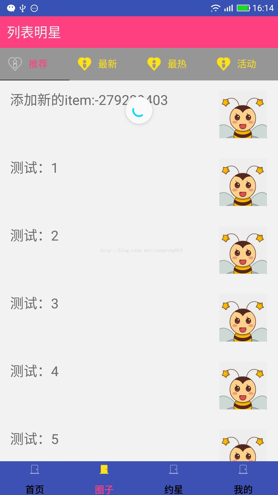
}接着看圈子fragment 的实现吧,主要是一些材料设计控件的使用:
<android.support.design.widget.CoordinatorLayout xmlns:android="http://schemas.android.com/apk/res/android"
    xmlns:app="http://schemas.android.com/apk/res-auto"
    xmlns:tools="http://schemas.android.com/tools"
    android:layout_width="match_parent"
    android:layout_height="match_parent"
    android:fitsSystemWindows="true"
    tools:context="com.example.administrator.myapplication.activity.mio.TwoFragment">

    <android.support.design.widget.AppBarLayout
        android:id="@+id/appbar"
        android:layout_width="match_parent"
        android:layout_height="wrap_content"
        android:theme="@style/ThemeOverlay.AppCompat.Dark.ActionBar"
        app:elevation="0dp">

        <TextView
            android:id="@+id/fagment2_text"
            android:layout_width="match_parent"
            android:layout_height="wrap_content"
            android:background="@color/colorAccent"
            android:padding="10dp"
            android:text="列表明星"
            android:textColor="@color/black_bg"
            android:textSize="20sp"
            app:layout_scrollFlags="scroll|enterAlways" />

    </android.support.design.widget.AppBarLayout>

    <LinearLayout
        android:layout_width="match_parent"
        android:layout_height="match_parent"
        android:orientation="vertical"
        app:layout_behavior="@string/appbar_scrolling_view_behavior">

        <android.support.design.widget.TabLayout
            android:id="@+id/circle_tab_layout"
            android:layout_width="match_parent"
            android:layout_height="wrap_content"
            android:background="@color/black_overlay"
            app:tabGravity="fill"
            app:tabIndicatorColor="@color/black_title"
            app:tabIndicatorHeight="1dp"
            app:tabMode="fixed"></android.support.design.widget.TabLayout>


        <android.support.v4.view.ViewPager
            android:id="@+id/circle_viewPager"
            android:layout_width="match_parent"
            android:layout_height="match_parent"
            android:layout_below="@id/circle_tab_layout" />
    </LinearLayout>
    >
</android.support.design.widget.CoordinatorLayout>
app:layout_scrollFlags="scroll|enterAlways" app:layout_behavior="@string/appbar_scrolling_view_behavior"
第一行代码说明该控件是联动的,当往上拉动时他会被隐藏,第二行是说明那个控件和这个控件进行联动
可以看到tablayout 图片在左侧,其实tab是可以自定义的,只是个布局而已,实现核心代码:
tabLayout.setupWithViewPager(viewPager);
LayoutInflater mLayoutInflater = getActivity().getLayoutInflater();
for (int i = 0; i < 4; i++) {
TabLayout.Tab tab = tabLayout.getTabAt(i);
View view = mLayoutInflater.inflate(R.layout.circle_tab, null);
TextView text = (TextView) view.findViewById(R.id.tv);
text.setText(mTitles[i]);
ImageView image = (ImageView) view.findViewById(R.id.iv);
image.setImageResource(tabIcons[i]);
tab.setCustomView(view);
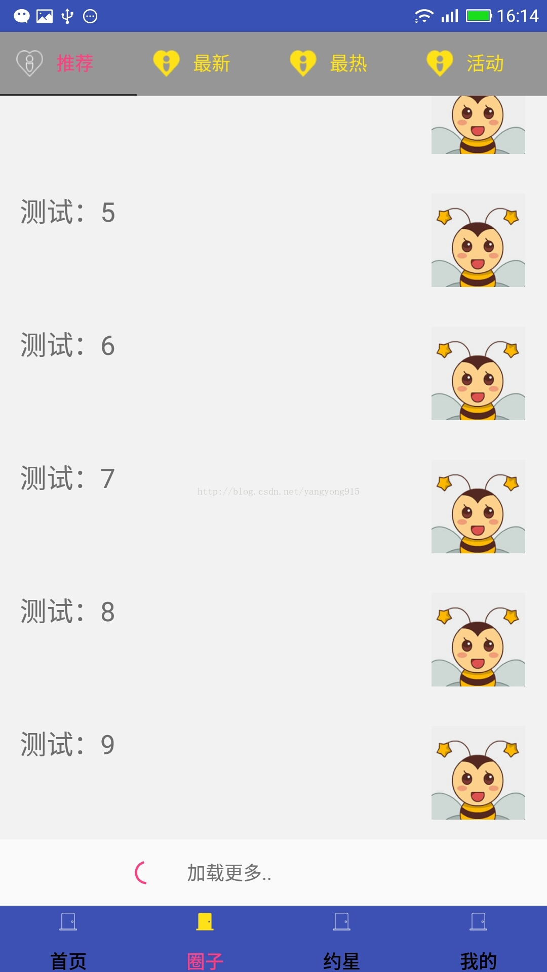
}接下来就是如何实现下拉刷新和上拉加载啦,其实大家可以看到下拉就是官方的 SwipeRefreshLayout控件, 但官方并没有给出上拉加载的实现,需要我们自己去实现,这里我走了个捷径,在洪洋大神的recycleview万能适配器里就有相关的实现,推荐大家使用,大量节省去写adapter的开发时间
adapter = new CommonAdapter<String>(getActivity(), R.layout.lv_item, data) {
            @Override
            protected void convert(ViewHolder holder, String text, int position) {
                holder.setText(R.id.lv_text, text);
            }
        };
        //添加footer
        loadMoreWrapper = new LoadMoreWrapper(adapter);
        loadMoreWrapper.setLoadMoreView(R.layout.footer_view);
        loadMoreWrapper.setOnLoadMoreListener(new LoadMoreWrapper.OnLoadMoreListener() {
            @Override
            public void onLoadMoreRequested() {
                new Handler().postDelayed(new Runnable() {
                    @Override
                    public void run() {
                        for (int i = 0; i < 10; i++) {
                            data.add("load more:" + i);
                        }
                        loadMoreWrapper.notifyDataSetChanged();

                    }
                }, 2000);
            }
        });
recyclerView.setAdapter(loadMoreWrapper);最后添加上项目下载的git地址:
https://github.com/yangyong915/app
这个里面包含了一些其他东西,如果你感兴趣,也可以去研究一些其他模块,谢谢!


 1336
1336


 被折叠的 条评论
为什么被折叠?
被折叠的 条评论
为什么被折叠?
 到【灌水乐园】发言


