


padding和margin属性在开发中十分常用,padding意为“填充”,一般用来在控件内部填充布局,而margin意为“边缘”,一般指的是控件外部距父控件的距离,可以结合下面的图片来理解,如图3.9所示。

图3.9 Android 布局示意图
图中序号如表3.1所示。
表3.1 Android布局示意图含义表

3.2.1 Android padding属性用法
下面通过一个实例来看一下这些属性的用法,首先看一下padding属性的用法:
<?xml version="1.0" encoding="utf-8"?>
<LinearLayout xmlns:android="http://schemas.android.com/apk/res/android"
    android:layout_width="match_parent"
    android:layout_height="match_parent"
    android:orientation="vertical">

    <TextView
        android:layout_width="wrap_content"
        android:layout_height="wrap_content"
        android:background="#96e25f"
        android:paddingBottom="80dp"
        android:paddingLeft="20dp"
        android:paddingRight="60dp"
        android:paddingTop="40dp"
        android:text="Hello World!" />
</LinearLayout>
为TextView控件添加了四个相关的padding属性,并设置了不同的属性值,为了方便观察还为用来演示的TextView控件添加了背景色(设置了background属性),查看Android Studio的预览窗口即可实时查看效果图,如图3.10所示。
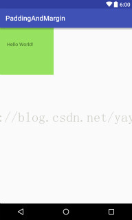
图3.10 Android Padding属性示意图
可以看出,和设置属性值一致,左上右下四个方向的padding值依次变大。
3.2.2 Android margin属性用法
下面看一下margin属性的用法:
<?xml version="1.0" encoding="utf-8"?>
<LinearLayout xmlns:android="http://schemas.android.com/apk/res/android"
    android:layout_width="match_parent"
    android:layout_height="match_parent"
    android:orientation="vertical">

    <TextView
        android:layout_width="wrap_content"
        android:layout_height="wrap_content"
        android:layout_marginLeft="10dp"
        android:layout_marginTop="30dp"
        android:background="#96e25f"
        android:paddingBottom="80dp"
        android:paddingLeft="20dp"
        android:paddingRight="60dp"
        android:paddingTop="40dp"
        android:text="Hello World!" />
</LinearLayout>
由于LinearLayout中控件默认在左上角显示,所以这里添加了两个margin属性,分别是layout_marginLeft(距左边界的距离)和layout_marginTop(距上边界的距离),效果如图3.11所示。

图3.11 Android Margin属性示意图一
修改代码如下:
<?xml version="1.0" encoding="utf-8"?>
<LinearLayout xmlns:android="http://schemas.android.com/apk/res/android"
    android:layout_width="match_parent"
    android:layout_height="match_parent"
    android:gravity="bottom|right"
    android:orientation="vertical">

    <TextView
        android:layout_width="wrap_content"
        android:layout_height="wrap_content"
        android:layout_marginBottom="30dp"
        android:layout_marginRight="10dp"
        android:background="#96e25f"
        android:paddingBottom="80dp"
        android:paddingLeft="20dp"
        android:paddingRight="60dp"
        android:paddingTop="40dp"
        android:text="Hello World!" />
</LinearLayout>
为了查看layout_marginBottom(距离底部边界)和layout_marginRight(距离右部边界)的效果,这里为LinearLayout添加了gravity属性并设置其值为bottom|right(控件将置于右下角),再次查看预览窗口,如图3.12所示。

图3.12 Android Margin属性示意图二
可以看出TextView位于右下角,距离其父布局边界底部边界30dp,距离父布局右边边界10dp。
当然除了上面的指定具体“上下左右”边界的值,还提供了padding和layout_margin属性,这时“上下左右”都是相同的值了,下面通过一个实例看一下这两个属性的效果:
<?xml version="1.0" encoding="utf-8"?>
<LinearLayout xmlns:android="http://schemas.android.com/apk/res/android"
    android:layout_width="match_parent"
    android:layout_height="match_parent"
    android:orientation="vertical">

    <TextView
        android:layout_width="wrap_content"
        android:layout_height="wrap_content"
        android:layout_margin="40dp"
        android:background="#96e25f"
        android:padding="40dp"
        android:text="TextView1" />
</LinearLayout>
为TextView添加了padding属性为40dp,这时候TextView的“上下左右”内间距相同,都为40dp;为TextView添加了layout_margin属性并设置了其值为40dp,这时距左边距40dp,距上边距40dp,效果如图3.13所示。

图3.13 Android Margin属性示意图三
可以看出,此时TextView控件距离模拟器的上边界和左边界的距离都相同了,且TextView里的文字位于TextView正中了。
再次修改下代码为:
<?xml version="1.0" encoding="utf-8"?>
<LinearLayout xmlns:android="http://schemas.android.com/apk/res/android"
    android:layout_width="match_parent"
    android:layout_height="match_parent"
    android:gravity="bottom|right"
    android:orientation="vertical">

    <TextView
        android:layout_width="wrap_content"
        android:layout_height="wrap_content"
        android:layout_margin="40dp"
        android:background="#96e25f"
        android:padding="40dp"
        android:text="TextView1" />
</LinearLayout>
为LinearLayout添加了gravity属性其值为bottom|right(右下),这时显示效果如图3.14所示。
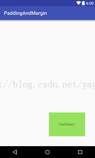
图3.14 Android Margin属性示意图四
可以看出,此时TextView距离模拟器底边界和右边界距离相同了。
如果你喜欢作者的文章,还可以购买他的书(京东自营):


 扫一扫
扫一扫
 1万+
1万+

 被折叠的 条评论
为什么被折叠?
被折叠的 条评论
为什么被折叠?
 到【灌水乐园】发言


