


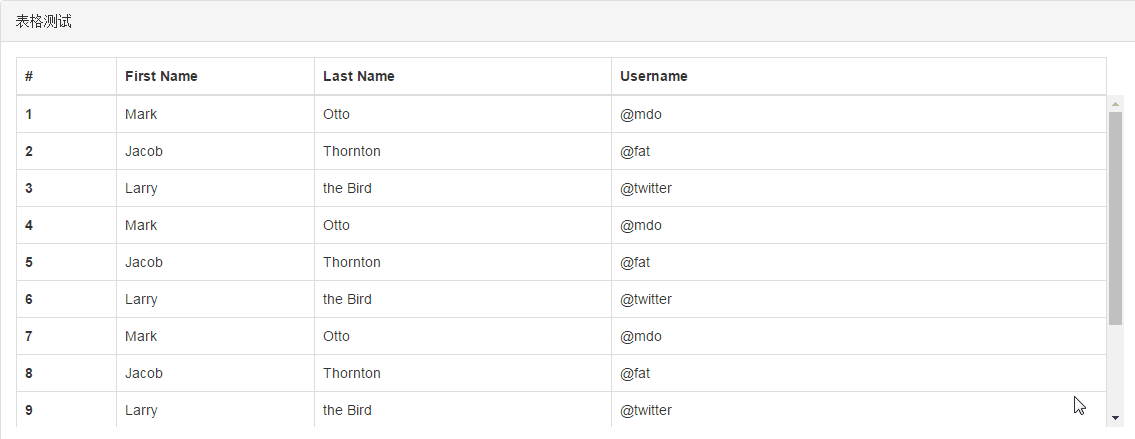
产品要求表格的表头固定,而内容在超出table的高度后,还能自由滚动,如下所示。
直觉的感受是修改thead与tbody,尝试了以下几种方法,但均告失败。
1. 将tbody设置为块状元素,然后设置表格的高度与溢出;
1. 将thead设置为绝对定位,然后设置表格的高度与溢出;
1. 将表格转换为块状元素,然后把有td都设置为浮动,从而控制高度与溢出;
原因都是彻底破坏了表格的布局,导致元素的排序、大小都彻底混乱了,完全没有发挥表格的优势,后来经过思考,决定采用拼接法,步骤如下:
1. 创建表格容器
1. 创建表头容器,留出滚动条位置,插入表头;
1. 创建表格内容容器,插入表格内容;
DOM结构的相关HTML代码如下:
<!-- 表格容器,可用于设置整个的边框及高度 -->
<div class="sti-tbl-container">
    <!-- 表头容器,必须留出17px的滚动条位置 -->
    <div class="sti-tbl-header" style="padding-right:17px;">
        <table class="table table-bordered" style="margin-bottom: 0px;border-bottom-style: none;">
            <tr>
                <th style="width : 10%;">#</th>
                <th  style="width : 20%;">First Name</th>
                <th  style="width : 30%;">Last Name</th>
                <th  style="width : 50%;">Username</th>
            </tr>
        </table>
    </div>
    <!-- 表格内容容器-->
    <div class="sti-tbl-body">
        <table class="table table-bordered">
            <tbody>
                <tr>
                    <th scope="row" style="width : 10%;">1</th>
                    <td style="width : 20%;">Mark</td>
                    <td style="width : 30%;">Otto</td>
                    <td style="width : 50%;">@mdo</td>
                </tr>
            </tbody>
        </table>
    </div>
</div>
表格的CSS代码如下:
/* 表格容器样式,用flex布局可保证table内容能铺满剩余空间 */
.sti-tbl-container {
    height : 100%;
    overflow : hidden;
    display : flex;
    flex-direction: column;
}
/* 设置表格的布局方式,用于宽度对齐 */
.sti-tbl-body>table, .sti-tbl-header>table {
    table-layout: fixed;
}
/* 设置表格内容容器,用于铺满整个剩余空间 */
.sti-tbl-container .sti-tbl-body {
    flex-grow : 1;
    overflow-y : scroll;
}


 扫一扫
扫一扫
 1396
1396

 被折叠的 条评论
为什么被折叠?
被折叠的 条评论
为什么被折叠?
 到【灌水乐园】发言


