


前言
光看题目,估计有人已经忍不住吐槽了:尼玛,TextView 这么简单的控件,还有什么高级用法吗?放在以前,我也会这么想,但是随着开发经验的积累,我愈发觉得 TextView 简直就是一座宝藏,里面有很多宝贝值得研究。
本文基于 @Chiuki 的讲座,并结合我自己的经验整理而成。
文章中的大部分图片和代码均摘自讲稿,感谢原作者的分享。
Compound Drawable
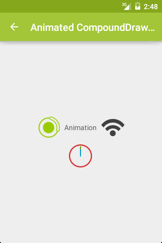
如下图1中的效果,我们可以用 LinearLayout 里面嵌套 ImageView 和 TextView 实现,也可以只用一个带 Drawable 的 TextView 做到。
<TextView
  android:layout_width="wrap_content"
  android:layout_height="wrap_content"
  android:text="@string/animation"
  android:drawablePadding="1dp"
  android:drawableLeft="@drawable/rotating_loading"
  android:drawableRight="@drawable/animated_wifi"
  android:drawableBottom="@drawable/animated_clock"/>
相比而言,后者 View 个数更少,层级更少,是优化层级的常用方法。
我们可以通过 drawablePadding 属性来调整图片资源和文字间的间距。但是,在 xml 中,没有对应的属性去调整图片的大小,也就是说,图片会按照原始尺寸进行展示,而没有 ImageView 的各种 ScaleType 可选,除非在 Java 代码中使用 setCompoundDrawables() 方法,或者使用自定义 View。使用 setCompoundDrawables() 控制图片尺寸的用法如下:
        Drawable drBottom = getResources().getDrawable(R.mipmap.hi);
        // drBottom.setBounds(0, 0, 200, 200);
        drBottom.setBounds(0, 0, drBottom.getIntrinsicWidth(), drBottom.getIntrinsicHeight());
        textView.setCompoundDrawablePadding(3);
        textView.setCompoundDrawables(null, null, null, drBottom);
而且,这里的 Drawable 不仅仅是图片,还可以是动画等资源文件,以此达到动画效果,如图2:

关键代码:
AnimatedRotateDrawable
<!-- res/drawable/rotating_loading.xml -->
<animated-rotate
  android:pivotX="50%"
  android:pivotY="50%"
  android:drawable="@drawable/ic_loading"
  android:duration="500" />
AnimationDrawable
<!-- res/drawable/animated_wifi.xml -->
<animation-list>
  <item android:drawable="@drawable/ic_wifi_0"
      android:duration="250" />
  <item android:drawable="@drawable/ic_wifi_1"
      android:duration="250" />
  <item android:drawable="@drawable/ic_wifi_2"
      android:duration="250" />
  <item android:drawable="@drawable/ic_wifi_3"
      android:duration="250" />
</animation-list>
AnimatedVectorDrawable
<!-- res/drawable/animated_clock.xml -->
<animated-vector android:drawable="@drawable/clock">
  <target android:name="hours"
    android:animation="@anim/hours_rotation" />
  <target android:name="minutes"
    android:animation="@anim/minutes_rotation" />
</animated-vector>
private void startAnimation(
    TextView textView) {
  Drawable[] drawables
      = textView.getCompoundDrawables();
  for (Drawable drawable : drawables) {
    if (drawable != null &&
        drawable instanceof Animatable) {
      ((Animatable) drawable).start();
    }
  }
}
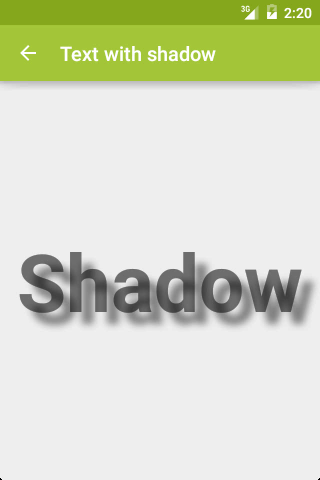
阴影效果
效果:
代码:
<TextView
  android:layout_width="wrap_content"
  android:layout_height="wrap_content"
  android:padding="12dp"
  android:text="@string/shadow"
  android:textSize="80sp"
  android:textStyle="bold"
  android:shadowColor="#7000"
  android:shadowDx="12"
  android:shadowDy="12"
  android:shadowRadius="8"/>
shadowColor, shadowDx, shadowDy, shado
注意,shadowDx,shadowDy,shadowRadius 的值的单位是 px,而非 dp。为了让阴影完全显示,记得设置合适的 padding。
通过综合使用这些属性,我们可以做到更多效果,如图4:
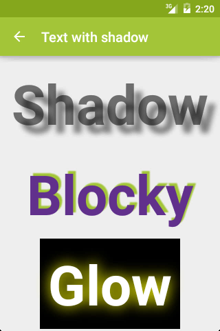
Blocky 和 Glow 效果对应的代码:
Blocky
<TextView
  android:layout_width="wrap_content"
  android:layout_height="wrap_content"
  android:padding="12dp"
  android:text="@string/blocky"
  android:textColor="@color/purple"
  android:textSize="80sp"
  android:textStyle="bold"
  android:shadowColor="@color/green"
  android:shadowDx="4"
  android:shadowDy="-4"
  android:shadowRadius="1"/>
Glow
<TextView
  android:layout_width="wrap_content"
  android:layout_height="wrap_content"
  android:padding="12dp"
  android:text="@string/glow"
  android:textSize="80sp"
  android:textStyle="bold"
  android:textColor="@android:color/white"
  android:background="@android:color/black"
  android:shadowColor="@color/yellow"
  android:shadowDx="0"
  android:shadowDy="0"
  android:shadowRadius="24"/>
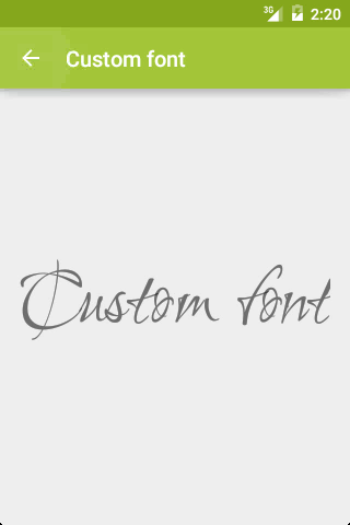
自定义字体
效果:
代码:
Typeface typeface = Typeface.createFromAsset(getAssets(), "Ruthie.ttf");

textView.setTypeface(typeface);
渐变色
效果:
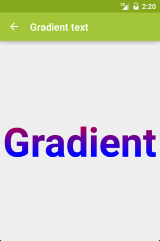
代码:
Shader shader = new LinearGradient(
    0, 0, 0, textView.getTextSize(),
    Color.RED, Color.BLUE,
    Shader.TileMode.CLAMP);

textView.getPaint().setShader(shader);
图片填充
效果:
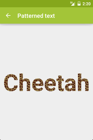
代码:
Bitmap bitmap = BitmapFactory.decodeResource(
    getResources(),
    R.drawable.cheetah_tile);

Shader shader = new BitmapShader(
    bitmap,
    Shader.TileMode.REPEAT,
    Shader.TileMode.REPEAT);
textView.getPaint().setShader(shader);
多样式
效果:
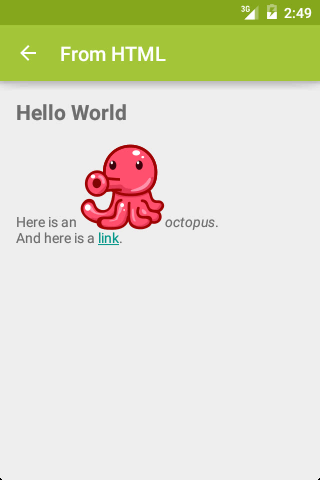
如果上述效果用 HTML 实现,其代码为:
HTML
<h1>Hello World</h1>
Here is an
<img src="octopus"><i>octopus</i>.<br>
And here is a
<a href="http://d.android.com">
link</a>.
其实,使用一个 TextView 也可以实现这种效果:
<string name="from_html_text">
< 最低0.47元/天 解锁文章


 扫一扫
扫一扫


 454
454

 被折叠的 条评论
为什么被折叠?
被折叠的 条评论
为什么被折叠?
 到【灌水乐园】发言


