


web前端开发者最最注的内容是三个:HTML、CSS与JavaScript,他们分别在不同方面发挥自己的作用,HTML实现页面结构,CSS完成页面的表现与风格,JavaScript实现一些客户端的功能与业务。当然内容与用户资源也是不能忽视的。尽量不要跨职责范围使用,有点“SRP单一职责”的意思,如字体大小应该是CSS控制的,就不应该使用HTML标签完成,如果CSS能解决的问题尽量不要用JavaScript完成。
一、CSS3概要
CSS(Cascading Style Sheet)是层叠样式表的意思,CSS3就是在CSS2.1的基础上升级的CSS新版本,属于HTML5的一部分。它可以有效地对页面的布局、字体、颜色、背景、动画和其它效果实现。CSS3是CSS技术的升级版本,CSS3语言开发是朝着模块化发展的。以前的规范作为一个模块实在是太庞大而且比较复杂,所以,把它分解为一些小的模块,更多新的模块也被加入进来。这些模块包括: 盒子模型、列表模块、超链接方式 、语言模块 、背景和边框 、文字特效 、多栏布局等。

1.1、特点
1.2、效果演示
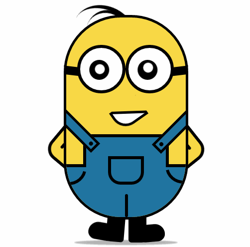
纯CSS3画出小黄人并实现动画效果
HTML页面:


<!DOCTYPE html>
<html lang="en">
<head>
    <meta charset="UTF-8">
    <title>drawLittleHuang</title>
    <link rel="stylesheet" type="text/css" href="drawLittleHuang.css">
</head>
<body>
    <div class="wrapper"><!-- 容器 -->
        <div class="littleH"><!-- 小黄人 -->
            <div class="bodyH"><!-- 身体 -->
                <div class="trousers"><!-- 裤子 -->
                    <div class="condoleBelt"><!-- 吊带 -->
                        <div class="left"></div>
                        <div class="right"></div>
                    </div>
                    <div class="trousers_top"></div><!-- 裤子突出的矩形部分 -->
                    <div class="pocket"></div><!-- 裤袋 -->
                    <!-- 三条线 -->
                    <span class="line_left"></span>
                    <span class="line_right"></span>
                    <span class="line_bottom"></span>
                </div>
            </div>
            <div class="hair"><!-- 头发 -->
                <span class="left_hair_one"></span>
                <span class="left_hair_two"></span>
            </div>
            <div class="eyes"><!-- 眼睛 -->
                <div class="leftEye"><!-- 左眼 -->
                    <div class="left_blackEye">
                        <div class="left_white"></div>
                    </div>
                </div>
                <div class="rightEye"><!-- 右眼 -->
                    <div class="right_blackEye">
                        <div class="right_white"></div>
                    </div>
                </div>
            </div>
            <div class="mouse"><!-- 嘴巴 -->
                <div class="mouse_shape"></div>
            </div>
            <div class="hands"><!-- 双手 -->
                <div class="leftHand"></div>
                <div class="rightHand"></div>
            </div>
            <div class="feet"><!-- 双脚 -->
                <div class="left_foot"></div>
                <div class="right_foot"></div>
            </div>
            <div class="groundShadow"></div><!-- 脚底阴影 -->
        </div>
    </div>
</body>
</html>
CSS样式:
@charset "utf-8";

body{
    margin: 0;
    padding:0;
}
.wrapper{
    width: 300px;
    margin:100px auto;
}
.litteH{
    position: relative;
}
.bodyH{
    position: absolute;
    width: 240px;
    height: 400px;
    border:5px solid #000;
    border-radius: 115px;
    background: rgb(249,217,70);
    overflow: hidden;
    z-index: 2;
}
.bodyH .condoleBelt{
    position: absolute;
}
.bodyH .condoleBelt .left,
.bodyH .condoleBelt .right{
    width: 100px;
    height: 16px;
    border:5px solid #000;
    background: rgb(32,116,160);
    position: absolute;
    top:-90px;
    left:-35px;
    z-index: 2;
    -webkit-transform:rotate(45deg);
}
.bodyH .condoleBelt .left{
    top:-88px;
    left:165px;
    -webkit-transform:rotate(-45deg);
}
.bodyH .condoleBelt .left:after,
.bodyH .condoleBelt .right:after{
    content: '';
    width: 8px;
    height: 8px;
    border-radius: 50%;
    background: #000;
    position: absolute;
    top:4px;
    left:88px;
}

.bodyH .condoleBelt .left:after{
    left:5px;
}
.bodyH .trousers{
    position: absolute;
    bottom: 0;
    width: 100%;
    height: 100px;
    border-top: 6px solid #000;
    background: rgb(32,116,160);
}
.trousers_top{
    width: 160px;
    height: 60px;
    border:6px solid #000;
    border-bottom: none;
    border-radius: 0 0 5px 5px;
    background: rgb(32,116,160);
    position: absolute;
    bottom: 100px;
    left:34px;
}
.pocket{
    width: 60px;
    height: 45px;
    border:6px solid #000;
    border-radius: 0px 0px 25px 25px;
    position: absolute;
    bottom:65px;
    left:84px;
}
.line_right{
    width: 30px;
    height: 30px;
    border-bottom-left-radius: 100px;
    border-bottom:6px solid #000;
    border-left:6px solid #000;
    position: absolute;
    left: 0;
    bottom:60px;
    -webkit-transform:rotate(-75deg);
}
.line_left{
    width: 30px;
    height: 30px;
    border-bottom-right-radius: 100px;
    border-bottom:6px solid #000;
    border-right:6px solid #000;
    position: absolute;
    right: 0;
    bottom:63px;
    -webkit-transform:rotate(75deg);
}
.line_bottom{
    height: 40px;
    border:3px solid #000;
    border-radius: 3px;
    position: absolute;
    left:118px;
    bottom: 0px;
}
.hair{
    position: relative;
}
.left_hair_one{
    width: 130px;
    height: 100px;
    border-radius: 50%;
    border-top:8px solid #000;
    position: absolute;
    left:17px;
    top:-17px;
    -webkit-transform:rotate(27deg);
    -webkit-animation: lefthair 2s ease-in-out infinite;
}
@-webkit-keyframes lefthair{
    0%,25%,31%,100%{
    }
    30%{
        -webkit-transform: rotate(31deg) translate3d(-3px,-1px,0);
    }
}
.left_hair_two{
    width: 80px;
    height: 80px;
    border-radius: 50%;
    border-top:6px solid #000;
    position: absolute;
    left:45px;
    top:-10px;
    -webkit-transform:rotate(15deg);
}
.eyes{
    position: relative;
    z-index: 3;
}
.eyes .leftEye,.eyes .rightEye{
    width: 85px;
    height: 85px;
    border-radius: 50%;
    border:6px solid #000;
    background: #fff;
    position: absolute;
    top:60px;
    left: 27px;
}
.eyes .leftEye{
    left: 124px;
}
.eyes .leftEye .left_blackEye,
.eyes .rightEye .right_blackEye{
    width: 40px;
    height: 40px;
    border-radius: 50%;
    background: #000;
    position: absolute;
    top:24px;
    left:22px;
    -webkit-animation: blackeye 5s ease-in infinite;
}
@-webkit-keyframes blackeye{
    0%,20%,50%,70%,100%{
        -webkit-transform: translateX(0px);
    }
    30%,40%{
        -webkit-transform: translateX(15px);
    }
    80%,90%{
        -webkit-transform: translateX(-15px);
    }
}
.eyes .leftEye .left_blackEye .left_white,
.eyes .rightEye .right_blackEye .right_white{
    width: 20px;
    height: 20px;
    border-radius: 50%;
    background: #fff;
    position: absolute;
    top:7px;
    left:17px;
    -webkit-animation: whiteeye 5s ease-in-out infinite;
}
@-webkit-keyframes whiteeye{
    0%,20%,50%,70%,100%{
        -webkit-transform: translateX(0px);
    }
    30%,40%{
        -webkit-transform: translate3d(3px,4px,0);
    }
    80%,90%{
        -webkit-transform: translate3d(-15px,4px,0);
    }
}
.eyes .leftEye .left_blackEye .left_white{
    top:4px;
    left:17px;
}
.eyes .leftEye:after,
.eyes .rightEye:after{
    content: '';
    width: 28px;
    height: 18px;
    background: #000;
    position: absolute;
    left:-30px;
    top:37px;
    -webkit-transform:skewX(20deg) rotate(7deg);
}
.eyes .leftEye:after{
    left:89px;
    top:37px;
    -webkit-transform:skewX(-20deg) rotate(-7deg);
}
.mouse{
    position: relative;
}
.mouse .mouse_shape{
    width: 55px;
    height: 35px;
    border:5px solid #000;
    border-bottom-left-radius: 30px;
    background: #fff;
    position: absolute;
    top:175px;
    left:98px;
    z-index: 3;
    -webkit-transform:rotate(-35deg);
    -webkit-animation: mouse 5s ease-in-out infinite;
}
@-webkit-keyframes mouse{
    40%,43%{
        width: 45px;
        height: 25px;
        top:180px;
    }
    0%,35%,48%,100%{
        width: 55px;
        height: 35px;
        top:175px;
        -webkit-transform:rotate(-35deg);
    }
}
.mouse .mouse_shape:after{
    content: '';
    width: 70px;
    height: 32px;
    border-bottom:5px solid #000;
    border-radius:35px 26px 5px 5px;
    background: rgb(249,217,70);
    position: absolute;
    top:-16px;
    left:3px;
    -webkit-transform:rotate(34deg);
    -webkit-animation: mouse_mask 5s ease-in-out infinite;
}
@-webkit-keyframes mouse_mask{
    40%,43%{
        width: 60.5px;
        top:-19.3px;
        left:1.5px;
    }
    0%,35%,48%,100%{
        width: 70px;
        top:-16px;
        left:3px;
        -webkit-transform:rotate(33deg);
    }
}
.hands{
    position: relative;
}
.hands .leftHand,
.hands .rightHand{
    width: 80px;
    height: 80px;
    border:6px solid #000;
    border-radius: 25px;
    background: rgb(249,217,70);
    position: absolute;
    top:220px;
    left:-23px;
    -webkit-transform:rotate(40deg);
    -webkit-animation:rightHand .8s ease-in-out infinite;
}
@-webkit-keyframes rightHand{
    0%,50%,100%{
        -webkit-transform: rotate(40deg);
    }
    30%{
        -webkit-transform: rotate(37deg) translateX(1px);
    }
}
.hands .leftHand{
    left:182px;
    top:220px;
    -webkit-transform:rotate(-40deg);
    -webkit-animation:leftHand .8s ease-in-out infinite;
}
@-webkit-keyframes leftHand{
    0%,50%,100%{
        -webkit-transform: rotate(-40deg);
    }
    80%{
        -webkit-transform: rotate(-37deg) translateX(-1px);
    }
}
.hands .leftHand:after,
.hands .rightHand:after{
    content: '';
    width: 6px;
    border:3px solid #000;
    border-radius: 3px;
    position: absolute;
    left:13px;
    top:50px;
    -webkit-transform:rotate(90deg);
}

.hands .leftHand:after{
    left:53px;
    top:50px;
    -webkit-transform:rotate(-90deg);
}
.feet{
    position: relative;
}
.feet .left_foot,
.feet .right_foot{
    width: 36px;
    height: 50px;
    border-bottom-right-radius: 6px;
    border-bottom-left-radius: 9px;
    background: #000;
    position: absolute;
    top: 406px;
    left:88px;
    -webkit-transform-origin: right top;
    -webkit-animation: rightfoot .8s ease-in-out infinite;
}
@-webkit-keyframes rightfoot{
    0%,50%,100%{
        -webkit-transform: rotate(0deg);
    }
    80%{
        -webkit-transform: rotate(10deg);
    }
}
.feet .left_foot{
    border-bottom-right-radius: 9px;
    border-bottom-left-radius: 6px;
    left:130px;
    -webkit-transform-origin: left top;
    -webkit-animation: leftfoot .8s ease-in-out infinite;
}
@-webkit-keyframes leftfoot{
    0%,50%,100%{
        -webkit-transform: rotate(0deg);
    }

    30%{
        -webkit-transform: rotate(-10deg);
    }
}
.feet .left_foot:after,
.feet .right_foot:after{
    content: '';
    width: 60px;
    height: 35px;
    border-radius: 20px 10px 21px 15px;
    background: #000;
    position: absolute;
    left:-36px;
    top:14.4px;
    -webkit-transform:rotate(5deg);
}
.feet .left_foot:after{
    border-radius: 10px 20px 15px 21px;
    left:13px;
    -webkit-transform:rotate(-5deg);
}
.groundShadow{
    width: 200px;
    height: 2px;
    border-radius: 50%;
    background: rgba(0,0,0,0.3);
    box-shadow: 0 0 2px 4px rgba(0,0,0,0.3);
    position: relative;
    top: 455px;
    left:25px;
}
相册演示的代码可以在示例中下载到。
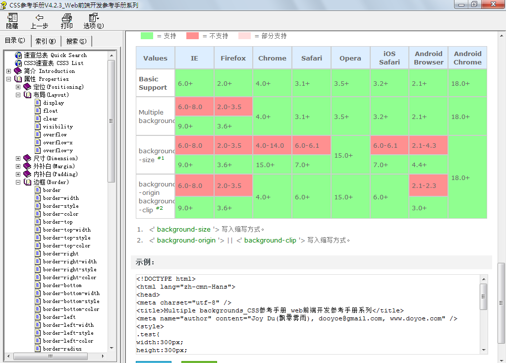
1.3、帮助文档与学习
权威的帮助文档是最好的学习资料,CSS2的帮助,非常详细:
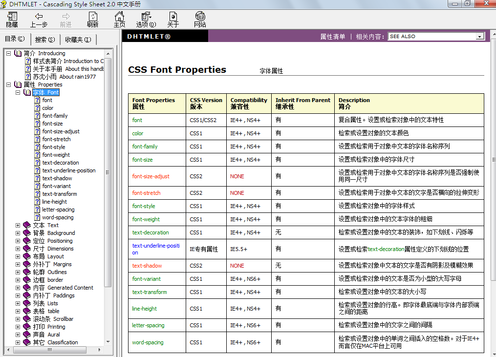
CSS3的帮助文档:

二、选择器
在使用CSS时我们首先要做的事情是找到元素,在写相应的样式,在CSS2.1中最常使用的是三种选择器:
a)、ID选择器:以#开始,引用时使用id,如id="div1"
#div1
{
color:red;
}
b)、类选择器:以.开始,使用class属性引用,可以有多个,如class="cls1 cls2 cls3"
.cls1
{
background-color:#99ccff;
}
c)、标签选择器:以标签名称开始,如p,span,div,*
div span
{
font-size:14px;
}
当然还有如伪类选择,a:hover,a:link,a:visted,a:active。
在CSS3中新增了很多的选择器,如果大家会jQuery,jQuery中多数选择器在CSS3中都可以直接使用。
1.1、基础的选择器
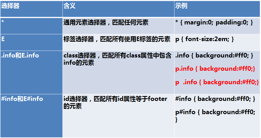
红色字体中选择器的区别是:p.info的意思是p元素中必须有class="info"属性将被选择,p .info是选择后代元素,示例:
<!DOCTYPE html>
<html>
    <head>
        <meta charset="UTF-8">
        <title>选择器</title>
        <style type="text/css">
            p.info{
                color: red;
            }
            p .info{
                color: blue;
            }
        </style>
    </head>
    <body>
        <h2>选择器</h2>
        <p class="info">p1</p>
        <p>
                <span class="info">span1</span>
                <p>p3</p>
        </p>
    </body>
</html>
运行结果:

1.2、组合选择器
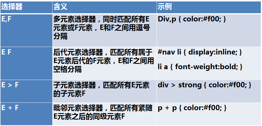
示例:
<!DOCTYPE html>
<html>
    <head>
        <meta charset="UTF-8">
        <title>组合选择器</title>
        <style type="text/css">
             #div1 span
             {
                 color: red;
             }
        </style>
    </head>
    <body>
        <h2>组合选择器</h2>
        <div id="div1">
            <span>span1</span>
            <div id="div2">
                <span>span2</span>
            </div>
        </div>
        <span>span3</span>
    </body>
</html>
运行结果:

示例:
<!DOCTYPE html>
<html>
    <head>
        <meta charset="UTF-8">
        <title>组合选择器</title>
        <style type="text/css">
             #div1 > span
             {
                 color: red;
             }
        </style>
    </head>
    <body>
        <h2>组合选择器</h2>
        <div id="div1">
            <span>span1</span>
            <div id="div2">
                <span>span2</span>
            </div>
        </div>
        <span>span3</span>
    </body>
</html>

<!DOCTYPE html>
<html>
    <head>
        <meta charset="UTF-8">
        <title>组合选择器</title>
        <style type="text/css">
             #div1 + span
             {
                 color: red;
             }
        </style>
    </head>
    <body>
        <h2>组合选择器</h2>
        <div id="div1">
            <span>span1</span>
            <div id="div2">
                <span>span2</span>
            </div>
        </div>
        <span>span3</span>
        <span>span4</span>
    </body>
</html>

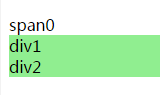
1.3、属性选择器

<!DOCTYPE html>
<html>
    <head>
        <meta charset="UTF-8">
        <title>属性选择器</title>
        <style type="text/css">
            div[id][class~=cls1] {
                background: lightgreen;
            }
        </style>
    </head>
    <body>
        <h2>组合选择器</h2>
        <span>span0</span>
        <div id="div1" class="cls1">
            div1
        </div>
        <div id="div2" class="cls1 cls2">
            div2
        </div>
    </body>

</html>
运行结果:
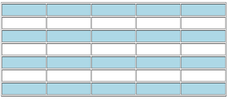
1.4、伪类
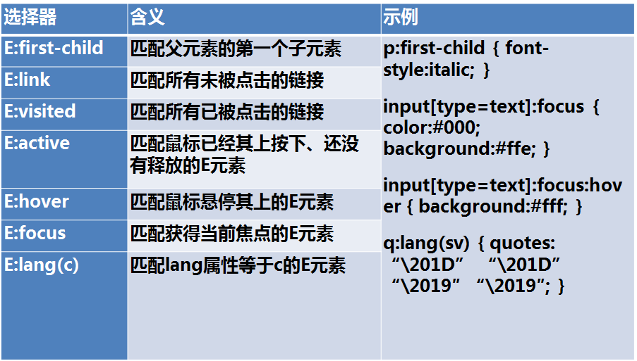
示例:
<!DOCTYPE html> <html> <head> <meta charset="UTF-8"> <title>伪类</title> <style type="text/css"> td:first-child { background: lightcoral; } </style> </head> <body> <h2>组合选择器</h2> <table border="1" width="100%"> <tr> <td> </td><td> </td><td> </td><td> </td><td> </td><td> </td> </tr> <tr> <td> </td><td> </td><td> </td><td> </td><td> </td><td> </td> </tr> <tr> <td> </td><td> </td><td> </td><td> </td><td> </td><td> </td> </tr> <tr> <td> </td><td> </td><td> </td><td> </td><td> </td><td> </td> </tr> <tr> <td> </td><td> </td><td> </td><td> </td><td> </td><td> </td> </tr> <tr> <td> </td><td> </td><td> </td><td> </td><td> </td><td> </td> </tr> </table> <hr /> <table border="1" width="100%"> <tr> <td> </td><td> </td><td> </td><td> </td><td> </td><td> </td> </tr> <tr> <td> </td><td> </td><td> </td><td> </td><td> </td><td> </td> </tr> <tr> <td> </td><td> </td><td> </td><td> </td><td> </td><td> </td> </tr> <tr> <td> </td><td> </td><td> </td><td> </td><td> </td><td> </td> </tr> <tr> <td> </td><td> </td><td> </td><td> </td><td> </td><td> </td> </tr> <tr> <td> </td><td> </td><td> </td><td> </td><td> </td><td> </td> </tr> </table> </body> </html>
运行结果:
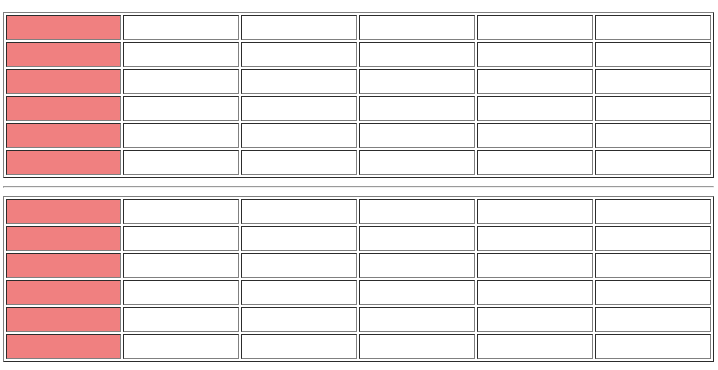
练习:实现隔行换色,当鼠标悬停在每一行上时高亮显示为黄色,按下时高亮红色。
        <style type="text/css">
           tr:nth-child(2n+1){
                background:lightblue;
           }
           tr:hover{
               background: yellow;
           }
           tr:active{
               background: orangered;
           }
        </style>
1.5、伪元素
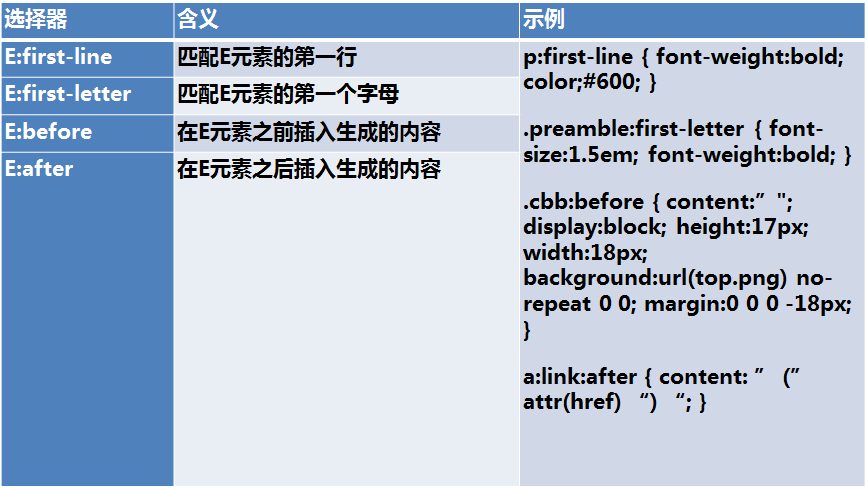
标准的伪元素应该使用::,但单:也行,只是为了兼容。
示例:
<!DOCTYPE html>
<html>
    <head>
        <meta charset="UTF-8">
        <title>伪类</title>
        <style type="text/css">
            a::before {
                content: "网站";
                display: inline-block;
                background: red;
                color: white;
            }
        </style>
    </head>
    <body>
        <h2>伪元素</h2>
        <a href="http://www.baidu.com">百度</a>
        <a href="http://best.cnblogs.com">博客园</a>
    </body>
</html>
运行结果:

三、特殊性(优先级)
a)、同类型,同级别的样式后者先于前者
b)、ID > 类样式 > 标签 > *
c)、内联>ID选择器>伪类>属性选择器>类选择器>标签选择器>通用选择器(*)>继承的样式
d)、具体 > 泛化的,特殊性即css优先级
e)、近的 > 远的 (内嵌样式 > 内部样式表 > 外联样式表)
内嵌样式:内嵌在元素中,<span style="color:red">span</span>
内部样式表:在页面中的样式,写在<style></style>中的样式
外联样式表:单独存在一个css文件中,通过link引入或import导入的样式
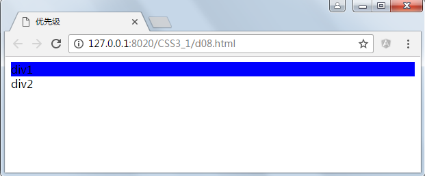
f)、!important 权重最高,比 inline style 还要高
<!DOCTYPE html>
<html>
    <head>
        <meta charset="UTF-8">
        <title>优先级</title>
        <style type="text/css">
            * {
                color: yellow;
            }
            p {
                color: red !important;
            }
            .cls1 {
                color: deeppink;
            }
            .cls2{
                color: blueviolet;
            }
            #p1{
                color:blue;
            }
        </style>
    </head>
    <body>
        <div>
            <p id="p1" class="cls2 cls1" style="color:#ccc">p1</p>
            <span>span1</span>
        </div>
    </body>
</html>
运行结果:

3.2、计算特殊性值
important > 内嵌 > ID > 类 > 标签 | 伪类 | 属性选择 > 伪对象 > 继承 > 通配符
权重、特殊性计算法:
CSS样式选择器分为4个等级,a、b、c、d
1.如果样式是行内样式(通过Style=“”定义),那么a=1,1,0,0,0
2.b为ID选择器的总数 0,1,0,0
3.c为属性选择器,伪类选择器和class类选择器的数量。0,0,1,0
4.d为标签、伪元素选择器的数量 0,0,0,1
5.!important 权重最高,比 inline style 还要高
比如结果为:1093比1100,按位比较,从左到右,只要一位高于则立即胜出,否则继续比较。

示例:
<!DOCTYPE html>
<html>
    <head>
        <meta charset="UTF-8">
        <title>优先级</title>
        <style type="text/css">
            html body #div1
            {
                background: red;
            }

            .cls1 #div1{
                background: blue;
            }
        </style>
    </head>
    <body>
        <div class="cls1">
            <div id="div1">div1
            </div>
            <div id="div2">div2
            </div>
        </div>
    </body>
</html>
运行结果:
因为html body #div1的特殊性值为:0102,而.cls1 #div1的特殊性值为0110,后者胜出。
四、刻度
在CSS中刻度是用于设置元素尺寸的单位。
特殊值0可以省略单位。例如:margin:0px可以写成margin:0
一些属性可能允许有负长度值,或者有一定的范围限制。如果不支持负长度值,那应该变换到能够被支持的最近的一个长度值。
长度单位包括包括:相对单位和绝对单位。
相对长度单位包括有: em, ex, ch, rem, vw, vh, vmax, vmin
绝对长度单位包括有: cm, mm, q, in, pt, pc, px

4.1、绝对长度单位
1in = 2.54cm = 25.4 mm = 72pt = 6pc = 96px
4.2、文本相对长度单位
em
相对长度单位。相对于当前对象内文本的字体尺寸。如当前对行内文本的字体尺寸未被人为设置,则相对于浏览器的默认字体尺寸。(相对父元素的字体大小倍数)
body { font-size: 14px; }
h1 { font-size: 16px; }
.size1 p { font-size: 1em; }
.size2 p { font-size: 2em; }
.size3 p { font-size: 3em; }
浏览器的默认字体大小为16像素,浏览器默认样式也称为user agent stylesheet,就是所有浏览器内置的默认样式,多数是可以被修改的,但chrome不能直接修改,可以被用户样式覆盖。

示例代码:
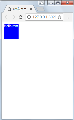
<!DOCTYPE html>
<html>
    <head>
        <meta charset="UTF-8">
        <title>em与rem</title>
        <style type="text/css">
            #div2{
                background: blue;
                height: 5em;
            }
        </style>
    </head>
    <body>
        <div id="div1">
            <div id="div2">
                Hello em
            </div>
        </div>
    </body>
</html>
结果: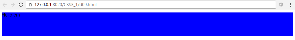
div2的高度为80px,是因为user agent stylesheet默认样式中字体大小为16px,按照这个规则我们可以手动修改字体大小,div2的高度将发生变化。
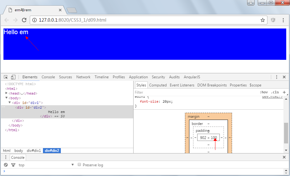
示例:
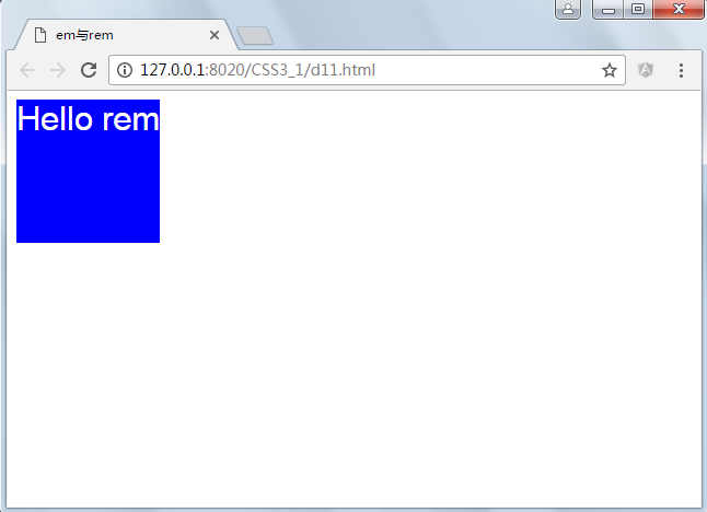
<!DOCTYPE html>
<html>
    <head>
        <meta charset="UTF-8">
        <title>em与rem</title>
        <style type="text/css">
            #div1 {
                font-size: 20px;
            }
            #div2 {
                color: white;
                background: blue;
                height: 5em;
            }
        </style>
    </head>
    <body>
        <div id="div1">
            <div id="div2">
                Hello em
            </div>
        </div>
    </body>
</html>
结果:
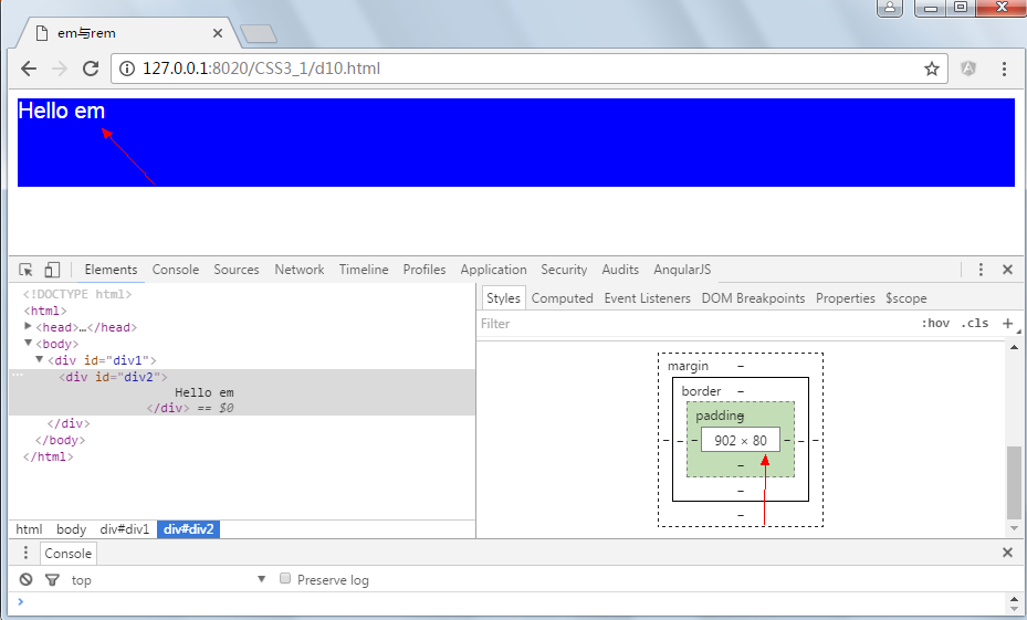
rem
rem是CSS3新增的一个相对单位(root em,根em),相对于根元素(即html元素)font-size计算值的倍数
只相对于根元素的大小
rem(font size of the root element)是指相对于根元素的字体大小的单位。简单的说它就是一个相对单位。看到rem大家一定会想起em单位,em(font size of the element)是指相对于父元素的字体大小的单位。它们之间其实很相似,只不过一个计算的规则是依赖根元素一个是依赖父元素计算。(相对是的HTML元素的字体大,默认16px)
示例:
<!DOCTYPE html>
<html>
    <head>
        <meta charset="UTF-8">
        <title>em与rem</title>
        <style type="text/css">
            #div1 {
                font-size: 20px;
            }
            #div2 {
                color: white;
                background: blue;
                height: 5rem;
            }
        </style>
    </head>
    <body>
        <div id="div1">
            <div id="div2">
                Hello em
            </div>
        </div>
    </body>
</html>
运行结果:
示例:
<!DOCTYPE html>
<html>
    <head>
        <meta charset="UTF-8">
        <title>em与rem</title>
        <style type="text/css">
            html {
                font-size: 10px;
            }
            body {
                font-size: 16px;
            }
            #div1 {
                font-size: 20px;
            }
            #div2 {
                color: white;
                background: blue;
                height: 5rem;
            }
        </style>
    </head>
    <body>
        <div id="div1">
            <div id="div2">
                Hello em
            </div>
        </div>
    </body>
</html>
结果:
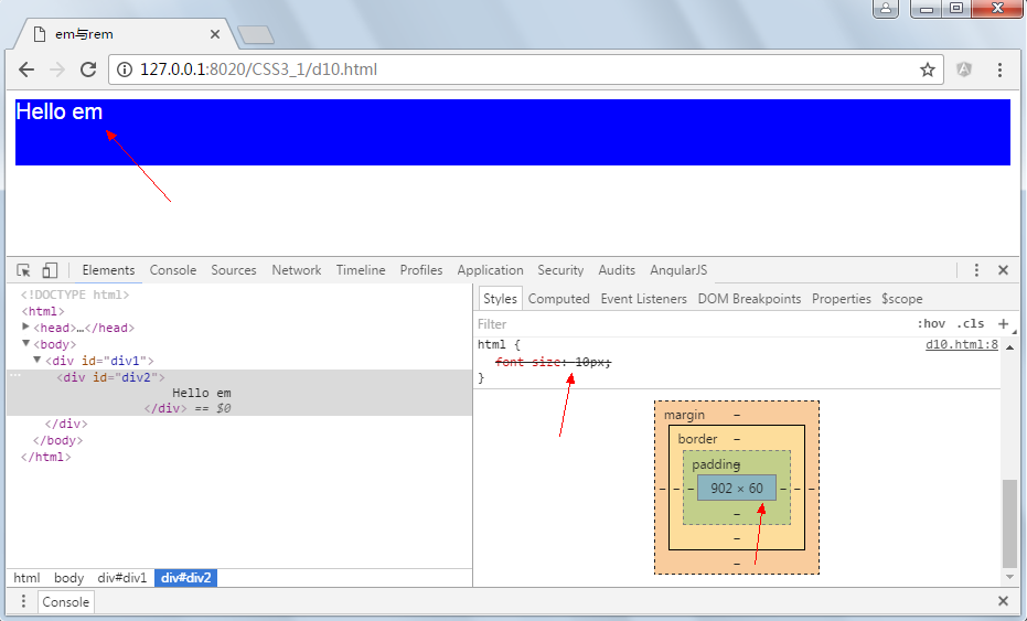
按理说高度为5*10px=50像素高度,但这里为60,是因为chrome浏览器限制了最小字体大小为12px,从上图可以看出。
4.3、Web App与Rem
为了实现简单的响应式布局,可以利用html元素中字体的大小与屏幕间的比值设置font-size的值实现当屏幕分辨率变化时让元素也变化,以前的tmall就使用这种办法,示例如下:

示例一:
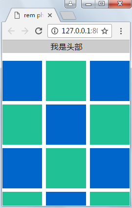
<!DOCTYPE html>
<html>
    <head>
        <meta charset="UTF-8">
        <title>rem phone test</title>
        <!--
            描述:视口
        -->
        <meta name="viewport" content="user-scalable=no, initial-scale=1.0, maximum-scale=1.0, minimum-scale=1.0">
        <style>
            html {
                height: 100%;
                width: 100%;
                font-family: 'Heiti SC', 'Microsoft YaHei';
                font-size: 20px;
                overflow: hidden;
                outline: 0;
                -webkit-text-size-adjust: none;
                -moz-text-size-adjust: none;
                -ms-text-size-adjust: none;
            }
            body {
                height: 100%;
                margin: 0;
                overflow: hidden;
                -webkit-user-select: none;
                /*取消用户选择*/

                width: 100%;
            }
            header,
            footer {
                width: 100%;
                line-height: 1.5rem;
                font-size: 1rem;
                color: #000;
                border: 1px solid #ccc;
                text-align: center;
                background-color: #ccc;
            }
            .bd {
                margin-top: 1rem;
                margin-bottom: .5rem;
                margin-right: -.5rem;
                font-size: 0;
            }
            .bd:after {
                clear: both;
            }
            .box {
                width: 5rem;
                height: 5rem;
                display: inline-block;
                margin-right: .5rem;
                margin-bottom: .5rem;
            }
            .blue-box {
                background-color: #06c;
            }
            .org-box {
                background-color: #1fc195;
            }
        </style>

    </head>
    <body>
        <header>我是头部</header>
        <div class="bd">
            <div class="box blue-box"></div>
            <div class="box org-box"></div>
            <div class="box blue-box"></div>
            <div class="box org-box"></div>
            <div class="box blue-box"></div>
            <div class="box org-box"></div>
            <div class="box blue-box"></div>
            <div class="box org-box"></div>
            <div class="box blue-box"></div>
            <div class="box org-box"></div>
            <div class="box blue-box"></div>
            <div class="box org-box"></div>
            <div class="box blue-box"></div>
            <div class="box org-box"></div>
            <div class="box blue-box"></div>
            <div class="box org-box"></div>
            <div class="box blue-box"></div>
            <div class="box org-box"></div>
            <div class="box blue-box"></div>
            <div class="box org-box"></div>
            <div class="box blue-box"></div>
            <div class="box org-box"></div>
            <div class="box blue-box"></div>
            <div class="box org-box"></div>
        </div>

        <footer>我是页脚</footer>

        <script>
           /*
           ;(function(win){
              win.alert("Hello IIEF");
           })(window);
           */

             //定义一个方法并执行
            (function(doc, win) {
                //获得文档的根节点html
                var docEl = doc.documentElement;
                //如果window中存在orientationchange对象,则取orientationchange,否则取resize
                //为了事件绑定
                resizeEvt = 'orientationchange' in win ? 'orientationchange' : 'resize';
                //定义一个方法,重新计算font-size大小
                var recalc = function() {
                    //页面的宽度
                    var clientWidth = docEl.clientWidth;
                    //如果没有宽度则退出
                    if (!clientWidth) return;
                    //重新计算font-size大小,假定320的宽度时字体大小为20;,当页面变化时重新设置字体大小
                    docEl.style.fontSize = 20 * (clientWidth / 320) + 'px';
                };
                //如果浏览器不支持添加事件监听则结束
                if (!doc.addEventListener) return;
                //添加事件监听,指定事件处理函数的时期或阶段(boolean)true表示在捕获事件执行,false表示冒泡时执行
                win.addEventListener(resizeEvt, recalc, false);
                //当Dom树加载完成时执行计算,DOMContentLoaded事件要在window.onload之前执行
                doc.addEventListener('DOMContentLoaded', recalc, false);
            })(document, window);
        </script>
    </body>

</html>
运行结果:

示例二:
<!DOCTYPE html>
<html>

    <head>
        <meta charset="UTF-8">
        <title>web app 与rem</title>
        <style type="text/css">
            html {
                font-size: 20px;
            }
            body {
                font-size: 16px;
            }
            #div2 {
                color: white;
                background: blue;
                height: 3rem;
                width: 3rem;
                font-size: .7rem;
            }
        </style>
    </head>

    <body>
        <div id="div2">
            Hello rem
        </div>
        <script type="text/javascript">
            function resize() {
                var w = document.documentElement.clientWidth;
                document.documentElement.style.fontSize = w * 20 / 290 + "px";
            }
            window.onresize =resize;

            resize();
        </script>
    </body>

</html>
运行结果:
变屏幕变宽时元素大小也随之发生变化,但这里并没有考虑高度,但为响应式布局与hack提供了思路。


 1349
1349


 被折叠的 条评论
为什么被折叠?
被折叠的 条评论
为什么被折叠?
 到【灌水乐园】发言


