Material Design设计规范

作为技术开发者需不需要了解设计规范?个人认为非常需要,一个交流的需要,另一就是了解相关的设计才能储备相应地知识,知道UI开发的方向。这问题非常希望读者能留言讨论。

 **Android**的设计风格变迁可以划分到三个时代:

1、无序时代
2、Holo theme
3、Material Design


1.无序时代

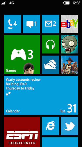
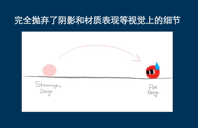
无序时代是没有Android设计规范的。无序时代的Android应用设计主要是参考的iOS的设计规范及其拟物,以及Windows Phone扁平化的MetroUI,当然也有应用自成设计风格。
拟物设计注重实物的阴影材质, 扁平化注重信息的表达。下面两张图是拟物实现和MetroUI。
图一拟物实现

图二MetroUI

2.Holo Theme

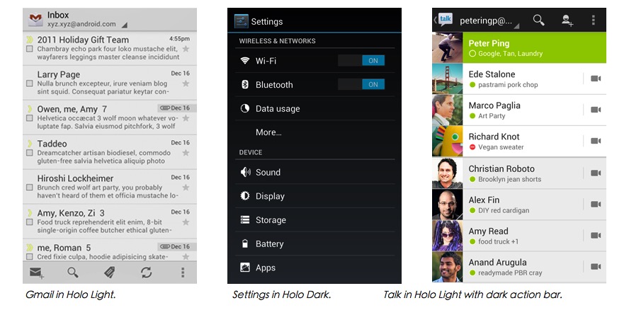
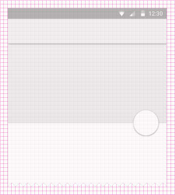
2011年底google发布了Android 4.0 ,也就是通常所说的 ICS,同时也发布了指导性的应用设计规范《Android Design》, Holo theme 也是在Android 4.0才定下来的。虽然在3.0版本就已经有了一部分Holo的身影,但是android 3.X的设备占有率也不高,Holo在3.0算是尝试。《Android Design》只是指导性的规范,国内应用使用的不多。下图是Holo Theme的表现形式。Holo也算是扁平化的设计。
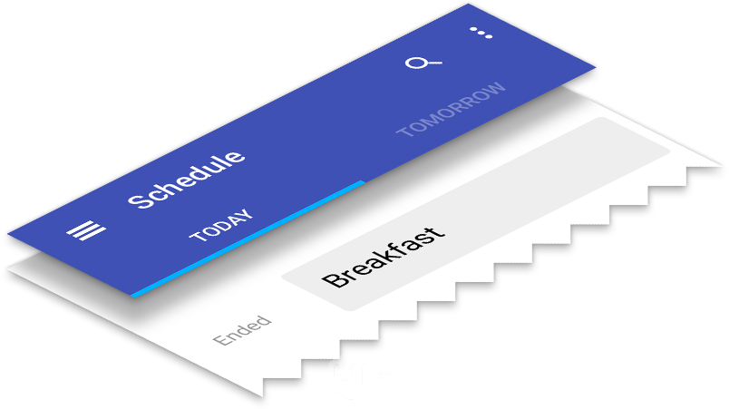
这里写图片描述

3.Material Design

什么是 Materail Design
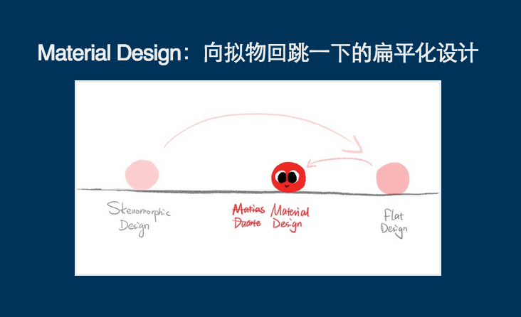
Google在I/O 2014上推出了新的设计语言Material Design。Material Design以现实世界的纸墨为隐喻,强调了阴影和层次,用动画效果代表现实的力反馈,试图把物理世界的规则带回电子界面。而就Android 平台而言,Material Design 不像此前的Holo 风格那样深沉,它更加跳动和富有活力。官方给出的解释:
Material design is a comprehensive guide for visual, motion, and interaction design across platforms and devices.

这里写图片描述

Materail Design的设计原则

1、隐喻
2、视觉设计
3、动画

Material is the metaphor(隐喻)
通过构建系统化的动效和空间合理化利用,并将两个理念合二为一,构成了实体隐喻。与众不同的触感是实体的基础,这一灵感来自我们对纸墨的研究。关于隐喻,我把分成了两点:

1、纸和墨

    信息的承载从石板、碑材、竹简、印章、动物皮、布帛……最后发现,如果从简洁的角度考察,纸张是最优秀的载体。既然没有办法完全的在手机上用app完全类比现实世界的逻辑层次,我们把app规范到纸片上,完全类比纸片的逻辑交互层次,这样不更好吗。

这里写图片描述

Material Design 使用的基本工具来源于印刷设计,例如通用于所有页面的基准线和删格。布局排版能够按比例横跨不同尺寸的屏幕,促进UI开发从根本上帮助你做可扩展的apps。

这里写图片描述

2、层次与阴影

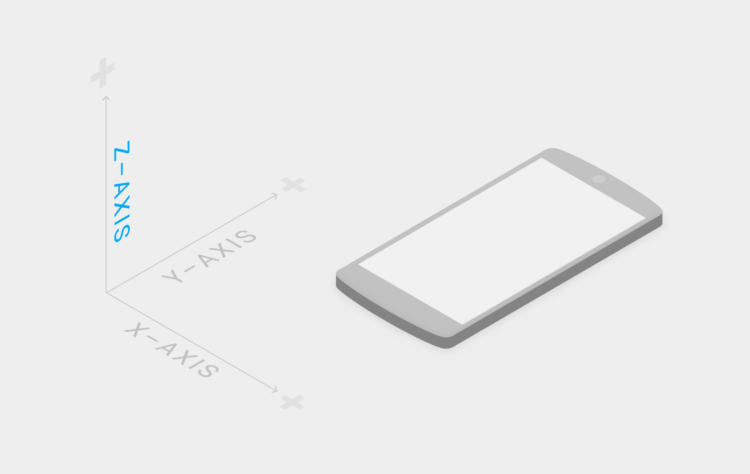
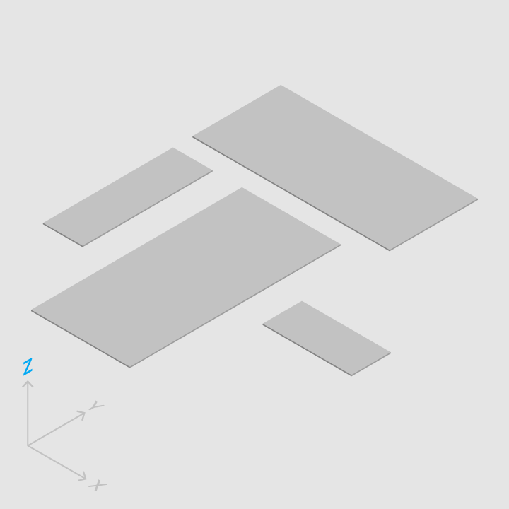
Material Design是一个三维空间,这意味着所有对象具有的x,y,z三种维度。 z轴垂直对准在显示器的平面上,朝向观察者的z轴延伸方向是正方向。材料的每一个片占据沿着z轴一个位置具有标准1dp厚度。   

三维空间

片层1DP

层次与阴影

Bold, graphic, intentional(视觉设计)

Material Design在基本元素的处理上,借鉴了传统的印刷设计,排版、网格、空间、比例、配色、图像等基础的平面设计规范。在这些设计基础上下功夫,不但可以愉悦用户,而且能够构建出视觉层级、视觉意义以及视觉聚焦。精心选择色彩、图像、选择合乎比例的字体、留白,力求构建出鲜明、形象的用户界面,让用户沉浸其中。

1、用色(Color)

色彩从当代建筑、路标、人行横道以及运动场馆中获取灵感,由此引发出大胆的颜色表达激活了色彩,与单调乏味的周边环境形成鲜明的对比。强调大胆的阴影和高光。引出意想不到且充满活力的颜色。   

这里写图片描述

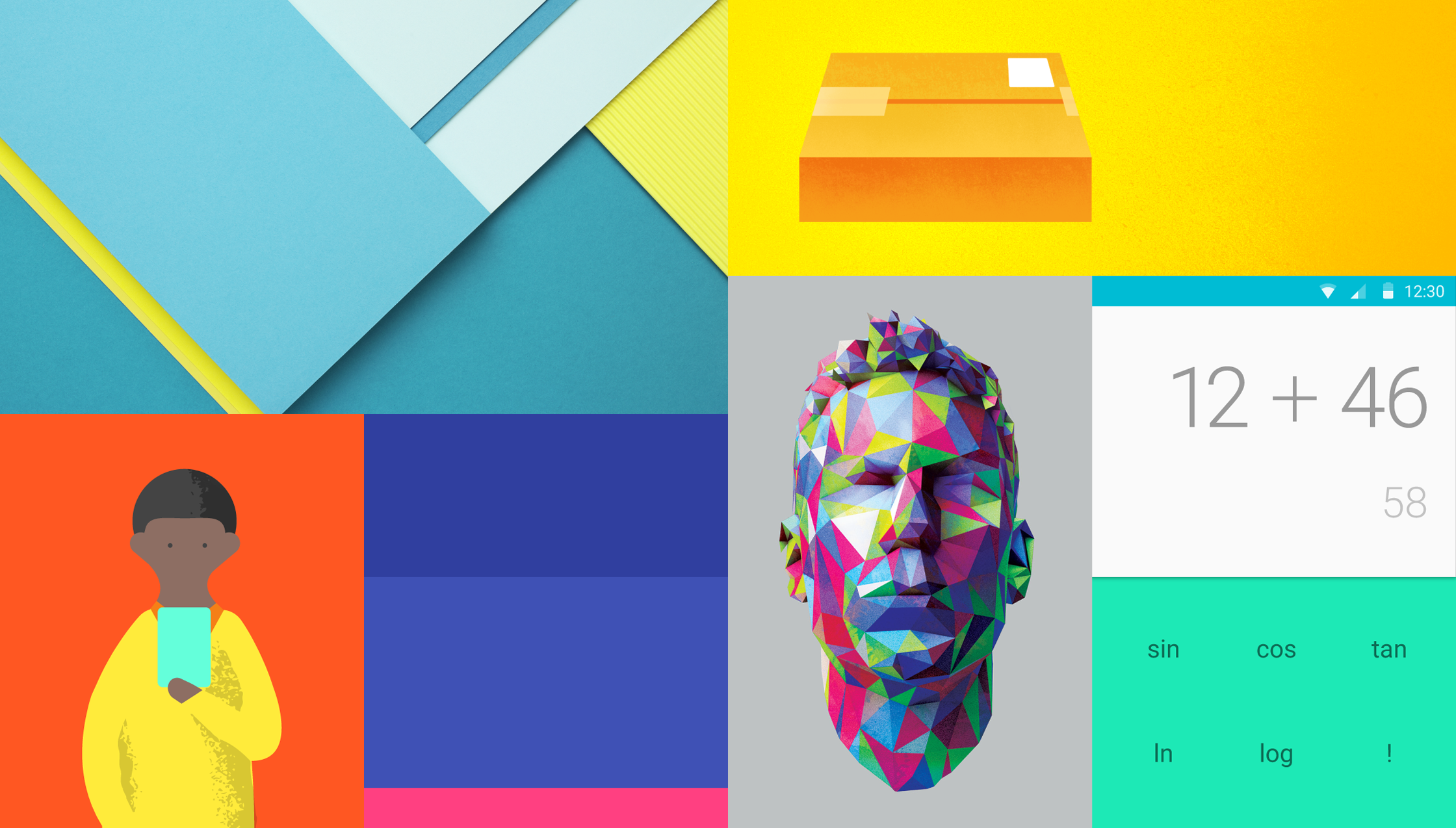
Material Design在用色指导主要包含四方面:
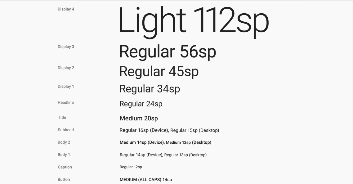
这里写图片描述

2、字体(Typography)

文字字体在界面设计的美感中也是重要的一个方面,google团队花费了整整一年半的时间开发出了全新用户界面字体“Roboto”。“Roboto”字体已经是Android 4.0及以后Android版本的默认字体。Material Design中字体又做了改进。下面是官方建议字体大小。

这里写图片描述

3、图标(Icons)

  系统图标的设计要简洁友好,有潮流感,有时候也可以设计的古怪幽默一点。要把很多含义精简到一个很简化的图标上表达出来,当然要保证在这么小的尺寸下,图标的意义仍然是清晰易懂。
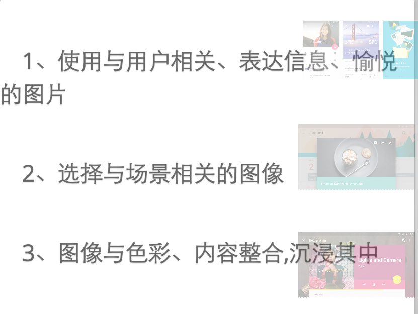
这里写图片描述

4、用图(Imagery)

   在material design中,图像(无论是绘画还是摄影)都应该是组建而成而并非人为策划的,看起来神奇并且不显得过度制作。这种风格乐观,愉悦,并且坦率。这种风格比较强调场景的实质性(Materiality),质感,深度,让人意想不到的色彩运用, 以及对环境背景的关注。这些原则都旨在创建目的性强,美丽又有深度的用户界面。
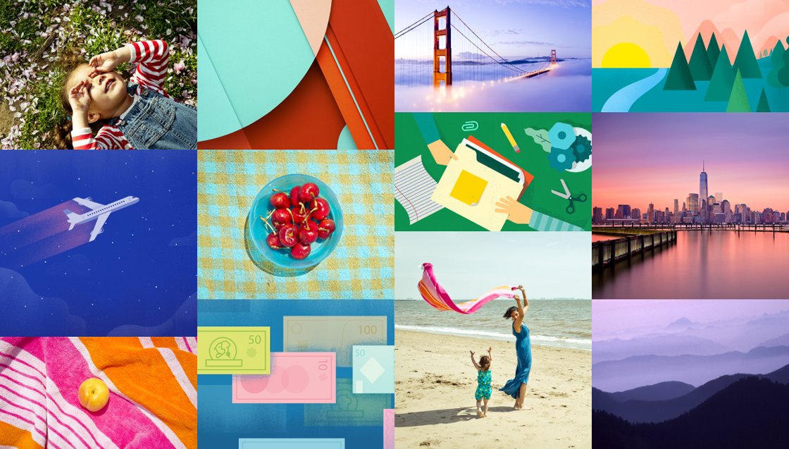
这里写图片描述

用图原则如下:

这里写图片描述

Motion provides meaning(动画,交互)
动画效果可以有效地暗示、指引用户。通过动效,让物体的变化的更连续、更平滑。

动画的指导主要体现在一下四点:
1、真实的动作(Authentic Motion)
2、响应式交互(Responsive Interaction)
3、有意义的转场动画(Meaningful Transitions)
4、打动用户的细节(Delightful Details)

动画示例可以下载PPT,自行欣赏。
1、真实的动作(Authentic Motion)

Material Design强调现实生活中积累的交互预期向数字空间的移植,于是设计指导一方面要求动画的形式必须具备现实中的运动的关键特征,同时也要求在界面转换时,如同现实空间那样,伴随动画动作的发生。

2、响应式交互(Responsive Interaction)

用户每一次的触摸,点击都要有相应,每一点都是活的。

3、有意义的转场动画(Meaningful Transitions)

视图切换存在转场动画。
4、打动用户的细节(Delightful Details)

动画最基本的使用场景是过度效果,但哪怕是最基本的动画,只要恰到好处并足够出色,同样能打动用户。例如一个菜单图标变成一个箭头或者是播放控制按钮,这种服务间的无缝切换不仅仅能让用户感知,更是让完美的细节和精湛的设计充满你的应用。用户真的会感受到这些小细节。

Materail Design怎样产生的
We challenged ourselves to create a visual language for our users that synthesizes the classic principles of good design with the innovation and possibility of technology and science. This is material design.

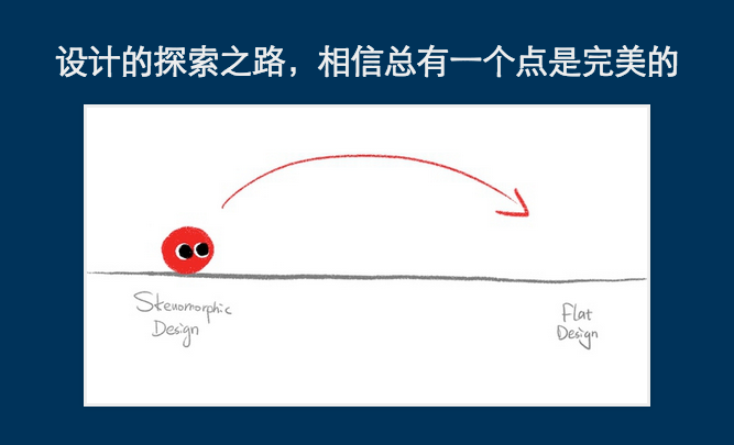
Material Design是苹果的拟物设计、微软的扁平设计的延续。

这里写图片描述

这里写图片描述

这里写图片描述

  • -

参考资料

Material Design

Creating Apps with Material Design

Google Design

Material Design:向拟物回跳一下的扁平化设计

  • 0
    点赞
  • 1
    收藏
    觉得还不错? 一键收藏
  • 1
    评论
在安卓中要改变AlertDialog的外观是非常不容易的事情,即便是HoneyComb之后增加了android:singleChoiceItemLayout属性。AlertDialogPro可以让事情变得简单,它包含了AlertDialog的所有功能,同时还具有灵活的自定义功能,代码中还自带了已经定义好的holo和material 两种风格的对话框。项目地址:https://github.com/fengdai/AlertDialogPro 效果图:如何使用1.创建AlertDialogPro除了将AlertDialog.Builder替换成AlertDialogPro.Builder之外其他的和AlertDialog没有区别。AlertDialogPro.Builder builder = new AlertDialogPro.Builder(getContext()); builder.setTitle("Title").        setIcon(R.drawable.ic_launcher).        setMessage("Message").        setNeutralButton("Neutral", null).        setPositiveButton("OK", null).        setNegativeButton("Cancel", null).        show();2.holo风格的dialog包含两种holo:Theme.AlertDialogPro.Holo和Theme.AlertDialogPro.Holo.Light只需在style文件中加入alertDialogProTheme属性:<style name="AppTheme" parent="AppBaseTheme">   ...   <!-- Use Holo dark theme as global theme of this app -->   <item name="alertDialogProTheme">@style/Theme.AlertDialogPro.Holo</item> </style>或者是在代码中创建dialog的时候设置:AlertDialogPro.Builder builder = new AlertDialogPro.Builder(getContext(), R.style.Theme_AlertDialogPro_Holo_Light);3.Material风格的dialog包含Theme.AlertDialogPro.Material 和Theme.AlertDialogPro.Material.Light 两种风格,使用方法和上面的holo差不多,但是需要AppCompat-v21的支持。4.自定义如果其中某一种风格符合你的绝大部分需求,但是需要做些改动,你可以设置以下属性:<!-- Minimum height of title panel--> <attr name="adpTitleMinHeight" format="dimension" /> <!-- The text appearance for the dialog's message text --> <attr name="adpMessageTextAppearance" format="reference" /> <!-- Minimum height of ListView's items --> <attr name="adpListItemMinHeight" format="dimension" /> <!-- The text color for ListView's items --> <attr name="adpListItemTextColor" format="reference|color" /> <!-- The text appearance for normal ListView's items --> <attr name="adpListItemTextAppearance" format="reference" /> <!-- The text appearance for "multi-choice" ListView's items --> <attr name="adpListMultiChoiceTextAppearance" format="reference" /> <!-- The text appearance for "single-choice" ListView's items --> <attr name="adpListSingleChoiceTextAppearance" format="reference" /> <!-- Divider for the ListView --> <attr name="adpListDivider" format="reference" /> <!-- Selector in a ListView --> <attr name="adpListItemBackground" format="reference" /> <!-- Style for button bars --> <attr name="adpButtonBarStyle" format="reference" /> <!-- Style for buttons within button bars --> <attr name="adpButtonBarButtonStyle" format="reference" /> <!-- Style for the "positive" buttons within button bars --> <attr name="adpButtonBarPositiveButtonStyle" format="reference" /> <!-- Style for the "negative" buttons within button bars --> <attr name="adpButtonBarNegativeButtonStyle" format="reference" /> <!-- Style for the "neutral" buttons within button bars --> <attr name="adpButtonBarNeutralButtonStyle" format="reference" />你甚至可以设置alertdialog的整个布局,如果你需要的是高度自定义的dialog,这是非常重要的。<style name="AlertDialogPro.Material">   <!-- As HoneyComb's android:layout.        Specify your AlertDialogPro's layout -->   <item name="adpLayout">@layout/adp_alert_dialog_material</item>   <!-- As HoneyComb's android:listLayout.        Specify your AlertDialogPro's ListView layout. -->   <item name="adpListLayout">@layout/adp_select_dialog_material</item>   <!-- As HoneyComb's android:listItemLayout.        Specify your AlertDialogPro's list item layout. -->   <item name="adpListItemLayout">@layout/adp_select_dialog_item_material</item>   <!-- As HoneyComb's android:multiChoiceItemLayout.        Specify your AlertDialogPro's multi choice list item layout. -->   <item name="adpMultiChoiceItemLayout">@layout/adp_select_dialog_multichoice_material</item>   <!-- As HoneyComb's android:singleChoiceItemLayout.        Specify your AlertDialogPro's single choice list item layout. -->   <item name="adpSingleChoiceItemLayout">@layout/adp_select_dialog_singlechoice_material</item> </style>使用上面自定义的alertdialog<item name="alertDialogProStyle">@style/AlertDialogPro.Material</item>

“相关推荐”对你有帮助么?

  • 非常没帮助
  • 没帮助
  • 一般
  • 有帮助
  • 非常有帮助
提交
评论 1
添加红包

请填写红包祝福语或标题

红包个数最小为10个

红包金额最低5元

当前余额3.43前往充值 >
需支付:10.00
成就一亿技术人!
领取后你会自动成为博主和红包主的粉丝 规则
hope_wisdom
发出的红包
实付
使用余额支付
点击重新获取
扫码支付
钱包余额 0

抵扣说明:

1.余额是钱包充值的虚拟货币,按照1:1的比例进行支付金额的抵扣。
2.余额无法直接购买下载,可以购买VIP、付费专栏及课程。

余额充值