


 本文介绍了如何使用JQuery、Webpack和Echarts构建一个轻量级的数据可视化开发环境。通过简单的项目结构,利用Webpack的ProvidePlugin引入JQuery和Echarts,并在index.html中设置Echarts图表的DOM元素。建议将不同图表的配置分散到独立模块,以提高调试效率和代码可读性。
数据可视化就越来越受重视,而一般的可视化的需求可能仅仅只是一个大屏展示,这就意味着我们没必要为一个大屏展示的项目引入一整套前端框架,而是使用jq就够了,因为成本最低,开发上手最快,接下来就分享下最近研究的jq+webpack+echarts构建的可视化开发环境
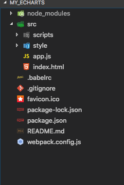
首先是我的项目结构
语法使用es6编写,关于es6的配置就不多说了
可视化用echarts还是比较方便,在这之前也看了一点d3.js,相比较而言,echarts还是简单很多,首先安装echarts
npm install echarts --save这是入口文件app.js(非常简单的入口文件,把可视化展示的逻辑放在echarts.js里去写,这里的app.js只是给webpack提供一个依赖图创建的入口)
import './scripts/echarts.js'
import './style/main.less'
接下来是webpack的配置文件
const webpack = require('webpack')
const echarts = require('echarts')
const HtmlWebpackPlugin = require('html-webpack-plugin')
const path = require('path')

module.exports = {
  context: path.resolve(__dirname, './'),

  entry: {
    app: './src/app.js'
  },

  output: {
    path: path.resolve(__dirname, 'public'),
    filename: '[name].js'
  },

  devServer: {
    contentBase: "./public",
    historyApiFallback: true,
    inline: true,
    hot: true,
  },

  module: {
    loaders: [
      {
        test: /\.js$/,
        loader: 'babel-loader',
        exclude: /^node_modules$/,
      },
      {
        test: /\.less$/,
        loader: 'style-loader!css-loader!less-loader',
        exclude: /^node_modules$/,
      },
      {
        test: /\.(png|jpe?g|gif|svg)(\?.*)?$/,
        loader: 'url-loader',
        options: {
          limit: 10000
        }
      }
    ]
  },

  plugins: [
    new webpack.ProvidePlugin({
      $: 'jquery',
      _: 'lodash'
    }),
    new webpack.HotModuleReplacementPlugin(),
    new HtmlWebpackPlugin({
      template: "./src/index.html",
      inject: true,
      favicon: path.resolve(__dirname, './favicon.ico')
    })
  ]

}
项目使用的是jq,webpack.ProvidePlugin可直接引入依赖,但是记得一定要先安装jq(lodash也是)
npm install jquery --save -dev模板文件就是index.html
<!DOCTYPE html>
<html lang="en">
<head>
<meta charset="UTF-8">
<meta name="viewport" content="width=device-width, initial-scale=1.0">
<meta http-equiv="X-UA-Compatible" content="ie=edge">
<link rel="shortcut icon" type="image/x-icon" href="./favicon.ico">
<title>Echarts</title>
</head>
<body>
<div id="echartsDom"></div>
</body>
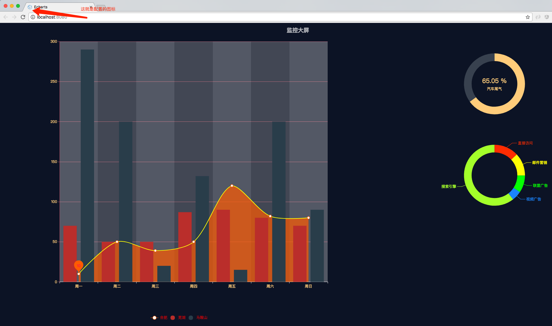
</html>可以看到我们为echarts准备的id为echartsDom的DOM节点,webpack里面HtmlWebpackPlugin也有相应的配置,为了美观,浏览器title的图标也从阿里矢量图标库找了一个图片,等项目跑起来的时候可以看到,这些都是在HtmlWebpackPlugin里面去配置。接下来就是我们的echarts.js了
const echarts = require('echarts')
const echartsDom = $('#echartsDom')[0]

const resizeWorldMapContainer = () => {
  echartsDom.style.width = window.innerWidth + 'px';
  echartsDom.style.height = window.innerHeight + 'px';
};

resizeWorldMapContainer();

const myEcharts = echarts.init(echartsDom)

myEcharts.setOption({
  title: {
    text: '监控大屏',
    textStyle: {
      color: 'rgba(255, 255, 255, 0.7)'
    },
    left: 'center',
    top: '10px'
  },
  tooltip: {

  },
  legend: {
    x: '25%',
    bottom: '2%',
    textStyle: {
      color: '#ffd285',
    },
    data: [
      {
        name: '合肥',
        textStyle: {
          color: 'red'
        }
      },
      {
        name: '芜湖',
        icon: 'circle',
        textStyle: {
          color: 'red'
        }
      },
      {
        name: '马鞍山',
        icon: 'circle',
        textStyle: {
          color: 'red'
        }
      }
    ]
  },
  grid: {
    left: '10%',
    right: '45%',
    bottom: '15%',
    containLabel: false
  },
  xAxis: {
    type: 'category',
    axisLine: {
      onZero: false,
      lineStyle: {
        color: '#fff'
      }
    },
    axisTick: {
      "show": true,
    },
    axisLabel: {
      textStyle: {
        color: '#ffd285'
      }
    },
    splitArea: {
      show: true
    },
    boundaryGap: true,
    data: ['周一', '周二', '周三', '周四', '周五', '周六', '周日']
  },
  yAxis: {
    "axisLine": {
      lineStyle: {
        color: '#c0576d'
      }
    },
    splitLine: {
      show: true,
      lineStyle: {
        color: '#c0576d'
      }
    },
    "axisTick": {
      show: true
    },
    axisLabel: {
      textStyle: {
        color: '#ffd285'
      }
    },
    type: 'value'
  },
  series: [
    {
      name: '合肥',
      smooth: true,
      type: 'line',
      lineStyle: {
        normal: {
          color: '#ffff00',
          opacity: 10
        }
      },
      itemStyle: {
        normal: {
          color: '#ff6600'
        },
        emphasis: {
          color: '#ff6600'
        }
      },
      areaStyle: {
        normal: {
          color: '#ff6600'
        },
      },
      symbolSize: 8,
      data: [10, 50, 39, 50, 120, 82, 80],
      markPoint: {
        label: {
          normal: {
            show: true,
            color: '#ff0066'
          },
          emphasis: {
            show: true,
            color: '#ff9900'
          }
        },
        data: [{
          name: '最大值',
          type: 'min'
        }]
      }
    },
    {
      name: '芜湖',
      smooth: true,
      type: 'bar',
      symbolSize: 8,
      data: [70, 50, 50, 87, 90, 80, 70]
    },
    {
      name: '马鞍山',
      smooth: true,
      type: 'bar',
      symbolSize: 8,
      data: [290, 200, 20, 132, 15, 200, 90]
    },
    {
      type: 'pie',
      name: '饼图',
      center: ['83%', '20%'],
      radius: ['15%', '20%'],
      tooltip: {
        trigger: 'item',
        formatter: "{a} <br/>{b} : {c} ({d}%)"
      },
      label: {
        normal: {
          position: 'center'
        },
        emphasis: {
          show: true,
          color: '#ff6600',
        }
      },
      data: [
        {
          value: 335,
          name: '污染来源分析',
          itemStyle: {
            normal: {
                color: '#ffd285'
            }
          },
          tooltip: {
            trigger: 'item',
            formatter: "{a} <br/>{b} : {c} ({d}%)"
          },
          label: {
            normal: {
              formatter: '{d} %',
              textStyle: {
                color: '#ffd285',
                fontSize: 20
              }
            }
          }
        },
        {
          value: 180,
          name: '占位',
          tooltip: {
            show: false
          },
          itemStyle: {
            normal: {
              color: '#404A59'
            }
          },
          label: {
            normal: {
              textStyle: {
                color: '#ffd285',
              },
              formatter: '\n汽车尾气'
            }
          }
        }
      ]
    },
    {
      type: 'pie',
      center: ['83%', '50%'],
      radius: ['15%', '20%'],
      name: '饼图',
      tooltip: {
        trigger: 'item',
        formatter: "{a} <br/>{b} : {c} ({d}%)"
      },
      data: [
        {
          value: 335,
          name: '直接访问',
          itemStyle: {
            normal: {
              color: '#FF3300'
            }
          }
        },
        {
          value: 310,
          name: '邮件营销',
          itemStyle: {
            normal: {
              color: '#FFFF00'
            }
          }
        },
        {
          value: 234,
          name: '联盟广告',
          itemStyle: {
            normal: {
              color: '#00FF00'
            }
          }
        },
        {
          value: 135,
          name: '视频广告',
          itemStyle: {
            normal: {
              color: '#1E90FF'
            }
          }
        },
        {
          value: 1548,
          name: '搜索引擎',
          itemStyle: {
            normal: {
              color: '#ADFF2F'
            }
          }
        }
      ]
    }
  ]
})

window.onresize = () => {
  resizeWorldMapContainer();
  myEcharts.resize();
};
可以看到这个文件是非常长的,因为我把一个大屏里面所有图形的option都放在这里面去设置,这样其实是不便于调试的,比较好的方案还是在布局的时候根据可视化的设计图,将不同的图,比如折线图,饼图甚至是地图的分别分成不同的模块,不同的模块对应不同的dom节点,然后在index.html的文件里去排版好这些dom节点的布局,使得每一个图形都只有一个单独的js文件,方便调试,看起来也十分清爽,因为时间有限,我就只放在了这一个文件里,dom节点也只创建了一个,有兴趣的同学可以自行尝试做一下
这是package.json
{
  "name": "my_echarts",
  "version": "1.0.0",
  "description": "",
  "main": "app.js",
  "scripts": {
    "dev": "rm -rf ./public && webpack-dev-server --inline --progress --config webpack.config.js",
    "build": "webpack"
  },
  "author": "",
  "license": "ISC",
  "devDependencies": {
    "babel-core": "^6.26.0",
    "babel-loader": "^7.1.2",
    "babel-preset-env": "^1.6.1",
    "babel-preset-es2015": "^6.24.1",
    "babel-preset-stage-0": "^6.24.1",
    "css-loader": "^0.28.7",
    "html-webpack-plugin": "^2.30.1",
    "jquery": "^3.2.1",
    "less": "^2.7.3",
    "less-loader": "^4.0.5",
    "raw-loader": "^0.5.1",
    "style-loader": "^0.19.1",
    "webpack": "^3.10.0",
    "webpack-dev-server": "^2.9.7"
  },
  "dependencies": {
    "echarts": "^3.8.5"
  }
} 启动项目npm run dev


 1451
1451

 被折叠的 条评论
为什么被折叠?
被折叠的 条评论
为什么被折叠?
 到【灌水乐园】发言


