


Android实现天气预报温度/气温折线趋势图
天气预报的APP应用中,难免会遇到绘制天气温度/气温,等关于数据趋势的折线或者曲线图,这类关于气温/温度的折线图,一般会有两条线,一条是高温线,一条是低温线。
我之前介绍了一个Android平台上第三方开源框架的统计图表库MPAndroidChart(文章链接地址:http://blog.csdn.net/zhangphil/article/details/47656521 ),具体使用方法详情请看这篇文章。
现在基于Android平台上的MPAndroidChart实现气温/温度折线图。
主Activity:MainActivity.java的全部代码:
package zhangphil.chart;

import java.text.DecimalFormat;
import java.util.ArrayList;

import android.app.Activity;
import android.graphics.Color;
import android.os.Bundle;

import com.github.mikephil.charting.charts.LineChart;
import com.github.mikephil.charting.components.Legend;
import com.github.mikephil.charting.components.Legend.LegendForm;
import com.github.mikephil.charting.components.Legend.LegendPosition;
import com.github.mikephil.charting.components.XAxis;
import com.github.mikephil.charting.components.XAxis.XAxisPosition;
import com.github.mikephil.charting.components.YAxis;
import com.github.mikephil.charting.components.YAxis.AxisDependency;
import com.github.mikephil.charting.data.Entry;
import com.github.mikephil.charting.data.LineData;
import com.github.mikephil.charting.data.LineDataSet;
import com.github.mikephil.charting.utils.ValueFormatter;

public class MainActivity extends Activity {

	@Override
	protected void onCreate(Bundle savedInstanceState) {
		super.onCreate(savedInstanceState);

		setContentView(R.layout.activity_main);

		LineChart mChart = (LineChart) findViewById(R.id.chart);
		setChart(mChart);

		// 制作5个数据点。
		setData(mChart, 5);

		Legend l = mChart.getLegend();
		l.setForm(LegendForm.LINE);
		l.setTextSize(12f);
		l.setTextColor(Color.BLACK);
		l.setPosition(LegendPosition.BELOW_CHART_CENTER);

		XAxis xAxis = mChart.getXAxis();

		// 将X坐标轴的标尺刻度移动底部。
		xAxis.setPosition(XAxisPosition.BOTTOM);

		// X轴之间数值的间隔
		xAxis.setSpaceBetweenLabels(1);

		xAxis.setTextSize(12f);
		xAxis.setTextColor(Color.BLACK);

		YAxis leftAxis = mChart.getAxisLeft();
		setYAxisLeft(leftAxis);

		YAxis rightAxis = mChart.getAxisRight();
		setYAxisRight(rightAxis);
	}

	private void setChart(LineChart mChart) {
		mChart.setDescription("@ http://blog.csdn.net/zhangphil");
		mChart.setNoDataTextDescription("如果传递的数值是空,那么你将看到这段文字。");
		mChart.setHighlightEnabled(true);
		mChart.setTouchEnabled(true);
		mChart.setDragDecelerationFrictionCoef(0.9f);
		mChart.setDragEnabled(true);
		mChart.setScaleEnabled(true);
		mChart.setDrawGridBackground(true);
		mChart.setHighlightPerDragEnabled(true);
		mChart.setPinchZoom(true);
		mChart.setBackgroundColor(Color.LTGRAY);
		mChart.animateX(3000);
	}

	private void setYAxisLeft(YAxis leftAxis) {
		// 在左侧的Y轴上标出4个刻度值
		leftAxis.setLabelCount(4, true);

		// Y坐标轴轴线的颜色
		leftAxis.setGridColor(Color.RED);

		// Y轴坐标轴上坐标刻度值的颜色
		leftAxis.setTextColor(Color.RED);

		// Y坐标轴最大值
		leftAxis.setAxisMaxValue(50);

		// Y坐标轴最小值
		leftAxis.setAxisMinValue(10);

		leftAxis.setStartAtZero(false);

		leftAxis.setDrawLabels(true);
	}

	private void setYAxisRight(YAxis rightAxis) {
		// Y坐标轴上标出8个刻度值
		rightAxis.setLabelCount(8, true);

		// Y坐标轴上刻度值的颜色
		rightAxis.setTextColor(Color.BLUE);

		// Y坐标轴上轴线的颜色
		rightAxis.setGridColor(Color.BLUE);

		// Y坐标轴最大值
		rightAxis.setAxisMaxValue(30);

		// Y坐标轴最小值
		rightAxis.setAxisMinValue(-5);

		rightAxis.setStartAtZero(false);
		rightAxis.setDrawLabels(true);
	}

	private void setData(LineChart mChart, int count) {

		ArrayList<String> xVals = new ArrayList<String>();
		for (int i = 0; i < count; i++) {
			xVals.add("某月" + (i + 1) + "日");
		}

		ArrayList<Entry> yHigh = new ArrayList<Entry>();
		LineDataSet high = new LineDataSet(yHigh, "高温");
		setHighTemperature(high, yHigh, count);

		ArrayList<Entry> yLow = new ArrayList<Entry>();
		LineDataSet low = new LineDataSet(yLow, "低温");
		setLowTemperature(low, yLow, count);

		ArrayList<LineDataSet> dataSets = new ArrayList<LineDataSet>();
		dataSets.add(high);
		dataSets.add(low);

		LineData data = new LineData(xVals, dataSets);
		data.setValueTextColor(Color.DKGRAY);
		data.setValueTextSize(10f);
		mChart.setData(data);
	}

	private void setHighTemperature(LineDataSet high, ArrayList<Entry> yVals,
			int count) {

		for (int i = 0; i < count; i++) {
			float val = (float) Math.random() + 30;
			yVals.add(new Entry(val, i));
		}

		// 以左边的Y坐标轴为准
		high.setAxisDependency(AxisDependency.LEFT);

		high.setLineWidth(5f);
		high.setColor(Color.RED);
		high.setCircleSize(8f);
		high.setCircleColor(Color.YELLOW);
		high.setCircleColorHole(Color.DKGRAY);
		high.setDrawCircleHole(true);

		// 设置折线上显示数据的格式。如果不设置,将默认显示float数据格式。
		high.setValueFormatter(new ValueFormatter() {

			@Override
			public String getFormattedValue(float value) {
				DecimalFormat decimalFormat = new DecimalFormat(".0");
				String s = "高温" + decimalFormat.format(value);
				return s;
			}
		});

	}

	private void setLowTemperature(LineDataSet low, ArrayList<Entry> yVals,
			int count) {

		for (int i = 0; i < count; i++) {
			float val = (float) Math.random() + 5;
			yVals.add(new Entry(val, i));
		}

		// 以右边Y坐标轴为准
		low.setAxisDependency(AxisDependency.RIGHT);

		// 折现的颜色
		low.setColor(Color.GREEN);

		// 线宽度
		low.setLineWidth(3f);

		// 折现上点的圆球颜色
		low.setCircleColor(Color.BLUE);

		// 填充圆球中心部位洞的颜色
		low.setCircleColorHole(Color.LTGRAY);

		// 圆球的尺寸
		low.setCircleSize(5f);

		low.setDrawCircleHole(true);

		low.setValueFormatter(new ValueFormatter() {

			@Override
			public String getFormattedValue(float value) {
				DecimalFormat decimalFormat = new DecimalFormat(".0");
				String s = "低温" + decimalFormat.format(value);
				return s;
			}
		});
	}
}
MainActivity.java需要的布局文章activity_main.xml :
<RelativeLayout xmlns:android="http://schemas.android.com/apk/res/android"
    xmlns:tools="http://schemas.android.com/tools"
    android:layout_width="match_parent"
    android:layout_height="match_parent" >

	<com.github.mikephil.charting.charts.LineChart
        android:id="@+id/chart"
        android:layout_width="match_parent"
        android:layout_height="match_parent" />

</RelativeLayout>
运行结果如图:
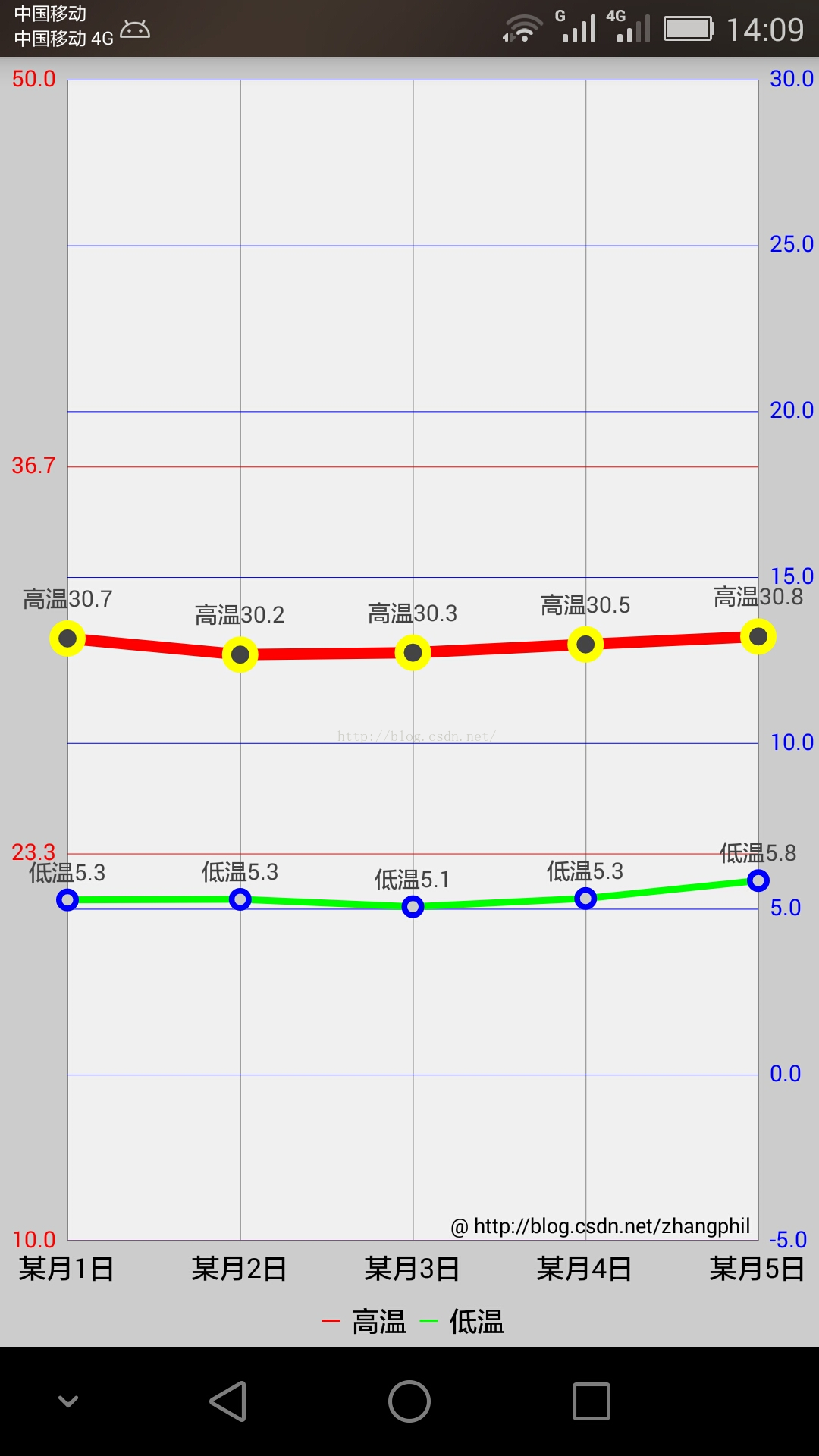
需要对MPAndroidChart的坐标体系加以说明。MPAndroidChart的Y纵坐标轴分为左右两条纵坐标:左纵坐标轴(chart的getAxisLeft()获得的YAxis)和右纵坐标轴(chart的getAxisRight()获得的YAxis)。虽然它们都是MPAndroidChart中的Yaxis一个类代表,但它们在具体使用中是相互独立的,但它们共用X坐标轴(横坐标)。
比如在本例中,左边的红色Y纵坐标轴独立代表高温折线,它有自己独立运行的一套绘图机制;同理,右边蓝色Y纵坐标轴独立代表的低温折线,它也有自己独立运行的一套绘图机制。不要将两者混为一谈。


 1157
1157


 被折叠的 条评论
为什么被折叠?
被折叠的 条评论
为什么被折叠?
 到【灌水乐园】发言


