


Android Toolbar左、中、右对齐
默认的Android Toolbar中添加子元素view是从左到右依次添加。需要注意的是,Android Toolbar为自身的NavigationIcon(app:navigationIcon)最靠右,Logo(app:logo)紧接NavigationIcon、Title(app:title)接续Logo、保留了默认的位置(从左边到右)。这些Android Toolbar保留的系统设置字段将挤压开发者自己安放在Toolbar中的子view,如图所示:
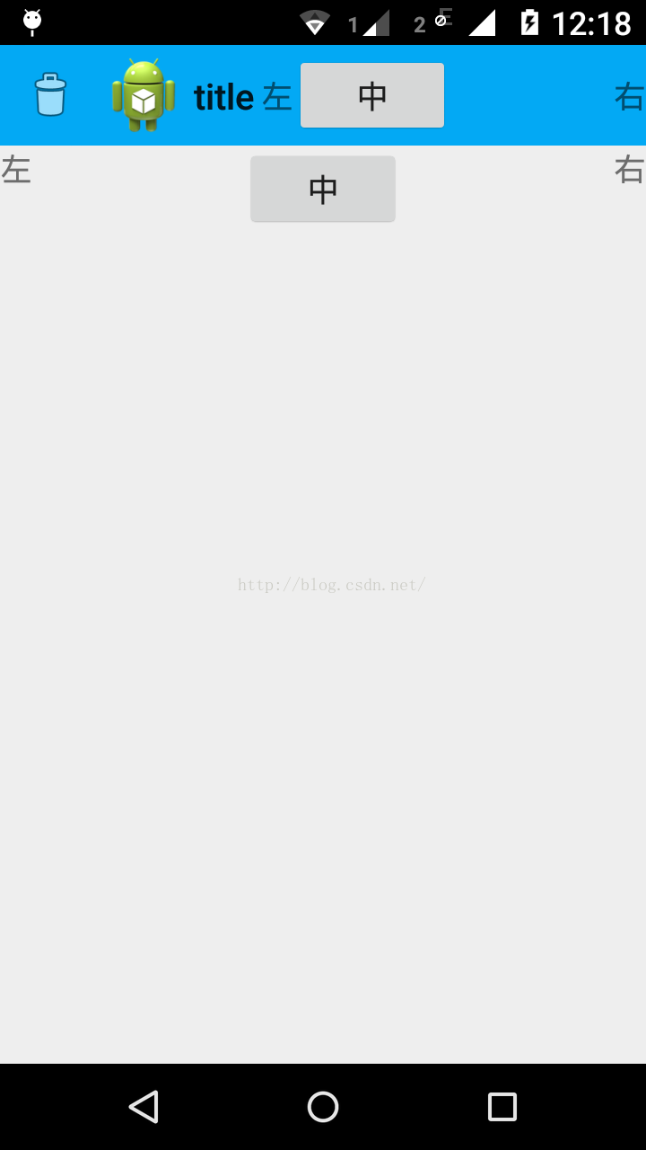
上图的XML实现代码:
<RelativeLayout xmlns:android="http://schemas.android.com/apk/res/android"
    xmlns:tools="http://schemas.android.com/tools"
    xmlns:app="http://schemas.android.com/apk/res/zhangphil.toolbar"
    android:layout_width="match_parent"
    android:layout_height="match_parent" >

    <android.support.v7.widget.Toolbar
        xmlns:app="http://schemas.android.com/apk/res-auto"
        android:id="@+id/toolbar"
        android:layout_width="match_parent"
        android:layout_height="?attr/actionBarSize"
        android:background="#03a9f4"
        android:minHeight="?attr/actionBarSize"
        android:theme="@style/ThemeOverlay.AppCompat.ActionBar"
        app:logo="@drawable/ic_launcher"
        app:navigationIcon="@android:drawable/ic_menu_delete"
        app:popupTheme="@style/ThemeOverlay.AppCompat.Light"
        app:title="title" >

        <TextView
            android:layout_width="wrap_content"
            android:layout_height="wrap_content"
            android:layout_gravity="left"
            android:text="左" />

        <Button
            android:layout_width="wrap_content"
            android:layout_height="wrap_content"
            android:layout_gravity="center_horizontal"
            android:text="中" />

        <TextView
            android:layout_width="wrap_content"
            android:layout_height="wrap_content"
            android:layout_gravity="right"
            android:text="右" />
    </android.support.v7.widget.Toolbar>

    <!-- 下边三个居左、居中、居右的view作为上面Toolbar的参照系可以清楚看出位置的偏移 -->

    <TextView
        android:layout_width="wrap_content"
        android:layout_height="wrap_content"
        android:layout_alignParentLeft="true"
        android:layout_below="@+id/toolbar"
        android:text="左" />

    <Button
        android:layout_width="wrap_content"
        android:layout_height="wrap_content"
        android:layout_below="@+id/toolbar"
        android:layout_centerHorizontal="true"
        android:text="中" />

    <TextView
        android:layout_width="wrap_content"
        android:layout_height="wrap_content"
        android:layout_alignParentRight="true"
        android:layout_below="@+id/toolbar"
        android:text="右" />

</RelativeLayout>
如果没有使用Android Toolbar自身的app:navigationIcon、app:logo、app:title,则可以大致实现自定义的view居中、居右显示,但居左仍会有一些小瑕疵,因为Android Toolbar仍然为NavigationIcon(app:navigationIcon)在Toolbar的最左边保留了一定的空间位置,如图:
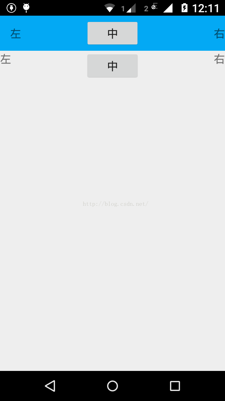
上图实现的XML代码:
<RelativeLayout xmlns:android="http://schemas.android.com/apk/res/android"
    xmlns:tools="http://schemas.android.com/tools"
    xmlns:app="http://schemas.android.com/apk/res/zhangphil.toolbar"
    android:layout_width="match_parent"
    android:layout_height="match_parent" >

    <android.support.v7.widget.Toolbar
        xmlns:app="http://schemas.android.com/apk/res-auto"
        android:id="@+id/toolbar"
        android:layout_width="match_parent"
        android:layout_height="?attr/actionBarSize"
        android:background="#03a9f4"
        android:minHeight="?attr/actionBarSize"
        android:theme="@style/ThemeOverlay.AppCompat.ActionBar"
        app:popupTheme="@style/ThemeOverlay.AppCompat.Light" >

        <TextView
            android:layout_width="wrap_content"
            android:layout_height="wrap_content"
            android:layout_gravity="left"
            android:text="左" />

        <Button
            android:layout_width="wrap_content"
            android:layout_height="wrap_content"
            android:layout_gravity="center_horizontal"
            android:text="中" />

        <TextView
            android:layout_width="wrap_content"
            android:layout_height="wrap_content"
            android:layout_gravity="right"
            android:text="右" />
    </android.support.v7.widget.Toolbar>

    <!-- 下边三个居左、居中、居右的view作为上面Toolbar的参照系可以清楚看出位置的偏移 -->

    <TextView
        android:layout_width="wrap_content"
        android:layout_height="wrap_content"
        android:layout_alignParentLeft="true"
        android:layout_below="@+id/toolbar"
        android:text="左" />

    <Button
        android:layout_width="wrap_content"
        android:layout_height="wrap_content"
        android:layout_below="@+id/toolbar"
        android:layout_centerHorizontal="true"
        android:text="中" />

    <TextView
        android:layout_width="wrap_content"
        android:layout_height="wrap_content"
        android:layout_alignParentRight="true"
        android:layout_below="@+id/toolbar"
        android:text="右" />

</RelativeLayout>
也即删掉了Toolbar的三个属性定义:app:navigationIcon、app:logo、app:title 。


 365
365


 被折叠的 条评论
为什么被折叠?
被折叠的 条评论
为什么被折叠?
 到【灌水乐园】发言


