


项目中常用到的圆形进度条有好多个,从网上搜到的自定义进度条多是封装的比较好的代码,但是不利于初学者,现在本博客就教给大家如何一步步实现自定义进度条的效果
相关视频链接:
http://edu.csdn.net/course/detail/3719/65396
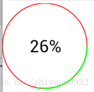
- 先看效果如图…
- 代码实现过程–main布局
这个布局中就是一个简单的引用
<LinearLayout xmlns:android="http://schemas.android.com/apk/res/android"
    xmlns:tools="http://schemas.android.com/tools"
    android:layout_width="match_parent"
    android:layout_height="match_parent"
    android:orientation="vertical" >

    <Button
        android:layout_width="match_parent"
        android:layout_height="wrap_content"
        android:text="开始下载"
        android:onClick="start" />

    <com.example.pb.ProgressView
        android:id="@+id/circleView"
        android:layout_width="100dp"
        android:layout_height="100dp" />

</LinearLayout>- 自定义ProgressView-默认是图中第一种效果
package com.example.pb;

import android.content.Context;
import android.graphics.Canvas;
import android.graphics.Color;
import android.graphics.Matrix;
import android.graphics.Paint;
import android.graphics.Paint.Style;
import android.graphics.Rect;
import android.graphics.RectF;
import android.os.Handler;
import android.util.AttributeSet;
import android.view.View;

public class ProgressView extends View {
    int progress = 0;
    private String text="0%";
    private int max = 100;

    public ProgressView(Context context, AttributeSet attrs, int defStyleAttr) {
        super(context, attrs, defStyleAttr);
    }

    public ProgressView(Context context, AttributeSet attrs) {
        super(context, attrs);
    }

    public ProgressView(Context context) {
        super(context);
    }

    @Override
    protected void onDraw(Canvas canvas) {
        super.onDraw(canvas);
        // 对于画笔
        Paint paint = new Paint();
        // 设置抗锯齿
        paint.setAntiAlias(true);
        // 设置画笔颜色

        // 三种样式--Stroke 只要描边 Fill 填充  FILL_AND_STROKE和既有描边又有填充
        paint.setStyle(Style.STROKE);
        //设置描边宽度
        paint.setStrokeWidth(2);
        //定义外圈员的颜色
        paint.setColor(Color.RED);
        //绘制圆形进度条--获取当前控件多大,正好让进度条在这个控件区间内
        canvas.drawCircle(getMeasuredWidth()/2, getMeasuredWidth()/2, getMeasuredWidth()/2, paint);
        //重新设置描边宽度,这个宽度最好能完全盖过圆形
        paint.setStrokeWidth(3);

        //定义限制圆弧的矩形,当前这样定义正好让圆弧和圆重合
        RectF oval = new RectF(0, 0, getMeasuredWidth(), getMeasuredWidth());
        //设置进度条(圆弧的颜色)
        paint.setColor(Color.GREEN);
        //绘制,设置进度条的度数从0开始,结束值是个变量,可以自己自由设置,来设置进度
        //true和false 代表是否使用中心点,如果true,代表连接中心点,会出现扇形的效果
        canvas.drawArc(oval, 0, 360 * progress / max, false, paint);
        //文字的绘制
        paint.setTextSize(40);
        //设置文字宽度
        paint.setStrokeWidth(1.0f);
        //测量文字大小-提前准备个矩形
        Rect bounds = new Rect();
        //测量文字的宽和高,测量的值可以根据矩形获取
        paint.getTextBounds(text, 0, text.length(), bounds);
        paint.setColor(Color.BLACK);
        paint.setStyle(Style.FILL);
        //绘制文字,计算文字的宽高进行设置
        canvas.drawText(text, getMeasuredWidth()/2 - bounds.width() / 2,
                getMeasuredWidth()/2 + bounds.height() / 2, paint);

    }
    /**
     * 初始设置当前进度的最大值-默认100
     * @param max
     */
    public void setMax(int max) {
        this.max = max;
    }
    /**
     * 更新进度和文字
     * @param progress
     * @param text
     */
    public void setProgressAndText(int progress, String text) {
        this.progress = progress;
        this.text = text;
        //重新绘制
        postInvalidate();
    }

}
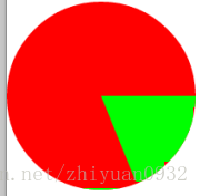
- 如果想要实现第二种效果
//设置填充模式
paint.setStyle(Style.FILL);
//绘制,设置进度条的度数从0开始,结束值是个变量,可以自己自由设置,来设置进度
        //true和false 代表是否使用中心点,如果true,代表连接中心点,会出现扇形的效果
canvas.drawArc(oval, 0, 360 * progress / max, false, paint);- Activity中代码–模拟一下下载的过程,效果随便定义
package com.example.pb;

import android.app.Activity;
import android.os.Bundle;
import android.view.View;

public class MainActivity extends Activity {

    private ProgressView circleView;

    @Override
    protected void onCreate(Bundle savedInstanceState) {
        super.onCreate(savedInstanceState);
        setContentView(R.layout.activity_main);

        circleView = (ProgressView) findViewById(R.id.circleView);

    }

    int progress = 0;

    public void start(View v) {
        // 1000公里
        circleView.setMax(100);
        progress=0;
        new Thread() {
            public void run() {
                while (true) {
                    progress = progress + 1;
                    String text = progress + "%";
                    circleView.setProgressAndText(progress, text);
                    try {
                        sleep(30);
                    } catch (InterruptedException e) {
                        // TODO Auto-generated catch block
                        e.printStackTrace();
                    }
                    if (progress == 100) {
                        break;
                    }
                }
            };
        }.start();
    }

}


 2176
2176


 被折叠的 条评论
为什么被折叠?
被折叠的 条评论
为什么被折叠?
 到【灌水乐园】发言


