


原文链接
本文翻译自Supporting Multiple Screens.
目前我这篇翻译应该是最全,最完整的官方文档翻译,转载我的翻译请联系本人,标明出处.
Supporting Multiple Screens
Android runs on a variety of devices that offer different screen sizes and densities. For applications, the Android system provides a consistent development environment across devices and handles most of the work to adjust each application’s user interface to the screen on which it is displayed. At the same time, the system provides APIs that allow you to control your application’s UI for specific screen sizes and densities, in order to optimize your UI design for different screen configurations. For example, you might want a UI for tablets that’s different from the UI for handsets.
Android系统运行在不同屏幕尺寸和屏幕密度的设备上.对于Android应用程序来说,Android系统在不同设备上提供了统一的开发环境,大部分工作是在调整应用程序需要显示的界面上的用户UI.与此同时,Android系统提供了API允许你单独控制在特定屏幕和分辨率设备下的UI显示.例如,在你的应用程序里,你可以为平板电脑和手机提供不同的UI显示.
Although the system performs scaling and resizing to make your application work on different screens, you should make the effort to optimize your application for different screen sizes and densities. In doing so, you maximize the user experience for all devices and your users believe that your application was actually designed for their devices—rather than simply stretched to fit the screen on their devices.
尽管Android系统可以在不同的屏幕上缩放、调整应用的UI,但是应用开发人员还是应该尽量的优化UI显示,并适配UI到不同的屏幕尺寸和分辨率的屏幕上.这样做时,你才能让用户相信你的应用就是针对他们而设计的,而不是简单的拉伸应用UI界面来适配用户的手机屏幕.
By following the practices described in this document, you can create an application that displays properly and provides an optimized user experience on all supported screen configurations, using a single .apk file.
按照本文的适配方法,通过一个apk文件,可以创建一个能够正确适配各种屏幕的应用程序并且能够提升用户的使用体验.
Overview of Screens Support(屏幕支持概述)
This section provides an overview of Android’s support for multiple screens, including: an introduction to the terms and concepts used in this document and in the API, a summary of the screen configurations that the system supports, and an overview of the API and underlying screen-compatibility features.
本节为Android多屏幕适配概述.包括:介绍本文中API用到的术语和概念,总结系统支持的屏幕配置,API概览和介绍屏幕兼容特性.
Terms and concepts(术语和概念)
Screen size
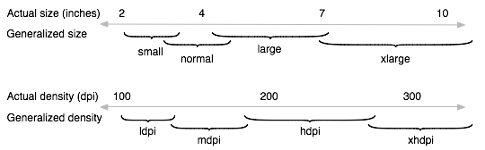
- Actual physical size, measured as the screen’s diagonal.
For simplicity, Android groups all actual screen sizes into four generalized sizes: small, normal, large, and extra-large
屏幕尺寸
屏幕实际的物理尺寸,是按照屏幕对角线计量的.
为了简单起见,Android将所有屏幕划分为四种广义的尺寸:小、标准、大和超大.
Screen density
- The quantity of pixels within a physical area of the screen; usually referred to as dpi (dots per inch). For example, a “low” density screen has fewer pixels within a given physical area, compared to a “normal” or “high” density screen.
For simplicity, Android groups all actual screen densities into six generalized densities: low, medium, high, extra-high, extra-extra-high, and extra-extra-extra-high.
屏幕密度
屏幕每英寸的像素点数,通常也被简称为dpi(每英寸像素点数).例如,与标准和高密度的屏幕相比,低密度屏幕在每英寸中具有较少的像素点.
为了简单起见,Android也将屏幕密度划分为六种广义密度:low,medium,high,extra-high,extra-extra-high和extra-extra-extra-high.
Orientation
- The orientation of the screen from the user’s point of view. This is either landscape or portrait, meaning that the screen’s aspect ratio is either wide or tall, respectively. Be aware that not only do different devices operate in different orientations by default, but the orientation can change at runtime when the user rotates the device.
屏幕方向
屏幕方向取决于用户的角度.无论是横向或者纵向,分别指的是屏幕的纵横比例.需要注意的是,不仅是不同的设备有不同的运行方向,同一台设备用户在使用过程中因为旋转设备也可能会改变屏幕方向.
Resolution
- The total number of physical pixels on a screen. When adding support for multiple screens, applications do not work directly with resolution; applications should be concerned only with screen size and density, as specified by the generalized size and density groups.
屏幕分辨率
屏幕上的像素总数.当应用需要支持各种屏幕尺寸时,应用不需要关心屏幕的分辨率,而应该关心屏幕的尺寸和屏幕密度.
Density-independent pixel (dp)
A virtual pixel unit that you should use when defining UI layout, to express layout dimensions or position in a density-independent way.
The density-independent pixel is equivalent to one physical pixel on a 160 dpi screen, which is the baseline density assumed by the system for a “medium” density screen. At runtime, the system transparently handles any scaling of the dp units, as necessary, based on the actual density of the screen in use. The conversion of dp units to screen pixels is simple: px = dp * (dpi / 160). For example, on a 240 dpi screen, 1 dp equals 1.5 physical pixels. You should always use dp units when defining your application’s UI, to ensure proper display of your UI on screens with different densities.
密度无关像素
在定义UI布局时应该使用的密度无关像素单位.
1dp等于160dpi屏幕上的1像素,此屏幕为mdpi的屏幕.在应用程序运行时,系统会根据不同密度的屏幕处理dp的大小.dp转px的公式为:px = dp * (dpi / 160).例如,在240dpi的屏幕上,1dp=1.5px.定义应用UI布局时,你应该总是使用dp单位,以确保在不同密度的屏幕上都能正确显示你的UI布局.
Range of screens supported(支持的屏幕范围)
Starting with Android 1.6 (API Level 4), Android provides support for multiple screen sizes and densities, reflecting the many different screen configurations that a device may have. You can use features of the Android system to optimize your application’s user interface for each screen configuration and ensure that your application not only renders properly, but provides the best user experience possible on each screen.
从Android1.6(API等级4)开始,Android已经提供了对不同屏幕尺寸和屏幕密度的支持,因为一个设备型号可能会有不同的屏幕配置.你可以利用Android系统的这些特性为每一个屏幕配置优化你的应用程序界面,确保你的应用程序不仅能正确的运行,而且还能尽可能在每一种屏幕上提供更好的用户体验.
To simplify the way that you design your user interfaces for multiple screens, Android divides the range of actual screen sizes and densities into:
- A set of four generalized sizes: small, normal, large, and xlarge
- A set of six generalized densities:
- ldpi (low) ~120dpi
- mdpi (medium) ~160dpi
- hdpi (high) ~240dpi
- xhdpi (extra-high) ~320dpi
- xxhdpi (extra-extra-high) ~480dpi
- xxxhdpi (extra-extra-extra-high) ~640dpi
为了简化多屏幕的UI适配,Android系统按照屏幕尺寸和屏幕密度划分为:
四种广义屏幕尺寸:小、标准、大,超大
六种广义屏幕密度:ldpi(low) ~ 120dpi
mdpi(medium) ~ 160dpi
hdpi(high) ~ 240dpi
xhdpi(extra-high) ~ 320dpi
xxhdpi(extra-extra-high) ~ 480dpi
xxxhpi(extra-extra-extra-high) ~ 640dpi
The generalized sizes and densities are arranged around a baseline configuration that is a normal size and mdpi (medium) density. This baseline is based upon the screen configuration for the first Android-powered device, the T-Mobile G1, which has an HVGA screen (until Android 1.6, this was the only screen configuration that Android supported).
这种屏幕尺寸和密度的划分是围绕一种基准的配置进行划分的.这种基准配置是指标准尺寸和mdpi的像素密度.这个基准也是基于Android第一款机型,T-Mobile G1,它具有HVGA的屏幕(直到Android1.6,这是Android唯一支持的屏幕配置).
Each generalized size and density spans a range of actual screen sizes and densities. For example, two devices that both report a screen size of normal might have actual screen sizes and aspect ratios that are slightly different when measured by hand. Similarly, two devices that report a screen density of hdpi might have real pixel densities that are slightly different. Android makes these differences abstract to applications, so you can provide UI designed for the generalized sizes and densities and let the system handle any final adjustments as necessary. Figure 1 illustrates how different sizes and densities are roughly categorized into the different size and density groups.
每个屏幕尺寸和屏幕密度的定义都包含了一个范围.例如,用手测量时,两个标准的屏幕尺寸的设备可能具有实际的稍微不同的屏幕尺寸和纵横比.同样的,两个同是hdpi像素密度的手机在真正的屏幕像素密度上可能也会有细微的差别.Android系统让这些差别对于应用程序来说无关,所以你可以为广义的屏幕尺寸和密度提供UI设计,让系统来处理最后的调整.图1粗略的表明如何按照不同尺寸密度分类成不同的屏幕尺寸和屏幕密度.
As you design your UI for different screen sizes, you’ll discover that each design requires a minimum amount of space. So, each generalized screen size above has an associated minimum resolution that’s defined by the system. These minimum sizes are in “dp” units—the same units you should use when defining your layouts—which allows the system to avoid worrying about changes in screen density.
- xlarge screens are at least 960dp x 720dp
- large screens are at least 640dp x 480dp
- normal screens are at least 470dp x 320dp
- small screens are at least 426dp x 320dp
当你为不同的屏幕设计UI时,你将会发现每一个设计都需要一个最小的屏幕空间.因此,上面提到的每一种屏幕尺寸都有系统定义的相关联的最小分辨率.这些最小尺寸使用dp为单位,和你定义UI的单位相同,这样使得系统能避免不同屏幕密度下的显示效果不一致.
超大屏幕至少960dp x 720dp
大屏幕至少640dp x 480dp
标准屏幕至少470dp x 320dp
小屏幕至少426dp x 320dp
To optimize your application’s UI for the different screen sizes and densities, you can provide alternative resources for any of the generalized sizes and densities. Typically, you should provide alternative layouts for some of the different screen sizes and alternative bitmap images for different screen densities. At runtime, the system uses the appropriate resources for your application, based on the generalized size or density of the current device screen.
为了在不同的屏幕尺寸和屏幕密度的设备上优化你的应用UI,你应该为不同的屏幕尺寸和密度提供不同的显示资源.一般开发人员都需要在同一款应用中为不同的屏幕尺寸和密度提供不同的布局文件和图片资源文件.在Android系统运行时,Android系统会根据当前屏幕的尺寸和密度选择合适的布局文件和图片资源.
You do not need to provide alternative resources for every combination of screen size and density. The system provides robust compatibility features that can handle most of the work of rendering your application on any device screen, provided that you’ve implemented your UI using techniques that allow it to gracefully resize (as described in the Best Practices, below).
在应用开发中,没必要为每一种屏幕尺寸和屏幕密度的组合提供不同的资源.Android系统会提供很强大的兼容性,只要你遵循这里描述的最佳实践,Android系统就能够处理大多数的情况了.
Density independence(密度无关性)
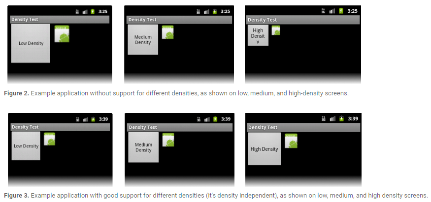
Your application achieves “density independence” when it preserves the physical size (from the user’s point of view) of user interface elements when displayed on screens with different densities.
你的应用必须在不同密度的设备上,保持UI元素的物理尺寸比例不变(从用户的角度来看),以实现密度无关的特性.
Maintaining density independence is important because, without it, a UI element (such as a button) appears physically larger on a low-density screen and smaller on a high-density screen. Such density-related size changes can cause problems in your application layout and usability. Figures 2 and 3 show the difference between an application when it does not provide density independence and when it does, respectively.
应用实现密度无关是非常重要的,如果应用无法实现密度无关,例如一个UI控件(像button这种)在低密度的屏幕上会显得很大,而在高密度的屏幕上又会显得很小.密度相关会导致你的应用在显示上出现问题.图2和图3分别展示了不提供密度无关性和提供密度无关性时,应用程序的显示差异.
The Android system helps your application achieve density independence in two ways:
- The system scales dp units as appropriate for the current screen density
- The system scales drawable resources to the appropriate size, based on the current screen density, if necessary
Android系统通过两个方式帮助你的应用实现密度无关的特性:
系统会在不同密度的屏幕上动态调整dp代表的像素值.
如有必要,系统会基于当前屏幕密度适配合适大小的图片资源.
In figure 2, the text view and bitmap drawable have dimensions specified in pixels (px units), so the views are physically larger on a low-density screen and smaller on a high-density screen. This is because although the actual screen sizes may be the same, the high-density screen has more pixels per inch (the same amount of pixels fit in a smaller area). In figure 3, the layout dimensions are specified in density-independent pixels (dp units). Because the baseline for density-independent pixels is a medium-density screen, the device with a medium-density screen looks the same as it does in figure 2. For the low-density and high-density screens, however, the system scales the density-independent pixel values down and up, respectively, to fit the screen as appropriate.
在图2中,TextView和Bitmap Drawable直接使用px为度量单位.View在低密度的屏幕上看起来很大,在高密度的屏幕上看起来又比较小.这是因为不同密度屏幕的每英寸像素数是不一致的.在图3中,TextView和Bitmap Drawable使用dp这种密度无关的度量单位,因此在不同密度的屏幕上看起来的效果是一致的.
In most cases, you can ensure density independence in your application simply by specifying all layout dimension values in density-independent pixels (dp units) or with “wrap_content”, as appropriate. The system then scales bitmap drawables as appropriate in order to display at the appropriate size, based on the appropriate scaling factor for the current screen’s density.
在大多数情况下,使用dp为度量单位或者使用wrap_content这种度量属性可以使你的应用具备屏幕密度无关特性.系统会基于当前屏幕密度使用合适的比例来适当的调整.
However, bitmap scaling can result in blurry or pixelated bitmaps, which you might notice in the above screenshots. To avoid these artifacts, you should provide alternative bitmap resources for different densities. For example, you should provide higher-resolution bitmaps for high-density screens and the system will use those instead of resizing the bitmap designed for medium-density screens. The following section describes more about how to supply alternative resources for different screen configurations.
然而,系统对图片的调整可能导致图片显示的模糊等问题.为了避免这种问题,你应该为不同密度的屏幕提供不同的图片资源.例如,你应该为hdpi的屏幕提供高分辨率的图片资源,为标准屏幕提供标准分辨率的图片资源,而不是让系统去根据屏幕密度来进行图片的调整.接下来的章节主要介绍如何为不同密度的屏幕提供不同的资源.
How to Support Multiple Screens(如何适配不同规格的屏幕)
The foundation of Android’s support for multiple screens is its ability to manage the rendering of an application’s layout and bitmap drawables in an appropriate way for the current screen configuration. The system handles most of the work to render your application properly on each screen configuration by scaling layouts to fit the screen size/density and scaling bitmap drawables for the screen density, as appropriate. To more gracefully handle different screen configurations, however, you should also:
Explicitly declare in the manifest which screen sizes your application supports
By declaring which screen sizes your application supports, you can ensure that only devices with the screens you support can download your application. Declaring support for different screen sizes can also affect how the system draws your application on larger screens—specifically, whether your application runs in screen compatibility mode.
To declare the screen sizes your application supports, you should include the <supports-screens> element in your manifest file.Provide different layouts for different screen sizes
By default, Android resizes your application layout to fit the current device screen. In most cases, this works fine. In other cases, your UI might not look as good and might need adjustments for different screen sizes. For example, on a larger screen, you might want to adjust the position and size of some elements to take advantage of the additional screen space, or on a smaller screen, you might need to adjust sizes so that everything can fit on the screen.
The configuration qualifiers you can use to provide size-specific resources are small, normal, large, and xlarge. For example, layouts for an extra-large screen should go in layout-xlarge/.
Beginning with Android 3.2 (API level 13), the above size groups are deprecated and you should instead use the sw<N>dp configuration qualifier to define the smallest available width required by your layout resources. For example, if your multi-pane tablet layout requires at least 600dp of screen width, you should place it in layout-sw600dp/. Using the new techniques for declaring layout resources is discussed further in the section about Declaring Tablet Layouts for Android 3.2.Provide different bitmap drawables for different screen densities
By default, Android scales your bitmap drawables (.png, .jpg, and .gif files) and Nine-Patch drawables (.9.png files) so that they render at the appropriate physical size on each device. For example, if your application provides bitmap drawables only for the baseline, medium screen density (mdpi), then the system scales them up when on a high-density screen, and scales them down when on a low-density screen. This scaling can cause artifacts in the bitmaps. To ensure your bitmaps look their best, you should include alternative versions at different resolutions for different screen densities.
The configuration qualifiers (described in detail below) that you can use for density-specific resources are ldpi (low), mdpi (medium), hdpi (high), xhdpi extra-high), xxhdpi (extra-extra-high), and xxxhdpi (extra-extra-extra-high). For example, bitmaps for high-density screens should go in drawable-hdpi/.
Android能够适配多种屏幕的基础在于它能根据当前屏幕的参数、配置来决定需要渲染的布局和图片资源.Android系统为了能在不同密度的屏幕上合理的显示应用,花了大量的工作用来处理布局和图片的调整.为了更好的适配不同的屏幕,应用开发人员应该注意以下几点:
- 在你的AndroidManifest文件中声明应用支持的屏幕尺寸.
通过这种声明,你可以保证只有符合屏幕尺寸要求的设备才能下载安装你的应用.声明不同尺寸屏幕会影响到系统在屏幕上如何绘制你的App,特别是当你的应用是运行在屏幕兼容模式下.
在AndroidManifest.xml中,通过”<supports-screens>”标签来声明你要支持的屏幕尺寸.- 为不同规格的屏幕提供不同的布局文件
默认情况下,Android系统会调整应用布局来适配当前的屏幕密度.大多数情况下,布局适配没有太大问题.但是也有例外,不同屏幕尺寸情况下你的UI可能需要单独调整.例如,在较大的屏幕上,可能需要调整某些元素的位置和尺寸来充分利用额外的屏幕空间,或者在较小的屏幕上,会调整尺寸使得一切都可以在屏幕上显示.
可以使用Android系统提供的大小限定符,有small,normal,large和xlarge.例如,为超大屏幕适配的布局文件应该存放在layout-xlarge目录下.
从Android3.2(API等级13)开始,上面的尺寸分组已经被弃用,你应该使用sw<N>dp限定符去定义布局资源需要的最小的可用宽度.例如,如果多窗口的平板布局至少需要600dp的屏幕宽度,因此你应该把平板的布局文件存放在layout-sw600dp目录下.- 为不同密度的屏幕提供不同的图片资源
默认情况下,Android系统会自动调整你的图片资源(.png, .jpg和.gif文件)和.9资源图片(.9.png文件),以便让资源在不同密度的屏幕上显示适当的物理尺寸.例如,如果你的应用中只为mdpi的标准屏幕提供了一份图片资源,那么在hdpi的屏幕上,Android系统会拉伸你的资源,在ldpi的屏幕上,Android系统会压缩你的资源.因此,为了确保你的图片资源看起来正常,你需要为不同密度的屏幕提供不同的图片资源.可以用来指定密度资源的限定符有ldpi,mdpi,hdpi,xhdpi,xxhdpi和xxxhdpi.例如,为hdpi屏幕准备的图片资源应该存放在drawable-hdpi目录下.
Note: The mipmap-xxxhdpi qualifier is necessary only to provide a launcher icon that can appear larger than usual on an xxhdpi device. You do not need to provide xxxhdpi assets for all your app’s images.
注意:mipmap-xxxhdpi目录是为了在超过xxxhdpi的设备上存放桌面图标的.你不需要为应用内所有的图片都提供xxxhdpi的资源.
At runtime, the system ensures the best possible display on the current screen with the following procedure for any given resource:
The system uses the appropriate alternative resource
Based on the size and density of the current screen, the system uses any size- and density-specific resource provided in your application. For example, if the device has a high-density screen and the application requests a drawable resource, the system looks for a drawable resource directory that best matches the device configuration. Depending on the other alternative resources available, a resource directory with the hdpi qualifier (such as drawable-hdpi/) might be the best match, so the system uses the drawable resource from this directory.If no matching resource is available, the system uses the default resource and scales it up or down as needed to match the current screen size and density
The “default” resources are those that are not tagged with a configuration qualifier. For example, the resources in drawable/ are the default drawable resources. The system assumes that default resources are designed for the baseline screen size and density, which is a normal screen size and a medium-density. As such, the system scales default density resources up for high-density screens and down for low-density screens, as appropriate.
However, when the system is looking for a density-specific resource and does not find it in the density-specific directory, it won’t always use the default resources. The system may instead use one of the other density-specific resources in order to provide better results when scaling. For example, when looking for a low-density resource and it is not available, the system prefers to scale-down the high-density version of the resource, because the system can easily scale a high-density resource down to low-density by a factor of 0.5, with fewer artifacts, compared to scaling a medium-density resource by a factor of 0.75.
在Android系统运行时,系统通过以下几个步骤来保证屏幕上有最佳的显示效果:
- 系统选择合适的资源来显示
基于当前屏幕的尺寸和密度,系统会选择应用程序中合适的资源.例如,在hdpi的设备上,应用程序需要一个图片资源,这时系统会寻找最适合在hdpi屏幕上显示的图片资源,一般会去drawable-hdpi目录下查找,因为这个目录下的资源是最匹配hdpi的屏幕的.- 如果没有匹配的资源可用,系统会使用默认资源且会拉伸或者压缩资源来适配当前屏幕的密度和尺寸
默认资源是指那些存放在没有被限定符标记的目录下的资源.例如,在drawable目录下就是默认的图片资源.Android系统假定默认资源是为基准屏幕尺寸和密度设计的,即标准屏幕尺寸和mdpi的屏幕密度.同样的,系统会为hdpi的屏幕拉伸默认资源,会为ldpi的屏幕压缩默认资源.
然而,当系统在寻找一个指定密度的资源且在匹配限定符目录下没找到它时,系统不一定总是使用默认资源.为了获取更好的压缩或拉伸效果,系统会使用一个其他指定密度的资源.例如,当系统寻找ldpi的资源且没找到时,系统会优先寻找hdpi的资源然后通过压缩来使用.因为系统通过换算,可以轻易知道只需要将hdpi的资源简单的乘以0.5系数来压缩即可得到ldpi的资源了.这比使用默认资源乘以0.75系数花费的工作要小很多.
Using configuration qualifiers (使用限定符)
Android supports several configuration qualifiers that allow you to control how the system selects your alternative resources based on the characteristics of the current device screen. A configuration qualifier is a string that you can append to a resource directory in your Android project and specifies the configuration for which the resources inside are designed.
Android系统支持多种限定符,让你可以控制系统如何基于当前的屏幕尺寸和密度选择合适的资源.一个限定符是一个字符串,你可以把它附加到你的Android工程的资源目录上以指定这是特定尺寸和密度的资源目录.
To use a configuration qualifier:
- Create a new directory in your project’s res/ directory and name it using the format: <resources_name>-<qualifier>
- <resources_name> is the standard resource name (such as drawable or layout).
- <qualifier> is a configuration qualifier from table 1, below, specifying the screen configuration for which these resources are to be used (such as hdpi or xlarge).
- You can use more than one <qualifier> at a time—simply separate each qualifier with a dash.
- Save the appropriate configuration-specific resources in this new directory. The resource files must be named exactly the same as the default resource files.
使用限定符的方法:
- 在res目录下创建资源目录,命名方式为:resources_name-qualifier
- resources_name是资源目录名,例如drawable或者layout
- qualifier是限定符名称,例如hdpi或者xlarge.
- 将相应的资源保存在上面创建的特定目录中.注意,例如drawable-hdpi的目录只能放置hdpi的资源图片,不要放错了.
For example, xlarge is a configuration qualifier for extra-large screens. When you append this string to a resource directory name (such as layout-xlarge), it indicates to the system that these resources are to be used on devices that have an extra-large screen.
例如,xlarge限定符是为超大屏幕做的适配标识.当你把xlarge加到相应的目录后面(例如layout-xlarge),这就意味着当处于超大屏幕时需要会从有xlarge标识的目录中寻找资源文件.
Table 1. Configuration qualifiers that allow you to provide special resources for different screen configurations.
表格1. 为应用提供的屏幕尺寸限定符和屏幕密度限定符.
| 屏幕特性 | 限定符 | 描述 |
|---|---|---|
| 屏幕尺寸 | small | 小屏幕 |
| normal | 基准屏幕 | |
| large | 大屏幕 | |
| xlarge | 超大屏幕 | |
| 屏幕密度 | ldpi | <=120dpi |
| mdpi | <= 160dpi | |
| hdpi | <= 240dpi | |
| xhdpi | <= 320dpi | |
| xxhdpi | <= 480dpi | |
| xxhdpi | <= 640dpi(只用来存放icon) | |
| nodpi | 与屏幕密度无关的资源.系统不会针对屏幕密度对其中资源进行压缩或者拉伸 | |
| tvdpi | 介于mdpi与hdpi之间,特定针对213dpi,专门为电视准备的,手机应用开发不需要关心这个密度值. | |
| 屏幕方向 | land | 横向 |
| port | 纵向 | |
| 屏幕宽高比 | long | 比标准屏幕宽高比明显的高或者宽的这样屏幕 |
| notlong | 和标准屏幕配置一样的屏幕宽高比 |
For example, the following application resource directories provide different layout designs for different screen sizes and different drawables. Use the mipmap/ folders for launcher icons.
以下是应用程序的资源目录列表.其中mipmap目录是用来存放应用图标的.
res/layout/my_layout.xml              // layout for normal screen size ("default")
res/layout-large/my_layout.xml        // layout for large screen size
res/layout-xlarge/my_layout.xml       // layout for extra-large screen size
res/layout-xlarge-land/my_layout.xml  // layout for extra-large in landscape orientation

res/drawable-mdpi/graphic.png         // bitmap for medium-density
res/drawable-hdpi/graphic.png         // bitmap for high-density
res/drawable-xhdpi/graphic.png        // bitmap for extra-high-density
res/drawable-xxhdpi/graphic.png       // bitmap for extra-extra-high-density

res/mipmap-mdpi/my_icon.png         // launcher icon for medium-density
res/mipmap-hdpi/my_icon.png         // launcher icon for high-density
res/mipmap-xhdpi/my_icon.png        // launcher icon for extra-high-density
res/mipmap-xxhdpi/my_icon.png       // launcher icon for extra-extra-high-density
res/mipmap-xxxhdpi/my_icon.png      // launcher icon for extra-extra-extra-high-density
Be aware that, when the Android system picks which resources to use at runtime, it uses certain logic to determine the “best matching” resources. That is, the qualifiers you use don’t have to exactly match the current screen configuration in all cases in order for the system to use them. Specifically, when selecting resources based on the size qualifiers, the system will use resources designed for a screen smaller than the current screen if there are no resources that better match (for example, a large-size screen will use normal-size screen resources if necessary). However, if the only available resources are larger than the current screen, the system will not use them and your application will crash if no other resources match the device configuration (for example, if all layout resources are tagged with the xlarge qualifier, but the device is a normal-size screen). For more information about how the system selects resources, read How Android Finds the Best-matching Resource.
请注意,当Android系统挑选资源时,它采用特定的逻辑来判定”最匹配”资源.这意味着,你使用限定符时不需要非常精确,以便于不同设备上应用程序进行筛选(ps:过于精确会导致系统找不到资源从而报错).特别需要注意的是,当基于限定符选择资源时,如果没有更匹配的资源,系统会使用比当前限定符更小的限定符修饰的资源.但是,如果唯一可用的资源比当前屏幕尺寸还大,系统将不会使用它们,这时可能导致应用程序崩溃.
Designing alternative layouts and drawables(设计可选择的布局文件和图片资源)
The types of alternative resources you should create depends on your application’s needs. Usually, you should use the size and orientation qualifiers to provide alternative layout resources and use the density qualifiers to provide alternative bitmap drawable resources.
应该创建的资源类型取决于应用程序的需要.通常,你需要使用屏幕尺寸和屏幕方向限定符来创建布局资源目录,使用屏幕密度限定符来创建图片资源目录.
The following sections summarize how you might want to use the size and density qualifiers to provide alternative layouts and drawables, respectively.
下面的章节概要的介绍了如何使用尺寸和密度来分别创建布局目录和资源目录.
Alternative layouts(可选布局)
Generally, you’ll know whether you need alternative layouts for different screen sizes once you test your application on different screen configurations. For example:
- When testing on a small screen, you might discover that your layout doesn’t quite fit on the screen. For example, a row of buttons might not fit within the width of the screen on a small screen device. In this case you should provide an alternative layout for small screens that adjusts the size or position of the buttons.
- When testing on an extra-large screen, you might realize that your layout doesn’t make efficient use of the big screen and is obviously stretched to fill it. In this case, you should provide an alternative layout for extra-large screens that provides a redesigned UI that is optimized for bigger screens such as tablets.
- Although your application should work fine without an alternative layout on big screens, it’s quite important to users that your application looks as though it’s designed specifically for their devices. If the UI is obviously stretched, users are more likely to be unsatisfied with the application experience.
- And, when testing in the landscape orientation compared to the portrait orientation, you might notice that UI elements placed at the bottom of the screen for the portrait orientation should instead be on the right side of the screen in landscape orientation.
通常情况下,一旦你在不同的屏幕配置上测试你的应用,你就会知道是否需要为不同的屏幕提供不同的布局适配了.例如:
- 当在小屏幕上进行UI测试时, 你可能会发现你的布局并不适合小屏幕.例如,你有一排的button控件可能在小屏幕上无法展开,这个时候你就需要为小屏幕单独适配一个布局文件.
- 当在超大屏幕上进行UI测试时,你可能会发现你的布局并没有合理的利用超大的布局空间,而仅仅是通过拉伸来填充它.这种情况下,你应该为超大屏幕例如平板设备提供一个新的布局文件来实现更好的布局.
- 当竖屏转为横屏时,你可能会注意到为竖屏设计的被放置在屏幕底部的UI元素在横屏情况下更应该被放在屏幕右侧.
To summarize, you should be sure that your application layout:
- Fits on small screens (so users can actually use your application)
- Is optimized for bigger screens to take advantage of the additional screen space
- Is optimized for both landscape and portrait orientations
总结一下,你应该确保你的应用程序布局满足如下三点要求:
- 适配小屏幕(保证用户能使用你的应用程序)
- 利用额外的屏幕空间为超大屏幕设备做优化
- 能够同时很好的支持横屏和竖屏
If your UI uses bitmaps that need to fit the size of a view even after the system scales the layout (such as the background image for a button), you should use Nine-Patch bitmap files. A Nine-Patch file is basically a PNG file in which you specify two-dimensional regions that are stretchable. When the system needs to scale the view in which the bitmap is used, the system stretches the Nine-Patch bitmap, but stretches only the specified regions. As such, you don’t need to provide different drawables for different screen sizes, because the Nine-Patch bitmap can adjust to any size. You should, however, provide alternate versions of your Nine-Patch files for different screen densities.
如果你的控件UI需要用图片来填充一个控件尺寸,甚至是在布局被调整之后(例如button的背景图),你应该使用.9图片.因为.9图片是一个可以指定特定二维区域被拉伸的png图片.当系统需要调整带有图片的控件时,系统会自动拉伸.9图片指定的区域.这样,你就没必要为不同的屏幕大小提供不同的图片资源了,.9的图片资源帮我们自动进行了调节.
Alternative drawables(可选图片资源)
Almost every application should have alternative drawable resources for different screen densities, because almost every application has a launcher icon and that icon should look good on all screen densities. Likewise, if you include other bitmap drawables in your application (such as for menu icons or other graphics in your application), you should provide alternative versions or each one, for different densities.
几乎所有的Android应用程序都需要为不同密度的屏幕提供不同的图片资源文件,因为至少每个应用都有launcher图标,而launcher图标需要在不同密度的屏幕上都有很好的显示.
Note: You only need to provide density-specific drawables for bitmap files (.png, .jpg, or .gif) and Nine-Patch files (.9.png). If you use XML files to define shapes, colors, or other drawable resources, you should put one copy in the default drawable directory (drawable/).
注意:你只需要为特定的图片文件(.png,.jpg或者.gif)提供不同屏幕密度的资源.如果你利用xml文件来定义一个shapes,colors等,你是不需要为xml做不同屏幕密度适配的,你只需要把xml文件放到drawable目录即可.
To create alternative bitmap drawables for different densities, you should follow the 3:4:6:8:12:16 scaling ratio between the six generalized densities. For example, if you have a bitmap drawable that’s 48x48 pixels for medium-density screens, all the different sizes should be:
- 36x36 (0.75x) for low-density
- 48x48 (1.0x baseline) for medium-density
- 72x72 (1.5x) for high-density
- 96x96 (2.0x) for extra-high-density
- 144x144 (3.0x) for extra-extra-high-density
- 192x192 (4.0x) for extra-extra-extra-high-density (launcher icon only; see note above)
为了给不同的密度的屏幕创建可选择的图片资源,你应该按照3:4:6:8:12:16这6种密度比例进行适配.例如,如果你为mdpi屏幕提供了一个48x48的图片资源,你同样需要为其他密度提供如下图片资源:
- 36x36 ldpi
- 48x48 mdpi
- 72x72 hdpi
- 96x96 xhdpi
- 144x144 xxhdpi
- 196x196 xxxhdpi
Declaring Tablet Layouts for Android 3.2(适配Android3.2平板布局)
For the first generation of tablets running Android 3.0, the proper way to declare tablet layouts was to put them in a directory with the xlarge configuration qualifier (for example, res/layout-xlarge/). In order to accommodate other types of tablets and screen sizes—in particular, 7” tablets—Android 3.2 introduces a new way to specify resources for more discrete screen sizes. The new technique is based on the amount of space your layout needs (such as 600dp of width), rather than trying to make your layout fit the generalized size groups (such as large or xlarge).
对于第一代运行在Android3.0上的平板,正确声明平板布局的方法是将他们放在xlarge限定符修饰的目录中(例如,res/layout-xlarge).为了适应其他类型的平板和屏幕尺寸,尤其是7寸平板,Android3.2为这些离散的平板尺寸引入了新的限定符.新的限定符是基于你布局需要的空间设定的(例如:需要600dp的宽度),而不是让你的布局去适配广义的尺寸组(例如:large或者xlarge的屏幕).
The reason designing for 7” tablets is tricky when using the generalized size groups is that a 7” tablet is technically in the same group as a 5” handset (the large group). While these two devices are seemingly close to each other in size, the amount of space for an application’s UI is significantly different, as is the style of user interaction. Thus, a 7” and 5” screen should not always use the same layout. To make it possible for you to provide different layouts for these two kinds of screens, Android now allows you to specify your layout resources based on the width and/or height that’s actually available for your application’s layout, specified in dp units.
为7寸屏幕设计布局复杂的原因是:当使用广义的尺寸组时,7寸的平板和5寸的手机位于同一个尺寸组里无法区分.很显然,平板和手机应该使用不同的布局,因此为了能够为这两种屏幕提供不同的布局,Android允许你用dp单位指定你布局文件在屏幕上需要的宽或高.
For example, after you’ve designed the layout you want to use for tablet-style devices, you might determine that the layout stops working well when the screen is less than 600dp wide. This threshold thus becomes the minimum size that you require for your tablet layout. As such, you can now specify that these layout resources should be used only when there is at least 600dp of width available for your application’s UI.
例如,当你为平板设备提供了布局文件之后,你可决定在小于600dp的屏幕上不使用这个布局文件.这个限制因此变成你平板布局需要的最小尺寸.在这种情况下,你能指定这些布局资源被用在至少600dp宽的屏幕上.
You should either pick a width and design to it as your minimum size, or test what is the smallest width your layout supports once it’s complete.
你应该选择一个宽度作为你平板布局设计的最小尺寸,或者一旦设计完成测试你的布局支持的最小宽度.
Note: Remember that all the figures used with these new size APIs are density-independent pixel (dp) values and your layout dimensions should also always be defined using dp units, because what you care about is the amount of screen space available after the system accounts for screen density (as opposed to using raw pixel resolution). For more information about density-independent pixels, read Terms and concepts, earlier in this document.
注意:所有Android3.2提供的新的API都是使用密度无关像素(dp),你的布局里面尺寸也应该用dp为单位.因为你关心的应该是考虑屏幕密度后的可用空间,而不是原始像素大小.
Using new size qualifiers(使用新的尺寸限定符)
The different resource configurations that you can specify based on the space available for your layout are summarized in table 2. These new qualifiers offer you more control over the specific screen sizes your application supports, compared to the traditional screen size groups (small, normal, large, and xlarge).
表2里总结Android3.2之后新增的尺寸限定符.相比传统的屏幕尺寸组(小,标准,大和超大),这些新的限定符为你的应用程序在特定的屏幕上提供了更多的支持.
Note: The sizes that you specify using these qualifiers are not the actual screen sizes. Rather, the sizes are for the width or height in dp units that are available to your activity’s window. The Android system might use some of the screen for system UI (such as the system bar at the bottom of the screen or the status bar at the top), so some of the screen might not be available for your layout. Thus, the sizes you declare should be specifically about the sizes needed by your activity—the system accounts for any space used by system UI when declaring how much space it provides for your layout. Also beware that the Action Bar is considered a part of your application’s window space, although your layout does not declare it, so it reduces the space available for your layout and you must account for it in your design.
注意:你使用的这些限定符修饰的尺寸并不是实际的屏幕尺寸,而是你Activity中Window所占据的屏幕尺寸.Android系统会为system UI分配一定的屏幕空间(例如屏幕底部的导航栏或者屏幕顶部的状态栏),所以你的布局可能不会占据所有的屏幕空间.因此,你定义的尺寸应该是你activity所需要使用到的尺寸.actionbar被认为是你应用程序界面的一部分,所以虽然你没有定义Action Bar,也需要为你的布局设计中考虑Action Bar所占用的空间.
Table 2. configuration qualifiers for screen size (introduced in Android 3.2).
表格2. 新的屏幕尺寸限定符(Android3.2 之后引入)
| 屏幕特性 | 限定符 | 描述 |
|---|---|---|
| 最小宽度限定符 | sw<N>dp 例如sw600dp, sw720dp | 屏幕的最小尺寸,就是屏幕可用区域的最小尺寸,是指屏幕可用高度或宽度的最小值(你可以默认是屏幕的最小宽度).你能用这个限定符确保,无论屏幕方向如何,这个限定符修饰下的布局需要的屏幕最小尺寸是Ndp. 例如,如果你的布局在运行时需要的最小屏幕宽度是600dp,则你可以利用这个限定符创建布局资源目录res/layout-sw600dp.只有当屏幕的最小宽度或最小高度是600dp时,系统才会使用这些布局文件或者资源文件.最小屏幕宽度是固定设备的特有屏幕尺寸,当屏幕方向发生变化时,设备的最小宽度值不变. 设备的最小宽度值要考虑屏幕的尺寸和系统UI.例如,如果在屏幕上有一些系统持久化UI元素,则系统的最小宽度值要比实现的屏幕尺寸小一些,因为这些系统的UI元素你的应用是无法使用到的. 当你使用之前的广义限定符是,你可以定义连续的一系列限定符.用最小宽度来决定广义屏幕尺寸是有意义的,是因为宽度是影响你UI设计的关键因素.UI在竖直方向上会经常滚动,但是在水平方向上往往是固定的布局.可见不论是适配手机或者平板,宽度往往都是布局的关键因素.因此,你需要关心你手机上的最小宽度值. |
| 屏幕可用宽度 | w<N>dp Examples: w720p w1024p | 指定资源使用时需要的最小宽度.当屏幕方向发生变化时,系统会调整这个值,使其始终为你UI显示的宽度. 这个属性经常被用来判断当前是否需要显示多屏布局,因为哪怕用户当前正在使用平板,你也可能不希望用户在平板竖屏时显示多个屏幕的布局样式.这时,你就可以使用这个限定符来标明你布局需要的最小宽度 |
| 屏幕可用高度 | h<N>dp Examples: h720dp h1024dp etc. | 标明资源使用时需要的最小高度.当屏幕发生旋转时,系统会自动选择当前大的一方作为高度值.大部分应用很少需要这个限定符,因此不做过多讲解 |
While using these qualifiers might seem more complicated than using screen size groups, it should actually be simpler once you determine the requirements for your UI. When you design your UI, the main thing you probably care about is the actual size at which your application switches between a handset-style UI and a tablet-style UI that uses multiple panes. The exact point of this switch will depend on your particular design—maybe you need a 720dp width for your tablet layout, maybe 600dp is enough, or 480dp, or some number between these. Using these qualifiers in table 2, you are in control of the precise size at which your layout changes.
虽然看起来使用这些新的限定符会比使用广义的屏幕尺寸组更加复杂,但是一旦你的UI需求确定之后,你会发现使用这些新的限定符会更加简单.当你设计UI时,你关心的最主要的事情应该是应用程序在手机类型UI和多窗格平板类型的UI之间切换时的实际尺寸.切换的关键点在于特殊的设计,也许需要720dp宽度给平板布局,也许600dp的宽度就够了,或者480dp.使用新的限定符,你可以精确的掌握你布局所需要的尺寸.
Configuration examples(配置示例)
To help you target some of your designs for different types of devices, here are some numbers for typical screen widths:
- 320dp: a typical phone screen (240x320 ldpi, 320x480 mdpi, 480x800 hdpi, etc).
- 480dp: a tweener tablet like the Streak (480x800 mdpi).
- 600dp: a 7” tablet (600x1024 mdpi).
- 720dp: a 10” tablet (720x1280 mdpi, 800x1280 mdpi, etc).
为了帮助你实现为不同类型设备设计UI的目标,下面是一些典型的屏幕宽度参数值:
- 320dp: 典型的手机屏幕.
- 480dp: 类似于手机的平板.
- 600dp: 7寸的平板.
- 720dp: 10寸的平板.
Using the size qualifiers from table 2, your application can switch between your different layout resources for handsets and tablets using any number you want for width and/or height. For example, if 600dp is the smallest available width supported by your tablet layout, you can provide these two sets of layouts:
res/layout/main_activity.xml # For handsets
res/layout-sw600dp/main_activity.xml # For tablets
In this case, the smallest width of the available screen space must be 600dp in order for the tablet layout to be applied.
使用表2中的限定符,可以让你的应用在手机和平板上使用不同的布局文件.例如,600dp是你平板布局需要的最小宽度,你就可以提供如下两个布局文件:
res/ layout/main_activity.xml #为手机布局
在上面的布局文件中,只有当屏幕可以宽度到达600dp时,layout-sw600dp目录下的布局文件才会被使用.
For other cases in which you want to further customize your UI to differentiate between sizes such as 7” and 10” tablets, you can define additional smallest width layouts:
res/layout/main_activity.xml # For handsets (smaller than 600dp available width)
res/layout-sw600dp/main_activity.xml # For 7” tablets (600dp wide and bigger)
res/layout-sw720dp/main_activity.xml # For 10” tablets (720dp wide and bigger)
再举一个例子,如果你需要丰富你的UI布局,例如为7英寸和10英寸平板设计不同的布局,你可以在如下不同的文件夹中定义同名的布局文件:
res/layout/main_activity.xml #手机布局
res/layout-sw600dp/main_activity.xml #7寸平板布局
res/layout-sw720dp/main_activity.xml #10寸平板布局
Notice that the previous two sets of example resources use the “smallest width” qualifier, sw<N>dp, which specifies the smallest of the screen’s two sides, regardless of the device’s current orientation. Thus, using sw<N>dp is a simple way to specify the overall screen size available for your layout by ignoring the screen’s orientation.
需要注意的是,前面的示例方案中都采用了sw<N>这种最小宽度标识的形式,这种形式可以让开发者不去考虑当前屏幕的方向.所以在不考虑屏幕方向只关注布局最小空间的前提下,使用sw<N>的方式更加简单.
However, in some cases, what might be important for your layout is exactly how much width or height is currently available. For example, if you have a two-pane layout with two fragments side by side, you might want to use it whenever the screen provides at least 600dp of width, whether the device is in landscape or portrait orientation. In this case, your resources might look like this:
res/layout/main_activity.xml # For handsets (smaller than 600dp available width)
res/layout-w600dp/main_activity.xml # Multi-pane (any screen with 600dp available width or more)
然而,在某些情况下,你的布局需要明确的知道当前宽和高的可用尺寸.例如,如果你有一个用两个Fragment填充的两个窗口的布局文件,无论当时屏幕的方向如何,只要当屏幕的空间超过600dp时你就需要使用它,这种情况下,你就应该按照如下方式进行声明:
res/layout/main_activity.xml # 手机布局
res/layout-w600dp/main_activity.xml #平板布局
Notice that the second set is using the “available width” qualifier, w<N>dp. This way, one device may actually use both layouts, depending on the orientation of the screen (if the available width is at least 600dp in one orientation and less than 600dp in the other orientation).
注意,上面的例子中使用的是可用宽度限定符w<N>dp.这种情况下,只要屏幕在横向或纵向有一种情况下宽度达到600dp,就会使用这个layout-w600dp目录下的布局文件.
Declaring screen size support(AndroidManifest.xml中支持屏幕尺寸的声明字段)
Once you’ve implemented your layouts for different screen sizes, it’s equally important that you declare in your manifest file which screens your application supports.
一旦已经实现了不同屏幕尺寸的布局,那么在AndroidManifest.xml文件中声明应用程序应该支持哪种屏幕也非常重要.
Along with the new configuration qualifiers for screen size, Android 3.2 introduces new attributes for the <supports-screens> manifest element:
android:requiresSmallestWidthDp
Specifies the minimum smallestWidth required. The smallestWidth is the shortest dimension of the screen space (in dp units) that must be available to your application UI—that is, the shortest of the available screen’s two dimensions. So, in order for a device to be considered compatible with your application, the device’s smallestWidth must be equal to or greater than this value. (Usually, the value you supply for this is the “smallest width” that your layout supports, regardless of the screen’s current orientation.)
For example, if your application is only for tablet-style devices with a 600dp smallest available width:<manifest ... > <supports-screens android:requiresSmallestWidthDp="600" /> </manifest>However, if your application supports all screen sizes supported by Android (as small as 426dp x 320dp), then you don’t need to declare this attribute, because the smallest width your application requires is the smallest possible on any device.
android:compatibleWidthLimitDp
This attribute allows you to enable screen compatibility mode as a user-optional feature by specifying the maximum “smallest width” that your application supports. If the smallest side of a device’s available screen is greater than your value here, users can still install your application, but are offered to run it in screen compatibility mode. By default, screen compatibility mode is disabled and your layout is resized to fit the screen as usual, but a button is available in the system bar that allows users to toggle screen compatibility mode on and off.android:largestWidthLimitDp
This attribute allows you to force-enable screen compatibility mode by specifying the maximum “smallest width” that your application supports. If the smallest side of a device’s available screen is greater than your value here, the application runs in screen compatibility mode with no way for the user to disable it.
Android3.2随着新的限定符也引进了新的manifest元素属性:
指定应用所需要的最小宽度.
SmallestWidth必须是能被应用程序UI利用的屏幕控件的最小尺寸(单位是dp),也是屏幕高或宽中的最小尺寸.因此,为了让设备与应用程序兼容,设备的smallestWidth必须大于等于这个值.
例如,如果你的应用只适配最小宽度为600dp的屏幕,那需要在AndroidManifest中添加如下声明:<manifest ... > <supports-screens android:requiresSmallestWidthDp="600" /> </manifest>然而,如果应用程序支持所有Android支持的屏幕尺寸,那么没有必要申明这个属性了.
android:compatibleWidthLimitDp
这个属性用来兼容通过指定应用程序支持的最小宽度.如果可用设备的最小值大于这个值,用户仍然可以安装应用程序,但是不能再屏幕的兼容模式上运行.默认情况下,屏幕的兼容模式是关闭的.android:largestWidthLimitDp
这个属性通过指定你的应用程序支持的最大“最小宽度”强制开启屏幕的兼容模式,如果设备的可用屏幕最小边大于这个值,应用程序会运行在屏幕兼容模式上,且用户没有办法去禁用它.
Best Practices(最佳实践)
The objective of supporting multiple screens is to create an application that can function properly and look good on any of the generalized screen configurations supported by Android. The previous sections of this document provide information about how Android adapts your application to screen configurations and how you can customize the look of your application on different screen configurations. This section provides some additional tips and an overview of techniques that help ensure that your application scales properly for different screen configurations.
支持多个屏幕尺寸的目标是开发一个在任何屏幕尺寸上都能够很好显示的Android应用程序.本文前面的章节介绍了Android系统是如何让应用程序适配不同屏幕的以及如何在不同尺寸的屏幕上自定义自己的UI布局.这一章节提供了更多的适配多种屏幕的开发技巧.
Here is a quick checklist about how you can ensure that your application displays properly on different screens:
- Use wrap_content, match_parent, or dp units when specifying dimensions in an XML layout file
- Do not use hard coded pixel values in your application code
- Do not use AbsoluteLayout (it’s deprecated)
- Supply alternative bitmap drawables for different screen densities
The following sections provide more details.
这里给出适配方案的简介列表:
- 在layout布局中声明宽或高时尽量使用wrap_content, match_parent或者dp等密度无关的度量单位.
- 不要在应用程序代码中为布局指定px硬编码.
- 不要使用绝对布局,AbsoluteLayout布局已经被废弃了.
- 为不同密度的屏幕提供不同的图片资源.
接下来,是每一条建议的详细描述.
1. Use wrap_content, match_parent, or the dp unit for layout dimensions(尽量使用wrap_content, match_parent或者dp等密度无关度量标识符)
When defining the android:layout_width and android:layout_height for views in an XML layout file, using “wrap_content”, “match_parent” or dp units guarantees that the view is given an appropriate size on the current device screen.
在layout布局文件中定义宽和高时,使用wrap_content, match_parent, dp等密度无关单位可以在不同的屏幕尺寸上都获得比较好的显示效果.
For instance, a view with a layout_width=”100dp” measures 100 pixels wide on medium-density screen and the system scales it up to 150 pixels wide on high-density screen, so that the view occupies approximately the same physical space on the screen.
例如,一个View的宽度声明为100dp,则意味着在mdpi的屏幕上,这个View占据的宽度为100px,而在hdpi的屏幕上,这个View占据的宽度为150px.因此虽然两个屏幕的密度不同,但是View控件宽度所占据的屏幕比例几乎是相同的.
Similarly, you should prefer the sp (scale-independent pixel) to define text sizes. The sp scale factor depends on a user setting and the system scales the size the same as it does for dp.
同样的,在修饰文字大小时建议使用sp为单位,而不是使用px.sp针对字体大小的效果和dp针对view大小的效果类似.
2. Do not use hard-coded pixel values in your application code(不要在应用代码中强制写死px大小)
For performance reasons and to keep the code simpler, the Android system uses pixels as the standard unit for expressing dimension or coordinate values. That means that the dimensions of a view are always expressed in the code using pixels, but always based on the current screen density. For instance, if myView.getWidth() returns 10, the view is 10 pixels wide on the current screen, but on a device with a higher density screen, the value returned might be 15. If you use pixel values in your application code to work with bitmaps that are not pre-scaled for the current screen density, you might need to scale the pixel values that you use in your code to match the un-scaled bitmap source.
为了性能考虑和兼顾代码简洁,Android系统使用px作为尺寸和坐标值的标准单位.这意味着,在代码中去测量一个View的大小总是基于当前屏幕的密度转换成px来表示.例如,通过myView.getWidth()返回的值为10,说明在当前屏幕密度下myView占据的宽度为10px,但是当换一个更高密度的屏幕时,myView.getWidth()返回的值可能就是15px了.如果你基于当前屏幕密度下,使用px来测试bitmap的大小,你计算时需要考虑到当前的屏幕密度值.
3. Do not use AbsoluteLayout(不要使用绝对布局)
Unlike the other layouts widgets, AbsoluteLayout enforces the use of fixed positions to lay out its child views, which can easily lead to user interfaces that do not work well on different displays. Because of this, AbsoluteLayout was deprecated in Android 1.5 (API Level 3).
不像其他布局控件,AbsoluteLayout强制你在xml文件里固定每个子View的位置,这很容易导致你的布局文件不能适配其他密度的屏幕.因此,AbsoluteLayout在Android1.5上就被废弃了.
You should instead use RelativeLayout, which uses relative positioning to lay out its child views. For instance, you can specify that a button widget should appear “to the right of” a text widget.
Android系统推荐你使用RelativeLayout,它可以让你的子控件的布局可以根据情况动态调整.例如,你可以让一个Button布局在一个TextView的右边.
4. Use size and density-specific resources(使用限定符修饰的布局和资源)
Although the system scales your layout and drawable resources based on the current screen configuration, you may want to make adjustments to the UI on different screen sizes and provide bitmap drawables that are optimized for different densities. This essentially reiterates the information from earlier in this document.
尽管Android系统会基于当前屏幕尺寸和密度来调整你的布局和图片资源,但是你可能希望在不同的屏幕尺寸和密度上显示不同的资源图片或者布局.前文已经详细介绍过这种实现方法了,就是通过限定符来标识目录.
If you need to control exactly how your application will look on various screen configurations, adjust your layouts and bitmap drawables in configuration-specific resource directories. For example, consider an icon that you want to display on medium and high-density screens. Simply create your icon at two different sizes (for instance 100x100 for medium-density and 150x150 for high-density) and put the two variations in the appropriate directories, using the proper qualifiers:
res/drawable-mdpi/icon.png //for medium-density screens
res/drawable-hdpi/icon.png //for high-density screens
如果你需要能精确的控制你的应用在不同屏幕尺寸和密度下的显示,你就需要用到限定符修饰的目录.例如,你想要在mdpi和hdpi两种屏幕密度下显示不同的icon图片,你可以先创建两个不同尺寸的icon图片,然后把它们分别放到被特定限制符修饰的目录下(100x100大小的图片放到mdpi目录,150x150大小的图片放到hdpi目录下).
Additional Density Considerations(附加注意事项)
This section describes more about how Android performs scaling for bitmap drawables on different screen densities and how you can further control how bitmaps are drawn on different densities. The information in this section shouldn’t be important to most applications, unless you have encountered problems in your application when running on different screen densities or your application manipulates graphics.
这个章节会更加详细的介绍Android系统是如何调整图片资源的,同时介绍了更多方法让你可以更好的操控图片在不同密度屏幕上的显示.
To better understand how you can support multiple densities when manipulating graphics at runtime, you should understand that the system helps ensure the proper scale for bitmaps in the following ways:
Pre-scaling of resources (such as bitmap drawables)
Based on the density of the current screen, the system uses any size- or density-specific resources from your application and displays them without scaling. If resources are not available in the correct density, the system loads the default resources and scales them up or down as needed to match the current screen’s density. The system assumes that default resources (those from a directory without configuration qualifiers) are designed for the baseline screen density (mdpi), unless they are loaded from a density-specific resource directory. Pre-scaling is, thus, what the system does when resizing a bitmap to the appropriate size for the current screen density.
If you request the dimensions of a pre-scaled resource, the system returns values representing the dimensions after scaling. For example, a bitmap designed at 50x50 pixels for an mdpi screen is scaled to 75x75 pixels on an hdpi screen (if there is no alternative resource for hdpi) and the system reports the size as such.
There are some situations in which you might not want Android to pre-scale a resource. The easiest way to avoid pre-scaling is to put the resource in a resource directory with the nodpi configuration qualifier. For example:
res/drawable-nodpi/icon.png
When the system uses the icon.png bitmap from this folder, it does not scale it based on the current device density.Auto-scaling of pixel dimensions and coordinates
An application can disable pre-scaling by setting android:anyDensity to “false” in the manifest or programmatically for a Bitmap by setting inScaled to “false”. In this case, the system auto-scales any absolute pixel coordinates and pixel dimension values at draw time. It does this to ensure that pixel-defined screen elements are still displayed at approximately the same physical size as they would be at the baseline screen density (mdpi). The system handles this scaling transparently to the application and reports the scaled pixel dimensions to the application, rather than physical pixel dimensions.
For instance, suppose a device has a WVGA high-density screen, which is 480x800 and about the same size as a traditional HVGA screen, but it’s running an application that has disabled pre-scaling. In this case, the system will “lie” to the application when it queries for screen dimensions, and report 320x533 (the approximate mdpi translation for the screen density). Then, when the application does drawing operations, such as invalidating the rectangle from (10,10) to (100, 100), the system transforms the coordinates by scaling them the appropriate amount, and actually invalidate the region (15,15) to (150, 150). This discrepancy may cause unexpected behavior if your application directly manipulates the scaled bitmap, but this is considered a reasonable trade-off to keep the performance of applications as good as possible. If you encounter this situation, read the following section about Converting dp units to pixel units.
Usually, you should not disable pre-scaling. The best way to support multiple screens is to follow the basic techniques described above in How to Support Multiple Screens.
为了更好的理解Android系统是如何在运行时对图片资源进行调整,你需要理解Android系统是如何来选中合适的图片资源的,以下是Android系统的筛选步骤:
预先调整资源
基于当前屏幕的密度,系统会选择是否有匹配限定符修饰的资源.如果没有匹配限定符修饰的资源,系统会使用默认的图片资源并依据当前屏幕的密度进行适当调整.系统假定默认资源目录(即没有被限定符修饰的目录)中的资源都是为标准屏幕(即mdpi)准备的.
如果开发人员需要知道被预先调整资源的大小,系统会返回已经按照当前屏幕密度调整后的图片大小.例如,针对mdpi屏幕提供的50x50像素的图片在hdpi屏幕上返回的大小是75x75像素.
想让Android不去调整你的资源有很多种方法,其中最简单的就是将资源放到被nodpi限定符修饰的目录中.例如:
res/drawable-nodpi/icon.png
当系统使用drawable-nodpi目录下的icon.png图片时,无论当前屏幕密度是多少,icon都不会被调整.自动调节尺寸和坐标值
应用可以通过在AndroidManifest.xml中设置android:anyDensity为false或者在代码中设置Bitmap的inScaled为false来禁止预先的调整资源.在这种情况下,系统会在绘制时自动调整绝对像素的坐标值和尺寸.这样做的目的是,为了确保已经定义像素的元素在其他密度的屏幕上仍然能够以接近它们在基准屏幕密度上的比例显示出来.系统会把调整后的像素值告知应用程序,调整过程对应用程序来说是透明的.
例如,假定一个设备有WVGA高密度屏幕,即480x800,这与传统的HVGA屏幕的尺寸大致相同,但是该设备已经禁止了预先调整应用资源的功能.在这种情况下,在应用程序查询当前屏幕密度时,系统会欺骗应用程序,假定当前的屏幕密度为320x533(欺骗的屏幕密度接近mdpi).然后,当应用程序开始绘制操作时,例如使(10,10)到(100, 100)的区域对应用无效,应用会将这部分坐标值进行相应的调整,最终无效的区域实际是(15, 15)到(150, 150).如果你的应用程序直接使用调整后的Bitmap对象,这个误差会导致不可预期的行为,但是这被认为是合理的折衷的尽可能保持应用性能的方法.
通常情况下,你不应该禁止系统的预先调整功能.最好的适配多种屏幕密度的方式就是参考本文之前介绍的方法.
If your application manipulates bitmaps or directly interacts with pixels on the screen in some other way, you might need to take additional steps to support different screen densities. For example, if you respond to touch gestures by counting the number of pixels that a finger crosses, you need to use the appropriate density-independent pixel values, instead of actual pixels.
如果你的应用程序在屏幕上以其他某种方式操作Bitmap对象或者直接与像素交互,你可能需要采取额外的步骤来支持不同密度的屏幕.例如,你可以计算手指划过的像素值来响应触摸,你需要使用密度无关像素值,而不是使用实际的像素值.
Scaling Bitmap objects created at runtime(在运行时调整Bitmap对象)
If your application creates an in-memory bitmap (a Bitmap object), the system assumes that the bitmap is designed for the baseline medium-density screen, by default, and auto-scales the bitmap at draw time. The system applies “auto-scaling” to a Bitmap when the bitmap has unspecified density properties. If you don’t properly account for the current device’s screen density and specify the bitmap’s density properties, the auto-scaling can result in scaling artifacts the same as when you don’t provide alternative resources.
如果你的应用在内存中创建一个Bitmap对象,系统会认为这个Bitmap对象是为标准密度屏幕设计的,默认情况下,在绘制时会自动调整Bitmap对象.当Bitmap对象没有明确定义自己的density属性是,系统会采用自动调整的方式.如果你没有考虑到当前屏幕密度也没有声明Bitmap的density属性,系统会和没有提供可选择资源时的方式一样去处理Bitmap对象.
To control whether a Bitmap created at runtime is scaled or not, you can specify the density of the bitmap with setDensity(), passing a density constant from DisplayMetrics, such as DENSITY_HIGH or DENSITY_LOW.
为了控制在运行时是否对Bitmap对象进行调整,你可以通过setDensity()函数对Bitmap对象的density属性进行指定.传递的参数应该是DisplayMetrics对象的常量,例如DENSITY_HIGH或者DENSITY_LOW.
If you’re creating a Bitmap using BitmapFactory, such as from a file or a stream, you can use BitmapFactory.Options to define properties of the bitmap as it already exists, which determine if or how the system will scale it. For example, you can use the inDensity field to define the density for which the bitmap is designed and the inScaled field to specify whether the bitmap should scale to match the current device’s screen density.
如果你使用BitmapFactory类从文件或者流中创建Bitmap对象,你可以使用BitmapFactory.Options来定义bitmap的属性值.例如,你可以使用inDensity字段来定义Bitmap是为哪种屏幕密度设计的,也可以使用inScaled字段来定义Bitmap在当前屏幕密度下是否需要系统进行调整.
If you set the inScaled field to false, then you disable any pre-scaling that the system may apply to the bitmap and the system will then auto-scale it at draw time. Using auto-scaling instead of pre-scaling can be more CPU expensive, but uses less memory.
如果你设置inScaled字段值为false,相当于禁用了系统的Bitmap预先调整功能,系统会在运行时绘制Bitmap的时候对其自动进行调整.使用自动调整方案,会增加CPU的负担,但同时也会减少内存的使用.
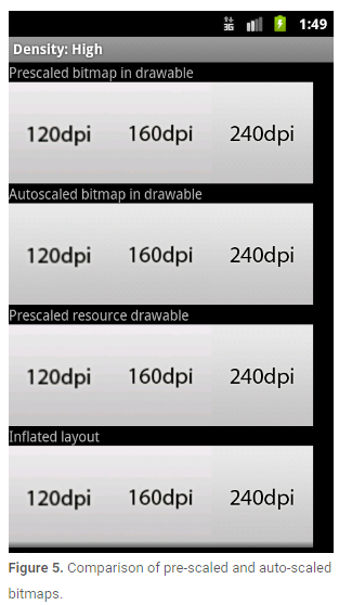
Figure 5 demonstrates the results of the pre-scale and auto-scale mechanisms when loading low (120), medium (160) and high (240) density bitmaps on a high-density screen. The differences are subtle, because all of the bitmaps are being scaled to match the current screen density, however the scaled bitmaps have slightly different appearances depending on whether they are pre-scaled or auto-scaled at draw time.
图5展示了在hdpi屏幕密度上加载低(120),中(160)和高(240)密度图片预先调整和自动调整的效果对比.区别是很微小的,因为Bitmap对象都会调整成适应当前屏幕密度的样式,然而在外观上还是会有些许不同,这取决于是采用预先调整还是绘制时自动调整.
Converting dp units to pixel units(dp和px单位转换)
In some cases, you will need to express dimensions in dp and then convert them to pixels. Imagine an application in which a scroll or fling gesture is recognized after the user’s finger has moved by at least 16 pixels. On a baseline screen, a user’s must move by 16 pixels / 160 dpi, which equals 1/10th of an inch (or 2.5 mm) before the gesture is recognized. On a device with a high-density display (240dpi), the user’s must move by 16 pixels / 240 dpi, which equals 1/15th of an inch (or 1.7 mm). The distance is much shorter and the application thus appears more sensitive to the user.
在某些情况下,你可能在xml文件中使用dp来标注大小同时需要在代码中将其转成px.在应用程序中,只有当用户手指划过16px时才会被系统认为是一个scroll或者fling的手势.在标准密度的屏幕上,用户必须移动 16px / 160dpi,相当于 1 / 10 英寸才能被检测到.在高密度的屏幕上(240dpi),用户必须移动16px/240dpi,相当于1/15英寸.这个距离在更高分辨率的屏幕上会显得更加敏感.
To fix this issue, the gesture threshold must be expressed in code in dp and then converted to actual pixels. For example:
为了解决这个问题,gesture threshold必须用dp来表示距离,并且在不同密度的屏幕上将其转换成像素.例如:
// The gesture threshold expressed in dp
private static final float GESTURE_THRESHOLD_DP = 16.0f;

// Get the screen’s density scale
final float scale = getResources().getDisplayMetrics().density;
// Convert the dps to pixels, based on density scale
mGestureThreshold = (int) (GESTURE_THRESHOLD_DP * scale + 0.5f);

// Use mGestureThreshold as a distance in pixels...
How to Test Your Application on Multiple Screens(如何使用模拟器在不同密度屏幕上测试你的应用程序)
Before publishing your application, you should thoroughly test it in all of the supported screen sizes and densities. The Android SDK includes emulator skins you can use, which replicate the sizes and densities of common screen configurations on which your application is likely to run. You can also modify the default size, density, and resolution of the emulator skins to replicate the characteristics of any specific screen. Using the emulator skins and additional custom configurations allows you to test any possible screen configuration, so you don’t have to buy various devices just to test your application’s screen support.
在你发布应用之前,你应该在所有你想支持的密度和尺寸的屏幕上测试你的应用程序.Android SDK中提供了模拟器来帮助你实现在不同屏幕尺寸和屏幕密度上测试你的应用.你可以修改模拟器的屏幕尺寸,屏幕密度和屏幕分辨率.使用模拟器可以帮你模拟任何你想模拟的屏幕,这样你就不需要去购买真实设备来测试你的应用程序了.
To set up an environment for testing your application’s screen support, you should create a series of AVDs (Android Virtual Devices), using emulator skins and screen configurations that emulate the screen sizes and densities you want your application to support. To do so, you can use the AVD Manager to create the AVDs and launch them with a graphical interface.
为了给你的应用搭建测试环境,你应该使用你想支持的屏幕尺寸和屏幕密度创建一系列Android虚拟设备.要做到这一点,可以使用AVD管理器去创建AVD,然后在图形化界面启动AVD.
To launch the Android SDK Manager, execute the SDK Manager.exe from your Android SDK directory (on Windows only) or execute android from the <sdk>/tools/ directory (on all platforms). Figure 6 shows the AVD Manager with a selection of AVDs, for testing various screen configurations.
为了启动Android SDK Manager,在window环境下可以在你Android SDK目录下执行SDK Manager.exe文件,在其他环境下(Linux或者Mac),可以再SDK目录的tools目录下执行android这个应用程序.图6展示了AVD Manager的示例.
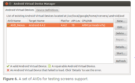
Table 3 shows the various emulator skins that are available in the Android SDK, which you can use to emulate some of the most common screen configurations.
表三展示了Android SDK中你可以使用的通用模拟器属性值.
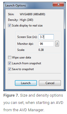
We also recommend that you test your application in an emulator that is set up to run at a physical size that closely matches an actual device. This makes it a lot easier to compare the results at various sizes and densities. To do so you need to know the approximate density, in dpi, of your computer monitor (for instance, a 30” Dell monitor has a density of about 96 dpi). When you launch an AVD from the AVD Manager, you can specify the screen size for the emulator and your monitor dpi in the Launch Options, as shown in figure 7.
我们同样建议在屏幕尺寸大约接近的模拟器上测试应用程序.这样做可以使得比较结果更加明显.为了做到这一点,你需要知道电脑显示器的近似密度.当你从AVD Manager启动AVD时,你可以指定模拟器的屏幕尺寸和显示器的dpi如表7所示.
If you would like to test your application on a screen that uses a resolution or density not supported by the built-in skins, you can create an AVD that uses a custom resolution or density. When creating the AVD from the AVD Manager, specify the Resolution, instead of selecting a Built-in Skin.
如果你想在一个没有在内置属性支持的屏幕上测试应用程序,你可以创建一个使用自定义分辨率或者屏幕密度的AVD.在创建AVD时,应该手动的指定屏幕密度和分辨率.
If you are launching your AVD from the command line, you can specify the scale for the emulator with the -scale option. For example:
如果你从命令行启动AVD,你可以通过-scale参数来指定屏幕分辨率.例如:
emulator -avd<avd_name> -scale 96dpiTo refine the size of the emulator, you can instead pass the -scale option a number between 0.1 and 3 that represents the desired scaling factor.
为了改变模拟器的尺寸,你可以通过指定-scale参数的值为0.1~3来改变比例因子.


 408
408


 被折叠的 条评论
为什么被折叠?
被折叠的 条评论
为什么被折叠?
 到【灌水乐园】发言


