


今天学习了制作这个华为全屋智能官网的页面的一部分,图片展示如下:
一、导航部分
<!-- 首页面的css样式 -->
<link rel="stylesheet" href="css/index.css">
创建一个index.css,先进行初始化
/* 初始化 */
* {
    margin: 0;
    padding: 0;
}

a {
    text-decoration: none;
}

ul {
    list-style-type: none;
}
1.设置左上角华为图标
  <!-- 头部 通栏宽度100%-->
    <div class="header">
        <!-- 头部的版心 -> 宽度 居中 -->
        <div class="header_con">
            <!-- logo使用a标签包裹 -->
            <a href="" class="logo">
                     /* 华为图片*/
                <img src="img/logo.svg" alt="">
            </a>
        </div>
    </div>
index.css里面进行调整
/* ----头部内容部分开始------ */
body {
background-color: #f1f3f5;
}
.header {
width: 100%;
height: 56px;
background-color: #f1f3f5;
}
/* 版心 */
.header_con {
width: 1200px;
margin: 0 auto;
height: 56px;
/* background-color: pink; */
}
.logo {
float: left;
margin-top: 15px;
}
.logo img {
width: 100px;
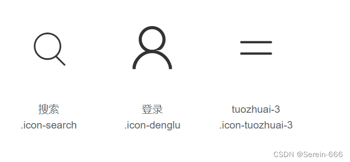
}2.设置右上角的字体图标
<!-- 引入字体图标css文件 -->
<link rel="stylesheet" href="fonts/iconfont.css">
<div class="addons">
<span class="iconfont icon-search"></span>
<span class="iconfont icon-denglu"></span>
<span class="iconfont icon-tuozhuai-3"></span>
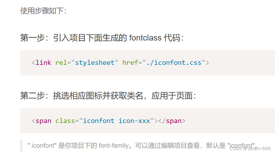
</div>设置字体图标的步骤如下:阿里巴巴矢量图,下载代码
index.css里面进行调整
.addons {
float: right;
margin-top: 15px;
}
.addons span {
font-size: 26px;
margin-right: 10px;
}
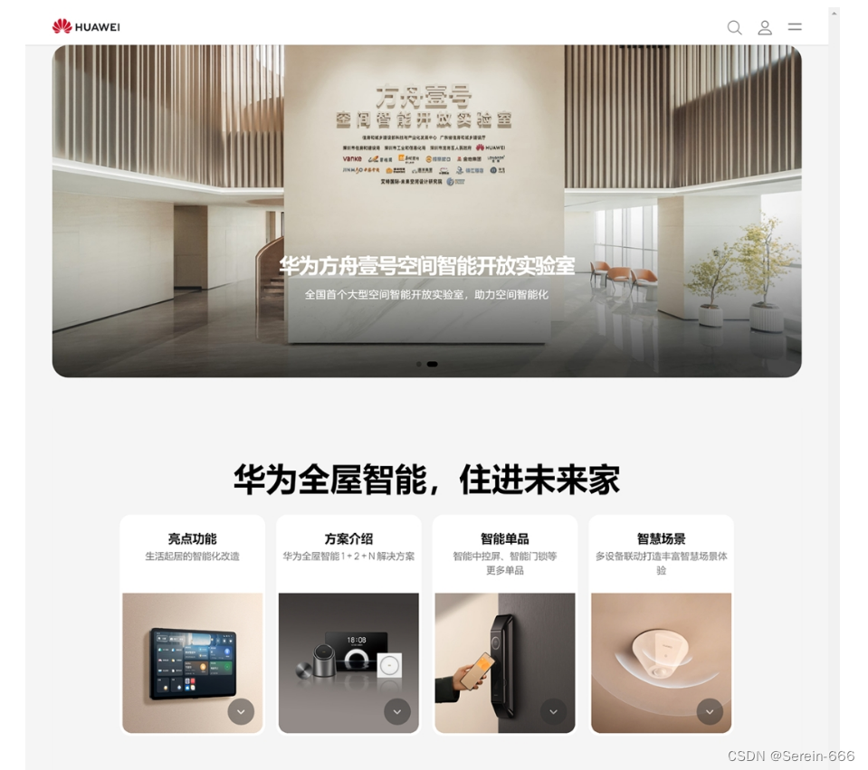
/* ----头部内容部分结束------ */二、图片部分
 <div class="banner">
        <div class="banner_text1">华为方舟壹号空间智能开放实验室</div>
        <div class="banner_text2">全国首个大型空间智能开放实验室,助力空间智能化</div>
    </div>
index.css里面进行调整字体大小等结构
/* ----banner内容部分开始------ */
.banner {
    width: 1200px;
    height: 500px;
    margin: 0 auto;
    background-color: pink;
    border-radius: 20px;
    background: url(../img/pc-2.jpg) no-repeat;
    background-size: cover;
    text-align: center;
    color: #fff;
    /* 解决外边距塌陷 */
    overflow: hidden;
}

.banner_text1 {
    font-size: 42px;
    font-weight: 700;
    margin: 300px 0 10px 0;
}

/* ----banner内容部分结束------ */
三、华为全屋智能,住进未来家部分
  <div class="smarthome">
        <!-- 上面 -->
        <div class="sec_title">华为全屋智能,住进未来家</div>
        <!-- 下面部分4部分内容 -->
        <div class="smarthome_con">
            <div class="item">
                <div class="item_title">
                    <div class="item_title1">亮点功能</div>
                    <div class="item_title2">生活起居的智能化</div>
                </div>
                <img src="img/1.jpg" alt="">
            </div>
            <div class="item">
                <div class="item_title">
                    <div class="item_title1">亮点功能</div>
                    <div class="item_title2">华为全屋智能 1 + 2 + N 解决方案</div>
                </div>
                <img src="img/2.jpg" alt="">
            </div>
            <div class="item">
                <div class="item_title">
                    <div class="item_title1">亮点功能</div>
                    <div class="item_title2">智能中控屏、智能门锁等</div>
                </div>
                <img src="img/3.jpg" alt="">
            </div>
            <div class="item last">
                <div class="item_title">
                    <div class="item_title1">亮点功能</div>
                    <div class="item_title2">
                        多设备联动打造丰富智慧场景体验
                    </div>
                </div>
                <img src="img/4.jpg" alt="">
            </div>
        </div>
    </div>
index.css里面进行调整
/* ----全屋智能内容部分开始------ */
.smarthome {
    width: 950px;
    /* 版心重要的内容 */
    margin: 0 auto;
    height: 460px;
    padding: 40px 0;
}

/* 上面的题目 */
.sec_title {
    text-align: center;
    font-size: 40px;
    font-weight: 700;
    margin-bottom: 20px;
}

/* 下面部分4部分内容 */
.smarthome_con {
    height: 348px;
}

.item {
    float: left;
    width: 216px;
    height: 340px;
    padding: 4px;
    background-color: #fff;
    margin-right: 16px;
    border-radius: 20px;
    /* 子绝父相 */
    position: relative;

}

.item_title {
    height: 120px;
    text-align: center;
}

.item_title1 {
    font-size: 14px;
    font-weight: 700;
    padding-top: 25px;
}

.item_title2 {
    font-size: 12px;
    opacity: 0.6;
    padding-top: 10px;
}

.item img {
    width: 100%;
    border-radius: 0 0 18px 18px;
}

/* 最后一个不需要设置margin-right */
.last {
    margin-right: 0;
}

/* ----全屋智能内容部分结束------ */
四、定位盒子居中(知识点)
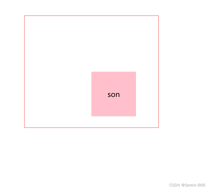
盒子水平居中
<!DOCTYPE html>
<html lang="en">
<head>
<meta charset="UTF-8">
<meta http-equiv="X-UA-Compatible" content="IE=edge">
<meta name="viewport" content="width=device-width, initial-scale=1.0">
<title>Document</title>
<style>
.father {
width: 300px;
height: 250px;
border: 1px solid red;
margin: 100px auto;
/* 子绝父相 */
position: relative;
}
.son {
width: 100px;
height: 100px;
background-color: pink;
position: absolute;
/* son左上角处于中间位置 */
left: 50%;
top: 50%;
/* 文字水平垂直居中 */
text-align: center;
line-height: 100px;
}
</style>
</head>
<body>
<div class="father">
<div class="son">son</div>
</div>
</body>
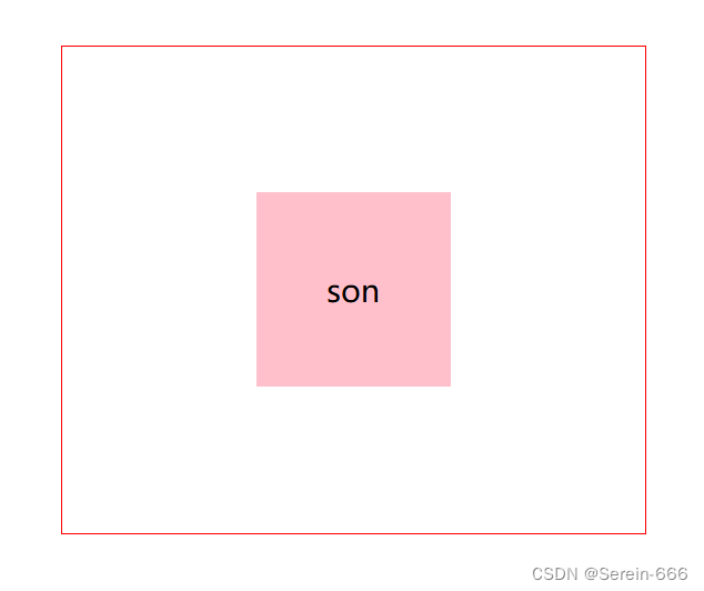
</html>结果为:son的左上位置处于中心位置,不是想要的结果,
解决方法:往上,往左 移动自身的一半,即可居中 */
margin-top: -50px;
margin-left: -50px;
结果为:
五、叠放层次(知识点)
/* z-index的默认属性值是0,取值越大,定位元素在层叠元素中越居上。 */
/*注意点:z-index在position定位设置时才可以使用,不然无效position: absolute relative fiexed; */
/* z-index:9999 设置在最上层 */
<style>
.father {
width: 400px;
height: 500px;
border: 1px solid red;
margin: 100px auto;
/* 子绝父相: 三个盒子重叠在一起 */
position: relative;
}
.father div {
width: 200px;
height: 200px;
position: absolute;
}
.son1 {
background-color: blue;
/* son1在最内层 */
left: 0;
top: 0;
}
.son2 {
background-color: pink;
left: 30px;
top: 30px;
}
.son3 {
background-color: yellow;
left: 60px;
top: 60px;
}
</style>
</head>
<body>
<div class="father">
<div class="son1">son1</div>
<div class="son2">son2</div>
<div class="son3">son3</div>
</div>
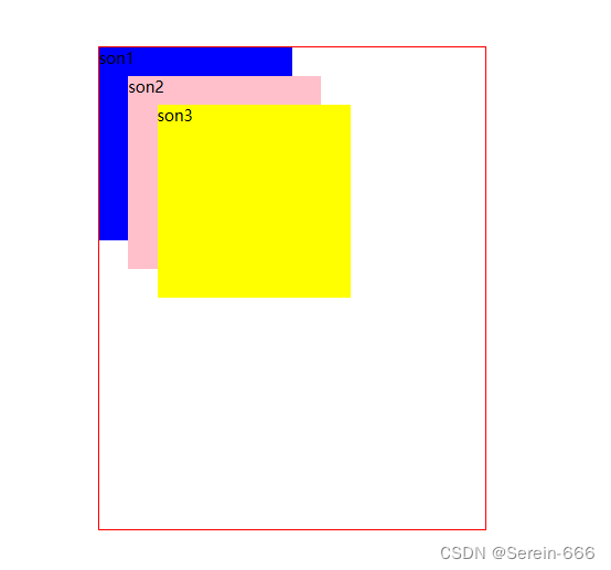
</body>结果为: 黄色部分在最上层
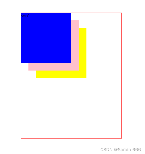
添加z-index属性设置排放顺序
 .son1 {
            background-color: blue;
            /* son1在最内层 */
            left: 0;
            top: 0;
            /* 设置z-index ,son1则在最上层 */
            z-index: 3;
            /* z-index:9999 设置在最上层 */
        }

        .son2 {
            background-color: pink;
            left: 30px;
            top: 30px;
            z-index: 2;
        }

        .son3 {
            background-color: yellow;
            left: 60px;
            top: 60px;
        }
结果为:黄色部分在最里面


 3711
3711

 被折叠的 条评论
为什么被折叠?
被折叠的 条评论
为什么被折叠?
 到【灌水乐园】发言


