


往期知识点整理
SideBarContainer 表示侧边栏容器,它可以添加两个子组件,第一个子组件表示侧边栏,第二个子组件表示内容区,本节笔者简单介绍一下 SideBarContainer 的简单使用。
SideBarContainer定义介绍
interface SideBarContainerInterface {
  (type?: SideBarContainerType): SideBarContainerAttribute;
}
- type:设置侧边栏的显示类型,
SideBarContainerType定义了一下 2 中类型:- Embed:侧边栏嵌入到组件内,侧边栏和内容区并列显示。
- Overlay:侧边栏浮在内容区上面。
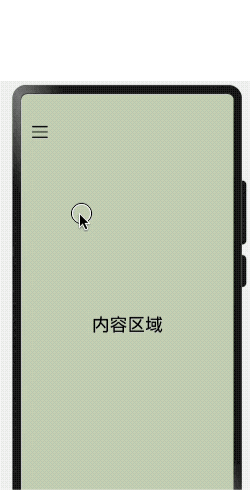
简单样例如下所示:
@Entry @Component struct SideBarContainerTest {

  build() {
    SideBarContainer(SideBarContainerType.Overlay) {
      Column() {
        Text("侧边栏区域")
          .width("100%")
          .height("100%")
          .fontSize(30)
          .textAlign(TextAlign.Center)
      }
      .width(10)
      .height("100%")
      .backgroundColor("#aabbcc")

      Column() {
        Text("侧边栏区域")
          .width("100%")
          .height("100%")
          .fontSize(30)
          .textAlign(TextAlign.Center)
      }
      .width("100%")
      .height("100%")
      .backgroundColor("#bbccaa")
    }
    .width('100%')
    .height('100%')
  }
}
样例运行结果如下图所示:
SideBarContainer属性介绍
declare class SideBarContainerAttribute extends CommonMethod<SideBarContainerAttribute> {
  showSideBar(value: boolean): SideBarContainerAttribute;
  controlButton(value: ButtonStyle): SideBarContainerAttribute;
  showControlButton(value: boolean): SideBarContainerAttribute;
  sideBarWidth(value: number): SideBarContainerAttribute;
  minSideBarWidth(value: number): SideBarContainerAttribute;
  maxSideBarWidth(value: number): SideBarContainerAttribute;
}

declare interface ButtonStyle {
  left?: number;
  top?: number;
  width?: number;
  height?: number;
  icons?: {
    shown: string | PixelMap | Resource;
    hidden: string | PixelMap | Resource;
    switching?: string | PixelMap | Resource;
  };
}
- showSideBar:设置是否显示侧边栏,默认为 true 表示显示侧边栏。
- controlButton:设置侧边栏控制按钮的属性,
ButtonStyle参数说明如下:- left:设置侧边栏控制按钮距离容器左界限的间距。
- top:设置侧边栏控制按钮距离容器上界限的间距。
- width:设置侧边栏控制按钮的宽度。
- height:设置侧边栏控制按钮的高度。
- icons:设置侧边栏控制按钮的图标:
- shown:设置侧边栏显示时控制按钮的图标。
- hidden:设置侧边栏隐藏时控制按钮的图标。
- switching:设置侧边栏显示和隐藏状态切换时控制按钮的图标。
- sideBarWidth:设置侧边栏的宽度,默认为 200 。
- minSideBarWidth:设置侧边栏最小宽度,默认为 200 。
- maxSideBarWidth:设置侧边栏最大宽度,默认为 280 。
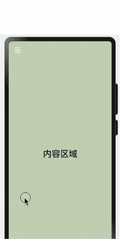
简单样例如下所示:
@Entry @Component struct SideBarContainerTest {

  build() {
    SideBarContainer(SideBarContainerType.Overlay) { // 设置侧边栏样式为悬浮态
      Column() {                                     // 第一个子组件为侧边栏视图
        Text("侧边栏区域")
          .width("100%")
          .height("100%")
          .fontSize(30)
          .textAlign(TextAlign.Center)
      }
      .width(10)
      .height("100%")
      .backgroundColor("#aabbcc")

      Column() {                                     // 第二个子组件为内容区视图
        Text("内容区域")
          .width("100%")
          .height("100%")
          .fontSize(30)
          .textAlign(TextAlign.Center)
      }
      .width("100%")
      .height("100%")
      .backgroundColor("#bbccaa")
    }
    .width('100%')
    .height('100%')
    .sideBarWidth(150)                               // 设置侧边栏宽度为150
    .minSideBarWidth(100)                            // 设置侧边栏最小宽度为100
    .maxSideBarWidth(200)                            // 设置侧边栏最大宽度为200
    .controlButton({                                 // 设置侧边栏控制按钮的样式
      width: 30,                                     // 设置侧边栏控制按钮宽度为30
      height: 30,                                    // 设置侧边栏控制按钮高度为30
      top: 15,                                       // 设置侧边栏控制按钮距离容器顶部为15
      icons: {                                       // 设置侧边栏控制按钮图片
        shown: $r("app.media.icon_back"),            // 设置侧边栏显示时控制按钮的图标。
        hidden: $r("app.media.icon_menu"),           // 设置侧边栏隐藏时控制按钮的图标。
        switching: $r("app.media.icon_back")         // 设置侧边栏显示和隐藏状态切换时控制按钮的图标。
      }
    })
  }
}
样例运行结果如下图所示:
SideBarContainer事件介绍
declare class SideBarContainerAttribute extends CommonMethod<SideBarContainerAttribute> {
  onChange(callback: (value: boolean) => void): SideBarContainerAttribute;
}
- onChange:当侧边栏的状态在显示和隐藏之间切换时触发回调,
value为 true 表示菜单栏显示显示,false表示菜单栏隐藏。


 扫一扫
扫一扫
 679
679

 被折叠的 条评论
为什么被折叠?
被折叠的 条评论
为什么被折叠?
 到【灌水乐园】发言


