


序言:
本文详细讲解了关于我们在页面上经常看到的轮播图在鸿蒙开发中如何用Swiper实现,介绍了Swiper的基本用法与属性,及如何面对大段的重复代码进行封装和重用(@Extend、@Styles、@Builder),使代码更加简洁易读。
笔者也是跟着B站黑马的课程一步步学习,学习的过程中添加部分自己的想法整理为笔记分享出来,如有代码错误或笔误,欢迎指正。
B站黑马的课程链接:鸿蒙课程介绍_哔哩哔哩_bilibili
往期笔记:
【01】纯血鸿蒙HarmonyOS NEXT星河版开发0基础学习笔记-ArkTs基础语法与界面开发基础
【02】纯血鸿蒙HarmonyOS NEXT星河版开发0基础学习笔记-界面进阶与布局排布(附QQ登陆、得物、京东登陆综合案例+代码)
【03】纯血鸿蒙HarmonyOS NEXT星河版开发0基础学习笔记-更多布局(弹性/层叠)方式与界面开发综合(附飞狗卡片+B站卡片案例+实战开发支付宝界面+代码)
【04】纯血鸿蒙HarmonyOS NEXT星河版开发0基础学习笔记-ArkTs进阶运算符+状态管理(附综合案例美团购物车)
【05】纯血鸿蒙HarmonyOS NEXT星河版开发0基础学习笔记-条件渲染+if/switch判断与for/while循环(附计数器、京东加购案例)
【06】纯血鸿蒙HarmonyOS NEXT星河版开发0基础学习笔记-综合案例·生肖抽奖卡具体实现(类似支付宝集五福)
目录
一.Swiper轮播组件
简介:
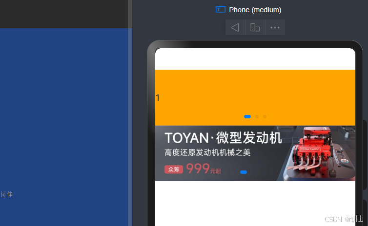
Swiper是一个容器组件,当设置了多个子组件后,可以对这些子组件进行轮播显示。(图片、文字...)
1.Swiper的基本用法
1)语法结构:
    Swiper(){
      //1.轮播内容
    }
    //2.设置尺寸(内容会自动拉伸)
    .width('100%')
    .height(100)
2)使用案例:
build() {
Column(){
//Swiper 轮播组件的基本使用
Swiper(){
//1.轮播内容
Text('1')
.backgroundColor(Color.Orange)
Text('2')
.backgroundColor(Color.Blue)
Text('3')
.backgroundColor(Color.Gray)
}
//2.设置尺寸(内容会自动拉伸)
//tips:给外层设置宽高,未来的子元素都会进行统一的拉伸
.width('100%')
.height(100)
Swiper(){
//1.轮播内容
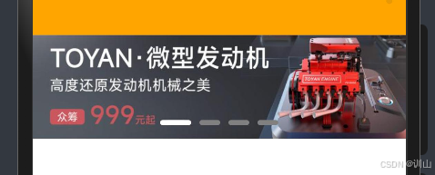
Image($r('app.media.ic_swiper_xmyp01'))
Image($r('app.media.ic_swiper_xmyp02'))
Image($r('app.media.ic_swiper_xmyp03'))
Image($r('app.media.ic_swiper_xmyp04'))
}
//2.设置尺寸(内容会自动拉伸)
//tips:给外层设置宽高,未来的子元素都会进行统一的拉伸
.width('100%')
.height(100)
}
}
2.Swiper的常见属性
1)Swiper的常见属性
| 属性方法 | 传值 | 作用 | 默认值 |
| loop | boolean | 是否开启循环 | true |
| autoPlay | boolean | 是否自动播放 | false |
| interval | number | 自动播放时间间隔(ms) | 3000 |
| vertical | boolean | 纵向滑动轮播 | false |
| ...其他属性 | 见文档 |
2)需求
使用上述属性,将刚刚的轮播图调整为
①自动播放
②播放间隔:4s
③纵向滑动
      Swiper(){
        //1.轮播内容
        Text('1')
          .backgroundColor(Color.Orange)
        Text('2')
          .backgroundColor(Color.Blue)
        Text('3')
          .backgroundColor(Color.Gray)
      }
      //2.设置尺寸(内容会自动拉伸)
      //tips:给外层设置宽高,未来的子元素都会进行统一的拉伸
      .width('100%')
      .height(100)
      .loop(true) //是否开启循环
      .autoPlay(true)  //是否自动播放
      .interval(4000)  //自动播放时间间隔-4s
      .vertical(true)  //纵向轮播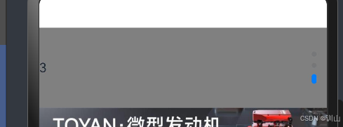
改为了纵向滑动→通常会在手机宣传页出现
3.Swiper样式自定义
1)使用案例:
      Swiper(){
        //1.轮播内容
        Image($r('app.media.ic_swiper_xmyp01'))
        Image($r('app.media.ic_swiper_xmyp02'))
        Image($r('app.media.ic_swiper_xmyp03'))
        Image($r('app.media.ic_swiper_xmyp04'))
      }
      //2.设置尺寸(内容会自动拉伸)
      //tips:给外层设置宽高,未来的子元素都会进行统一的拉伸
      .width('100%')
      .height(100)
      //定制小圆点
      .indicator(
        Indicator.dot()  //小圆点
          .itemWidth(20)  //默认的宽
          .itemHeight(5)  //默认的高
          .color(Color.Gray)  //默认的颜色
          .selectedItemWidth(30)  //选中的宽
          .selectedItemHeight(5)  //选中的高
          .selectedColor(Color.White)  //选中的颜色
      )
tips:
aspectRatio(1)  //宽高比例为1
aspectRatio(2)  //宽高比例为2
//等比例缩放用于根据不同设备想要相同的视觉效果,保持图片的正常适配
二.样式&结构重用
1.@Extend:扩展组件(样式、事件)
1)原代码:
Swiper(){
//1.轮播内容
Text('1')
.backgroundColor(Color.Orange)
.textAlign(TextAlign.Center)
.fontColor(Color.White)
.fontSize(30)
.onClick(()=>{
AlertDialog.show({
message:'我是轮播图1号'
})
})
Text('2')
.backgroundColor(Color.Blue)
.textAlign(TextAlign.Center)
.fontColor(Color.White)
.fontSize(30)
.onClick(()=>{
AlertDialog.show({
message:'我是轮播图2号'
})
})
Text('3')
.backgroundColor(Color.Gray)
.textAlign(TextAlign.Center)
.fontColor(Color.White)
.fontSize(30)
.onClick(()=>{
AlertDialog.show({
message:'我是轮播图3号'
})
})
}
//2.设置尺寸(内容会自动拉伸)
//tips:给外层设置宽高,未来的子元素都会进行统一的拉伸
.width('100%')
.height(100)
.loop(true)
.autoPlay(true)
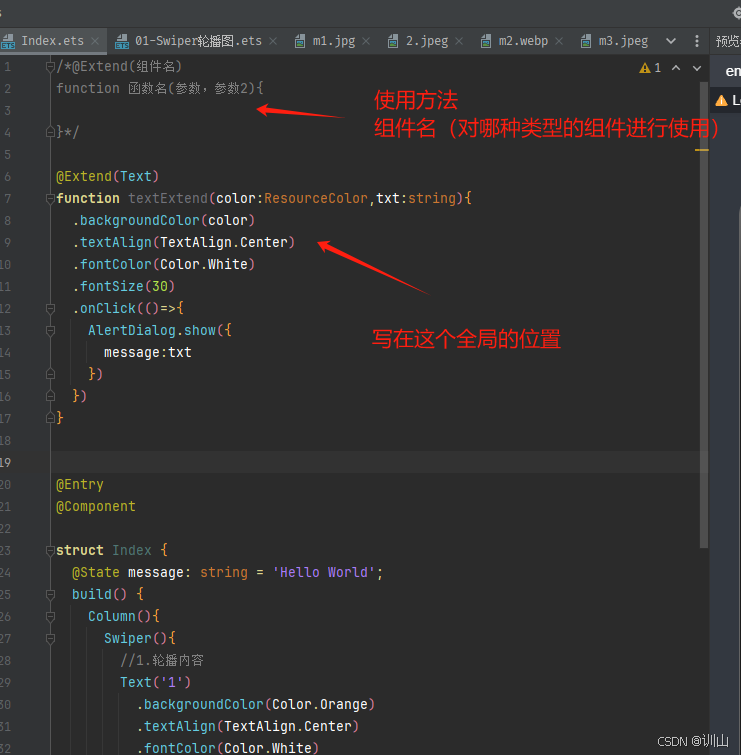
.interval(4000)2)组件重写的方法和图示
@Extend(Text)
function textExtend(color:ResourceColor,txt:string){
  .backgroundColor(color)
  .textAlign(TextAlign.Center)
  .fontColor(Color.White)
  .fontSize(30)
  .onClick(()=>{
    AlertDialog.show({
      message:txt
    })
  })
}
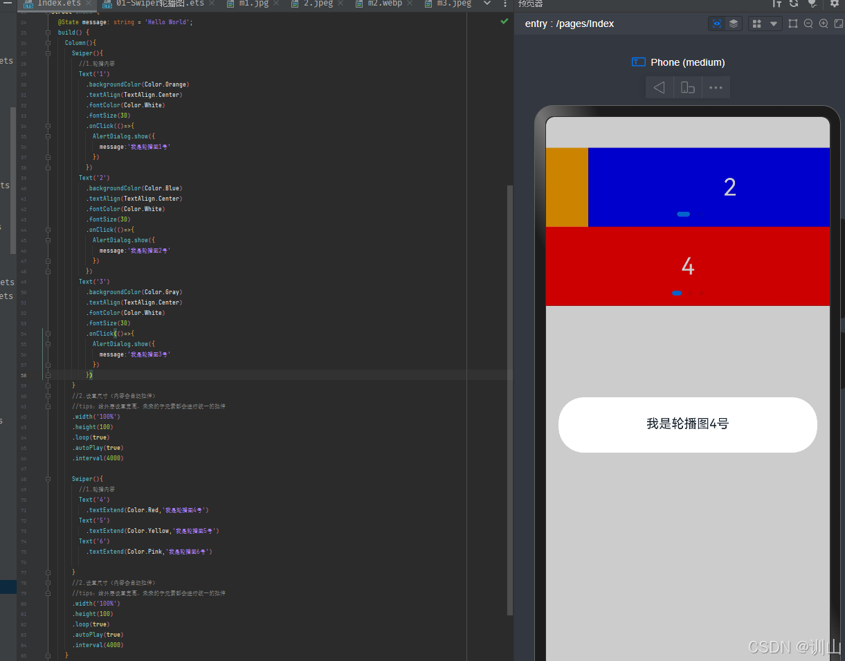
3)重写达成的效果:
①代码部分:
     Swiper(){
        //1.轮播内容
        Text('4')
          .textExtend(Color.Red,'我是轮播图4号')
        Text('5')
          .textExtend(Color.Yellow,'我是轮播图5号')
        Text('6')
          .textExtend(Color.Pink,'我是轮播图6号')


      }
      //2.设置尺寸(内容会自动拉伸)
      //tips:给外层设置宽高,未来的子元素都会进行统一的拉伸
      .width('100%')
      .height(100)
      .loop(true)
      .autoPlay(true)
      .interval(4000)
②图示:
显而易见于上面啰嗦的代码,通过封装大段相同的代码,我们的代码会变得更加简洁高效
2.@Style:抽取通用属性、事件
1)原文件:
    Column(){
      Text(this.message)
        .margin(50)
        .width(100)
        .height(100)
        .backgroundColor(this.bgColor)
        .onClick(()=>{
          this.bgColor=String(Color.Orange)
        })


      Button('按钮')
        .margin(50)
        .width(100)
        .height(100)
        .backgroundColor(this.bgColor)
        .onClick(()=>{
          this.bgColor=String(Color.Orange)
        })


      Column(){}
      .margin(50)
      .width(100)
      .height(100)
      .backgroundColor(this.bgColor)
      .onClick(()=>{
        this.bgColor=String(Color.Orange)
      })
    }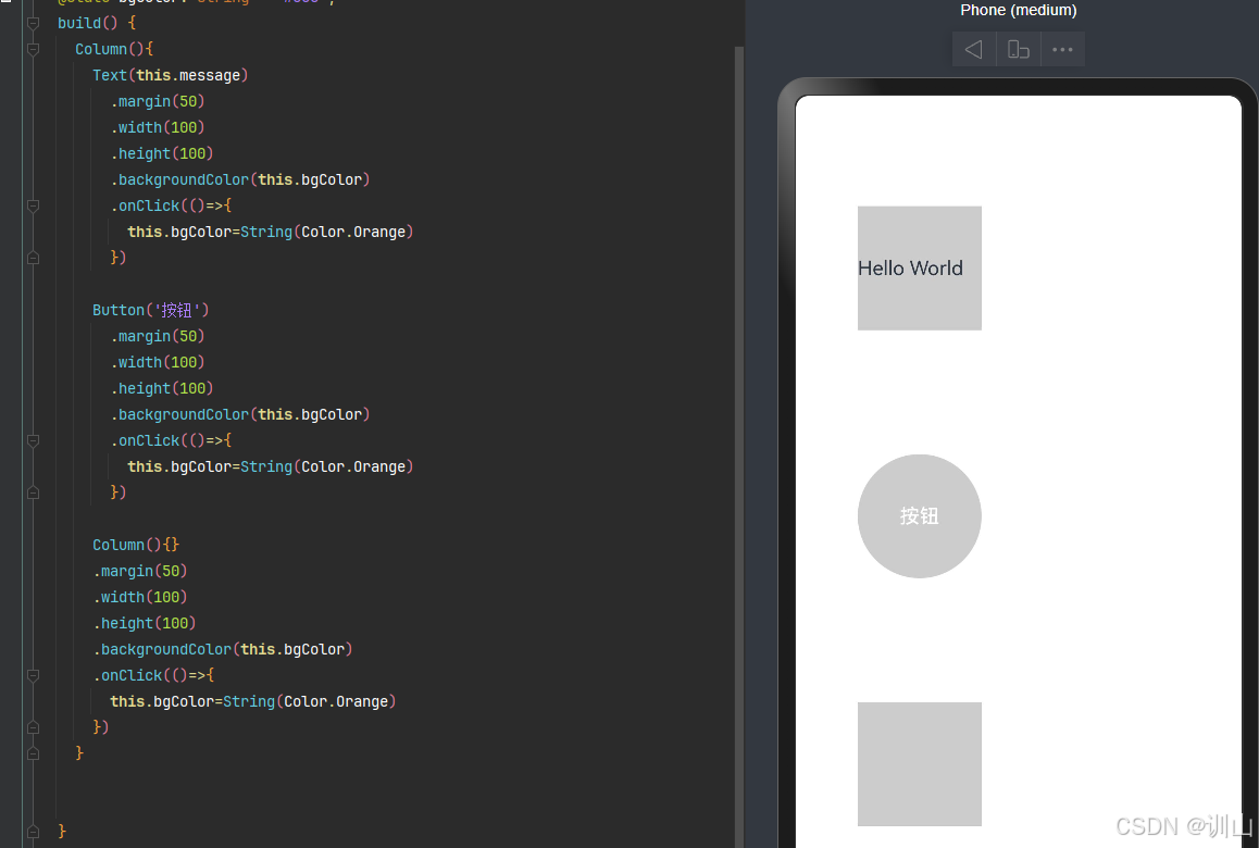
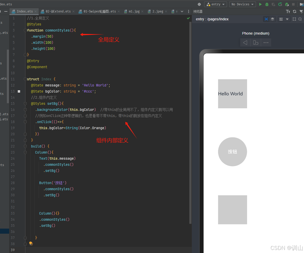
2)组件重写的方法与图示
①带this的全局用不了,组件内定义就可以用
②例如onClick这种带逻辑的,也是看带不带this,带this的就放在组件内定义
③Styles不支持传参
④因为全局定义无法获取this,所以组件内定义要比全局更加常用
Column(){
  Text(this.message)
    .commonStyles()
    .setBg()

  Button('按钮')
    .commonStyles()
    .setBg()


  Column(){}
  .commonStyles()
  .setBg()


}
3.@Builder:自定义构建函数(结构、样式、事件)
1)原代码:
    Row(){
      Column(){
        Image($r('app.media.ic_reuse_01'))
          .width('80%')
        Text('阿里拍卖')
      }
      .width('25%')
      .onClick(()=>{
        AlertDialog.show({
          message:'点击了 阿里拍卖'
        })
      })


      Column(){
        Image($r('app.media.ic_reuse_02'))
          .width('80%')
        Text('菜鸟')
      }
      .width('25%')
      .onClick(()=>{
        AlertDialog.show({
          message:'点击了 菜鸟'
        })
      })


      Column(){
        Image($r('app.media.ic_reuse_03'))
          .width('80%')
        Text('芭芭农场')
      }
      .width('25%')
      .onClick(()=>{
        AlertDialog.show({
          message:'点击了 芭芭农场'
        })
      })


      Column(){
        Image($r('app.media.ic_reuse_04'))
          .width('80%')
        Text('阿里药房')
      }
      .width('25%')
      .onClick(()=>{
        AlertDialog.show({
          message:'点击了 阿里药房'
        })
      })


    }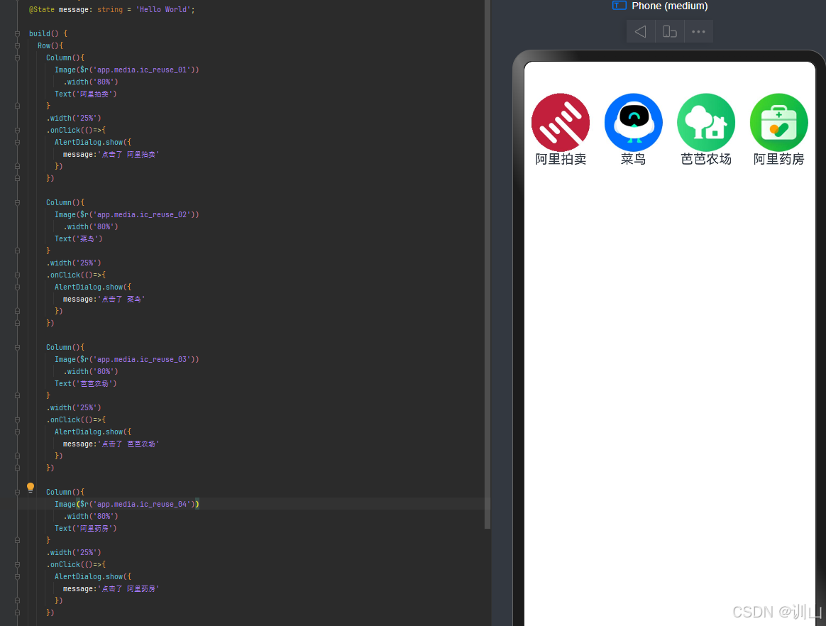
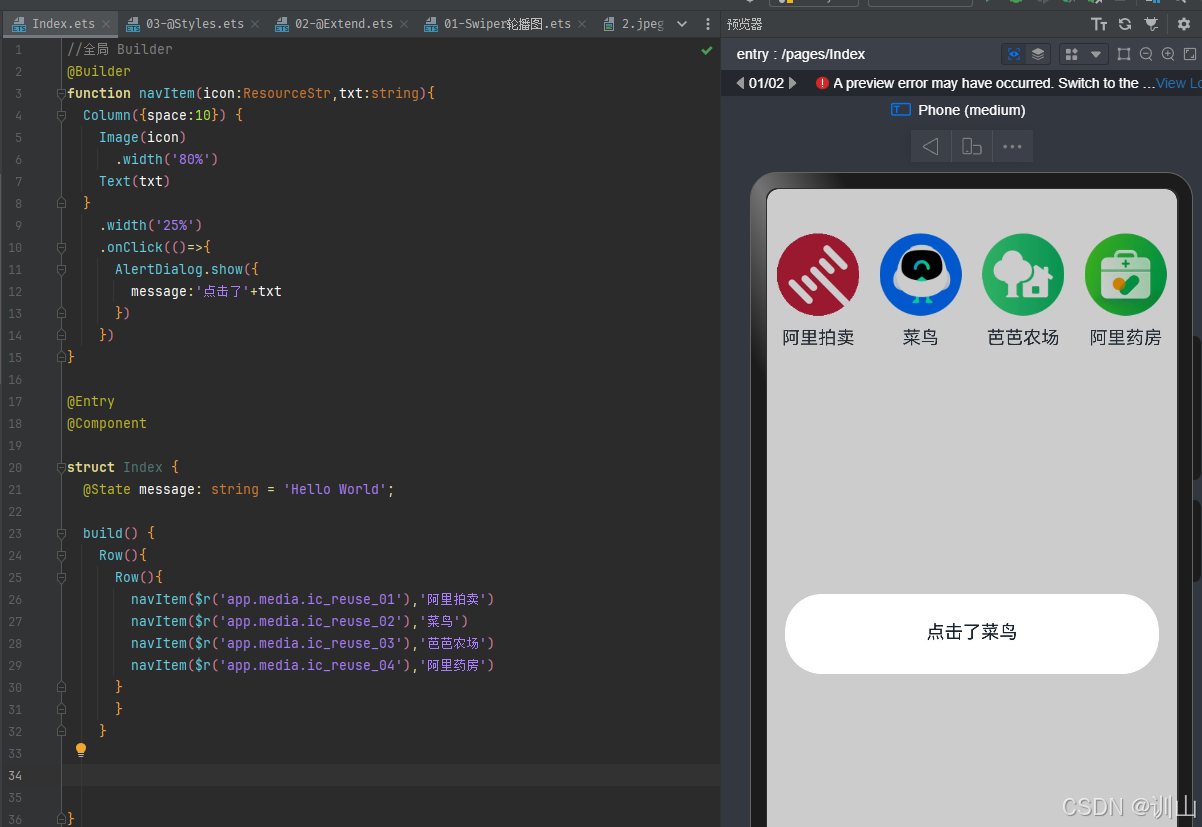
2)组件重写的方法与图示
//全局 Builder
@Builder
function navItem(icon:ResourceStr,txt:string){
  Column({space:10}) {
    Image(icon)
      .width('80%')
    Text(txt)
  }
    .width('25%')
    .onClick(()=>{
      AlertDialog.show({
        message:'点击了'+txt
      })
    })
}


@Entry
@Component


struct Index {
  @State message: string = 'Hello World';
  build() {
    Row(){
      Row(){
        navItem($r('app.media.ic_reuse_01'),'阿里拍卖')
        navItem($r('app.media.ic_reuse_02'),'菜鸟')
        navItem($r('app.media.ic_reuse_03'),'芭芭农场')
        navItem($r('app.media.ic_reuse_04'),'阿里药房')
      }
      }
    }

}
感谢阅读。


 扫一扫
扫一扫
 667
667

 被折叠的 条评论
为什么被折叠?
被折叠的 条评论
为什么被折叠?
 到【灌水乐园】发言


