


将x轴设置为时间轴
显示指定日期
注意事项:
在对x轴进行时间转换时需要注意:
- datetime.date2num():是从1,1,1开始计数,单位是天
- time.mktime():是从1970.1.1开始计数,单位是秒
实例
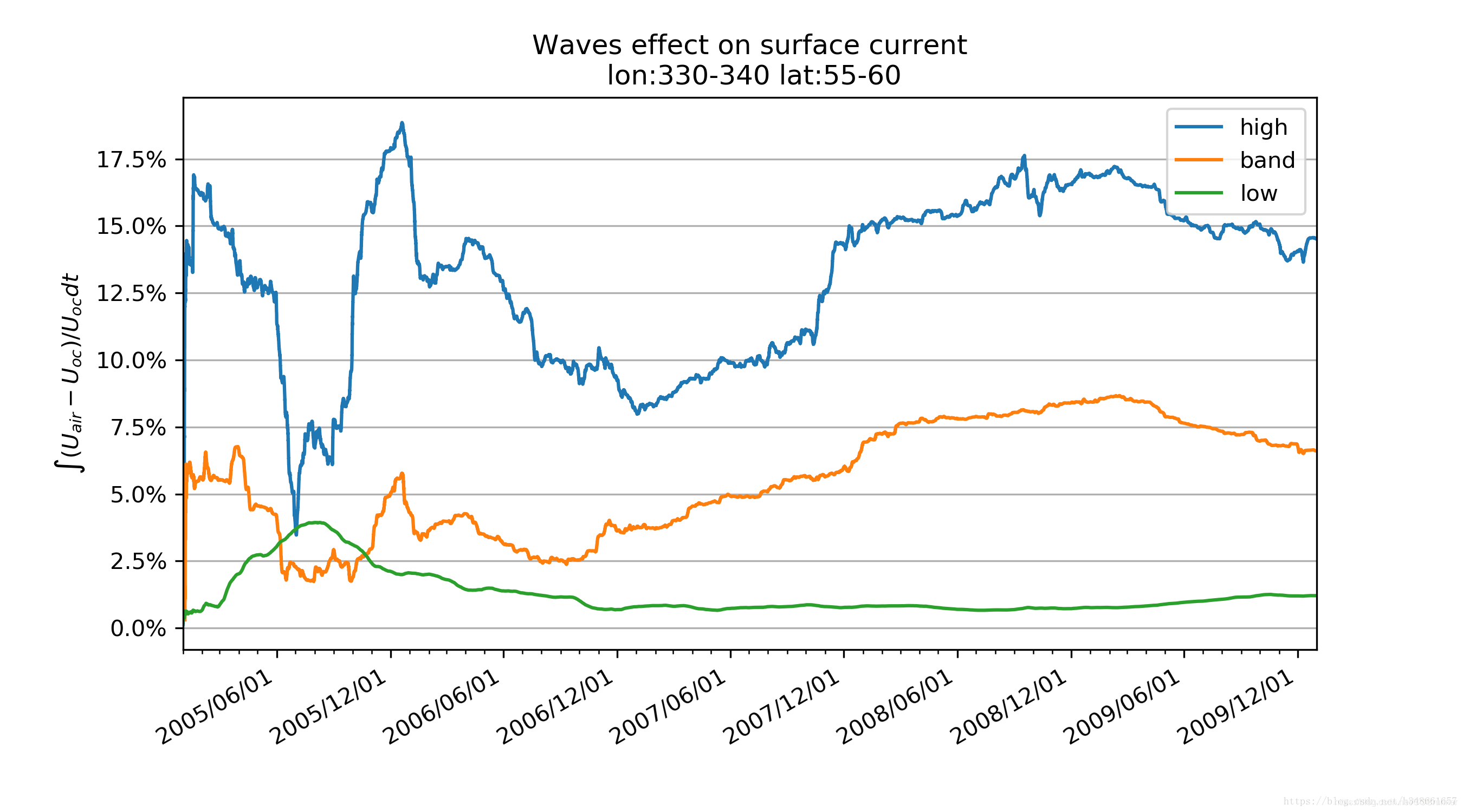
# 摘取自ww3项目Figure_area_average.py
import time, datetime, calendar
import numpy as np
import matplotlib.pyplot as plt
import matplotlib.dates as dt
import matplotlib.ticker as ticker
from matplotlib.dates import DateFormatter, MONDAY, MonthLocator, YearLocator
from Package_Read.Filter_tools import * #直接读取项目src包中的TXT文件
# 画图
fig = plt.figure(figsize=[9, 5])
ax = fig.add_subplot(1, 1, 1)

formatter = DateFormatter('%Y/%m/%d')
time1 = datetime.date(1970, 1, 1)
time2 = dt.date2num(time1)
timex0=timex
timex = timex/24/3600 + time2
ax.plot_date(timex[2:-1], dhf[2:-1], '-',label='high', alpha=1)
ax.plot_date(timex[2:-1], dbf[2:-1], '-',label='band', alpha=1)
ax.plot_date(timex[2:-1], dlf[2:-1], '-',label='low', alpha=1)
# ax.set_alpha = 0.8
ax.xaxis.set_major_formatter(formatter)
ax.yaxis.grid(True) # 显示x刻度网格

# 设置x轴时间刻度
yeardays=YearLocator() # 获取每年第一日数据
mondays=MonthLocator() # 获取每月第一日数据
locate=MonthLocator(range(1, 13), bymonthday=1, interval=6) # 获取每6个月第一日数据

ax.xaxis.set_major_locator(locate) # 设定主刻度
ax.xaxis.set_minor_locator(mondays) # 设定次刻度
# autodates = dt.AutoDateLocator() # 自动显示x轴时间刻度
# ax.xaxis.set_major_locator(autodates) # 设置时间间隔
ax.xaxis.set_major_formatter(formatter) # 设置时间显示格式
fig.autofmt_xdate() # 自动旋转xlabel
# ax.yaxis.set_ticks_position('both') # 在图像左右两侧显示y轴刻度
formatter_y=ticker.PercentFormatter(xmax=100)
ax.yaxis.set_major_formatter(formatter_y)
ax.legend(loc='upper right', shadow=False)
# ax.set_xlabel('Time (year/month/day)')
ax.set_ylabel('$\int(U_{air}-U_{oc})/U_{oc}dt$')
ax.set_xlim(timex[0], timex[-1]) #设置时间轴
ax.set_title(f'Waves effect on surface current\n '
             f'lon:{lon1}-{lon2} lat:{lat1}-{lat2}')

fig.show()
fig.savefig(fig_file,dpi=300)


 757
757


 被折叠的 条评论
为什么被折叠?
被折叠的 条评论
为什么被折叠?
 到【灌水乐园】发言


