


介绍
在做pc官网或者有页脚等页面,底部的关于我们等页脚内容,有时会不满一屏,这时仍然要求页脚位于底部,当然不能挨着页面内容,那肯定不好看,于是便有了以下几个方案,供小伙伴们参考
方案一
将内容部分 margin-bottom 设为负数,注意有html高度设为100%,wrapper的min-height:100%
代码如下:
<!DOCTYPE html>
<html>
    <head>
        <title>footer置底</title>
        <meta http-equiv="Content-Type" content="text/html;charset=UTF-8">
        <style>
            html, body{
                margin: 0;
                padding: 0;
                height: 100%;
            }
            .wrapper {
                min-height: 100%;
                margin-bottom: -50px; /*等于footer的高度*/
                box-sizing: border-box;
                background-color: beige;
            }
            .wrapper::before{
                content: "";
                display: table;
            }
            .footer, .push {
                height: 50px;
            }
            .footer {
                background-color: #666;
            }
            .footer:before {
                content: "";
                display: table;
            }
        </style>
    </head>
    <body>
        <div class="wrapper">
            <h1>这是标题</h1>
            <!--这个class为push的div是 为了弥补margin的-50高度 -->
            <div class="push"></div>
        </div>
        <div class="footer">
            <p>这是页脚</p>
        </div>
    </body>
</html>
- 这个方法需要容器里有额外的占位元素(div.push)。
- div.wrapper的margin-bottom需要和div.footer的-height值一样,注意是负height。
-
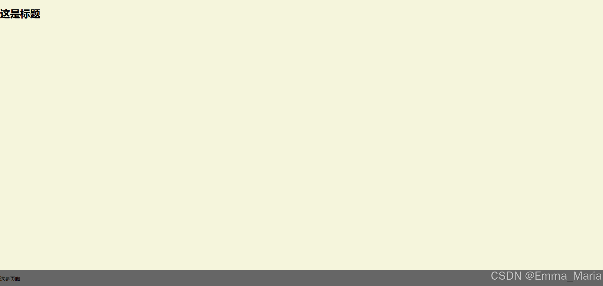
注:footer高度都是固定的,如果footer的内容太多则可能会破坏布局。
效果如下:
方案二
将页脚的margin-top设为负数,注意有html高度设为100%,wrapper的min-height:100%
代码如下:
<!DOCTYPE html>
<html>
    <head>
        <title>footer置底</title>
        <meta http-equiv="Content-Type" content="text/html;charset=UTF-8">
        <style>
            html, body {
                margin: 0;
                padding: 0;
                height: 100%;
            }
            .wrapper {
                min-height: 100%;
            }
            .wrapper-inside {
                padding: 20px;
                padding-bottom: 50px;
            }
            .footer {
                height: 50px;
                margin-top: -50px;
            }
        </style>
    </head>
    <body>
        <div class="wrapper">
            <div class="wrapper-inside">
                <!-- content -->
                <h1>这是内容</h1>
            </div>
          </div>
          <div class="footer">
            这是页脚
          </div>
    </body>
</html>
效果如下
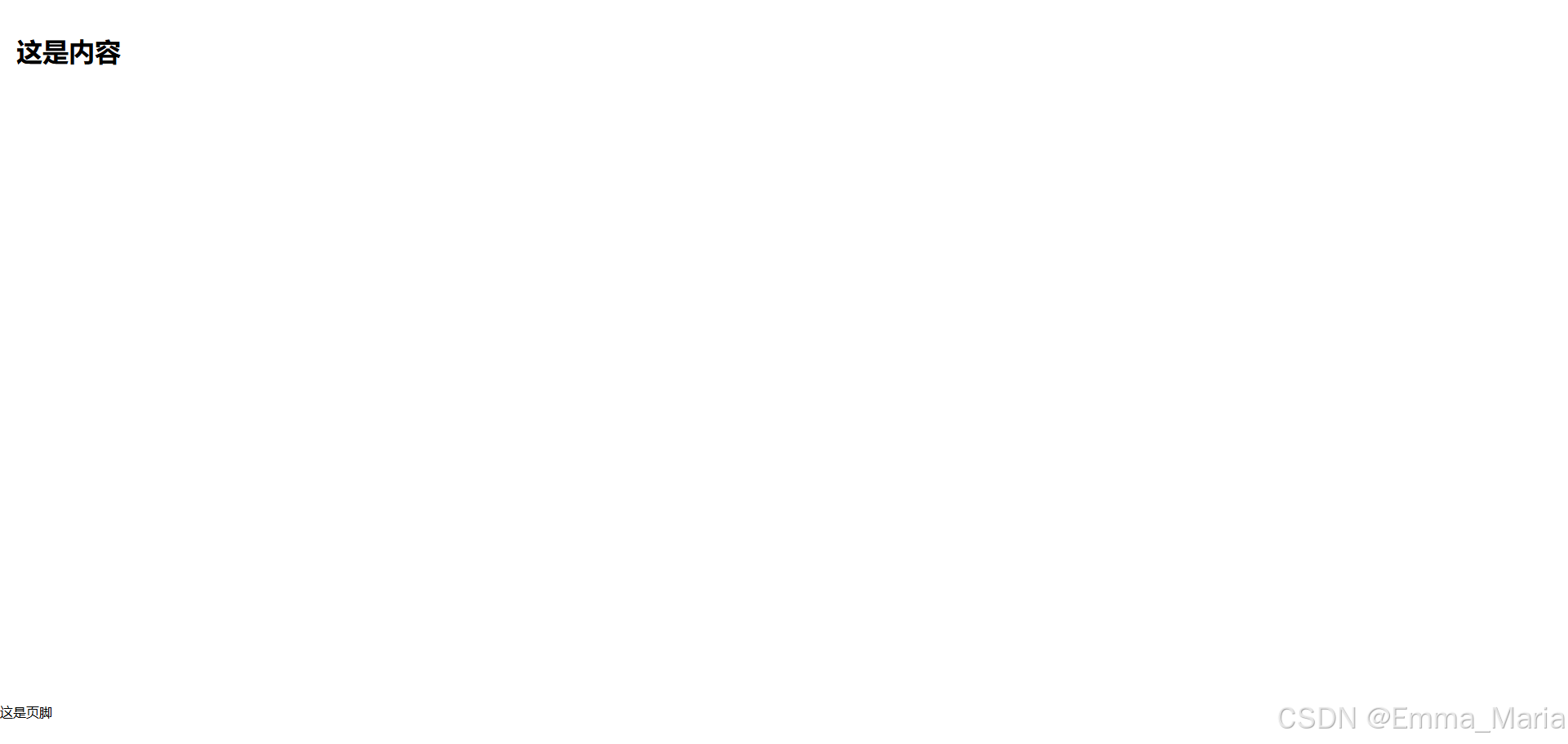
注:footer高度都是固定的,如果footer的内容太多则可能会破坏布局。
方案三
使用calc()设置内容高度
代码如下:
<!DOCTYPE html>
<html>
    <head>
        <title>footer置底</title>
        <meta http-equiv="Content-Type" content="text/html;charset=UTF-8">
        <style>
            .content {
                min-height: calc(100vh - 50px);
            }
            .footer {
                height: 50px;
            }
        </style>
    </head>
    <body>
        <div class="content">
            <!-- content -->
        </div>
        <div class="footer">footer</div>
    </body>
</html>
注:footer高度都是固定的,如果footer的内容太多则可能会破坏布局。
方案四
使用flexbox弹性盒布局
代码如下:
<!DOCTYPE html>
<html>
    <head>
        <title>footer置底</title>
        <meta http-equiv="Content-Type" content="text/html;charset=UTF-8">
        <style>
            html {
                margin: 0;
                padding: 0;
                height: 100%;
            }
            body {
                margin: 0;
                padding: 0;
                min-height: 100%;
                display: flex;
                flex-direction: column;
            }
            .content {
                flex: 1;
            }
        </style>
    </head>
    <body>
        <div class="content">
            <!-- content -->
             <h1>这是内容</h1>
        </div>
        <div class="footer">footer</div>
    </body>
</html>
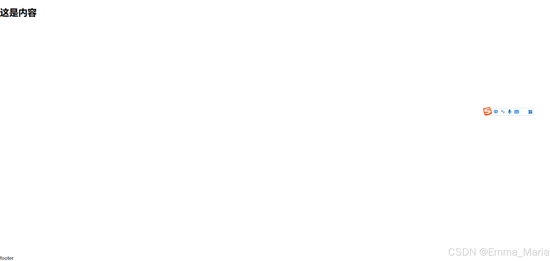
效果如下:
方案五
使用Grid网格布局(仅有IE10+浏览器支持)
代码如下:
<!DOCTYPE html>
<html>
    <head>
        <title>footer置底</title>
        <meta http-equiv="Content-Type" content="text/html;charset=UTF-8">
        <style>
            html {
                margin: 0;
                padding: 0;
                height: 100%;
            }
            body {
                margin: 0;
                padding: 0;
                min-height: 100%;
                display: grid;
                grid-template-rows: 1fr auto;
            }
            .footer {
                grid-row-start: 2;
                grid-row-end: 3;
            }
        </style>
    </head>
    <body>
        <div class="content">
            <!-- content -->
             <h1>这是内容</h1>
        </div>
        <div class="footer">footer</div>
    </body>
</html>
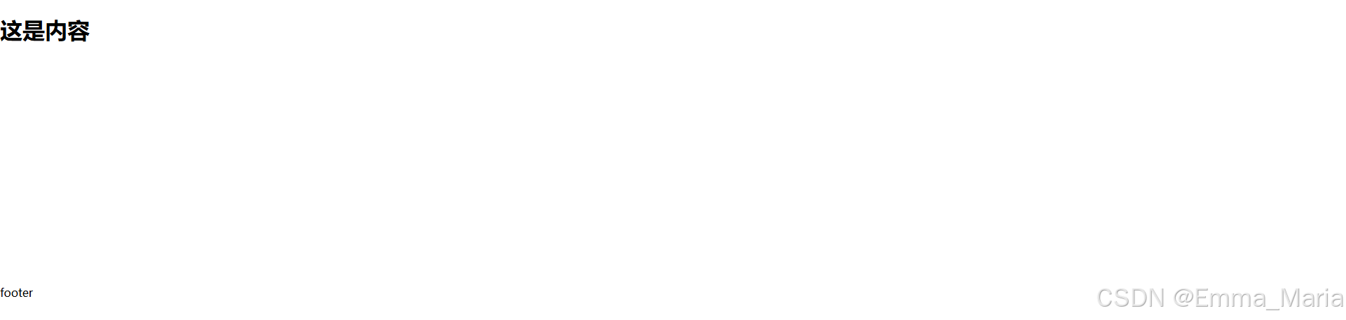
效果如下:

方案六
将内容部分 margin-bottom 设为负数
代码如下:
<!DOCTYPE html>
<html>
    <head>
        <title>footer置底</title>
        <meta http-equiv="Content-Type" content="text/html;charset=UTF-8">
        <style>
            html, body {
                margin: 0;
                padding: 0;
                height: 100%;
            }
            .content {
                min-height: 100%;
                margin-bottom: -50px; /* 等于footer的高度 */
            }
            .content::before {
                min-height: 100%;
                content: "";
                display: table;
            }
        </style>
    </head>
    <body>
        <div class="content">
            <!-- content -->
             <h1>这是内容</h1>
        </div>
        <div class="footer">footer</div>
    </body>
</html>
效果如下:
以上仅为局部布局代码,具体在做页面时还要按需使用,感谢观看,喜欢的话欢迎点赞收藏评论哦!


 扫一扫
扫一扫


 2332
2332

 被折叠的 条评论
为什么被折叠?
被折叠的 条评论
为什么被折叠?
 到【灌水乐园】发言


