


Flot是纯Javascript实现的基于jQuery的图表插件,主要支持线状图和柱状图的绘制(通过插件也可以支持饼状图)。
它的特点是使用简单、图形美观,支持鼠标跟踪及缩放功能。
Flot是基于canvas进行图表的绘制,可以在IE6+/Firefox2+/Safari3+/Opera9.5+/Chrome等主流浏览器上运行;其中IE9以下浏览器不支持canvas标记,需要额外引用excanvas库(VML)来实现。
基本使用
首先,在页面头部引用脚本:
| 1 2 3 |
|
在页面中创建一个html标记,如div,然后通过样式来指定图表的大小:
| 1 |
|
最后,在DOM Ready事件中调用Flot的绘制方法$.plot:
| 1 2 3 |
|
这样就简单的绘制了一条线。
数据格式
flot的数据格式是数组,数组中包含多个系列的数据,每个系列的数据对应一条线:
| 1 |
|
每一个系列的数据可以是一个数组或者对象。
数组格式的数据,每一个点都是一个数组(分x/y轴):
| 1 |
|
如下定义了三个点:
| 1 |
|
绘制图表的时候,会把这三个点连接起来;假如中间有个点使用了空值即null,这个点的两边则不会连接起来:
| 1 |
|
需要注意的是,每个点的数据必须是数字,如果是字符串,可能会得到奇怪的错误。
对象格式的数据,如下:
| 1 2 3 4 5 6 7 8 9 10 11 12 13 14 |
|
通常不需要关心其他选项,只需要指定label和data:
| 1 2 3 4 |
|
对象格式的数据提供更大的灵活性,也更有利于代码的可读性,如下定义了两个系列即两条线:
| 1 2 3 |
|
选项设置
所有的选项都是可选的,改变某个属性,只需要指定特定的属性名称:
| 1 2 3 4 5 6 7 8 9 10 11 12 13 14 15 16 17 18 19 20 21 22 23 24 25 26 27 28 29 30 31 32 33 34 35 36 37 38 39 40 41 42 43 44 45 46 47 48 49 50 51 52 53 54 55 56 57 58 59 60 61 62 63 64 65 66 67 68 69 70 71 72 73 74 75 76 77 78 79 80 81 82 83 84 85 86 87 88 89 90 91 92 93 94 95 96 97 98 99 100 101 102 103 104 105 106 107 108 109 110 111 112 113 114 115 116 117 118 119 120 121 122 123 124 |
|
| 1 2 3 4 5 |
|
格式化图例的显示
通过legend参数的labelFormatter参数来格式化图例的显示,其中series为一个对象(属性参考对象格式的数据):
| 1 2 3 4 |
|
轴的设置
自定义刻度的显示,可以通过ticks参数来设置,如下定义X轴:
| 1 2 3 |
|
这样轴上只会显示以上定义的刻度。当有时候数据超出这个范围时,部分刻度会被隐藏,这时候就需要手动指定min/max参数,如下:
| 1 2 3 4 5 6 7 8 9 10 11 12 |
|
ticks参数还可以定制刻度显示的文字:
| 1 |
|
最强大的还是通过自定义函数,通过tickFormatter参数:
| 1 2 3 |
|
绘制多个刻度轴
如下,绘制两个y轴,同时需要在数据中指定属于哪个轴:
| 1 2 3 4 5 6 7 8 9 10 |
|
时间格式的数据
使用时间格式的数据需要引用jquery.flot.time.js,它支持以下格式的时间格式化:
| 1 2 3 4 5 6 7 8 9 10 11 12 13 14 |
|
还支持自定义月份、一周中每一天的名称:
| 1 2 |
|
使用如下:
| 1 2 3 4 5 6 7 8 9 10 11 |
|
当然,如果不使用timeformat的话,也可以用tickFormatter来格式化显示:
| 1 2 3 4 5 |
|
特殊的显示需求
可能需要在同一个点上进行时间的对比,比如x轴:
| 1 2 3 4 5 6 7 8 9 10 11 12 13 14 |
|
在以上方法中,把x轴和x轴刻度的值一一对应,当然也可以换成y轴。
控制线和点的显示
通过series参数,可以控制线的填充、点的显示(点默认是不显示的):
| 1 2 3 4 |
|
颜色的控制
flot有多个参数都用到了颜色,均可以通过定义单个、或多个颜色来控制每个数据呈现的颜色:
| 1 |
|
再比如网格的背景色:
| 1 2 3 |
|
颜色还有更加详细的选项来定义:
| 1 |
|
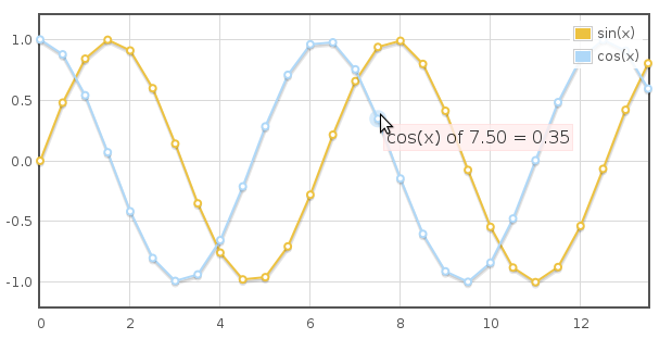
跟踪鼠标事件
主要有鼠标移动和点击事件,需要先开启相应开关:
| 1 2 3 4 |
|
然后再绑定相应的事件,如点击事件:
| 1 2 3 4 5 6 7 8 9 10 |
|
plothover事件的的绑定也一样。item对象主要有以下属性:
| 1 2 3 4 5 6 7 |
|
内置方法
- highlight(series, datapoint):高亮显示point
- unhighlight(series, datapoint) or unhighlight():取消高亮point,没有参数则取消高亮当前的point
- setData(data):重新设置数据,需要调用draw()方法来重绘
- setupGrid():重新计算坐标、轴,需要调用draw()方法来重绘
- draw():重绘图表
- triggerRedrawOverlay():更新可交互的区域,如point
- width()/height():获取宽高
- offset():获取偏移
- pointOffset({ x: xpos, y: ypos }):获取某个点相对于placeholder的div的偏移
- resize():调整图表的大小
- shutdown():清理即取消绑定所有事件处理函数
还有一些其他函数,但需要你比较了解flot内部运作,否则可能产生不好的结果:
- getData():获取数据,即在$.plot方法中定义的数据
- getAxes():获取坐标轴
- getPlaceholder():获取placeholder元素
- getCanvas():获取canvas对象
- getPlotOffset():获取偏移
- getOptions():获取设置的选项
如highlight方法,就可以在click事件中使用:
| 1 2 3 4 5 6 7 |
|
flot还提供了一些函数,用于在绘图各个流程步骤中进行一些额外的处理,这里不再列出。
相关资源
插件主页:http://code.google.com/p/flot/ (API文档:http://people.iola.dk/olau/flot/API.txt)
最新版本:https://github.com/flot/flot (API文档:https://github.com/flot/flot/blob/master/API.md)
在线DEMO:http://people.iola.dk/olau/flot/examples/
Flot的插件:http://code.google.com/p/flot/wiki/Plugins (实现更多类型的图表)


 841
841


 被折叠的 条评论
为什么被折叠?
被折叠的 条评论
为什么被折叠?
 到【灌水乐园】发言


