


CSS
什么是 CSS
CSS(Cascading Style Sheets) 指层叠样式表,样式定义如何显示 HTML 的样式,样式通常存储在样式表中,把样式添加到 HTML5 中,是为了解决内容与表现分离的问题,外部样式表可以极大提高工作效率,外部样式表通常存储在 CSS 文件中,多个样式定义可以层叠为一。
什么地方可以写 css
行内样式,在标签内部通过 style 属性编写的 CSS 样式就是行内。
内嵌样式,一般在页面中的 head 标签内通过
外部 css
标签 通过在页面中的 标签中使用 标签将外部 CSS 样式引入/导入到当前页面中。 href 链接的地址 rel 指定类型css
/* id选择器 */
#yanse
{
	color: #111ff1;
	background-color: #a6f18f;
}
HTML
<!DOCTYPE html>
<html>
	<head>
		<meta charset="utf-8">
		<title>yanse</title>
		<!-- 外部样式css文件导入/引入 -->
		<link href="css/demo.css" rel="stylesheet"/>
	</head>
	<body>
		<a id="yanse">先帝创业未半</a>
	</body>
</html>
选择器
选择器统一格式:
选择器名{
属性名: 属性值;
…
}
标签选择器:
标签名{ 属性名:属性值;…}
id 选择器:
#id 选择器名{属性名:属性值;…}
class 选择器:
.class 选择器名{属性名:属性值;…}
1.1、并集选择器
格式:
选择器 1,选择器 2,…,选择器 N
{
属性名:属性值;
}
/* 标签选择器,id选择器,class选择器 */
span,#idd,.cls
{
  border: 1px solid black;
  border-color: red;
  font-size: 30px;
}
html
<!DOCTYPE html>
<html>
	<head>
		<meta charset="utf-8">
		<title>yanse</title>
		<!-- 外部样式css文件导入/引入 -->
		<link href="css/demo.css" rel="stylesheet"/>
	</head>
	<body>
		<a id="yanse">先帝创业未半</a>
		<span>span---</span>
		<div id="idd">div</div>
		<div class="cls">div---class</div>
	</body>
</html>

1.2、选择器优先级
CSS 选择器优先级从高到低顺序为:
1、id 选择器
2、class 选择器
3、标签选择器
4、层级选择器
5、子代选择器
6、伪类选择器
盒子模型(Box Model)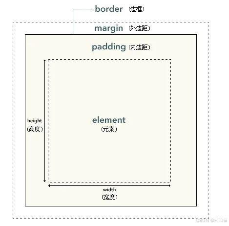
<!DOCTYPE html>
<html>
	<head>
		<meta charset="utf-8">
		<title>boxmodel</title>
		<style>
			div
			{
				/* border: 1px solid black; */
				border-radius: 10px;
				width: 300px;
				height: 300px;
				/* 内边距 */
				/* padding: 20px; */
				/* 处理div的每个边框 */
				border-top: 6px solid black;
				border-left: 6px double red;
				border-bottom: 6px groove green;
				border-right: 6px ridge blue;
			}

			img
			{
				width: 200px;
				height: 200px;
				margin-top: 20px;
				margin-left: 20px;
				border-radius: 10px;
			}

		</style>
	</head>
	<body>
		<div>
			<img src="imgs/bj.png"/>
		</div>
	</body>
</html>

阴影效果
shadow 阴影相关的属性。
<!DOCTYPE html>
<html>
	<head>
		<meta charset="utf-8">
		<title>阴影</title>
		<style>
			div
			{
				border: 2px outset red;
				width: 200px;
				height: 200px;
				box-shadow:  10px 5px 5px red;
			}

			button
			{
				width: 100px;
				height: 50px;
				margin-top: 30px;
				border-radius: 30px 10px 10px 10px;
				box-shadow:  10px 5px 5px gray;
			}

			a
			{
				 text-shadow: 10px 5px 5px red;
			}

		</style>
	</head>
	<body>

		<div>box</div>

		<button>按钮</button>
		<br />
		<a>文字内容</a>

	</body>
</html>

图片处理
background-image:url(图片 1),url(图片 2) 背景图片
background-size:图片 1 大小,图片 2 大小 处理图片大小
background-repeat:图片 1 效果,图片 2 效果处理
background-position: 图片 1 布局,图片 2 布局 图片布局处理
<!DOCTYPE html>
<html>
	<head>
		<meta charset="utf-8">
		<title>图片处理</title>
		<style>
			#tp1
			{
				width: 200px;
				height: 200px;
				border-radius: 100px;
			}

			div
			{
				border: 1px solid black;
				width: 300px;
				height: 300px;
				/* 背景图片,
				现在浏览器不支持直接在background-image中单独处理图片效果
				 请使用background-position
				 */
				background-image: url("imgs/douyin.png"),url("imgs/fanhui.png");
				/* 背景大小 */
				background-size: 60px 60px;
				/* 背景排列方式 */
				background-repeat: no-repeat;
				/* 按照顺序定位背景图片的位置 */
				background-position: right bottom,left top;

			}


		</style>
	</head>
	<body>
		<img id="tp1" src="imgs/bj.png"/>
		<div>div</div>
	</body>
</html>

多列
column-count: number; 列数
column-gap: 像素; 列间距
<!DOCTYPE html>
<html>
	<head>
		<meta charset="utf-8">
		<title>多列</title>
		<style>

			.dv1
			{
				border: 1px solid gray;
				background-color: gray;
				width: 100px;
				height: 100px;
				display: inline;
				border-radius: 10px;
			}

			.dv
			{
				width: 300px;
				border: 1px solid black;
				/* 指定dv是3列 */
				column-count: 3;
				/* 列间距为6像素 */
				column-gap: 6px;
				/* 列分割线 */
				column-rule: 6px double red;
				/* background-color: gray; */
			}
			/* class是dv中的第一个div的样式 */
			.dv div:nth-child(1)
			{
				font-size: 20px;
				background-color: aquamarine;
			}

			.dv div:nth-child(2)
			{
				background-color: beige;
				font-family: '楷体';
			}

			.dv div:nth-child(3)
			{
				background-color: #fe1ffe;
			}


		</style>
	</head>
	<body>
		<div>
			<div class="dv1">首页</div>
			<div class="dv1">关于我们</div>
			<div class="dv1">联系我们</div>
		</div>
		<hr />
		<div class="dv">
			<div>首页</div>
			<div>关于我们</div>
			<div>联系我们</div>
		</div>
	</body>
</html>

可调整大小的 div
resize 用于设置元素是否可调整尺寸,以及可调整的方向。
必须要 overflow 属性一起使用,并且 overflow 属性的值不能是 visible。
none
元素不提供用户可控的调整其尺寸的方法。
both
元素显示可让用户调整其尺寸的机制,可沿水平和竖直方向调整尺寸。
horizontal
元素显示可让用户沿水平方向调整其尺寸的机制。
vertical
元素显示可让用户沿竖直方向调整其尺寸的机制。
<!DOCTYPE html>
<html>
	<head>
		<meta charset="utf-8">
		<title>可调节的div</title>
		<style>
			div
			{
				width: 200px;
				height: 200px;
				border: 1px solid black;
				resize: both;
				overflow: auto;
			}
		</style>
	</head>
	<body>
		<div></div>
	</body>
</html>

浮动
float 浮动属性。
<!DOCTYPE html>
<html>
	<head>
		<meta charset="utf-8">
		<title>浮动</title>
		<style>

			.dv
			{
				background-color: pink;
				border-radius: 20px;
				width: 100%;
				height: 20px;
				padding: 0px 2px;
			}

			.ft
			{
				float: left;
			}

			.rt
			{
				float:  right;
			}

		</style>
	</head>
	<body>
		<div class="dv">
			<div class="ft">手机</div>
			<div class="rt">更多...</div>
		</div>
	</body>
</html>
练习

<!DOCTYPE html>
<html>
	<head>
		<meta charset="utf-8">
		<title>按钮</title>
		<style>

			.btn
			{
				width: 100px;
				height: 30px;
				border-radius: 6px;
				/* 去除下划线 */
				text-decoration: none;
				line-height: 30px;
				padding: 10px;
				margin: 10px;
				color: #fff;
				font-weight: 600;
			}

			.btn-primary
			{
				background-color: #0D6EFD;
			}

			.btn-primary:hover
			{
				background-color: #0b5ed7;
			}

			.btn-secondary
			{

				background-color: #6c757d;
			}

			.btn-secondary:hover
			{
				background-color: #5c636a;
			}

			.btn-success
			{
				background-color: #198754;
			}

			.btn-success:hover
			{
				background-color: #157347;
			}

			.btn-danger
			{
				background-color: #dc3545;
			}

			.btn-danger:hover
			{
				background-color: #bb2d3b;
			}

			.btn1
			{
				padding: 10px;
				color: #000;
				font-weight: 600;
				border-radius: 6px;
				border: 0px white;
				cursor: pointer;
			}

			.btn2
			{
				padding: 10px;
				color: #fff;
				font-weight: 600;
				border-radius: 6px;
				border: 0px white;
				cursor: pointer;
			}

			.btn-warning
			{
				background-color: #ffc107;
			}

			.btn-warning:hover
			{
				background-color: #ffca2c;
			}

			.btn-info
			{
				background-color: #0dcaf0;
			}

			.btn-info:hover
			{
				background-color: #31d2f2;
			}
			.btn-light
			{
				background-color: #f8f9fa;
			}

			.btn-light:hover
			{
				background-color: #d3d4d5;
			}
			.btn-dark
			{
				background-color: #212529;
			}

			.btn-dark:hover
			{
				background-color: #424649;
			}

		</style>
	</head>
	<body>
		<a href="" class="btn btn-primary">Primary</a>
		<a href="" class="btn btn-secondary">Secondary</a>
		<a href="" class="btn btn-success">Success</a>
		<a href="" class="btn btn-danger">Danger</a>
		<button  class="btn1 btn-warning">Warning</button>
		<button  class="btn1 btn-info">Info</button>
		<button  class="btn1 btn-light">Light</button>
		<button  class="btn2 btn-dark">Dark</button>
	</body>
</html>
弹性盒子
1.1、弹性容器
display-flex 设置当前容器为弹性容器,设置以后,默认为水平弹性布局方式。
flex-direction:弹性布局方式----设置主轴
row 水平布局
column 垂直布局
<!DOCTYPE html>
<html>
	<head>
		<meta charset="utf-8">
		<title>displayflex</title>
		<style>
			.container
			{
				background-color: pink;
				/* 将盒子设置为flex弹性盒子 */
				display: flex;
				/* 将盒子设置为垂直布局 */
				/* flex-direction: column; */

			}

			.item
			{
				width: 100px;
				background-color: deeppink;
				text-align: center;
				margin: 3px;
			}

		</style>
	</head>
	<body>
		<div class="container">
			<div class="item">Item1</div>
			<div class="item">Item2</div>
			<div class="item">Item3</div>
			<div class="item">Item4</div>
			<div class="item">Item5</div>
			<div class="item">Item6</div>
		</div>
	</body>
</html>

1.2、主轴对齐方式
关键字:
justify-content,相当于水平 row 的对齐方式。
属性值:
flex-start 主轴起始端对齐,即默认左对齐。
flex-end 主轴末端对齐,即默认右对齐。
center 居中对齐
space-between 两端对齐
<!DOCTYPE html>
<html>
	<head>
		<meta charset="utf-8">
		<title>displayflex</title>
		<style>
			.container
			{
				background-color: pink;
				display: flex;
				/* 居中对齐 */
				/* justify-content: center; */
				/* 居右对齐 */
				/* justify-content: flex-end; */
				/* 居左对齐 */
				/* justify-content: flex-start; */
				justify-content: space-between;

			}

			.item
			{
				width: 100px;
				background-color: deeppink;
				text-align: center;
				margin: 3px;
				display: inline;
			}

		</style>
	</head>
	<body>
		<div class="container">
			<div class="item">Item1</div>
			<div class="item">Item2</div>
			<div class="item">Item3</div>
			<div class="item">Item4</div>
			<div class="item">Item5</div>
			<div class="item">Item6</div>
		</div>
	</body>
</html>

1.3、侧轴对齐方式
关键字:align-items,相当于 y 轴垂直对齐方式。
属性值:
flex-start 起始端对齐,顶部对齐
flex-end 末端对齐,底部对齐
center 居中对齐
stretch 拉伸对齐
<!DOCTYPE html>
<html>
	<head>
		<meta charset="utf-8">
		<title>displayflex</title>
		<style>
			.container
			{
				background-color: pink;
				display: flex;
				/* 居中对齐 */
				align-items: center;
				height: 200px;

			}

			.item
			{
				width: 100px;
				background-color: deeppink;
				text-align: center;
				margin: 3px;
				display: inline;
			}

		</style>
	</head>
	<body>
		<div class="container">
			<div class="item">Item1</div>
			<div class="item">Item2</div>
			<div class="item">Item3</div>
			<div class="item">Item4</div>
			<div class="item">Item5</div>
			<div class="item">Item6</div>
		</div>
	</body>
</html>

1.4、多行对齐
关键字:align-content
属性值:
flex-start 主轴起始端对齐,即默认左对齐。
flex-end 主轴末端对齐,即默认右对齐。
center 居中对齐
space-between 两端对齐
<!DOCTYPE html>
<html>
	<head>
		<meta charset="utf-8">
		<title>displayflex</title>
		<style>
			.container
			{
				background-color: pink;
				display: flex;
				align-content: center;
				/* 内容溢出换行 */
				flex-wrap: wrap;
			}

			.item
			{
				width: 100px;
				background-color: deeppink;
				text-align: center;
				margin: 3px;
				display: inline;
			}

		</style>
	</head>
	<body>
		<div class="container">
			<div class="item">Item1</div>
			<div class="item">Item2</div>
			<div class="item">Item3</div>
			<div class="item">Item4</div>
			<div class="item">Item5</div>
			<div class="item">Item6</div>
			<div class="item">Item6</div>
			<div class="item">Item6</div>
			<div class="item">Item6</div>
			<div class="item">Item6</div>
			<div class="item">Item6</div>
			<div class="item">Item6</div>
			<div class="item">Item6</div>
		</div>
	</body>
</html>
定位
关键字:position
属性值:
absolute 绝对定位,释放原有空间位置
relative 相对定位,不会释放原有空间位置
fixed 锁定定位,释放原有空间位置
定位属性:
left/right/top/bottom
z-index 图层定位,数值大的覆盖数值小的,即数值越大,越在顶层,越小越靠底层。
定位和分层
<!DOCTYPE html>
<html>
	<head>
		<meta charset="utf-8">
		<title>定位</title>
		<style>
			div{
				width: 200px;
				height: 200px;
				border: 1px solid black;
			}

			.div1
			{
				background-color: aquamarine;
				position: absolute;
				top: 300px
			}

			.div2
			{
				background-color: cadetblue;
				position: relative;
				top: 100px;
				left: 300px;
			}

			.div3
			{
				background-color: darkcyan;
				position: fixed;
				z-index: -1;
			}

		</style>
	</head>
	<body>
		<div class="div1">div1</div>
		<div class="div2">div2</div>
		<div class="div3">div3</div>
	</body>
</html>

锁定定位
<!DOCTYPE html>
<html>
	<head>
		<meta charset="utf-8">
		<title>锁定定位</title>
		<style>
			div{
				width: 200px;
				height: 200px;
				border: 1px solid black;
			}


			.div3
			{
				background-color: darkcyan;
				position: fixed;
				right: 10px;
				top: 300px;
			}

		</style>
	</head>
	<body>
		<div class="div3">div3</div>
		<ul>
			<li>1</li>
			<li>1</li>
			<li>1</li>
			<li>1</li>
			<li>1</li>
			<li>1</li>
			<li>1</li>
			<li>1</li>
			<li>1</li>
			<li>1</li>
			<li>1</li>
			<li>1</li>
			<li>1</li>
			<li>1</li>
			<li>1</li>
			<li>1</li>
			<li>1</li>
			<li>1</li>
			<li>1</li>
			<li>1</li>
			<li>1</li>
			<li>1</li>
			<li>1</li>
			<li>1</li>
			<li>1</li>
			<li>1</li>
			<li>1</li>
			<li>1</li>
			<li>1</li>
			<li>1</li>
			<li>1</li>
			<li>1</li>
			<li>1</li>
			<li>1</li>
			<li>1</li>
			<li>1</li>
			<li>1</li>
			<li>1</li>
			<li>1</li>
			<li>1</li>
			<li>1</li>
			<li>1</li>
			<li>1</li>
			<li>1</li>
			<li>1</li>
			<li>1</li>
			<li>1</li>
			<li>1</li>
			<li>1</li>
			<li>1</li>
			<li>1</li>
			<li>1</li>
			<li>1</li>
			<li>1</li>
			<li>1</li>
			<li>1</li>
			<li>1</li>
			<li>1</li>
			<li>1</li>
			<li>1</li>
			<li>1</li>
			<li>1</li>
			<li>1</li>
			<li>1</li>
			<li>1</li>
			<li>1</li>
			<li>1</li>
			<li>1</li>
		</ul>
	</body>
</html>

Animate
官方网站:Animate.css | A cross-browser library of CSS animations.
通过 github 去下载使用即可,需要注意的是,使用时,下划线是两个连续的。
https://animate.style/
<!DOCTYPE html>
<html>
	<head>
		<meta charset="utf-8">
		<title>动画效果</title>
		<link href="css/animate.min.css" rel="stylesheet"/>
	</head>
	<body>
		<!-- 注意此处是两个下划线 -->
		<h1 class="animate__animated animate__backInDown">标题1</h1>
	</body>
</html>


 1679
1679

 被折叠的 条评论
为什么被折叠?
被折叠的 条评论
为什么被折叠?
 到【灌水乐园】发言


