


所谓的覆盖是指优先级相同的时候
优先级:当两个选择器同时选中一个标签的时候 且属性设置发生了冲突 这个时候以谁为准谁的优先级就更高
元素选择器 < 类选择器 < id

1. 当id个数不相等的时候  id个数越多优先级越高
    总结:在比较优先级的时候首先就先看id个数 其他的统统不管
2. 当id个数相等的时候   由类选择器个数决定 类选择器越多优先级越高
    总结:在比较优先级的时候如果id个数相等 就再看类选择器 类选择器多的优先级一定高
3. id 和 类 个数都一样的时候  看元素选择器的个数 元素选择器个数多的优先级高

注意:不分先后顺序,只看选择器类型和个数
css之圆角
<!doctype html>
<html lang="en">
<head>
    <meta charset="UTF-8">
    <meta name="viewport"
          content="width=device-width, user-scalable=no, initial-scale=1.0, maximum-scale=1.0, minimum-scale=1.0">
    <meta http-equiv="X-UA-Compatible" content="ie=edge">
    <style>
        *{ padding: 0; margin: 0;}
        ul,ol{list-style: none;}
        a,img{border:none; text-decoration: none; color:inherit; }

        div{
           width: 100px;
           height: 100px;
           background: green;
            margin-bottom: 10px;
        }
        /*border-radius 圆角
        一个值:border-radius: 10px; 代表四个角
        两个值:border-radius: 10px 30px; 左上右下  右上左下
        三个值:border-radius: 10px 30px 40px;  左上 右上左下 右下
        四个值:分别代表四条边

        单位:px 百分比
            单纯只是想要给一点圆角好看就用px
            如果想要变圆或者椭圆就要用50%好一点

        */
        div:nth-child(1){
            border-radius: 10px;
        }
        div:nth-child(2){
            border-radius: 10px 30px;
        }
        div:nth-child(3){
            border-radius: 10px 30px 40px;
        }
        div:nth-child(4){
            width: 200px;
            border-radius: 50px;
        }
        div:nth-child(5){
            width: 200px;
            border-radius: 50%;
        }
        div:nth-child(6){
            border-radius: 50%;
        }
    </style>
    <title>Document</title>
</head>
<body>
    <div></div>
    <div></div>
    <div></div>
    <div></div>
    <div></div>
    <div></div>
</body>
</html>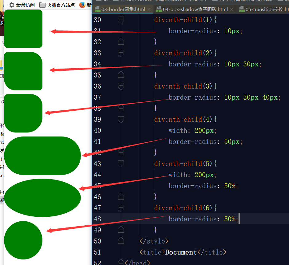
css特效之盒子阴影

css特效之transform and transition
transition改变长度和颜色
<!doctype html>
<html lang="en">
<head>
<meta charset="UTF-8">
<meta name="viewport"
content="width=device-width, user-scalable=no, initial-scale=1.0, maximum-scale=1.0, minimum-scale=1.0">
<meta http-equiv="X-UA-Compatible" content="ie=edge">
<style>
*{ padding: 0; margin: 0;}
ul,ol{list-style: none;}
a,img{border:none; text-decoration: none; color:inherit; }
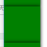
div{
width: 100px;
height: 100px;
background: green;
box-shadow: 0 0 10px 0 #000;
/*transition: width 2s 3s linear;*/
transition: 3s;
}
div:hover{
width: 800px;
background: deeppink;
}
/*
transition过渡:
transition: width 2s 3s linear;
1. 你需要过渡的属性(不给所有属性都满足)
2. 过渡的时间 经过多少时间执行完整个过程
3. 延时 满足条件以后再多少时间以后执行
4. 速度曲线 linear匀速
注意:只写一个时间的时候就是过渡时间
*/
</style>
<title>Document</title>
</head>
<body>
<div></div>
</body>
</html>
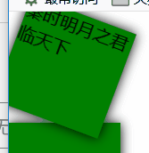
transform 使图片旋转和缩放
<!doctype html>
<html lang="en">
<head>
    <meta charset="UTF-8">
    <meta name="viewport"
          content="width=device-width, user-scalable=no, initial-scale=1.0, maximum-scale=1.0, minimum-scale=1.0">
    <meta http-equiv="X-UA-Compatible" content="ie=edge">
    <style>
        *{ padding: 0; margin: 0;}
        ul,ol{list-style: none;}
        a,img{border:none; text-decoration: none; color:inherit; }

        div{
            width: 100px;
            height: 100px;
            background: green;
            box-shadow: 0 0 10px 0 #000;
            transition: 2s;
            /*border-radius: 50%;*/

        }
        div:nth-child(1):hover{
            transform: rotate(45deg);
        }
        div:nth-child(2):hover{
            transform: scale(0.5);
        }
        /*
            transform: rotate(45deg)旋转  顺时针旋转45度
            transform: scale(0.5);  将元素放大缩小   小于1缩小 大于1放大

        */

    </style>
    <title>Document</title>
</head>
<body>
    <div>秦时明月之君临天下</div>
    <div></div>
    <div></div>

</body>
</html>


 扫一扫
扫一扫
 1075
1075

 被折叠的 条评论
为什么被折叠?
被折叠的 条评论
为什么被折叠?
 到【灌水乐园】发言


