


Ch3 可视化数据
此系列记录《数据科学入门》学习笔记
3.1 matplotlib
%matplotlib inline
import matplotlib.pyplot as plt

years = [1950, 1960, 1970, 1980, 1990, 2000, 2010]
gdp = [300.2, 543.3, 1075.9, 2862.5, 5979.6, 10289.7, 14958.3]

plt.plot(years, gdp, color='green', marker='o',linestyle='solid');
plt.title("名义GDG")
plt.ylabel("十亿美元")
plt.show()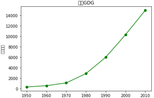
# matplotlib 字体的默认设置中并没有中文字体,所以上述中文字符乱码,进行如下代码手动添加中文字体的名称
from pylab import *
mpl.rcParams['font.sans-serif'] = ['SimHei']

plt.plot(years, gdp, color='darkgreen', marker='o',linestyle='dotted');
plt.title("名义GDG")
plt.ylabel("十亿美元")
plt.show()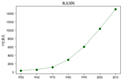
import numpy as np
t = np.arange(0., 5., 0.2)
plt.plot(t, t, 'r--', t, t**2, 'yp', t, t**3, 'g^')
plt.show()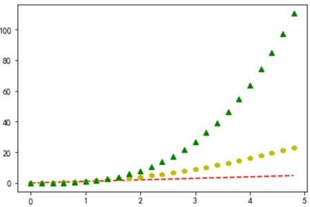
关于linestyle、color以及marker,可以利用plt.plot?语句得到详细的说明,张贴部分内容
The following format string characters are accepted to control
the line style or marker:

================    ===============================
character           description
================    ===============================
``'-'``             solid line style
``'--'``            dashed line style
``'-.'``            dash-dot line style
``':'``             dotted line style
``'.'``             point marker
``','``             pixel marker
``'o'``             circle marker
``'v'``             triangle_down marker
``'^'``             triangle_up marker
``'<'``             triangle_left marker
``'>'``             triangle_right marker
``'1'``             tri_down marker
``'2'``             tri_up marker
``'3'``             tri_left marker
``'4'``             tri_right marker
``'s'``             square marker
``'p'``             pentagon marker
``'*'``             star marker
``'h'``             hexagon1 marker
``'H'``             hexagon2 marker
``'+'``             plus marker
``'x'``             x marker
``'D'``             diamond marker
``'d'``             thin_diamond marker
``'|'``             vline marker
``'_'``             hline marker
================    ===============================


The following color abbreviations are supported:

==========  ========
character   color
==========  ========
'b'         blue
'g'         green
'r'         red
'c'         cyan
'm'         magenta
'y'         yellow
'k'         black
'w'         white
==========  ========
利用scatter函数可以进一步了解每一个marker的形状(scatter函数本章节后面有介绍)
#  代码来源 https://stackoverflow.com/questions/8409095/matplotlib-set-markers-for-individual-points-on-a-line
markers=['.',',','o','v','^','<','>','1','2','3','4','8','s','p','P','*','h','H','+','x','X','D','d','|','_']
descriptions=['point', 'pixel', 'circle', 'triangle_down', 'triangle_up','triangle_left', 'triangle_right', 'tri_down', 'tri_up',
              'tri_left','tri_right', 'octagon', 'square', 'pentagon', 'plus (filled)','star', 'hexagon1', 'hexagon2', 'plus',
              'x', 'x (filled)','diamond', 'thin_diamond', 'vline', 'hline']
x=[]
y=[]
for i in range(5):
    for j in range(5):
        x.append(i)
        y.append(j)
plt.figure()
for i,j,m,l in zip(x,y,markers,descriptions):
    plt.scatter(i,j,marker=m)
    plt.text(i-0.15,j+0.15,s=m+' : '+l)
plt.axis([-0.1,3.8,-0.1,4.5])
plt.tight_layout()
plt.axis('off')
plt.show() 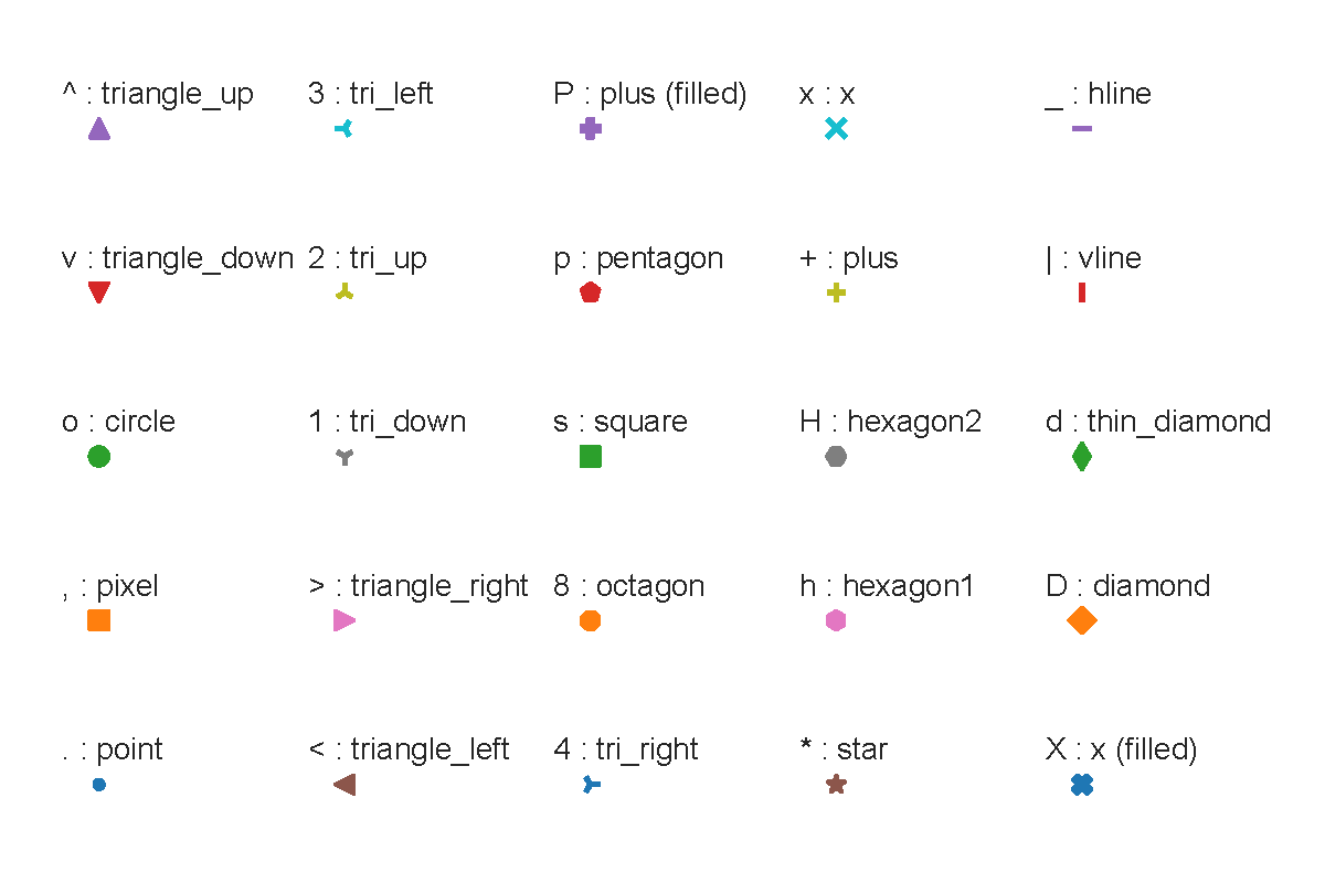
3.2 条形图
Call signatures::

   bar(x, height, *, align='center', **kwargs)
   bar(x, height, width, *, align='center', **kwargs)
   bar(x, height, width, bottom, *, align='center', **kwargs)
movies = ["Annie Hall", "Ben-Hur", "Cassablanca", "Gandhi", "West Side Story"]
num_oscars = [5, 11, 3, 8, 10]"""书上的方法"""
# 条形的默认宽度是0.8,因此对左侧坐标加上0.1,从而每个条形在中间位置
xs = [i for i, _ in enumerate(movies)]
plt.bar(xs, num_oscars);
plt.ylabel('所获奥斯卡金像奖数量')
plt.xlabel('我最喜爱的电影')
# 使用电影名称标记x轴,位置在x轴上每个条形的中间
plt.xticks(xs, movies)
plt.show()# python3 不需要调整也可以达到同样的效果
plt.bar(movies, num_oscars);
plt.ylabel('所获奥斯卡金像奖数量')
plt.xlabel('我最喜爱的电影')
plt.show()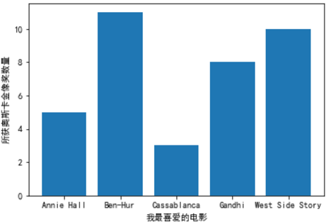
"""利用直方图观察取值的分布"""
from collections import Counter
grades = [83, 95, 91, 87, 70, 0, 85, 100, 67, 73, 77, 0]
decile = lambda grade: grade // 10 * 10
histogram = Counter(decile(grade) for grade in grades)

# python 3 自动将刻度放在中间,不需要将数据进行平移
plt.bar(histogram.keys(), histogram.values(), 9)
plt.xticks([10 * i for i in range(11)])
plt.xlabel('十分相')
plt.ylabel('学生数')
plt.title('考试分数分布图')
plt.show()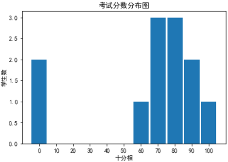
"""一般不会将y轴的下限设为为零,不然会出现误导结果"""

metions = [500, 505]
years = [2013, 2014]
plt.bar([2012.6, 2013.6], metions, 0.8, align='edge')
plt.xticks(years)
plt.ylabel("听到有人提及‘数据科学'的次数")
plt.axis([2012.5, 2014.5, 499, 506])
plt.title('快看,如此巨大的增长!')
plt.show()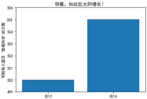
metions = [500, 505]
years = [2013, 2014]
plt.bar([2012.6, 2013.6], metions, 0.8, align='edge')
plt.xticks(years)
plt.ylabel("听到有人提及‘数据科学'的次数")
plt.axis([2012.5, 2014.5, 0, 550])
plt.show()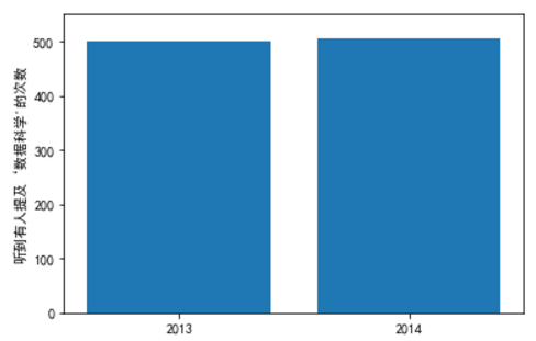
3.3 线图
variance = [1, 2, 4, 8, 16, 32, 64, 128, 256]
bias_squared = [256, 128, 64, 32, 16, 8, 4, 2, 1]
total_error = [x + y for x, y in zip(variance, bias_squared)]

# 可以调用多个plt.plot,以便在同一个图上显示多个序列
xs = [i for i, _ in enumerate(variance)]
plt.plot(xs,variance, 'g-', label='variance'); # 绿色实线
plt.plot(xs,bias_squared, 'r-.', label='bias^2'); # 红色点虚线
plt.plot(range(len(variance)),total_error, 'b:', label='total error'); # 蓝色点线
# 因为已经对每个序列都指派了标记,所以可以自由的布置图例
plt.plot(xs,variance, 'g-', label='variance'); # 绿色实线
plt.plot(xs,bias_squared, 'r-.', label='bias^2'); # 红色点虚线
plt.plot(range(len(variance)),total_error, 'b:', label='total error'); # 蓝色点线
plt.legend(loc=9) # loc=9表示顶端中央
plt.xlabel('模型复杂度')
plt.title('偏差-方差权衡图')
plt.show()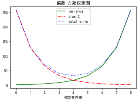
3.4 散点图
# friedns朋友数、minutes花在网站上的分钟数
friends = [70, 65, 72, 63, 71, 64, 60, 64, 67]
minutes = [175, 170, 205, 120, 220, 130, 105, 145, 190]
plt.scatter(friends, minutes, marker='D');
labels = ['a', 'b','c', 'd', 'e', 'f', 'g', 'h', 'i']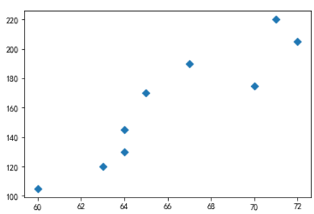
# 给每个点加标记
plt.scatter(friends, minutes)
for label, friend_count, minute_count in zip(labels, friends, minutes):
    plt.annotate(label, xy=(friend_count, minute_count), # 将标记放在对应的点上
                 xytext=(5, -5),  # 但要有轻微偏离
                 textcoords='offset points')

plt.title('日分钟数与朋友数')
plt.xlabel('朋友数')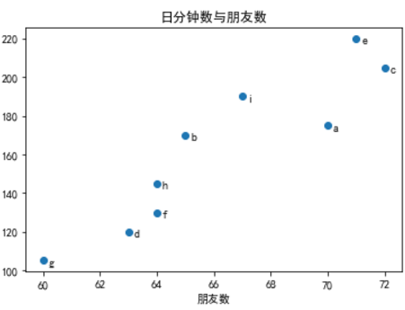
"""matplotlib自己选择刻度可能会得到误导性图片"""

test_1_grade = [ 99, 90, 85, 97, 80]
test_2_grade = [100, 85, 60, 90, 70]

plt.scatter(test_1_grade, test_2_grade)
plt.title("Axes Aren't Comparable")
plt.xlabel('测试1的分数')
plt.ylabel('测试2的分数')
plt.show()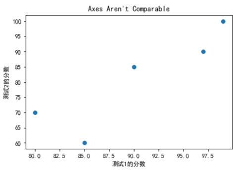
plt.scatter(test_1_grade, test_2_grade)
plt.axis("equal")
plt.xlabel('测试1的分数')
plt.ylabel('测试2的分数')
plt.show()

"""说明测试2的波动大"""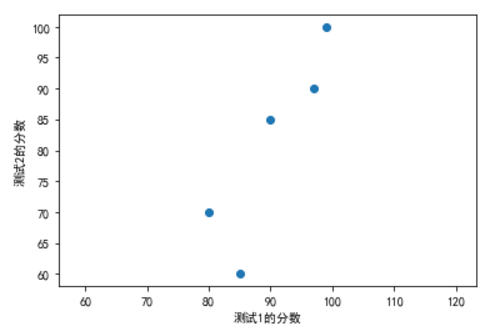
以上是Ch3的相关内容
2018.02.27 YR


 6893
6893

 被折叠的 条评论
为什么被折叠?
被折叠的 条评论
为什么被折叠?
 到【灌水乐园】发言


