


http://blog.teamtreehouse.com/the-css3-placeholder-pseudo-element
An HTML5 feature that had the web community abuzz with excitement a couple of years ago was theplaceholder attribute for displaying placeholder text in input fields. Now that it’s widely supported by modern browsers, there is a lot more we can do with this useful feature, like customize the text’s appearance.
The latest ::input-placeholder CSS pseudo-element gives us a standards-compliant way to style placeholder text, regardless of an input field’s default styles.
Styling Placeholder Text
A browser applies predefined styles to text displayed via the placeholder attribute. By default, the text is a light gray, which can be difficult to read depending on the context.
There was a bit of dashed hope when developers discovered that there were no CSS styling options available for placeholders –– it was the UA styles or nothing. The good news is that the new ::input-placeholder pseudo-element allows us to break out of the UA norm by offering more styling flexibility.
For example, let’s use the following placeholder and change its color and text case:
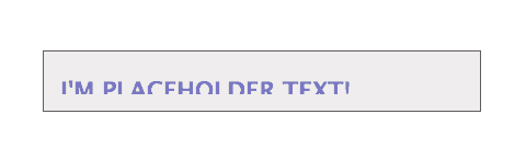
<input type="text" placeholder="I'm placeholder text!">
We’ll then create a CSS rule using the new pseudo-element:
input::-webkit-input-placeholder {
   color: rgba(0,5,143,.5);
   text-transform: uppercase;
}
::input-placeholder has decent implementation, but for now we’ll need to use vendor prefixes. We are also unable to combine the prefixed selectors into one rule. They each need to be defined separately, otherwise the entire rule will be ignored by the browser.
input::-webkit-input-placeholder {
	color: rgba(0,5,143,.5);
	text-transform: uppercase;
}
input::-moz-placeholder {
	color: rgba(0,5,143,.5);
	text-transform: uppercase;
}
input:-moz-placeholder {   /* Older versions of Firefox */
	color: rgba(0,5,143,.5);
	text-transform: uppercase;
}
input:-ms-input-placeholder {
	color: rgba(0,5,143,.5);
	text-transform: uppercase;
}
Check it out in CodePen.
The Placeholder Attribute Selector
Additionally, we can target input fields entirely based on whether or not they have a placeholder attribute with the [placeholder] attribute selector:
input[placeholder] {
   font-weight: bold;
   border-color: blue;
}
Now, every input field that has a placeholder attribute will have a bold font weight and blue border.
Which properties can we use?
Not all CSS properties are supported in a ::input-placeholder rule. In fact, only a handful are, the most useful ones being:
color
 font-size
 font-style
 font-weight
 letter-spacing
 line-height
 padding
 text-align
 text-decoration
It’s important to keep in mind that placeholder styles will not resize an input field and will not affect its box model. A line height and padding, for example, will move a placeholder, but too much padding and line height will display the text outside the content area of a field obscuring some parts. The same occurs with font sizes.
input::-webkit-input-placeholder {
   padding-top: 8px;
}
Placeholder text is cut off
Browser Support
The ::input-placeholder pseudo-element is currently supported in Firefox 4+, Chrome 4+, Safari 5+, Opera 11.6 and IE10. Firefox supports both a pseudo-element and a pseudo-class for older versions of Firefox.
Form interaction is an integral part of just about everything we do on the web. So even small enhancement features like this help us make great strides in developing powerful user experiences.
To learn more about new CSS features, take a look at my latest CSS Foundations Deep Dive.


 扫一扫
扫一扫


 888
888

 被折叠的 条评论
为什么被折叠?
被折叠的 条评论
为什么被折叠?
 到【灌水乐园】发言


