


border-radius: none | length{1,4} [/ length{1,4}
其中每一个值可以为 数值或百分比的形式。
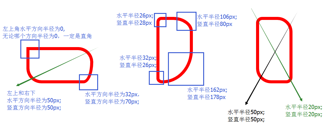
length/length 第一个lenght表示水平方向的半径,而第二个表示竖直方向的半径。
如果是一个值,那么 top-left、top-right、bottom-right、bottom-left 四个值相等。
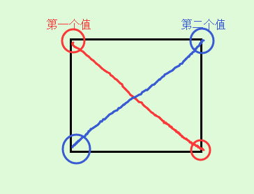
如果是两个值,那么 top-left和bottom-right相等,为第一个值,top-right和bottom-left值相等,为第二个值。
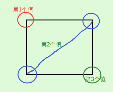
如果是三个值,那么第一个值是设置top-left,而第二个值是 top-right 和 bottom-left 并且他们会相等,第三个值是设置 bottom-right。
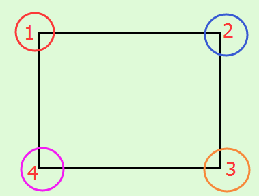
如果是四个值,那么第一个值是设置 top-left, 而第二个值是 top-right 第三个值 bottom-right 第四个值是设置 bottom-left
除了上述的简写外,还可以和border一样,分别写四个角,如下:
border-top-left-radius: //左上角
border-top-right-radius: //右上角
border-bottom-right-radius: //右下角
border-bottom-left-radius: //左下角
分别是水平方向和竖直方向半径,第二值省略的情况下,水平方向和竖直方向的半径相等。
border-radius 只有在以下版本的浏览器:Firefox4.0+、Safari5.0+、Google Chrome 10.0+、Opera 10.5+、IE9+ 支持 border-radius 标准语法格式,对于老版的浏览器,border-radius 需要根据不同的浏览器内核添加不同的前缀,比说 Mozilla 内核需要加上“-moz”,而 Webkit 内核需要加上“-webkit”等,但是IE和Opera没有私有格式,因此为了最大程度的兼容浏览器,我们需要设置如下:
-webkit-border-radius: 10px 20px 30px;
-moz-border-radius: 10px 20px 30px;
border-radius: 10px 20px 30px;
请将标准形式写在浏览器私有形式之后。
举几个例子看一下效果:
- 1
- 2
- 3
- 4
- 5
- 6
- 7
- 8
- 9
- 10
- 11
- 12
- 13
- 14
- 15
- 16
- 1
- 2
- 3
- 4
- 5
- 6
- 7
- 8
- 9
- 10
- 11
- 12
- 13
- 14
- 15
- 16
效果:
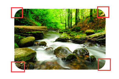
四个角的半径都是30px;
再看一个标准的圆以及椭圆:
- 1
- 2
- 3
- 4
- 5
- 6
- 7
- 8
- 9
- 10
- 11
- 12
- 13
- 14
- 15
- 16
- 17
- 18
- 19
- 20
- 21
- 1
- 2
- 3
- 4
- 5
- 6
- 7
- 8
- 9
- 10
- 11
- 12
- 13
- 14
- 15
- 16
- 17
- 18
- 19
- 20
- 21
效果:
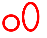
第一个和第二个div的差别主要在于其是正方形还是长方形,圆圈在轮播时,可以替代圆圈的图片使用。
以上都是水平方向和竖直方向半径相等的例子,下面举两个水平方向和竖直方向半径不相同的例子:
- 1
- 2
- 3
- 4
- 5
- 6
- 7
- 8
- 9
- 10
- 11
- 12
- 13
- 14
- 15
- 16
- 17
- 18
- 19
- 20
- 21
- 1
- 2
- 3
- 4
- 5
- 6
- 7
- 8
- 9
- 10
- 11
- 12
- 13
- 14
- 15
- 16
- 17
- 18
- 19
- 20
- 21
效果如下所示:
-
顶
-
踩


 扫一扫
扫一扫
 2531
2531

 被折叠的 条评论
为什么被折叠?
被折叠的 条评论
为什么被折叠?
 到【灌水乐园】发言


