


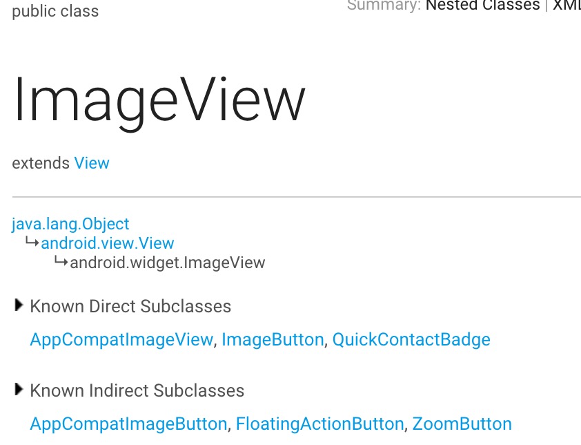
一、ImageView简介
显示任意图像,例如图标。ImageView类可以加载各种来源的图片(如资源或图片库或网络图片)
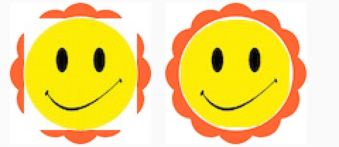
其结构关系图如下:
二、主要XML属性
| 属性名 | 关联方法 | 描述 |
|---|---|---|
| :adjustViewBounds | setAdjustViewBounds(boolean) | 设置该属性为真可以在ImageView调整边界时保持图片的纵横比例.需要与maxWidth、MaxHeight一起使用,否则单独使用没有效果. |
| :baseline | setBaseline(int) | 视图内基线的偏移量. |
| :baselineAlignBottom | setBaselineAlignBottom(boolean) | 如果为true,将父视图基线与ImageView底部边缘对齐. |
| :cropToPadding | setCropToPadding(boolean) | 如果为真,会剪切图片以适应内边距的大小,与ImageView的paddingXXX和scrollX|Y属性配合使用. |
| :maxHeight | setMaxHeight(int) | 视图最大高度. |
| :android:maxWidth | setMaxWidth(int) | 视图最大宽度. |
| :scaleType | setScaleType(ImageView.ScaleType) | 控制为了使图片适合 ImageView 的大小,应该如何变更图片大小或移动图片. |
| :src | setImageResource(int) | 设置可绘制对象作为 ImageView 显示的内容. |
| :tint | setImageTintList(ColorStateList) | 为图片设置渲染颜色. |
| android:tintMode | setImageTintMode(PorterDuff.Mode) | 图片渲染的混合模式. |
三、属性详解
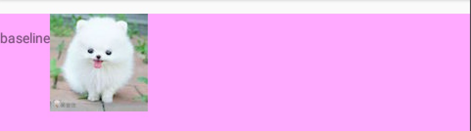
1、baseline
视图内基线的偏移量,也就是基线位置到ImageView顶部的距离
效果图:(文字基线到ImageView顶部距离为30)
布局代码
<LinearLayout
android:layout_width="match_parent"
android:layout_height="120dp"
android:background="#faf"
android:baselineAligned="true">
<TextView
android:layout_width="wrap_content"
android:layout_height="wrap_content"
android:text="@string/baseline"/>
<ImageView
android:layout_width="wrap_content"
android:layout_height="wrap_content"
android:baseline="30dp"
android:src="@mipmap/bomei"/>
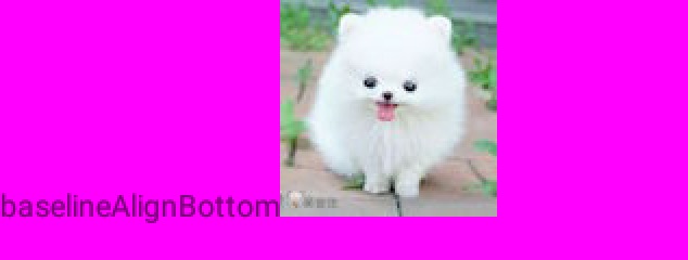
</LinearLayout>2、baselineAlignBottom
如果为true,将父视图基线与ImageView底部边缘对齐.
这个看图清晰明了
效果图:
代码:
 <LinearLayout
                android:layout_width="match_parent"
                android:layout_height="120dp"
                android:background="#f0f"
                android:baselineAligned="true">

                <TextView
                    android:layout_width="wrap_content"
                    android:layout_height="wrap_content"
                    android:text="@string/baselineAlignBottom"/>

                <ImageView
                    android:layout_width="wrap_content"
                    android:layout_height="wrap_content"
                    android:baselineAlignBottom="true"
                    android:src="@mipmap/bomei"/>
            </LinearLayout>
注意:baseline和baselineAlignBottom混用
两个ImageView,一个设置了baseline属性,一个设置了baselineAlignBottom=“true”,那么这个时候的基线是怎么样的呢?
我们先来看一下代码
 <LinearLayout
                android:layout_width="match_parent"
                android:layout_height="120dp"
                android:background="#0af"
                android:baselineAligned="true">

                <TextView
                    android:layout_width="wrap_content"
                    android:layout_height="wrap_content"
                    android:text="@string/baseline_AlignBottom"/>

                <ImageView
                    android:layout_width="wrap_content"
                    android:layout_height="wrap_content"
                    android:baseline="30dp"
                    android:src="@mipmap/bomei"/>

                <ImageView
                    android:layout_width="wrap_content"
                    android:layout_height="wrap_content"
                    android:baselineAlignBottom="true"
                    android:src="@mipmap/bomei"/>

            </LinearLayout>
再来看一下效果图

结果说明:
1.基线会以设置了android:baselineAlignBottom=“true”的视图底部为准
2.设置了android:baseline=“Mdp”的视图,其顶部到基线的距离为M
3、cropToPadding
如果为真,会剪切图片以适应内边距的大小,与ImageView的paddingXXX属性配合使用.
代码:
  <!-- about cropToPadding begin-->
            <TextView
                android:layout_width="wrap_content"
                android:layout_height="wrap_content"
                android:text="@string/cropToPadding"/>

            <LinearLayout
                android:layout_width="match_parent"
                android:layout_height="wrap_content"
                android:background="#0ff">

                <ImageView
                    android:layout_width="80dp"
                    android:layout_height="80dp"
                    android:background="#f00"
                    android:scrollX="20dp"
                    android:paddingLeft="10dp"
                    android:cropToPadding="true"
                    android:src="@mipmap/bomei"/>

                <ImageView
                    android:layout_width="80dp"
                    android:layout_height="80dp"
                    android:layout_marginLeft="10dp"
                    android:background="#f00"
                    android:scrollX="-20dp"
                    android:cropToPadding="true"
                    android:paddingRight="10dp"
                    android:src="@mipmap/bomei"/>

                <ImageView
                    android:layout_width="80dp"
                    android:layout_height="80dp"
                    android:layout_marginLeft="10dp"
                    android:background="#f00"
                    android:cropToPadding="true"
                    android:scrollY="20dp"
                    android:paddingTop="10dp"
                    android:src="@mipmap/bomei"/>

                <ImageView
                    android:layout_width="80dp"
                    android:layout_height="80dp"
                    android:layout_marginLeft="10dp"
                    android:background="#f00"
                    android:scrollY="-20dp"
                    android:cropToPadding="true"
                    android:paddingBottom="10dp"
                    android:src="@mipmap/bomei"/>
            </LinearLayout>
            <!-- about cropToPadding end-->
效果图:
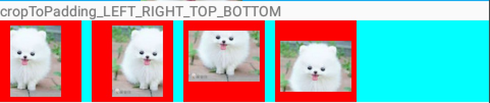
结果说明:
1.设置裁剪图片左右时与android:scrollX配合使用;
裁剪图片上下时与android:scrollY配合使用
2. android:cropToPadding=”true”时,设置paddingXXX才有效果
3. android:cropToPadding 默认值为false
4、background and src
background设置的为背景图片,src设置的为前景图片
二者配合使用,可以形成组合图片
如下效果图
它是由下面两张图片组成的


5、maxHeight & maxWidth & adjustViewBounds
效果图:
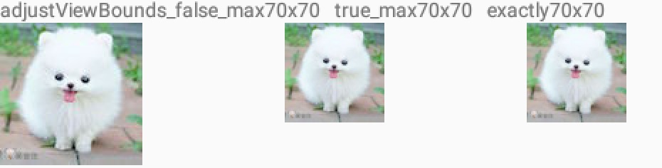
说明:
1.android:adjustViewBounds=”true”时并且android:layout_width=”wrap_content”
android:layout_height=”wrap_content”,设置maxHeight和maxWidth才有效果
2.maxHeight和maxWidth设置值大于图片本来尺寸时,已原始尺寸为准
3.如果设置android:layout_width和android:layout_height为固定值,则已此固定值为准
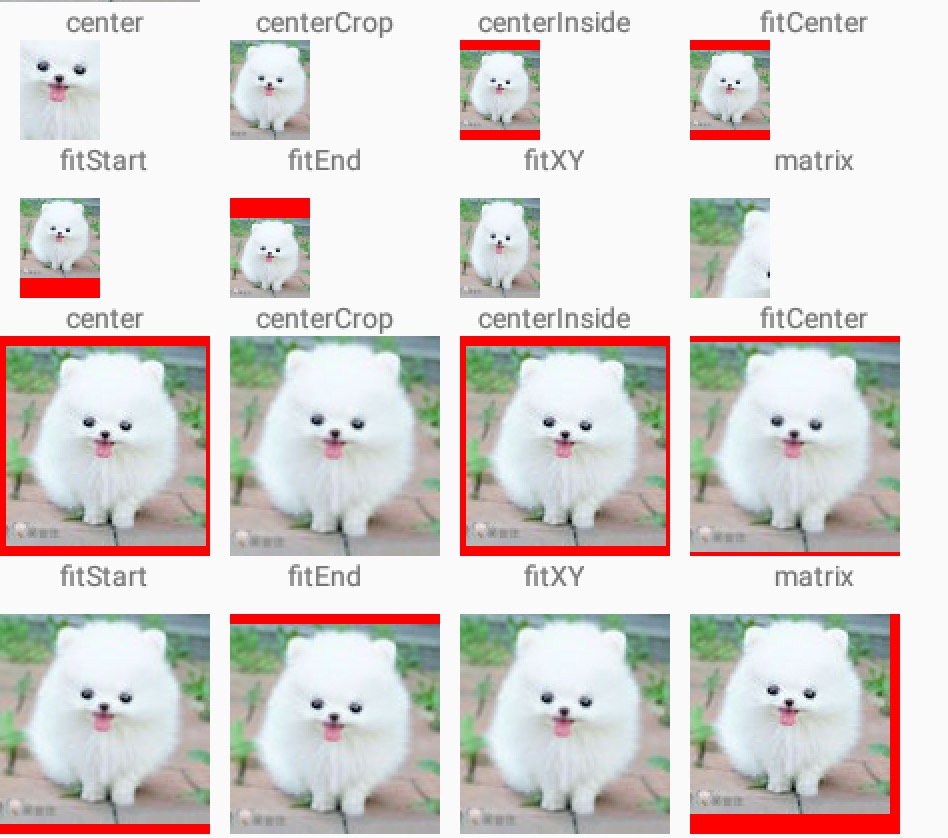
6、scaleType
控制图片缩放或移动
默认值为fitCenter
共计有8个属性值
| 属性值 | 说明 |
|---|---|
| center | 无缩放,按原图大小显示图片,当图片宽高大于View的宽高时,截取图片中间部分显示 |
| centerCrop | 按比例拉伸原图直至于填充满View宽高,并显示在View的中间。 |
| centerInside | 当View的宽高>=图片的宽高时,图片居中显示原大小 反之将原图按比例缩放至View的宽高居中显示。 |
| fitCenter | 按比例拉伸原图直至等于View某边的宽高,且显示在View的中间 |
| fitStart | 按比例拉伸图片,且显示在View的左上边 |
| fitEnd | 按比例拉伸图片,且显示在View的右下边 |
| fitXY | 拉伸图片(不按比例)以填充View的宽高 |
| matrix | 用矩阵来绘图 |
效果图如下
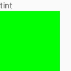
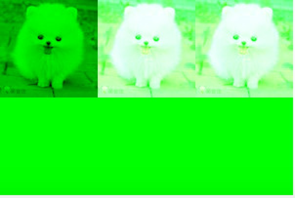
7、tint
为图片设置渲染颜色,单独设置时,会覆盖掉原有背景图片
代码
  <ImageView
                android:layout_width="wrap_content"
                android:layout_height="wrap_content"
                android:src="@mipmap/bomei"
                android:tint="#0f0"/>
效果图
8、tintMode图片渲染的混合模式
这个属性是在Android 5.0(API21)中引入的
用来设置图片的渲染模式,默认值为src_atop
有如下几个值
摘自SDK
| Tables | Are | Cool |
|---|---|---|
| src_over | The tint is drawn on top of the drawable. [Sa + (1 - Sa)*Da, Rc = Sc + (1 - Sa)*Dc] | |
| src_in | The tint is masked by the alpha channel of the drawable. The drawable’s color channels are thrown out. [Sa * Da, Sc * Da] | |
| src_atop | The tint is drawn above the drawable, but with the drawable’s alpha channel masking the result. [Da, Sc * Da + (1 - Sa) * Dc] | |
| multiply | Multiplies the color and alpha channels of the drawable with those of the tint. [Sa * Da, Sc * Dc] | |
| screen | [Sa + Da - Sa * Da, Sc + Dc - Sc * Dc] | |
| add | Combines the tint and drawable color and alpha channels, clamping the result to valid color values. Saturate(S + D) |
代码:
  <!-- about tintMode begin-->
            <GridLayout
                android:layout_width="match_parent"
                android:layout_height="wrap_content"
                android:columnCount="3">

                <ImageView
                    android:layout_width="wrap_content"
                    android:layout_height="wrap_content"
                    android:src="@mipmap/bomei"
                    android:tint="#0f0"
                    android:tintMode="multiply"/>

                <ImageView
                    android:layout_width="wrap_content"
                    android:layout_height="wrap_content"
                    android:src="@mipmap/bomei"
                    android:tint="#0f0"
                    android:tintMode="add"/>

                <ImageView
                    android:layout_width="wrap_content"
                    android:layout_height="wrap_content"
                    android:src="@mipmap/bomei"
                    android:tint="#0f0"
                    android:tintMode="screen"/>

                <ImageView
                    android:layout_width="wrap_content"
                    android:layout_height="wrap_content"
                    android:src="@mipmap/bomei"
                    android:tint="#0f0"
                    android:tintMode="src_over"/>

                <ImageView
                    android:layout_width="wrap_content"
                    android:layout_height="wrap_content"
                    android:src="@mipmap/bomei"
                    android:tint="#0f0"
                    android:tintMode="src_atop"/>

                <ImageView
                    android:layout_width="wrap_content"
                    android:layout_height="wrap_content"
                    android:src="@mipmap/bomei"
                    android:tint="#0f0"
                    android:tintMode="src_in"/>


            </GridLayout>
            <!-- tint end-->
效果图
开发工具:Android Studio1.4
SDK: Android 6.0
API 23
代码下载:ImageView(1).zip


 3487
3487


 被折叠的 条评论
为什么被折叠?
被折叠的 条评论
为什么被折叠?
 到【灌水乐园】发言


