原文链接:http://developer.android.com/guide/practices/ui_guidelines/icon_design_launcher.html
另一个参考网址:http://developer.android.com/guide/practices/ui_guidelines/icon_design_launcher_archive.html
1. Do's and Don'ts
Below are some "do and don't" examples to consider when creating icons for your application.
![]()
Icons should not be overly complicated. Remember that launcher icons will be used at often small sizes, so they should be distinguishable at small sizes.
![]()
Icons should not be cropped. Use unique shapes where appropriate; remember that launcher icons should differentiate your application from others. Additionally, do not use too glossy a finish unless the represented object has a glossy material.
![]()
Icons should not be thin. They should have a similar weight to other icons. Overly thin icons will not stand out well on all backgrounds.
![]()
Icons should make use of the alpha channel, and should not simply be full-frame images. Where appropriate, distinguish your icon with subtle yet appealing visual treatment.
2. Size and Format
Launcher icons should be 32-bit PNGs with an alpha channel for transparency. The finished launcher icon dimensions corresponding to a given generalized screen density are shown in the table below.
Table 1. Summary of finished launcher icon dimensions for each generalized screen density.
You can also include a few pixels of padding in launcher icons to maintain a consistent visual weight with adjacent icons. For example, a 96 x 96 pixel xhdpi launcher icon can contain a 88 x 88 pixel shape with 4 pixels on each side for padding. This padding can also be used to make room for a subtle drop shadow, which can help ensure that launcher icons are legible across on any background color.
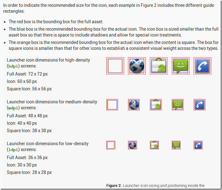
3. size and position
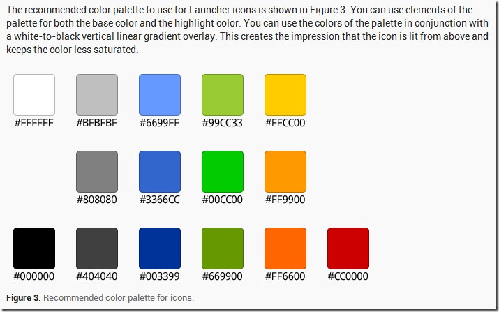
4. Recommended color palette for icons
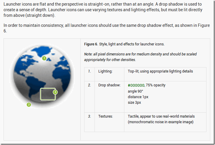
5. effects


 1094
1094


 被折叠的 条评论
为什么被折叠?


