


 本文详细介绍了SwitchButton控件的使用方法,包括在应用程序中引入、布局配置、属性解析及注意事项。通过具体代码示例,展示了如何实现开关按钮的自定义样式和动画效果。
目录
引言
项目开发中用到了switch切换按钮,所以在网上找了一个用的比较多的控件,这里记录一下用法。
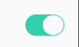
效果图
一、在您的应用程序中使用SwitchButton
该控件github地址:https://github.com/kyleduo/SwitchButton
在Gradle 中,在模块的build.gradle中添加依赖项
dependencies {
	implementation 'com.kyleduo.switchbutton:library:2.0.0'
}
二、布局中使用
  <com.kyleduo.switchbutton.SwitchButton
                        android:id="@+id/switchKongZhiPeiJian"
                        android:layout_width="@dimen/view_width_50"
                        android:layout_height="28dp"
                        android:layout_alignParentRight="true"
                        android:layout_centerVertical="true"
                        app:kswBackDrawable="@drawable/switchbutton_selector"
                        app:kswThumbColor="@color/white"
                        app:kswThumbHeight="28dp"
                        app:kswThumbMargin="@dimen/margin_1"
                        app:kswThumbRadius="@dimen/margin_14"
                        app:kswThumbWidth="28dp"
                        app:kswTintColor="@color/green" />
三、SwitchButton的属性值
| name | info |
|---|---|
| kswThumbDrawable | 手柄 |
| kswThumbColor | 手柄颜色 |
| kswThumbMargin | 手柄周边margin |
| kswThumbMarginTop | 上外边距 |
| kswThumbMarginBottom | 底外边距 |
| kswThumbMarginLeft | 左外边距 |
| kswThumbMarginRight | 右外边距 |
| kswThumbWidth | 手柄宽度(与高度等时是个圆) |
| kswThumbHeight | 手柄高度 |
| kswThumbRadius | 手柄的圆角 需要:kswThumbColor |
| kswBackRadius | 除手柄外的背景色需要:kswBackColor |
| kswBackDrawable | 背景图 |
| kswBackColor | 背景字体颜色 |
| kswFadeBack | 启用动画? |
| kswAnimationDuration | 动画持续时间 |
| kswTintColor | change SwitchButton’s style just by one property, all relevant color will be generate automatically. Do not support SwitchButtonMD or other style created by xml resources. |
| kswTextOn | 开文字 |
| kswTextOff | 关文字 |
| kswTextThumbInset (since 2.0.0) | length of the part of text under the thumb. |
| kswTextExtra (since 2.0.0) | extra space needed by background besides the actual text width. |
| kswTextAdjust (since 2.0.0) | 文字自适应 |
| kswThumbRangeRatio (since 2.0.0) | 手柄移动范围长条滑动 |
| kswBackMeasureRatio | (since 2.0.0)移除 |
| kswTextMarginH | (since 2.0.0)移除 |
| kswAutoAdjustTextPosition | (since 2.0.0)移除 |
四、需要注意的地方
在我的项目中,需要实现选中和非选中状态的背景图不同。试了全部的属性值,似乎都不能解决,在绝望之际,突然迸发出一丝灵感。那就是使用kswBackDrawable属性为SwitchButton设置背景图,自定义selector,选中和未选中状态显示不同的颜色。代码如下:
<?xml version="1.0" encoding="utf-8"?>
<selector xmlns:android="http://schemas.android.com/apk/res/android">
    <item android:drawable="@drawable/selector_switchbutton_selected" android:state_selected="true" />
    <item android:drawable="@drawable/selector_switchbutton_selected" android:state_checked="true" />
    <item android:drawable="@drawable/selector_switchbutton_no_selected" />
</selector>
除此之外,switchbutton存在两种选中方式,分别为:
switchKongZhiPeiJian.setCheckedNoEvent(false);
switchKongZhiPeiJian.setChecked(false);
setCheckedNoEvent():只是走实际的选中事件,只是实现了选中的效果
setChecked():会经过选中事件,
结束语
如有问题欢迎交流


 扫一扫
扫一扫


 1万+
1万+

 被折叠的 条评论
为什么被折叠?
被折叠的 条评论
为什么被折叠?
 到【灌水乐园】发言


