


使用三星手机的过程中发现三星手机系统自带的滑动条有一个特效。比方调节亮度的滑动条。在滑动滑块的过程中,滑块会变大。功能非常小可是体验却非常好,于是决定做一个这种效果出来。好了废话不多说了,以下開始实现
我们知道在SeekBar控件中有两个非常重要的属性,一个是进度条(即android:progressDrawable属性),一个是滑块(即android:thumb属性),我们主要用到的是滑块的特效,这里就把进度条的配置略微的介绍一下,先上代码:
在res/xml目录下创建seekbar_progress.xml文件:
<?xml version="1.0" encoding="utf-8"?>
<layer-list xmlns:android="http://schemas.android.com/apk/res/android" >

    <item android:id="@android:id/background">
        <shape>
            <corners android:radius="0dip" />

            <gradient
                android:angle="270"
                android:centerColor="#999999"
                android:centerY="0.75"
                android:endColor="#999999"
                android:startColor="#999999" />
        </shape>
    </item>
    <item android:id="@android:id/secondaryProgress">
        <clip>
            <shape>
                <corners android:radius="1dip" />

                <gradient
                    android:angle="270"
                    android:centerColor="#88803990"
                    android:centerY="0.75"
                    android:endColor="#88803990"
                    android:startColor="#88803990" />
            </shape>
        </clip>
    </item>
    <item android:id="@android:id/progress">
        <clip>
            <shape>
                <corners android:radius="1dip" />

                <gradient
                    android:angle="270"
                    android:centerColor="#803990"
                    android:centerY="0.75"
                    android:endColor="#803990"
                    android:startColor="#803990" />
            </shape>
        </clip>
    </item>

</layer-list>
代码的内容非常easy。主要是设置进度条的第一进度、第二进度和背景颜色。这里就不做详细介绍了。
接下来開始我们的滑块属性,要想实现三星的那种效果。我们必需要处理正常状态下和按下的事件,应该都想到了状态选择器,这里我们在res/drawable目录下创建滑块的状态选择器thum_selector.xml,然后设置去设置它的一些item属性,可是这时候发现我们的滑块还没有创建呢,这里的滑块我们不使用图片。而是通过绘制的方式来实现(至于详细的怎么去创建,我们能够在Android源代码中找到thum的配置文件,改改即可了),在xml目录下创建seekbar_thum_normal.xml文件:
<?xml version="1.0" encoding="UTF-8"?> <shape xmlns:android="http://schemas.android.com/apk/res/android" android:shape="rectangle" > <gradient android:angle="270" android:endColor="#ff585858" android:startColor="#ffffffff" /> <size android:height="15dp" android:width="15dp" /> <stroke android:width="5dp" android:color="#00000000" /> <corners android:radius="8dp" /> <solid android:color="#dcdcdc"/> </shape>
按压状态下滑块的配置文件seekbar_thum_pressed.xml:
<?xml version="1.0" encoding="UTF-8"?>
<shape xmlns:android="http://schemas.android.com/apk/res/android"
    android:shape="rectangle" >

    <gradient
        android:angle="270"
        android:endColor="#ff585858"
        android:startColor="#ffffffff" />

    <size
        android:height="15dp"
        android:width="15dp" />
    <corners
        android:radius="8dp" />
    <solid android:color="#dcdcdc"/>
</shape>接下来就是我们滑块的状态选择器的布局thum_selector.xml了
<?xml version="1.0" encoding="utf-8"?> <selector xmlns:android="http://schemas.android.com/apk/res/android"> <item android:state_pressed="true" android:state_window_focused="true" android:drawable="@xml/seekbar_thum_pressed" /> <item android:state_focused="true" android:state_window_focused="true" android:drawable="@xml/seekbar_thum_pressed" /> <item android:state_selected="true" android:state_window_focused="true" android:drawable="@xml/seekbar_thum_pressed" /> <item android:drawable="@xml/seekbar_thum_normal" /> </selector>
最后贴一下seekbar的布局文件。说明一下能够通过调节 android:thumbOffset属性,让进度条的进度在滑块的中心点
<SeekBar
android:id="@+id/seekBar1"
android:layout_width="fill_parent"
android:layout_height="wrap_content"
android:progressDrawable="@xml/seekbar_progress"
android:thumb="@drawable/thum_selector"
android:thumbOffset="10dp"
android:minHeight="5dp"
android:maxHeight="5dp"
>
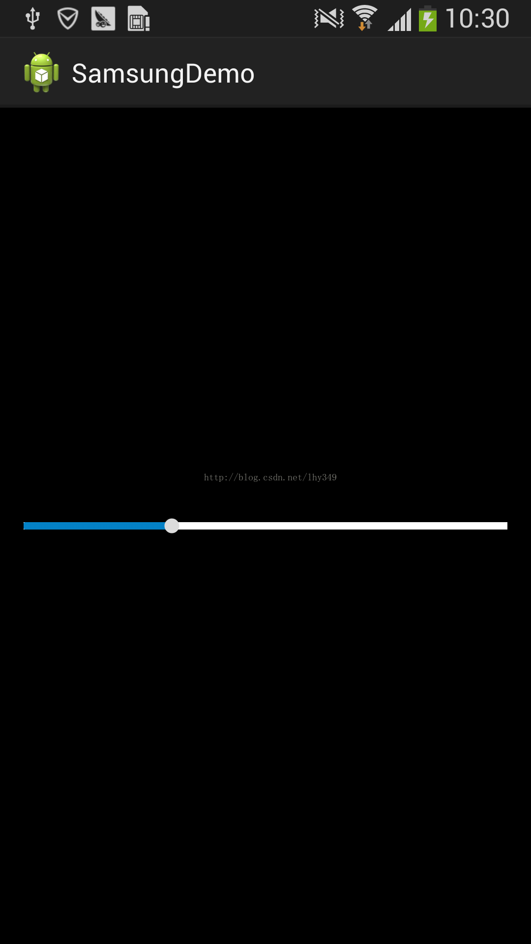
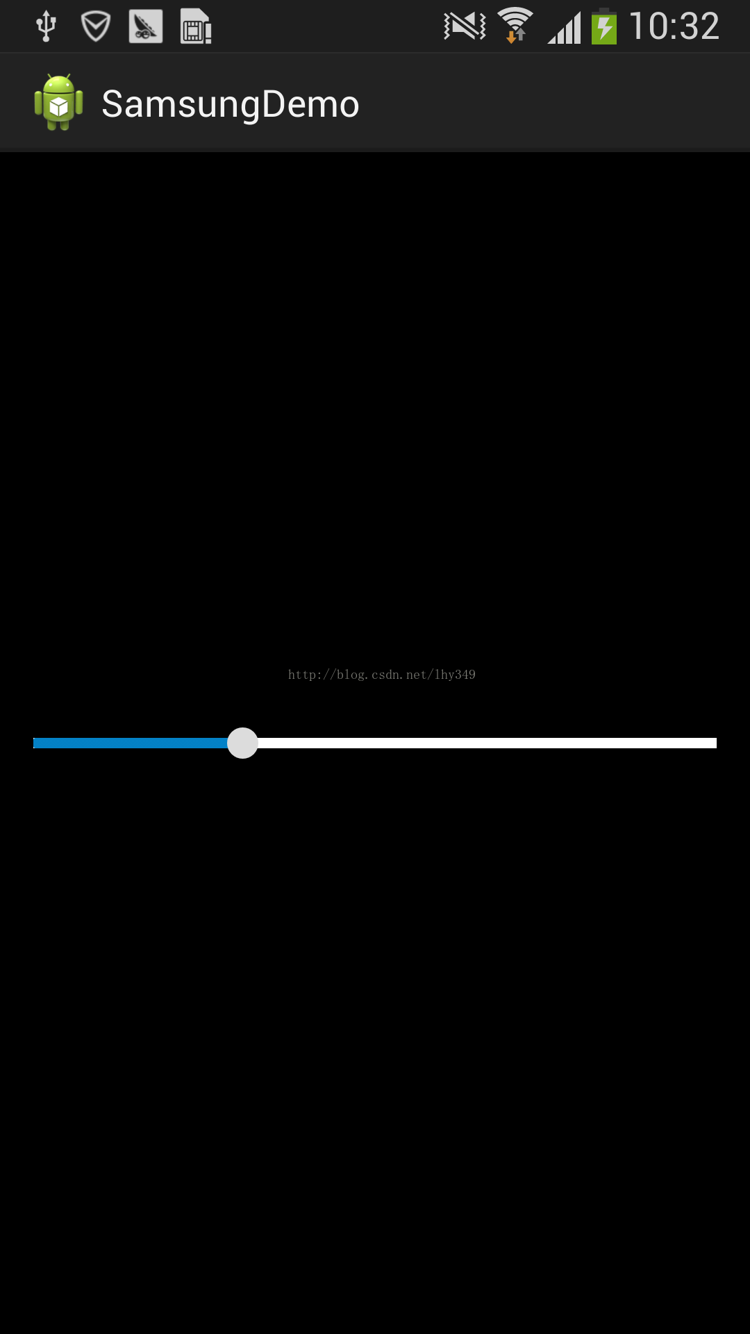
</SeekBar>到此,我们模仿的效果就结束了。Demo的下载链接:https://github.com/hiyounglee/SamsungDemo 看一下三星手机的效果图


 2955
2955


 被折叠的 条评论
为什么被折叠?
被折叠的 条评论
为什么被折叠?
 到【灌水乐园】发言


