


最近公共组件写到导航条,本来打算拿已有的改。看了下uniapp市场上已有的组件,一是不支持vue3+typescript,二是包装过重。索性自己手撸了一个导航条,不到100行代码全部搞定,因为自己的需求很简单:
1)遵循28原则,能覆盖80%以上导航需求即可,特殊需要单独写代码
2)适配状态条和小程序胶囊区高度
3)默认浮动定位(滚动贴顶),可以指定样式修改为非浮动。这个不用添加额外代码,直接在组件使用时指定css即可
4)支持大/中/小标题
5)支持中间和右边占位组件,中间可以放个搜索框什么。右边可以放个图片按钮或文字按钮等
6)支持背景图片,这个不用额外添加代码,直接在使用时指定css即可,默认背景透明,背景渐变色也是通过css自己去指定
7)支持更改左侧的导航图片,有时候要深色样式,就要换个返回按钮svg图片了
8)支持返回多步或跳转首页。具体场景在代码里有注释
9)支持带参数返回,例如编辑完页面信息后,点击返回按钮回列表则直接update列表的对应行数据而不用整体刷新
组件全部代码(unibest框架下,否则可能要自己导入vue一些公共方法):
<!--
  ccframe 公共导航条组件,满足80%的情况,不过度扩充
  1)关于背景图片:可以套一个view,指定为背景色,或者背景图片
  2)背景图片且顶部浮动:在1基础上,套的view指定为浮动
  3)下滑时吸顶:把整个组件包在下滑吸顶工具指定的区块内
-->
<template>
  <view :class="[props.fixed ? 'fixed' : '', 'left-0', 'right-0', 'top-0']">
    <view :style="{ height: statusBarHeight + 'px' }" />
    <view class="x-items-center" :style="{ height: navbarHeight }">
      <view class="flex-center w-80rpx" @click="doBack">
        <image :src="props.backImgUrl" class="w-40rpx h-40rpx" />
      </view>
      <slot>
        <view class="flex-1 text-center" :style="_titleStyle">{{ props.title }}</view>
      </slot>
      <slot name="right">
        <div class="w-80rpx"></div>
      </slot>
    </view>
  </view>
</template>
<script lang="ts" setup>
import type { CSSProperties } from 'vue'
import * as utils from '@/utils'

const joinClass = (currentClass: string | string[], propClass: string | string[] | undefined) => {
  const currentClasses = [].concat(currentClass)
  if (propClass) {
    return currentClasses.concat(propClass)
  } else {
    return currentClasses
  }
}

type CustomCSSProperties = CSSProperties & {
  fontSize?: string // 允许使用 rpx 等自定义单位
}

// 获取状态栏高度
const { statusBarHeight } = uni.getSystemInfoSync()

const props = withDefaults(
  defineProps<{
    title?: string // 指定标题内容
    titleStyle?: CustomCSSProperties // 指定标题样式
    titleSize?: 'small' | 'medium' | 'large' // 指定标题文本大小
    titleColor?: string // 指定标题颜色
    backImgUrl?: string // 指定返回按钮图片
    backMode?: 'back' | 'home' | number // 指定返回按钮的回退模式
    fixed?: boolean // 是否固定在顶部,默认为false
    /**
     * 回退模式backMode:
     * back: 默认回退,一般用于返回上一页
     * home: 跳转到首页(/pages/index/index且不可返回),一般用于例如支付完成的跳转
     * number: 回跳指定数量页面,一般用于多步流程跳转到流程第一页
     */
    backValue?: any // 返回额外参数,前一页必须使用navigateTo(url, backFunc)的模式来接收回调
  }>(),
  {
    title: '标题',
    titleStyle: () => ({
      fontSize: '32rpx', // 自定义单位
      fontWeight: 500
    }),
    titleSize: 'medium',
    titleColor: '#333333',
    backImgUrl: '/static/images/back-b.svg',
    backMode: 'back',
    fixed: false
  }
)

const _titleStyle = computed(() => {
  return {
    ...props.titleStyle,
    fontSize:
      props.titleSize === 'small' ? '32rpx' : props.titleSize === 'large' ? '48rpx' : '40rpx',
    color: props.titleColor
  }
})

const navbarHeight = computed(() => {
  // 只处理安卓/IOS/微信小程序
  if (process.env.VUE_APP_PLATFORM === 'mp-weixin') {
    const menuButtonInfo = uni.getMenuButtonBoundingClientRect()
    return menuButtonInfo.height + (menuButtonInfo.top - statusBarHeight) * 2 + 2 + 'px'
  } else {
    return '80rpx'
  }
})

const doBack = () => {
  if (props.backMode === 'home') {
    uni.reLaunch({
      url: '/pages/index/index'
    })
  } else if (props.backMode === 'back') {
    utils.goBack(props.backValue)
  } else {
    uni.navigateBack({
      delta: props.backMode
    })
  }
}
</script>
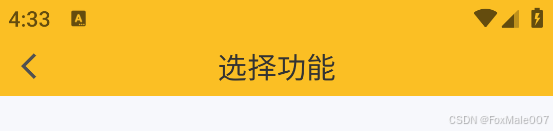
标准用法效果:
<cc-navbar class="relative bg-amber" title="选择功能" />效果:
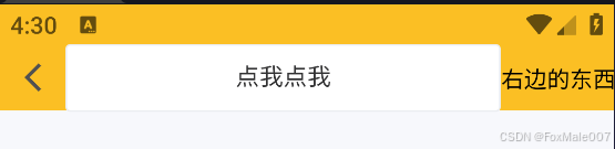
添加中间和右边组件:
    <cc-navbar class="bg-amber">
      <view class="flex-1"><up-button>点我点我</up-button></view>
      <template #right><text>右边的东西</text></template>
    </cc-navbar>
效果:
默认的back-b.svg文件:
<?xml version="1.0" standalone="no"?><!DOCTYPE svg PUBLIC "-//W3C//DTD SVG 1.1//EN" "http://www.w3.org/Graphics/SVG/1.1/DTD/svg11.dtd"><svg t="1722612224491" class="icon" viewBox="0 0 1024 1024" version="1.1" xmlns="http://www.w3.org/2000/svg" p-id="8436" xmlns:xlink="http://www.w3.org/1999/xlink" width="200" height="200"><path d="M789.048889 886.613333l-80.213333 80.213334L254.520889 512.512 255.032889 512l-0.512-0.483556L708.835556 57.173333l80.213333 80.213334L414.435556 512l374.613333 374.613333z" fill="#515151" p-id="8437"></path></svg>还有个深色主题的back-w.svg,修改下上面的fill颜色值即可
x-items-center和flex-center是自己的tailwindcss快速组合样式:
.x-items-center {
// 水平排列,垂直居中
@apply flex flex-row items-center;
}
.flex-center {
// 完全居中,使用flex定位
@apply flex justify-center items-center;
}
----------------------------------- [ 2024/08/25 的分隔线] -------------------------------
导航条组件支持了带参数返回,详细带参返回模式请见我的文章《优化uni-app页面间的传参跳转》


 扫一扫
扫一扫
 1125
1125

 被折叠的 条评论
为什么被折叠?
被折叠的 条评论
为什么被折叠?
 到【灌水乐园】发言


