原文[:Leveling up in CSS]
CSS seems easy at first. After all, it’s just styling, right?
But, give it time. Soon, CSS will show you the true depths of its complexity.
There are four things you can do to stay sane while using CSS at scale: use proper semantics, modularize, adopt a naming convention, and follow the single responsibility principle.
CSS起初看咋看很简单,毕竟它只是样式而已,对吗?
但是,给点时间,很快CSS就要向你展示它的复杂性的真实深度。
在大规模使用CSS的时候有保持理性,有一下四个方面的事情可以去做: 适当的语义化, 模块化,采用一种命名约定,并遵循单一责任原则。
1、适当的语义化( Use proper semantics)
在HTML和CSS中有语义标记的概念。 语义意味着单词和意义之间的关系。在HTML的环境中,意味着使用适当的标记,这有个经典的例子:
<!-- bad -->
<div class=”footer”></div>
<!-- good -->
<footer></footer>
Semantic HTML is pretty straightforward. On the other-hand, semantic CSS is much more abstract and subjective. Writing semantic CSS means choosing class names that convey structural meaning and function. Come up with class names that are easy to understand. Make sure they aren’t too specific. That way, you can reuse your classes.
语义的HTML相当的简洁明了,另一方面,语义化的CSS相当的抽象并且主观。 写语义化的CSS时候意味着传达结构上的意义和职责,提出一种便于理解的类名。确保它不是很具体,这样你就可以重用你的类名。
为了列举好的语义化的类名,这里有CSS方法的一个简单的例子:
<div class="stream">
  <div class="streamItem">
    <article class="postArticle">
      <div class="postArticle-content">
        <!-- content -->
      </div>
    </article>
  </div>
</div>
From the code, you can immediately discern structure, role, and meaning. The parent class is stream, a list of articles. The child class is streamItem, an actual article within the list. It’s clear how parent and child relate to one another. Furthermore, those classes are used on every page that features articles.
从上面的代码中,能够立即看清楚结构,角色,和意义。 父类是stream,是一个文章列表,子类是streamItem,是一个在列表之内的文章。父类和子类的关系很清楚。而且这样的类可以在任何有文章的页面中使用。
You should be able to read HTML and CSS like a book. It should tell a story. A story has characters and relationships between them. More semantic CSS will ultimately make your code more maintainable.
For further reading, check out What Makes for Semantic Class Names ,Naming CSS Stuff is Really Hard, and Semantics and Sensibility. For a longer read, see About HTML semantics and front-end architecture.
你可以想看书一样来阅读HTML和CSS,它应该告诉你一个故事,故事包含人物角色和他们之间的关系。好的语义化的CSS将从根本上让你的代码更好的维护。
进阶阅读,请挪步 怎样语义化类名, 命名CSS这玩意真的好难,和 语义化和识别能力。较长的阅读 ,请挪步 关于HTML的语义和前端构架。
2、模块化(Modularize)
In the age of component-based libraries like React, modularization is king. Think of components as composable modules created by deconstructing interfaces. Below is Product Hunt’s front page stream. As an exercise, let’s break the stream down into various components.
在像React这样基于组件的库的年代,模块化才是王道。
思考组件是由结构界面创造的可组合的模块,在产品的前端页面流下,我们做一个练习,将这种流拆分成各种不同的组件。

Each colored outline represent a component. The stream has many stream items.
每一个颜色轮廓代表一个组件,这个流包含许多流项目。
<div class="stream">
    <div class="streamItem">
        <!-- product info -->
    </div>
</div>
Most components can be broken down into even smaller components.
大多数的组件可以被拆解成更小的组件,就像这样:

Each stream item has a thumbnail and information about a featured product.
每一个流项目有关于特定产品的一个简略图和信息
<!-- STREAM COMPONENT -->
<div class="stream">
  <div class="streamItem">
<!-- POST COMPONENT -->
    <div class="post">
        <img src="thumbnail.png" class="postThumbnail"/>
        <div class="content">
        <!-- product info -->
        </div>
    </div>
  </div>
</div>
Because the stream component is independent of its children and vice versa, you can easily adjust or switch out the post class without making significant changes to the stream class.
流组件相对于它的孩子是独立的,反之亦然,你可以很容易的调整或者更换出post的类而不用对流的class做多大的变化。
Thinking in components will help you make your decouple code. The more decoupled your code is, the lower the interdependence between your classes. This makes your code easier to modify and work with in the long run.
考虑组件可以帮助使你的代码解耦。 解耦的程度越高,你的类之间的互相依赖就越低。 这样能够使你的代码容易修改并且长期运行。
When modularizing your CSS, start off by breaking your design down into component. You can do this with paper and pencil or in a program like Illustrator or Sketch. Identifying components will give you an idea of how to name your classes and how they relate to one another.
To read more about component driven CSS, check out CSS Architectures: Scalable and Modular Approaches, Writing Modular CSS with Sass, and Modularizing Your Front-End Code for Long Term Maintainability and Sanity.
当模块化CSS的时候,开始把你的设计拆分成组件,你可以用你的纸和笔或者使用像 Illustrator or Sketch 这样的软件,组件将会给你一个怎样去命名你的类并且它们之间如何联系的一个思路。
更多关系组件化驱动CSS的文章请移步 CSS架构-可伸缩和模块化的方法, 用SASS写模块化的CSS,为长期的维护和合理健全模块化你的前端代码。
3、选择一个好的命名约定(Choose a good naming convention)
There are dozens of CSS naming conventions out there. Some people swear by their choice of convention, claiming theirs is better than others. In truth, the best naming convention is different for each person. The best advice I ever received on this is: choose the naming convention that makes the most sense to you.
Here is a short list of some of the naming conventions people use:
- Object oriented CSS OOCSS
- Block element modifier (BEM)
- Scalable and modular architecture for CSS (SMACSS)
- Atomic
One of my favorite naming conventions is BEM. BEM stands for block, element, and modifier. Yandex, the Russian equivalent of Google, came up with it to issues they had with their CSS codebase at scale.
选择一个靠谱的命名约定(Choose a good naming convention)
CSS的命名约定有一大把,有些人声称他们选择的命名约定,声称他们的是比其他人的好。事实上,好的命名约定对每个人来说是不同的,我接收到的最好的建议是这样:选择对你自己最合理的的命名约定。
关于其他人使用的命名的约定这边有一个列表:
- 面向对象的CSS OOCSS
- 块级元素修饰 (BEM)
- CSS的可扩展和模块化构架 (SMACSS)
- 原子性
一种我最喜欢的命名约定是BEM,BEM 代表块,元素和修饰。 Yandex,俄罗斯人的Google,他们在处理自己那种规模的代码库时候想出来的解决方案。

BEM is one of the simplest — yet strictest — of the naming conventions.
BEM是一种简单又严格的命名约定。
.block {}
.block__element {}
.block--modifier {}
Blocks represent higher level classes. Elements are children of blocks. And modifiers represent different states.
block代表高层次的类,元素是类的子元素,并且修饰器代表了不同的状态。
<div class="search">
 <input type="search__btn search__btn--active" />
</div>
In the example above, the class search is the block and search button is its element. If we want to modify the state of the button, we can add a modifier like active .
One thing to remember about naming conventions is that regardless of which CSS naming convention you prefer, you will often times inherit or work on codebases with different standards. Be open to learning new standards and alternative ways of thinking about CSS.
You can read more about BEM in Getting your head ’round BEM syntax , BEM 101 , and Intro to BEM . For general reading about different conventions, check outOOCSS, ACSS, BEM, SMACSS: what are they? What should I use?
在这个例子中,search类是个块,搜索按钮是元素,如果我们想修改按钮的状态,可以添加一个修改器像active.
忽略你所熟悉的CSS命名约定,你会经常继承或者在不同的代码库的标准下工作。以开放的心态去学习新的标准和替代的方式去思考CSS.
关于BEM的更多的阅读 开始了解BEM的语法,BEM101, BEM简介。关于不同的约定一般阅读, OOCSS,ACSS,BEM,SMACSS 他们是什么? 我应该用哪个?
4、 遵循单一责任的原则 (Follow the single responsibility principle )
The single responsibility principles states that every module or class should have responsibility over a single part of the functionality provided by the software, and that responsibility should be entirely encapsulated by the class.
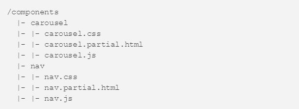
Within the context of CSS, the single responsibility principles means that pieces of code, classes and modules should do only one thing. When applied to CSS file organization, this means that self-contained components like carousels and navigation bars should have their own CSS file.
单一责任原则指出每一个模块或者类都应该对一个支持软件功能的一个单一部分负责,这种责任应该完全被封装在类中。在CSS的上下文环境中,单一责任原则意味着一个代码片段,一个类,或者一个模块应该做一件事情。 当应用于CSS的组织的时候,这代表独立的组件,像导航栏和轮播应该有他们自己的CSS文件,就像下边这样的:

Another common pattern in file organization is grouping files by functionality. For example, in the snippet above, all the files related to the carousel component are grouped together. Adopting this approach makes finding files much easier.
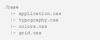
In addition to separating component styles, it’s good to separate global style using the single responsibility principle.
另外一种组织文件的普通的模式是将文件按照功能分组。举个例子,在上面的代码片段中,所以的和轮播相关的文件组织在一起。 采用这样的方法使得查找文件变得相当简单。
另外对于分离组件样式,将全局的样式按照单一责任原则抽离开是不错的。

In the example, each style concern is separated into its own file. This way, if you want to update your colors, you know exactly where to look.
Regardless of which file organization convention you use, let the single responsibility principle help guide your decisions. If one file starts getting bloated, consider partitioning it out based on what makes logical sense.
For more on file structures and CSS architecture, read Aesthetic Sass 1: Architecture and Style Organization and Scalable and Maintainable CSS Architecture.
When the single responsibility principle is applied to individual CSS classes, it means that each class should have only one function. In other words, separate out styles into different classes based on concerns. Here is a classic example:
在这例子中,每种设计的样式被分离在自己的文件中,这样,如果你想要更新你的颜色,应该很明确在哪里找。
不管你用哪一种文件组织约定,汤单一责任原则帮助你指导你的决定,如果一个文件开始变得臃肿,考虑从基于逻辑层面划分这个文件。
更多的关于文件结构和CSS架构,阅读 审美SASS, 架构和组织CSS和可伸缩以及可维护的架构风格。
当单一责任原则被CSS的类所采用,这意味着每个类必须只有一个功能,换句话说,基于关系将样式划分成为不同的类,这里有个经典的案例:
.splash {
  background: #f2f2f2;
  color: #fffff;
  margin: 20px;
  padding: 30px;
  border-radius: 4px;
  position: absolute;
  top: 0;
  right: 0;
  bottom: 0;
  left: 0;
}
In the example above, we are mixing concerns. The splash class not only contains presentation and styling logic for itself, but for its children as well. To remedy this, we can split the code into two separate classes.
在上边的例子中,我们混合了不同的点,这个类不仅包含展现和自己的样式逻辑,还包含自己自元素的,为了拯救它,我们可以将样式代码分开在两个单独的类中。
.splash {
  position: absolute;
  top: 0;
  right: 0;
  bottom: 0;
  left: 0;
}

.splash__content {
  background: #f2f2f2;
  color: #fffff;
  padding: 30px;
  border-radius: 4px;
}
Now we have a splash and splash content. We can use splash as a generic full-bleed class that takes any child. All of the concerns of the child, in this case the splash content, are decoupled from the parent.
现在我们有slash和splash__content 我们可以使用splash作为一个普通的可以容纳任何子类的类,所有与子类有关的特性,在这个例子中与父类完全解耦。
You can read more about applying the single responsibility approach to styling and classes in The single responsibility principle applied to CSS and Single Responsibility.
可以阅读更多关于采用单一责任的方法书写样式和类的文章 The single responsibility principle applied to CSS and Single Responsibility.
简单超越复杂(Simplicity over complexity)
Ask any good front-end developer or CSS architect and they will tell you that they’ve never been fully satisfied with their code. Writing good CSS is an iterative process. Start simple, follow basic CSS conventions and style guides, and iterate from there.
If you enjoyed this article, you might like the article I wrote that teaches you five important characteristics of good design through k-pop.
I would love to know how you approach CSS. What is your favorite naming convention? How do you organize your code? Feel free to leave a note or Tweet to me.
去问任何好的前端开发者或者CSS架构师,他们会告诉你他们从来没有真正的对自己的代码完全满意过。 编写好的CSS是一个反复迭代的过程,从简单的开始,遵循基本的CSS约定和风格指南,并从那里开始迭代。


 254
254

 被折叠的 条评论
为什么被折叠?


