


content一般和:before,:after一起使用,用来生成内容(img和input没有该属性),content的内容一般可以为以下四种:
- none: 不生成任何值。
- attr: 插入标签属性值
- url: 使用指定的绝对或相对地址插入一个外部资源(图像,声频,视频或浏览器支持的其他任何资源)
- string: 插入字符串
none
其实我们常用的clearfix就是应用了这个none了
Css Code
.clearfix:after {
    content: "";
    visibility: hidden;
    display: block;
    font-size: 0;
    clear: both;
    height: 0;
}
* html .clearfix             { zoom: 1; } /* IE6 */
*:first-child+html .clearfix { zoom: 1; } /* IE7 */
attr: 插入标签属性值
普通文字demo
青,取之于蓝,而青于蓝;冰,水为之,而寒于水。
Css Code
.attr-title:after{
    content:attr(title);
    color:#f00;
}
图片滑过动画效果
 鼠标放上
鼠标放上  鼠标移出
鼠标移出
Css Code
#imghover li{
    position:relative;
    margin-right:20px;
}
#imghover a:after{
    content:attr(title);
    position:absolute;
    top:0;
    left:0;
    width:100%;
    background-color:rgba(0,0,0,0.5);
    line-height:30px;
    color:#fff;
    text-align:center;
    font-size:14px;
    text-shadow:-1px -1px 0 rgba(0,0,0,0.8);
    opacity: 0;
    -webkit-transition:all 0.3s ease;
    -moz-transition:all 0.3s ease;
    -ms-transition:all 0.3s ease;
    -o-transition:all 0.3s ease;
    transition:all 0.3s ease;
}
#imghover a:hover:after{
    top:50%;
    margin-top:-15px;
    opacity: 1;
}
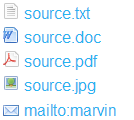
url: 使用指定的绝对或相对地址插入一个外部资源
Css Code
#icon_list a{
    font-size:16px;
}
#icon_list a[href]:before{
    content:'';
    margin-right:5px;
}
#icon_list a[href$='.txt']:before{
    content:url(images/icon_txt.gif);
}
#icon_list a[href$='.pdf']:before{
    content:url(images/icon_pdf.gif);
}
#icon_list a[href$='.doc']:before{
    content:url(images/icon_doc.gif);
}
#icon_list a[href$='.jpg']:before{
    content:url(images/icon_pic.gif);
}
#icon_list a[href^="mailto:"]:before{
    content:url(images/icon_mailto.gif);
}
string: 插入字符串
其实关于插入字符串,这个页面结构已经应用了很多了,第一个是h2标题左边的蓝色一块,第二个是鼠标滑过代码区的动画效果,第三个就是footer部分的emailto旁边的小图标,如果有兴趣可以用firebug查看查看,这个主要说下如何应用content做计数器
- css3新增的选择器
- 属性选择器
- 结构伪类选择器
- 增强的文本和颜色功能
- 文本阴影,文本换行,溢出文本
- rgba色彩模式
- 新增的弹性盒模型
- box布局
- 弹性布局实战
Css Code
#counter li{
    margin-left:0;
    list-style:none outside none;
    counter-increment: title1;
}
#counter li:before{
    content:"第"counter(title1)"章:";
    font-size:14px;
    color:#f00;
}
#counter li li{
    margin-left:25px;
    counter-increment: title2;
}
#counter li li:before{
    content:counter(title1)"."counter(title2);
}
插入特殊字符
在这篇文章的最后,说下如何在content里面插入特殊字符,关于特殊字符可以参考这里:html特殊字符,请先查阅其实用方法,即第一列为符号;第二列为html中使用的,需在前面加上&#;第三排css中可以使用,不过需要反斜杠\转义。下面实例操作下
- css3新增的选择器
- 增强的文本和颜色功能
- 新增的弹性盒模型
- copyright
Css Code
#special li:before,
#special li:after{
    color:#f00;
}
#special li:nth-child(2n+1):before{
    color:#ccc;
}
#special li:first-child:before,
#special li:first-child:after{
    content:"\25ba";
}
#special li:first-child:after{
    -webkit-transform:scale(-1);
    -moz-transform:scale(-1);
    -ms-transform:scale(-1);
    -o-transform:scale(-1);
    transform:scale(-1);
}
#special li:nth-of-type(2):before{
    content:"\2714";
}
#special li:nth-child(3):after{
    content:"\00bb";
}
#special li:last-of-type:before{
    content:"\00a9";
    margin-right:5px;
}
注:这里顺便多应用了下css3的子元素选择器,然后对于第一的after箭头,通过transform的scale为-1来左右调转


 1万+
1万+


 被折叠的 条评论
为什么被折叠?
被折叠的 条评论
为什么被折叠?
 到【灌水乐园】发言


