


题外话
keyframes的小练习,相信对刚掌握了keyframes理论知识的有些帮助;
百看不如一练,动手吧。
注意: 建议用chrome或者chromium内核的浏览器进行浏览器,Firefox也行
基础理论
keyframes是CSS3才引进的 … 使用方法是前面@keyframes Demo, Demo是自定义动画名字- 仅支持百分比为进度条和
form-to!!!两者可以混用 animation有八个参数,可以分开写,可以综合写(一般一起写);animation-name规定 @keyframes 动画的名称。animation-duration规定动画完成一个周期所花费的秒或毫秒。默认是 0。animation-timing-function规定动画的速度曲线。默认是 “ease”。animation-delay规定动画何时开始。默认是 0。animation-iteration-count规定动画被播放的次数。默认是 1。animation-direction规定动画是否在下一周期逆向地播放。默认是 “normal”。animation-play-state规定动画是否正在运行或暂停。默认是 “running”。animation-fill-mode规定对象动画时间之外的状态。
综合写法: animation : name 1s linear 1s inifinite alternate running both;
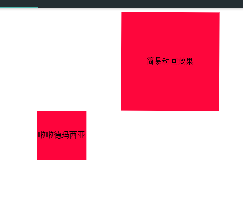
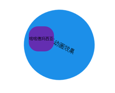
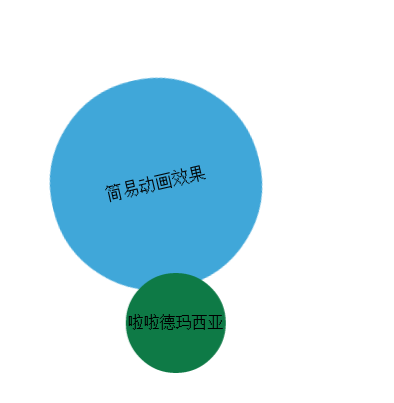
效果图
代码
<!DOCTYPE html>
<html lang="en">
	<head>
		<meta charset="UTF-8">
		<title>keyframes</title>
		<style>
			.demo {
				width: 200px;
				height: 200px;
				text-align: center;
				line-height: 200px;
				background-color: #fe043c;
				position: relative;
				left: 50%;
				margin-left: -100px;
				-webkit-animation: Demo 6s ease-in-out infinite alternate running forwards;
				animation: Demo 6s ease-in-out infinite alternate running forwards;
			}
			.demo1 {
				width: 100px;
				height: 100px;
				text-align: center;
				line-height: 100px;
				background-color: #fe043c;
				position: absolute;
				left: 30%;
				margin-left: -100px;
				-webkit-animation: Demo1 6s ease-in-out infinite alternate running forwards;
				animation: Demo1 6s ease-in-out infinite alternate running forwards;
			}

			@-webkit-keyframes Demo {
				20% {
					background-color: #f68c1b;
					top: 50px;
					border-radius: 20%;
				}
				40% {
					background-color: #31b32c;
					top: 100px;
					border-radius: 40%;
					-webkit-transform: rotate(90deg) scale(1.4);
					transform: rotate(90deg) scale(1.4);
				}

				60% {
					background-color: #1b8df6;
					top: 200px;
					border-radius: 60%;
					-webkit-transform: scale(.4) translateX(300);
					transform: scale(.4) translateX(300);
				}
				80% {
					background-color: #ba38d5;
					top: 300px;
					border-radius: 80%;
					-webkit-transform: rotate(-90deg) scale(1.4);
					transform: rotate(-90deg) scale(1.4);
				}
				100% {
					background-color: #2bbada;
					top: 400px;
					border-radius: 100%;
				}
			}

			@keyframes Demo {
				20% {
					background-color: #f68c1b;
					top: 50px;
					border-radius: 20%;
				}
				40% {
					background-color: #31b32c;
					top: 100px;
					border-radius: 40%;
					-webkit-transform: rotate(90deg) scale(1.4);
					transform: rotate(90deg) scale(1.4);
				}

				60% {
					background-color: #1b8df6;
					top: 200px;
					border-radius: 60%;
					-webkit-transform: scale(.4) translateX(300);
					transform: scale(.4) translateX(300);
				}
				80% {
					background-color: #ba38d5;
					top: 300px;
					border-radius: 80%;
					-webkit-transform: rotate(-90deg) scale(1.4);
					transform: rotate(-90deg) scale(1.4);
				}
				100% {
					background-color: #2bbada;
					top: 400px;
					border-radius: 100%;
				}
			}

			@-webkit-keyframes Demo1 {
				form {
					background-color: #df5891;
					-webkit-transform: translateX(50px);
					transform: translateX(150px);
					border-radius: 25%;
					top: 100px;
				}

				50% {
					-webkit-transform: scale(2);
					transform: scale(2);
					-webkit-transform: translateX(350px);
					transform: translateX(150px);
					background-color: #642eb1;
					border-radius: 35%;
					top: 200px;
				}
				75% {
					-webkit-transform: scale(2);
					transform: scale(2.5);
					-webkit-transform: translateX(150px);
					transform: translateX(150px);
					background-color: #642eb1;
					border-radius: 55%;
					top: 400px;
				}

				to {
					background-color: #05823b;
					-webkit-transform: translateX(250px);
					transform: translateX(250px);
					border-radius: 75%;
					top: 600px;
				}
			}

			@keyframes Demo1 {
				form {
					background-color: #df5891;
					-webkit-transform: translateX(50px);
					transform: translateX(150px);
					border-radius: 25%;
					top: 100px;
				}

				50% {
					-webkit-transform: scale(2);
					transform: scale(2);
					-webkit-transform: translateX(350px);
					transform: translateX(150px);
					background-color: #642eb1;
					border-radius: 35%;
					top: 200px;
				}
				75% {
					-webkit-transform: scale(2);
					transform: scale(2.5);
					-webkit-transform: translateX(150px);
					transform: translateX(150px);
					background-color: #642eb1;
					border-radius: 55%;
					top: 400px;
				}

				to {
					background-color: #05823b;
					-webkit-transform: translateX(250px);
					transform: translateX(250px);
					border-radius: 75%;
					top: 600px;
				}
			}
		</style>
	</head>
	<body>
		<div class="demo">简易动画效果</div>
		<div class="demo1">啦啦德玛西亚</div>
	</body>
</html>


 886
886


 被折叠的 条评论
为什么被折叠?
被折叠的 条评论
为什么被折叠?
 到【灌水乐园】发言


